


Templates
Tools
Learn
Company
Home
Blog
Design
Swiss Style Poster Design
Swiss Style Poster Design

What is Swiss Graphic Design?
Is it just simple-looking arrangements of words? Why is there so little detail here? Why is everything so reduced? But more importantly, why should any designer study Swiss Design?
As the name suggests, this design style, also known as the International Typographic Style, has its origins in Switzerland and emerged around 1955 from the Bauhaus movement, as well as from Russian constructivism.
Designer Josef Müller-Brockmann is the main figure in this style evolution. He’s recognized for his use of clean shapes, colors, and typography, which is what the Swiss Style is all about. Probably the best-known product of this design niche is a work by designer Max Miedinger – the famous Helvetica typeface, the most used Typeface of all time.

So if you take a closer look, the true star of Swiss Style Graphic Design shines behind a curtain of consistent aesthetically arranged letters. There seems to be a system that makes these simple compositions so intriguing to the eye, making them typography art. In this article, we'll give you some insight into that hidden system: the Swiss Design Grid.

6 column grid

4 column grid
the most legible and harmonious means for structuring information
”Mathematical grids are the foundation of International Typographic Design. In The 1950s, these grids were considered to be "the most legible and harmonious means for structuring information” and that holds up to this day. For example, websites are broken into flexible grids to create a hierarchy of information. Even every smartphone offers to take a picture with a grid to measure the precision of the picture’s position.


In swiss design, everything is structured. Both the design and the designer are subordinate to the content of the topic for which the design is created. The basic idea is to optimize the communication of the content and to remove distracting information, like emotions or self-portrayal, from the design.
This optimization is why you can still see classical swiss design being around for almost a century when it comes to theater plays or art exhibitions. Especially for artistic content, the design must not become a competitor.
Basically, Swiss design represents the attitude that the designer is not an artist but a visual communicator who creates clarity and order of information between members of society.


Ok, cool. But why is this interesting for every designer and not only for the minimalists and theorists? Well, when it comes to visual communication, Swiss Design Principles teach you a lot, if not the most about composition, harmony, and structure, which is important if you want to improve any design.
It's functional, objective, extremely systematic, and universal. The main goal is to communicate in the most adequate visual way. And if you learn how to do that, how to put the font in hierarchy and harmony, and how to create visual balance with just some letters, that will elevate every other type of design you'll be going for.
It is especially relevant for contemporary design concepts where it is less about the individual logo or poster and more about the coherence of these things.
At its best, a logo is created with a quality font according to a grid. The same grid is then adapted for posters, the website, and so on, forming everything, from the typeface to complex commercials, into a harmonious unit – a visual identity.
If done correctly, the grid-based layout of a medium can be enough to tell the viewer which campaign it belongs to. You may have noticed this with big fashion labels these days. We see an ad and can immediately guess which brand it represents without even seeing the logo. And it’s thanks to Swiss Design Principles.


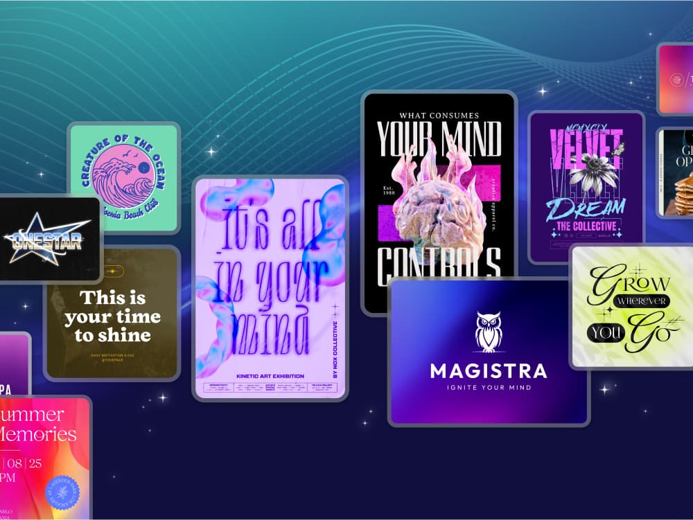
Let’s go! So what do you need to achieve that International Typographic Style? Kittl’s Swiss Design Poster Ideas show you how the above principles can be implemented and expanded to give you the best possible introduction to this exciting topic. But let’s scratch the surface of the theory first.


Swiss Typography
Universal belief might be that your work is done when there is nothing left to add. But in Swiss Design, work is perfect when there is nothing to remove from it. This becomes particularly clear when you look at the perfectly constructed fonts of swiss typography, which form the visual basis for the entire design niche.
The main focus of these fonts is legibility. They should appear as objective as possible. This is also the reason for the lack of serifs, which categorizes them into the so-called Sans Serif Typography, also known as Grotesque Fonts.
Famous examples of these typefaces include Helvetica, Akzidenz Grotesk, Univers, and Frutiger. The latter is relatively close to Poppins, which you can use in Kittl to give your designs that super sharp look.

The Swiss Grid
If we keep it simple, a Swiss design grid is based on the typeface that we are using. Obviously, the grid divides a two-dimensional plane into smaller fields. These fields correspond in-depth to a number of text lines. The fields are separated by an intermediate space with a width of one, two, or more lines of text, so it's impossible to get messy.
There is virtually no limit to the number of grid divisions, but we advise you to use three to four vertical columns, or go with a higher number that can be easily divided.

Hierarchy of data
Swiss design sorts the information so that the viewer perceives the most important information first. This is accomplished by enlarging the font because the human brain is unconsciously reading it from largest to smallest.
The viewer moves from information to information, and your concentration is automatically increasing due to the decreasing font size. So if you work in advertising and want people to squint while checking out your design, this might come in handy.

Now you’ve got a small glimpse of this academic design topic. And if you find it interesting and want to learn more, you will find the most important key points and some book recommendations below.
Maybe these thoughts will move you to delve deeper into the International Typographic Style and make a few designs yourself. Maybe a poster series for an exhibition or an opera, a magazine cover, a futuristic fashion campaign, or simply a minimalistic logo. The possibilities are endless, as always. Have fun and Create Magic.
Facts
Swiss Design is:
- Asymmetrically organizing the design elements on a mathematically-constructed grid to create Visual unity in composition.
- Presenting visual and textual information in a clear and factual manner, using objective photography and illustration, and ensuring that it filters any propaganda and the exaggerated claims of commercial advertising
- Using sans-serif typography, set flush left, ragged right. The movement believed sans-serif typography expressed the spirit of a progressive age and those mathematical grids were the most legible and harmonious means for structuring information
Swiss Design beliefs:
- Design is a socially worthwhile and serious vocation.
- In design, there is no room for eccentricity or idiosyncrasy. Design should be grounded on universal artistic principles, and using a scientific approach should provide a well-defined solution to a problem.
- The designer is a visual communicator and not an artist. The designer acts as an objective and reliable transmitter of important information between members of society.
- The idea of design is to achieve clarity and order.
Some books to read:
- Pioneer of Swiss Graphic Design by Josef Müller-Brockmann
- Grid Systems by Josef Müller-Brockmann
- Typography by Emil Ruder
- Design is Attitude by Helmut Schmid
Related articles

Design
Create Tattoo T-Shirt Designs Easily
The custom of marking bodies with permanent designs is probably as old as mankind itself, or at leas...

Tutorials
How to create your own movie title design in Kittl
In the previous article, we showed examples of how Netflix and Warner used to create stunning movie ...

News
NEW: Upload your fonts to Kittl
Are you in love with a certain typeface? Well, although we from Kittl think we have the very best ty...