


Templates
Tools
Learn
Company
Home
Blog
Tutorials
How to Make Y2K Logos Easily | Design Tutorial
How to Make Y2K Logos Easily | Design Tutorial
When we talk about the Y2K style, we’re talking about the type of design that goes back to the early 2000s. They were memorable types of logos that stood out with their loud, bright neon colors and massive lettering. The Y2K style isn’t just a novelty compared to earlier styles or a design that invokes nostalgia. It’s a unique visual style with an attitude.
If you’re interested in creating your own Y2K logos, you’ll find that the process isn’t overly complex – if you’ve got the right tools. And Kittl is precisely what you need for the job. This tutorial will give you a step-by-step process to create genuine Y2K graphics with Kittl. And if you don’t have Kittl, you can sign-up for free right now and follow along.
1. Make a New Kittl Project
The very first thing you’ll need to do to get started is to create a new project in Kittl. This will be as simple as signing up and hitting “New Project.” Then, you’ll get a new canvas for your graphic and adjust it to your liking. For instance, you can tweak settings like size, grid, and orientation.

2. Choose a Y2K Font
When it comes to the Y2K design, the font choice will be at the center. The font will determine the rest of the graphic, so you’ll need something that makes an immediate impression.
In Kittl, you can select a font by going to the “Text” menu on the left sidebar. You’ll see various presets arranged by categories like “Vintage,” “Modern,” “Decorated,” etc. However, we won’t go for those options in this case. Instead, you should choose the “Add Headline” option at the top.
You’ll see the text “Headline” pop up at the center of your canvas. For this example, we’ll type in “Orbit,” but you can enter whatever words you want. Now, while the text is selected and active, you can go to the right sidebar and adjust the basic settings. In particular, the font selection menu is located right under “Text Settings.”
As mentioned, the font in a Y2K design needs to be bold and powerful. We’ve chosen Basement Grotesque and made it all caps.

3. Slant, Shadow, and Border Your Text
The next step in our design will be to tweak the text and make it more exciting. For starters, we’ll want to make it look italic to get that slanted look.
You’ll find that certain fonts don’t have the italic option by default. Luckily, we can create the same effect with some visual trickery.
While your text is selected, go to the right sidebar and choose “Angle” under “Transformation.” This option will, of course, slant the text on an angle. But we don’t want to keep it slanted – we only want the italic effect. To that end, we’ll confirm the angle transformation and click and drag the round arrow beneath the slanted text. This will rotate the lettering until it’s laying horizontally.
You can make the rotation process more precise and easier by turning on the grid for orientation. To toggle the grid, simply tap CTRL + apostrophe (‘) on Windows or CMD + apostrophe (‘) on Mac.

4. Add Shadow and Border to the Text
Once your text is italicized, you can proceed to give it some shadow and border. This is a relatively simple process that you can complete using the sidebar on the right.
In the text sidebar, switch from the “Text Settings” tab to the “Effects” tab. You’ll see two main categories: “Shading” and “Decoration.” Under “Shading,” you can select the type of shadow to apply to the text. The types in question are Drop, Line, Block, and Detailed 3D shadow. We’ve chosen the Block shadow for this example. We’ve also adjusted the shadow offset to 5 and the angle to -90.
The next crucial element for a Y2K-style text will be color. This setting is easy to adjust as well – you’ll find the color menu right beneath the four shadow options. We’ve chosen a bolt of neon purple for the shadow and turned the main body of the text white.
For the border, we increased the outline width to 18. Finally, we made the lettering a bit tighter by decreasing the spacing between the letters. We also added another word – “Works” – by simply copying the first word and dragging the copy just beneath the original.

5. Add Y2K Elements
When the text is in place, it’s time to add some unique decorative elements in the Y2K style. To do that, go to the “Elements” menu in the left toolbar, then navigate to the right-most tab named “Abstract.” Scroll down until you get to the “Y2K” section and choose one of the elements to serve as the centerpiece of the graphic.
In this example, we went with the globe. We positioned the globe at the very center and brought it behind the letters. We also changed the color of the globe to match the letters. Also, we increased the border weight to 11.30 from the “Object Settings” in the right sidebar. We used a similar process to add a star to the graphic.
Finally, we added an orbit ring, placed it in the background, flipped it, and changed it to the same color as the rest of the elements. With this step, your graphic will be done. Next, we’ll have a quick look at one other Y2K logo idea.
Kittl allows you to send elements to the front or back with great ease. You only need to right-click the desired element and select “Forward,” “Backward,” “To Front,” or “To Back.”

6. Alternative Y2K Design
For this design, we took the blocky Liberation font and typed in “DNA.” Then, we italicized the lettering using the same technique from Step 3 of this tutorial. We changed the color of the text to neon blue and made the background grey.
Next, we added the same type of shadow as in the first graphic. However, this time, we made some adjustments to the offset – in particular, we reduced it to zero. We also gave the shadow a more massive width, bumping it up to 18. We also colored the shadow white.
To complete the lettering, we added the word “Labs” in a different font (Syncopate). We preserved the shadow style and coloring by copying the original text.
Finally, we gave the logo a double stroke. We did this by duplicating the entire text, increasing the outline width on it to 30, and changing the color to the same neon blue of the letters. This way, the background shadow popped up behind the original lettering, creating a double-stroke effect. For easier manipulation, we grouped the words “DNA” and “Labs” with their copies.
We wrapped the entire design up with some elements resembling lava-lamp patterns. We placed the elements in the background and made them the same color as the letters. The result is a genuine Y2K logo with the words “DNA Labs” and an interesting splash behind the lettering.

7. Alternative Y2K Design 2
Now let’s try a design inspired by disco. We’ll start with the Balinera font and the word “Disco.” As in the previous examples, we’ll create an italic effect by putting the text at an angle and then tilting it to get it in line.
We added Block Shadow to the text with an angle of 35 degrees and a width of 30. Then, we copied the word “Disco” and dragged the copy below the original. We changed the font to Righteous, and the word to “Girls.” The slogan on our logo became “Disco Girls.”
From the “Add Elements” menu, we went to the Y2K section and selected a star symbol. We copied the symbol two times, making each copy a bit smaller than the original. Then, we positioned the stars in a semi-circle from the “S” in “Girls” to the top of the letter “O” in “Disco.” We also pushed the stars to the back to create the impression they’re going behind the letters.
For the color of the stars, we chose a bright green with a thick black border.
At first, the word “Girls” was leaving some of the background visible. We wanted the letters to pop, so we made a black rectangle from Basic Shapes, stretched it over the letters, and placed it to the back. This filled the gaps in the lettering.

8. Alternative Y2K Design 3
The final design we made had an oval Y2K-style grid at the center. We changed the color of this object to a neon green with a black background.
We went to the text tool and chose the Generic Techno font. Using this futuristic font, we wrote the word “Orbital.” Then, we increased the text, changed its color to match the grid, and placed it across the central object. Here again, we used Block Shadow for the text, this time with a 90-degree angle and width of 35.
Next, we copied the word “Orbital,” changed the font to Syncopate, and wrote “World” instead of “Orbital” on the copy. We placed the new word beneath the previous one to get the “Orbital World” slogan at the center of our oval grid.
To get the words to pop out, we repeated a trick from the previous design. We went to “Add Elements,” then “Basic Shapes,” and took a black rectangle. Then, we stretched the rectangle over the top word and pushed it to the back. We did the same for the second word.
To top the design off, we took a four-pointed star from the “Add Elements” menu, colored it the same as the rest of the elements, and placed it at the top left of our grid. We copied that star and pasted it to the opposite side of the oval.

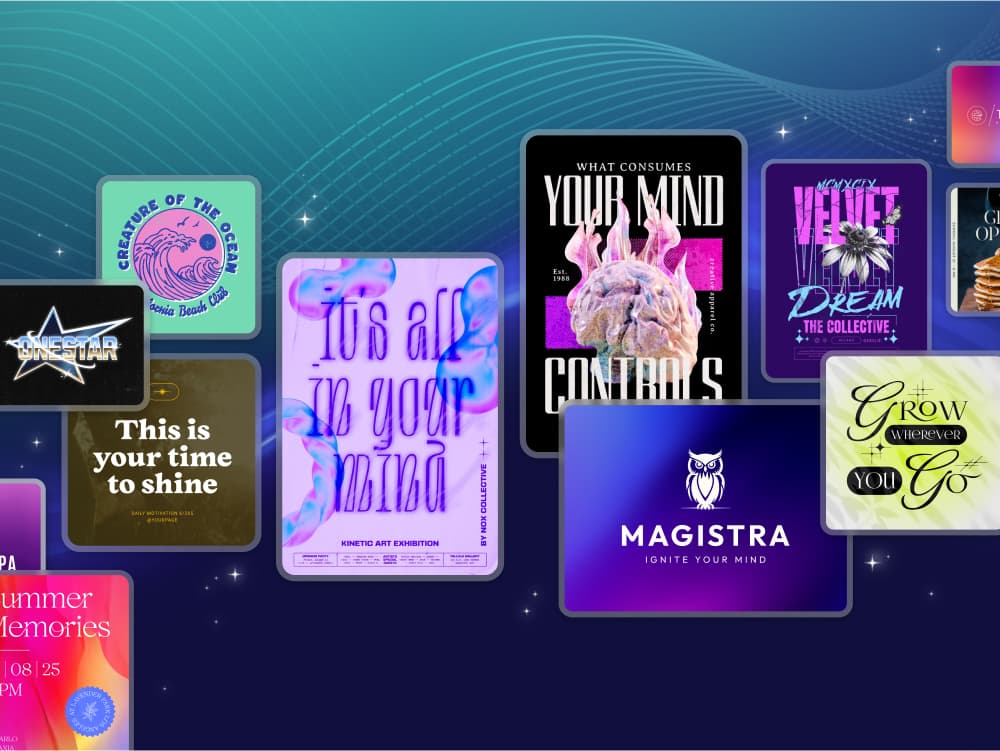
Y2K logo template in Kittl
Related articles
Design
3 Questions for Logo Designers
There are a lot great tips and tutorials for creating a logo design, but we wanted to give you some ...
Tutorials
Easily Make Badge Logo Layouts With Kittl | Design Tutorial
Badges can make everything more interesting. Whether it’s for a hat, shirt, or backpack, this simple...
Tutorials
How to Easily Make the Netflix Logo Text Effect | Design Tutorial
The Netflix logo might not look like much at first sight. It’s got some lettering, a simple red colo...