


Templates
Tools
Learn
Company
Home
Blog
Tutorials
How to Easily Make the Netflix Logo Text Effect | Design Tutorial
How to Easily Make the Netflix Logo Text Effect | Design Tutorial
The Netflix logo might not look like much at first sight. It’s got some lettering, a simple red color, and a mild curvature along the bottom edge of the letters. And yet, that logo (along with the well-known music cue that you’re probably hearing in your head right now) has become iconic.
So, what’s the catch?
The secret is in the logo’s simplicity and style. It manages to look authentic with as few elements as possible. Also, the font, color, and text effects are selected carefully for maximum effect.
This tutorial will show you how to achieve that same effect with ease using Kittl. If you don’t have Kittl yet, you can sign-up for free right now and follow this project along.
1. Add Text to Your Project
Since the text is the most important element of the Netflix logo, we’ll, of course, start by adding it to the artboard. Go to the left sidebar, click on the “Add Text” menu, and choose “Add Headline.”
The text will appear at the center of your canvas. Double-click it to edit the text and type in “Netflix.” For this project, we’ll need a sans-serif condensed font. The best choice will be the Bebas Neue. You can choose the font from the right-side “Text Settings” menu.
To get the same look as the original Netflix logo, we’ll increase the letter spacing to 30. This option is available under the font selection menu.

2. Apply the Distort Effect
Once the text is in place, you’ll be ready to add the crucial effect. To do that, go to the “Transformation” menu in the right sidebar and choose “Distort.”
When the “Distort” effect is active, you’ll see several nodes appear around the text. Dragging the nodes will distort the text. To achieve the Netflix logo effect, use the bottom central node. Drag that node slightly upwards, and that familiar curve will appear.
With the central node lifted, you’ll see two additional nodes appear on either side. You can use these to increase the curve – simply drag each node a bit further from the central point.
If you want to make the curve a bit more pronounced, drag the nodes on the lower edges slightly downwards.
If you drag a node too far, you can undo the action using a simple keyboard shortcut. Press Ctrl+Z to go back one step.

3. Color the Text
Changing text color is very straightforward in Kittl. You can do just that via the “Text Settings” menu on the right side. “Text Color” will be the first option in that menu.
Click on the black circle to bring up the color palette. Then, choose a lighter red color for the signature Netflix look. You can tweak the color if you want an exact match. For this example, we’ll say that the color we chose was close enough.

4. Create the Netflix Effect for a Different Text
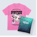
Now that our Netflix text design is done, we can change the word on the logo. To edit the text, simply double-click on it and start typing. We typed in “Kittl Design.”
The great thing about Kittl text effects is that they’ll stay the same even if you type in new text. In other words, everything we changed about the text – the font, spacing, Distort effect, and color – will remain.
And that’s it. If you want to create custom text with the same design as the Netflix logo, Kittl allows you to achieve that in minutes.

Related articles

Tutorials
20+ Essential Keyboard Shortcuts in Kittl
If you are a fan of keyboard shortcuts, then you are in luck, because Kittl has many of the graphic ...

Tutorials
How To Upload Your Own Fonts To Kittl
In this video, Drew shows you how to upload and use your own fonts to Kittl. Add a personal touch to...

Design
How To Pair Fonts Together
In this video, Drew gives you some tips for pairing fonts together as well as some examples!