Have you ever finished a t-shirt design and thought, “What if this turns into an expensive batch of shirts with a belly print or an awkward, oversized logo?”
If you’re a graphic designer, POD seller, or screen-printing beginner, that’s a normal fear. A design can look great on screen but still print too low, too wide, or too small once it’s on the shirt. And with the custom t-shirt market valued at $5.16 billion in 2024 and still growing, getting those details right matters.
At the same time, buyers expect products to feel more personal and more polished. In BCG’s global survey, four out of five consumers said they’re comfortable with personalized experiences. For apparel creators, that means your designs need to feel custom without looking off-balance or poorly placed.
This guide gives you a practical blueprint for choosing the right placement T shirt design size chart, and setting up your file for production. You’ll learn standard t-shirt print sizes, left-chest logo sizing, back print dimensions, and how to build everything properly in Kittl.
Why T-shirt design placement & sizing make or break your brand
T-shirt placement directly affects how professional your brand looks once the shirt is printed. That matters even more as apparel decoration becomes more digital.
In the 2024 State of the Decorated Apparel Industry report, PRINTING United Alliance says digital methods made up 33.4% of apparel decoration in 2024 and are expected to reach 47.1% by 2026. When more jobs go straight from file to printer, bad sizing choices get exposed fast.
- Visual balance shapes first impressions.
Good placement is about making the print feel stable and intentional on the body. Alignment creates order, while balance gives a design stability. On a T-shirt, that means a graphic can be technically centered and still look wrong if it sits too close to the collar, feels too low on the torso, or has the wrong visual weight for the placement. - Press tolerance is why exact measurements still need breathing room.
Shirts are not flat posters. Fabric shifts, seams interfere, and garment sizes change how a placement reads. STAHLS is clear that placement measurements are guidelines and may need to be adjusted based on garment size. That is why safe spacing matters. If your artwork is too close to the neckline, placket, hem, or seam, even a small production shift can make the print look off. - Sizing affects print quality, not just style.
Larger is not always better. Different decoration methods have different limits, and oversized solid areas can create technical issues. Impressions notes that each decoration method has its own artwork requirements and that digital printing can show banding or streaking, especially in large flat areas. That means the best print size is the one that fits both the garment and the print method. - Consistency increases perceived brand value.
Customers notice when placement feels clean and repeatable. McKinsey found that consistency is a strong predictor of customer experience and loyalty. On apparel, consistent placement helps your products look more polished, more trustworthy, and more retail-ready.
That is why placement and sizing make or break your brand. They affect how your design looks, how well it prints, and whether the final shirt feels premium or amateur.
The master t-shirt design size chart
Before you start adjusting artwork by eye, it helps to have one reliable reference point. This chart gives you the standard placement measurements most designers use to size graphics correctly across adult and youth tees, so you can make faster decisions and avoid costly print mistakes.
| Placement | Adult print size | Youth print size | Top-of-design placement |
| Standard front / center chest | 11″ x 11″ | 10.5″ x 10.5″ (youth M/L), 8.5″ x 8.5″ (youth S) | 3″ to 3.5″ below collar on adult tees, 2″ to 3″ below collar on youth tees |
| Full front max print area | 12″ x 14″ max | 9″ x 9″ for a dedicated youth print, or 10″ to 10.5″ wide if you need one shared print size across youth + adult runs | Keep the top of the design about 1.5″ to 3″ below the collar, then center it visually on the chest |
| Left chest logo / pocket area | 3.5″ x 3.5″ baseline, up to 4.5″ x 4.5″ for wider horizontal logos | 3″ to 3.5″ wide | Place 5.5″ to 8″ down from the left shoulder seam and 4″ to 6″ from the centerline |
| Full back | 12″ x 14″ max | Match your front scaling: 9″ x 9″ for dedicated youth, or 10″ to 10.5″ wide for a shared run | Start just below the back collar line and adjust to the upper-back visual center |
| Short sleeve hit | 3″ x 3″ | 2″ to 2.5″ wide | Place 1″ to 3″ above the sleeve hem |
| Inside neck label | 2.5″ to 3″ wide | 2.5″ wide | Center inside the tagless label zone, just below the back collar seam |
This chart is your quick-reference print area cheat sheet. It works best for standard T-shirt print sizes on regular-fit blanks. If you are designing for oversized streetwear print sizing, boxy tees, or unusual garment cuts, treat these numbers as your starting safe zone, then check the actual printable area on the blank before exporting your final file.
For the best results, scale your designs based on the fit of the specific garment and keep a 1-inch minimum clearance from seams as a general rule. For long-sleeve prints, leave 2 to 3 inches from seams so the artwork has enough space to sit cleanly on the arm.
Specialty placements
These placements are best for secondary branding, white-label details, and streetwear-focused layouts that do not fit the standard front-or-back print system.
| Placement | Recommended size | Placement note |
| Upper back / yoke | 2″ to 3″ wide | Place it just below the back collar seam for a subtle brand hit between the shoulders. |
| Outer back neck / locker patch | Up to 4″ x 4″ | Keep it tight to the upper back, directly under the collar seam, so it reads like a small signature mark instead of a second back graphic. |
| Long sleeve vertical print | 2″ x 11.25″ standard or up to 2.5″ x 14″ for a bolder look | Center it between the shoulder and wrist, or keep it 2″ to 3″ away from either seam if you want the print pushed higher or lower. |
Match the placement to the print method
The same placement can behave differently depending on the decoration method. Use this quick comparison before you export.
| Print method | Best file type | Safe use case | Main limitation |
| DTG | PNG with transparent background, sRGB, 300 DPI at final size | Full-color chest and back graphics, photos, gradients, and standard POD shirt prints | Low-resolution files and semi-transparent effects can print poorly |
| Screen print / DTF | SVG, PDF, or other outlined vector art for clean edges; high-res PNG can also work for some DTF workflows | Bold logos, spot-color graphics, sleeve hits, left-chest marks, and transfer-based production | Soft edges, transparency, ultra-fine lines, and tiny negative space can fail or fill in |
| Embroidery | Clean vector PDF/SVG or simplified PNG as source art; production uses a digitized machine file | Left-chest logos, hats, polos, outer back neck marks, and compact brand details | Distressed textures, photos, and highly detailed DTG-style artwork do not translate well |
| Sublimation / AOP | High-resolution PNG or print PDF built to the product template with bleed | Seam-to-seam coverage, repeating patterns, sportswear, and cut-and-sew polyester garments | Requires exact templates and bleed, and works best on polyester |
Common T-shirt placement mistakes to avoid
- Too close to the collar: Leave about 3 to 3.5 inches below the collar for a standard adult front print.
- Too close to seams: The print can look distorted or sit unevenly near sleeve seams, side seams, hems, or collar stitching. Keep a 1-inch minimum clearance from seams in general, and leave 2 to 3 inches for long-sleeve placements.
- Raster file upscaled too far: Do not stretch small, low-resolution artwork to full print size.
- Standard print used on an oversized blank: Increase the artwork size for oversized and drop-shoulder tees.
- Logo too detailed for left chest or neck label: Use simple marks, thicker lines, and readable text.
15 essential T-shirt design placement rules & size charts
The chart above gives you the measurements. These next rules show how to apply them so the print looks balanced on the body, reads clearly at a glance, and stays production-ready when you export the file.
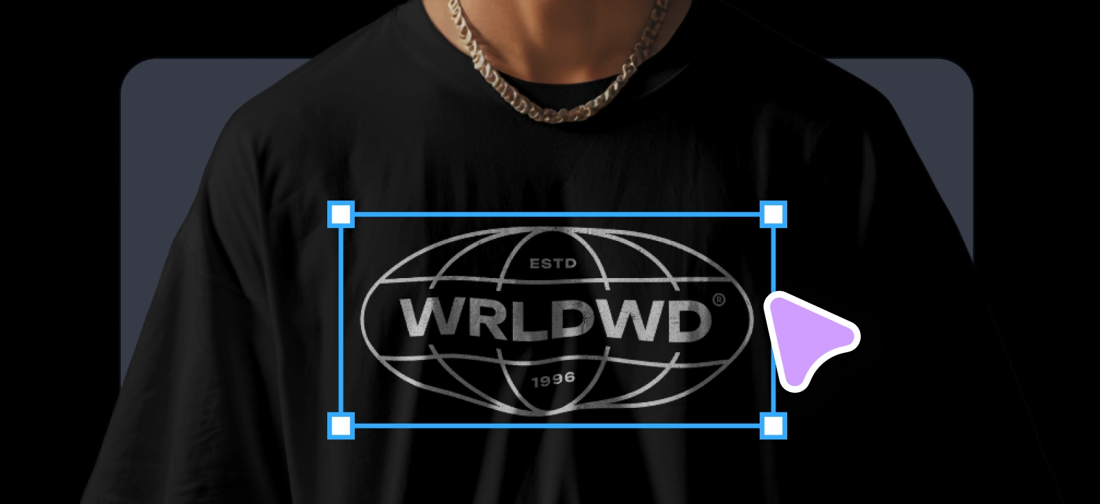
1. Standard center chest alignment

Standard center chest is the most versatile placement for graphic tees. In most cases, the design should be 8 to 10 inches wide and sit 3 to 5 inches below the collar. That range keeps the artwork high enough to feel intentional and centered on the upper torso instead of dropping too low.
In Kittl, set your artboard to 3000 x 3000 px to build a clean front graphic with enough resolution for print. Starting from the T-shirt templates can speed things up, especially for text-led layouts. Then use Kittl’s alignment snapping tools to keep the main typographic focal point dead center so the print does not drift into belly-print territory.
2. Left chest logo (pocket area) precision

Left chest placement is ideal for subtle branding, small corporate marks, and understated streetwear graphics. A strong starting point is 3 to 4 inches wide, placed 3 to 4 inches from the collar, and positioned over the far edge of the collarbone. That helps the logo feel clean and intentional instead of floating too close to the center chest.
In Kittl, use the logo templates or T-shirt logo templates to build a minimalist vector badge that still reads clearly when scaled down to 3 inches. Keep the shape simple, the spacing open, and the detail level controlled so the mark holds up across different shirt colors and sizes.
3. Full front maximum impact sizing

Full front is built for bold graphics that need more room to breathe. A strong range is 12 to 15 inches wide and up to 16 inches tall, with the artwork stopping about 1 inch before the side seams so the print still feels clean on the shirt. This placement works best for oversized graphics, vintage-style layouts, and statement-driven merch that needs more visual coverage.
Start with the vintage T-shirt templates, then use vintage textures and masks to break up large solid areas so the print feels lighter and more breathable. That gives you the scale of a big front graphic without turning it into a dense block of ink.
4. Upper back (yoke) branding

Upper back placement is great for subtle brand recognition. Keep the logo or tagline around 3 to 4 inches wide and place it 1 to 2 inches below the back collar seam so it sits in the yoke area instead of dropping too far down the back. This is a smart spot for fashion labels, teamwear, and understated streetwear branding.
A compact mark from the typography logo templates works well here. If you want the branding to follow the neckline more naturally, use Kittl’s curved text tools to wrap the brand name along the collar shape and keep the placement feeling intentional.
5. Full back statement graphics

When determining your back of shirt design size, full back is the go-to placement for tour merch, streetwear drops, and detailed illustration-led shirts. A common size is 12 x 16 inches, placed 3 to 4 inches below the collar so the graphic has enough presence without crowding the neckline. It gives you room for intricate artwork while keeping the print anchored in the upper-to-mid back.
This is a strong use case for pairing a large back graphic with a smaller front hit. Build the main visual from the T-shirt templates or generate a custom illustration with Kittl’s AI image generator, then balance it with a simple left-chest logo on the front. That front-and-back system makes the shirt feel more retail-ready and less like a single oversized print dropped onto a blank.
6. Oversized and boxy fit adjustments

Standard print sizes can look too small on oversized blanks. For modern streetwear tees and drop-shoulder fits, scale the design up by about 10 to 15% so it still feels proportional on the larger body shape and wider chest area. This matters most on heavyweight shirts, where a standard front graphic can start to feel undersized.
For this kind of layout, Kittl works best when you build the design as a clean vector first, then export it as SVG so your manufacturer can scale it up without pixelation. Streetwear, logo, and bold graphic styles usually translate especially well here, since they hold their shape better when enlarged across oversized blanks.
7. Short sleeve cuff branding

Short-sleeve branding works best as a small secondary hit. Keep the design around 2 to 4 inches wide and place it about 1 inch above the sleeve hem, centered on the outer fold. This placement is ideal for compact logos, icons, and simple marks that add detail without fighting the main chest or back print.
A clean Kittl setup for this area usually starts with a narrow, easy-to-read shape. Geometric marks, badge-style logos, and minimal streetwear symbols tend to work especially well because they fit naturally into the sleeve’s tight horizontal or vertical space. To build those marks faster, use Kittl’s Shape Builder to combine simple circles, rectangles, stars, or polygons into one clean vector icon, then refine the form until it reads clearly at small size.
8. Long sleeve arm prints

Long sleeve arm prints are usually built as a narrow vertical layout instead of a standard chest graphic. A common starting size is 2.5 inches wide by 14 inches long, which gives you enough length for repeating symbols, stacked graphics, or vertical typography without wrapping too far around the sleeve.
Typography-led designs are usually the strongest fit here. Kittl’s template styles for streetwear, band-inspired graphics, and bold type treatments are useful references for this look, especially when you want tall sans-serif text running down the arm. Keep the layout narrow, the spacing controlled, and the lettering bold enough to stay readable along the full sleeve length.
9. Inner neck label legalities and sizing

Inner neck labels are small, but they do a lot of work. A typical print size is 2 x 2 inches or 3 x 3 inches, which gives you enough room for your brand logo, shirt size, and key garment details without crowding the collar area. If you are replacing the manufacturer tag for U.S. apparel, care instructions are required, and textile labeling rules may also apply to fiber content, country of origin, and manufacturer identity, depending on the product.
For setup, keep the layout simple and readable. Kittl’s tag templates and label templates are a practical starting point for building a clean tagless label system. Keep body text at 10 pt or larger, use a high-contrast sans-serif, and avoid decorative effects that can blur once printed on fabric. Kittl’s clothing logo template ecosystem also supports apparel branding workflows, including tag-style extensions.
10. Outer back neck placement

Outer back neck placement is one of the cleanest ways to add a subtle brand hit. A good starting size is 2 x 2 inches, placed just below the back collar seam so it reads like a small signature instead of a second back graphic. This works especially well for icon marks, monograms, and compact logo symbols that need to stay visible without taking over the shirt.
The best approach here is restraint. Strip the logo down to its core icon and remove fine details that disappear at distance. Kittl’s minimalist logo templates and monogram logo templates are especially useful for this kind of mark, because they lean into simple forms that still read clearly from 10 feet away.
Bonus tip: Outside hem labels and printed outside labels
- Place the mark near the bottom hem or side seam so it feels like a retail branding detail.
- Keep the artwork small and simple, like a monogram, icon, or short wordmark.
- Match it to your inner neck label and outer back neck mark so the shirt feels like one connected white-label system.
- Use clean logo styles from your existing brand kit so the detail stays subtle and consistent across garments.
11. All-over print (AOP) scaling

All-over print is a different system from standard chest placement. Instead of working inside a fixed print area, you are designing for seam-to-seam sublimation, which means the file has to cover the full garment with enough scale and resolution to survive cutting, sewing, and wraparound distortion. That is why AOP graphics usually need massive high-resolution files and layouts that still look intentional when parts of the design shift across side seams, sleeves, and body panels.
This is where repeating artwork matters more than isolated artwork. In Kittl, build the design as a seamless tile or modular pattern so the edges repeat cleanly and do not create harsh cutoff lines around the torso. Pattern-heavy styles like vintage textures, abstract fills, doodle graphics, sports motifs, and AI-assisted repeats tend to work well for this approach, and Kittl’s broader design styles guide can help you choose a direction that holds up at garment scale.
12. Pocket tee (actual pocket) alignment

Printing on a real chest pocket gives you very little room for error. Keep the design to a strict 2.5 to 3 inches max width, and place it directly on the pocket or slightly above it so the graphic feels tied to the pocket shape instead of floating beside it. Anything larger usually starts to look cramped or gets disrupted by the pocket seam.
Small, solid-color icons work best here. Minimal marks, monograms, and simple badge shapes usually print cleaner than gradients or detailed illustrations, especially because pocket seams can create ink buildup and cracking over time. Kittl’s minimalist T-shirt templates are a strong reference for this kind of restrained graphic, especially when you want the print to feel subtle and merch-ready instead of oversized.
13. Youth and toddler proportion rules

Youth and toddler shirts need their own scaling rules. A simple starting point is to scale adult designs down by about 20% for youth, which lands around 8 x 9 inches, and by about 45% for toddlers, so the print does not wrap around the child’s ribs. The goal is to keep the design readable from the front without letting it spill too far toward the side seams.
This is a good place to lock your full design into one grouped layout, then export a separate Youth PNG at the exact reduced size instead of resizing elements one by one. Kittl’s youth-friendly styles, like the cute T-shirt templates and big sister T-shirt templates, are useful references because they already lean into cleaner proportions and simpler shapes that scale down well.
14. V-neck and deep neckline adjustments

V-necks need more vertical clearance than crewnecks. For center or full-front prints, shift the artwork down by about 1 to 2 inches from the bottom point of the V so the design stays clear of the neckline and does not compete with the collar seam. This matters most for typography, stacked logos, and badge-style layouts that can look cramped when they sit too high.
A smart way to handle this in Kittl is to build a custom guide layer that marks the V-neck drop before you place the artwork. That gives you a visible safe zone while you work, which is especially helpful for sport-inspired, retro, and text-led layouts. Kittl’s sport T-shirt templates and baseball T-shirt templates are good style references here because they often rely on centered graphics that need strong neckline spacing to read cleanly.
15. The 300 DPI export rule for print-ready files

A strong layout can still fail at export. For print-ready files, keep the artboard set to the exact inch dimensions required by your POD provider and export at 300 DPI so the physical print stays sharp and proportional. This is also the stage where background settings matter, especially if the design needs to sit cleanly on colored garments.
Design in RGB/sRGB, unless your printer gives you a different spec, since many POD workflows convert CMYK files and can shift colors.
For Kittl workflows, the safest habit is to remove unwanted backgrounds before export, then download the file as a 300 DPI PNG or SVG based on your printer’s requirements. PNG is useful for transparent raster artwork, while SVG works best for vector graphics that need to scale cleanly.
Final thoughts on the placement T-shirt design size chart
A strong t-shirt print is part design choice and part production setup. The right placement helps the graphic look balanced on the shirt and print cleanly in real life.
Before you export, check:
- Placement: Is the design sitting in the right print zone?
- Garment fit: Does the size still look balanced on regular, oversized, or youth blanks?
- Print method: Does the file match the needs of DTG, DTF, embroidery, or AOP?
That is what makes a placement t-shirt design size chart useful. It gives you the measurements, but it also helps you make better production decisions.
Kittl helps connect those two steps by making it easier to set the right dimensions, align the artwork, and export a print-ready file without guesswork.
Frequently asked questions about placement T-shirt design size chart
-
What is the standard t-shirt print size?
The most common standard front print size for adult shirts is around 8 to 10 inches wide for a regular center chest graphic. A larger full-front design usually falls in the 11 to 12 inch range, while oversized front prints can go up to 12 to 15 inches wide depending on the garment and printable area.
-
How far below the collar should a shirt design go?
For a standard adult front print, a safe starting point is 3 to 5 inches below the collar. Smaller placements like left chest logos usually sit higher, while V-necks and deeper necklines often need the artwork shifted lower to keep it out of the collar zone.
-
What is the standard left chest logo size on shirt?
The standard left chest logo size on shirt is usually 3 to 4 inches wide. That size keeps the mark visible without making it feel too large for the pocket area. Simple logos, badges, and monograms usually work best at this scale because they stay clear and readable in a small print zone.
-
What file size should I use for print on demand?
Use the exact dimensions required by your print provider, built at 300 DPI. For many standard shirt graphics, that means creating a file large enough to match the final print area at full size. PNG is a common choice for transparent artwork, while SVG is better for clean vector graphics that need to scale without losing sharpness.
-
How do oversized shirts change print sizing?
Oversized and boxy shirts usually need artwork scaled up by about 10 to 15% so the print still feels proportional on the wider body and drop-shoulder fit. A standard print can look too small on heavyweight oversized blanks, so the design often needs more width and visual presence to feel balanced.