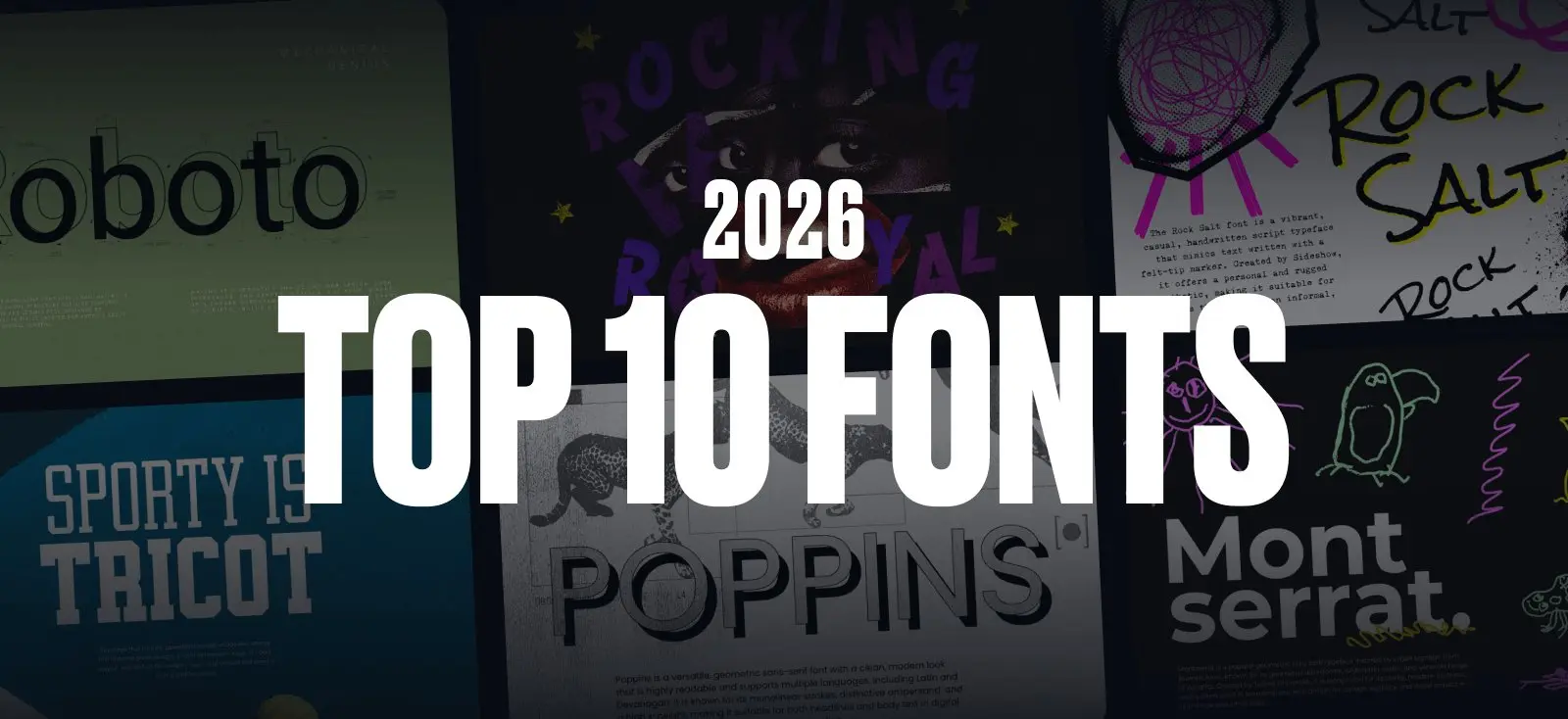
Fonts always tell the truth about where design is headed. And if you look at what people are using on Kittl right now, you can already see the early shape of 2026 — a mix of clean, confident sans-serifs and loud, handmade lettering that feels human again.
Some of the fonts topping the charts are classics. Others are Kittl exclusives that only exist here. All of them line up with the same themes we highlighted in our 2026 Design Trends Report: Naive illustration, Blueprint-style precision, Punk Grunge textures, Future Medieval ornamentation, and the return of personality in type.
Think of this as your sneak peek into what’s about to dominate next year—pulled straight from what thousands of designers are already using.
Why Kittl’s font trends matter
Kittl started with typography. It’s still what our community reaches for first — whether they’re designing merch, building brands, laying out posters, or mocking up packaging.
So when certain fonts consistently rise to the top here, it’s usually a signal. Not just a trend report prediction, but proof that something’s already shifting in design culture.
These are the fonts people are choosing right now. And they’re showing up across the biggest aesthetics of 2026.
1. Roboto

Roboto’s having a second life, and it’s not because designers suddenly discovered it. It’s because 2026 visuals are getting noisy. There’s scribbles everywhere, blueprint diagrams, and Y2K gloss is making a comeback. And layouts need something steady underneath all that chaos.
Roboto doesn’t compete. It supports. Which is exactly why it keeps showing up in UI mockups, product promos, and minimalist branding on Kittl. Pair it with an expressive serif for headlines, and let Roboto handle the annotations, captions, and all the small stuff that needs to stay readable.
Best pairing: High-contrast serifs like Abril Fatface or Playfair Display warm up Roboto’s precision. For a sharper, tech-forward look, try it with other geometric sans like Poppins or Montserrat.
Pro Tip
Roboto Condensed in tight all-caps makes killer Blueprint-style labels. Set your line spacing to 1.2x and use it for arrows, callouts, and technical annotations. It reads like an engineer designed it, but in a good way.
2. Rocking Royal

Rocking Royal taps into that playful, slightly cartoonish energy that’s creeping back into design. Chunky curves, comic-book-style shapes, and just enough retro flair to feel fun without trying too hard.
It carries a lot of visual weight on its own, which makes it great for posters, merch, and badges — anything where the headline needs to do the heavy lifting. And it fits right into the Type-Collage trend, where mixing multiple type styles in one layout is the whole point.
Best pairing: Stick with simple geometric sans serifs like Poppins, Inter, or Montserrat. They let Rocking Royal stay the star while keeping the rest of the layout neat and readable.
3. Montserrat

Montserrat has become one of the internet’s favorite sans-serifs — and for good reason. It’s geometric, friendly, and feels instantly contemporary without going sterile. In 2026, as designers balance between glossy futurism and raw handmade visuals, Montserrat sits right in the middle as a clean, trustworthy base.
It’s heavily used in branding, packaging, and product design inside Kittl because it scales beautifully. At large sizes, the geometry feels bold and modern; at small sizes, it stays readable and crisp. That versatility is why you see it paired with trend-led textures, gradients, and Blueprint-style diagrams every where.
Best pairing: Montserrat loves a good serif contrast. Pair it with Abril Fatface, Rogue Serif, or Cormorant for brand systems that mix warmth with precision. For a cleaner feel, pairing Montserrat with Roboto or Poppins gives you a unified, tech-forward look.
Pro Tip
Switch to Montserrat Alternates when you need a design to feel slightly more custom. The rounded terminals and stylistic tweaks are subtle, but they make a difference — especially at large sizes where people actually notice the details.
4. Robusta

Robusta is that clean, modern script that doesn’t go full cursive or wedding invitation. It’s smooth, legible, and hits that sweet spot between “handwritten” and “professional.”
In 2026, people want type that feels human but still polished. Robusta delivers. It’s all over merch, beauty branding, stationery, and digital products — anywhere that needs warmth without sacrificing clarity.
Best pairing: Pair with rounded sans-serifs like Poppins for a friendly vibe, or with elegant serifs like Playfair Display or Cormorant for elevated lifestyle branding.
Pro Tip
Use Robusta at larger sizes so the stroke weight and flow really shine. Then add a subtle shadow or highlight (try a soft rim light effect) for that “digitally handmade” look that’s everywhere in 2026.
5. Rock Salt

Rock Salt leans fully into the scruffy, uneven, handwritten look that’s taking over merch and streetwear again. It feels like it was scribbled with a dry marker — playful, chaotic, and human in all the right ways.
Designers love it because it instantly adds a raw edge to otherwise clean layouts. In Naive Design’s world of doodles and imperfect lines, Rock Salt is an easy go-to.
Best pairing: Pair with geometric sans-serifs like Montserrat or Inter for balance. For grungier layouts, pair with condensed sans-serifs.
Pro Tip
Layer Rock Salt over grainy textures, crumpled paper, or fabric scans. The imperfect strokes look even better when the background has some tactile grit to it.
6. Tricot

Tricot has that chunky, geometric, almost arcade-like energy that instantly gives designs a retro-yet-modern edge. It’s bold, playful, and perfect for badges, logos, and layouts that need a strong graphic punch.
It shines in 2026 as part of the Type-Collage trend — where mixing shapes, weights, and styles is part of the fun.
Best pairing: Use Tricot for the big headline, then pair with clean sans-serifs like Poppins or Montserrat underneath for legibility.
Pro Tip
Set Tricot in all caps and play with the letter spacing. Tighten it up for a dense, blocky look, or add extra tracking to let the geometric shapes breathe. Either way, it locks into a grid beautifully.
7. Poppins

Poppins has become a digital-era favorite — rounded, modern, and incredibly easy to use. It works in brand identities, templates, UI previews, and packaging because it reads beautifully in every size.
In 2026, it’s everywhere because it plays nice with the loud stuff: vibrant gradients, glowing Y2K effects, futuristic gloss. Poppins holds the layout together while everything else gets weird.
Best pairing: Pair with high-contrast serifs like Abril Fatface for editorial layouts, or soften it up with a script like Robusta for beauty and lifestyle branding.
Pro Tip
Don’t sleep on Poppins Light or Thin for captions and supporting text. The lighter weights work surprisingly well as anchors in busy, trend-heavy layouts. They stay readable without adding visual weight.
8. Rogue Back

Rogue Back brings that vintage serif charm—chunky shapes, dramatic curves, and just enough ornamentation to feel special without overwhelming your layout. It’s great for headlines, packaging, or anything that wants a nostalgic, crafted vibe.
In 2026, it fits right into Future Medieval’s ornamental revival and the curated-object aesthetic of Trinket Design.
Best pairing: Pair with clean sans-serifs like Roboto or Poppins to let the curves stand out. Works great in two-font branding systems.
Pro Tip
Arch it. Seriously. Rogue Back’s serifs and curves look incredible when set on a circular path. Perfect for circular logos, badges, or vintage-style stamps.
9. Roar Guroes

Roar Guroes is what happens when a cartoon character becomes a font. Chunky, rounded, with playful “monster” cutout shapes — it’s pure toy-box energy. And in 2026, that vibe is everywhere: Kidcore, youth branding, candy packaging, sticker culture.
It’s bold but not aggressive. Fun but not childish. Which makes it surprisingly versatile for anything aiming for that zero-seriousness, hyper-fun aesthetic.
Best pairing: Keep it simple. Use Poppins, Inter, or Montserrat for body copy so Roar Guroes can do its thing without competing for attention.
Pro Tip
Try it with bright color blocking or gradient-filled shapes — Kidcore typography thrives when the color story is as bold as the font itself.
10. 215000E

215000E is the exact kind of rough-edged, imperfect display font that Punk Grunge thrives on. It feels like a mix of old stencils, warehouse labels, and industrial stamps — the sort of typography you’d find on shipping crates, bootleg posters, or anything intentionally gritty.
In 2026, grunge isn’t just about rebellion — it’s about texture. Designers are mixing clean, digital precision with raw, analog marks. And 215000E delivers that “real, tactile, printed” energy instantly.
It’s one of the most-used fonts on Kittl for streetwear, music merch, gig posters, and anything that needs a little DIY attitude. It also works surprisingly well in Type-Collage layouts, especially when you stack it with clean sans-serifs or tiny blueprint annotations.
Best pairing: Pair 215000E with neutral sans-serifs (Roboto, Inter, Montserrat) so the distressed details stand out without overwhelming the layout.
Pro Tip
Set it in all caps and add extra tracking. The expanded spacing brings out the stamped texture and makes the chaos look intentional instead of accidental. Aim for 50–100 units of tracking depending on your design.
How to use this 2026 font trends list
Treat this like a starting point, not a rulebook. Each of these fonts naturally leans into certain font trends, so you can pair typefaces with visual styles without overthinking it.
- Exploring Naive Design? Look for the playful, imperfect fonts.
- Building a Blueprint layout? Stick to the clean, condensed sans-serifs.
- Chasing Punk Grunge or Future Medieval? Grab the rough, textured, or ornamental fonts.
Use this list as your inspiration board and your go-to font menu inside Kittl. It’s here to help you design faster and smarter for the year ahead.
Fonts are the easiest way to get trend-ready for 2026
The quickest way to make your work feel “now”? Choose the right type. Design trends shift slowly, but fonts signal what’s current long before the rest of the visuals catch up.
Don’t forget to dive into our 2026 graphic design trend report here and happy exploring!
Pair a clean sans-serif with glowing gradients and you’re in Frutiger Aero territory. Drop a stamped display font into your layout and you’ve hit Punk Grunge. Add a playful bubble font and your design becomes Kidcore in seconds.
You don’t need a full aesthetic overhaul to feel fresh. Sometimes all it takes is one new typeface.
Use these fonts, trust your eye, and let your typography lead you into 2026.

Shafira is a content writer who turns boring business talk into reads people actually enjoy. She grew up hoarding $1 novels in Singapore and writing hilariously bad fiction, but now she tackles content marketing with all that creative chaos since 2019. From blogs and newsletters to UX and SEO, she writes how she thinks: nerdy, honest, and a bit offbeat. She believes the best content is human-designed, not just plain text.