Black Friday used to be simple. Run a discount, send an email, watch the orders roll in.
Now? Your audience is scrolling past dozens of “BIGGEST SALE OF THE YEAR” banners before they’ve even finished their morning coffee. Every brand is louder, bolder, and somehow still blending into the same red-and-black blur.
And the numbers prove it’s worth fighting for. Black Friday and Cyber Monday still pull in tens of millions of shoppers every year, with mobile now driving over half of online purchases. This means: your campaign isn’t just competing on price — it’s competing for attention on a 6-inch screen, mid-scroll, with a dozen tabs open.
That’s where most black friday marketing ideas fall short. They tell you what to do, but they skip the part that actually determines whether your campaign works:
What does it look like when your customer sees it for 1.5 seconds?
Because that’s the real game. The presentation and how clearly and convincingly your offers show up across every touchpoint.
In this guide, we’ll guide you through 30 proven black friday marketing ideas and black friday campaign ideas. But we’ll also provide the design ideas and execution angle behind each one:
- How to make your emails stand out
- How to structure your landing pages
- How to build visual systems so you’re not redesigning everything from scratch at 2 a.m. the night before launch.
If Black Friday is crowded — and it is — then clarity, consistency, and visual impact are your unfair advantage.
Let’s start before the sale even begins.
The importance of a strategic Black Friday marketing ideas
Here’s the reality most brands quietly run into: a bigger discount doesn’t guarantee better results.
On Black Friday, attention is the real currency — and it’s painfully limited.
Shoppers aren’t browsing. They’re scanning, comparing, jumping between tabs, half-reading emails while standing in line for coffee. If your campaign doesn’t make sense instantly, it doesn’t get a second chance.
That’s why treating Black Friday like a one-day sale is a losing move.
The brands that perform well aren’t just offering deals. They’re running tight, multi-touch campaigns that feel cohesive from the first teaser to the final “last chance” push.
That means:
- Your email doesn’t feel disconnected from your ads
- Your landing page doesn’t undo the promise of your social content
- Your visuals don’t change tone every time the platform does
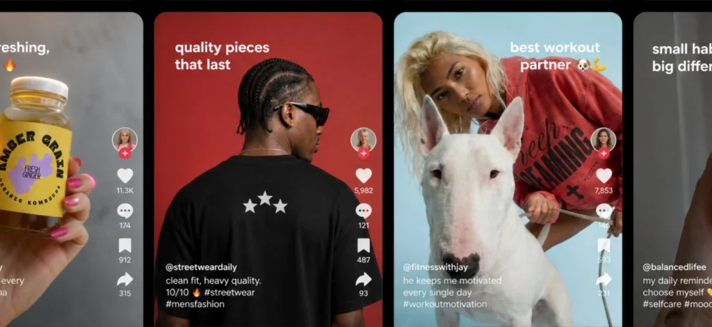
Instead, everything clicks into place. Same energy, structure, and visual language.
Because when your campaign is consistent, your customer doesn’t have to think — they recognize it.
And recognition speeds everything up:
- Faster understanding of the offer
- Stronger trust in the brand
- Fewer drop-offs between click and checkout
Where most black friday marketing ideas fall apart isn’t in the idea itself. It’s in the execution. Too many assets, built too quickly, with no system holding them together.
The smarter approach is simpler — and far more scalable.
Build the campaign first, then build the assets.
Define how your sale looks, how it sounds, and how it shows up across channels before you start designing anything. Once that foundation is clear, everything else becomes faster, sharper, and far more effective.
Because on Black Friday, you’re not just launching promotions. You’re creating a moment people recognize — and act on.
Pre-sale & VIP Black Friday marketing ideas
The brands that win Black Friday don’t wait for Black Friday.
By the time their sale goes live, their audience is already paying attention — and often already buying. That early momentum reduces pressure on your main campaign and makes everything else easier to convert.
1. Launch a password-protected secret sale
A password-protected sale shifts your campaign from exposure to access.
Instead of pushing your offer to everyone, you control who gets in first — subscribers, loyalty members, or early sign-ups. That restriction changes how people behave. The offer feels more intentional, and the urgency becomes internal (“I have access”) instead of external (“this is on sale”).
It also helps you convert your warmest audience early, before the main surge begins.
The mistake is treating this as a technical gate instead of part of the experience. If the entry feels generic, the exclusivity disappears.

Design the entry page like a campaign moment, not a login. One headline, one input field, no navigation. If it looks like a backend screen, it breaks the illusion.
2. Offer early-bird VIP discounts
If your first sale email goes out on Black Friday morning, you’re already late.
Early access works because it rewards attention.
Instead of competing during peak noise, you give your most engaged audience a reason to act before everyone else. That timing alone increases conversions, especially for products people are already considering.
It also spreads demand. Rather than relying entirely on Black Friday itself, you secure part of your revenue in advance.
Where brands fall short is treating early access like a smaller version of the main campaign. If it looks identical, it loses its advantage.
Make early access visually distinct. Fewer elements, tighter layout, and a clear “you’re in early” message. It should feel different on sight.
3. Run a “sneak peek” teaser campaign
If you show everything too early, you kill the reason to come back.
A good teaser introduces curiosity without resolving it — products are hinted at, not fully revealed.
This is especially effective in the days leading up to Black Friday, when people are aware of upcoming deals but haven’t committed yet.
Most brands reveal too much too early. That removes the reason to engage again.

Obscure part of the product or offer. Blur, crop, or shadow elements so the viewer understands something is coming — but not exactly what.
4. Host a pre-Black Friday live stream
Live streams reduce uncertainty.
Instead of static messaging, you walk customers through your products, pricing, and upcoming deals in real time. That allows you to answer questions, demonstrate value, and remove hesitation before the sale begins.
This works particularly well for products that benefit from explanation or context.
The common mistake is treating it casually. Without structure or visual clarity, the stream becomes easy to ignore.
Plan the flow before going live. Decide what you’ll show, in what order, and what each segment should communicate. Structure improves engagement more than production quality.
5. Create an interactive countdown page
A countdown page builds anticipation through focus.
Instead of sending traffic to a generic homepage, you create a single-purpose destination: one headline, one timer, one next step. That clarity makes the wait feel intentional.
The countdown itself becomes the message.
Most brands dilute this by adding too much content — products, multiple CTAs, competing visuals. That weakens the effect.
Make the timer the dominant element. If it’s not the first thing someone notices, it’s not doing its job.
6. Implement “Buy One, Get One” (BOGO) 50% off
BOGO works when it simplifies the decision.
The goal is not just to increase cart size — it’s to make the second item feel like an obvious addition. This depends on pairing. Products need to make sense together.
If the relationship between items is unclear, the offer feels forced.
Many brands rely on the discount alone, which makes the offer easy to ignore.
Show both products together and highlight the price difference clearly. If customers have to calculate the value, the offer loses impact.
7. Rotate hourly flash sales (doorbusters)
Flash sales create urgency through timing.
Instead of giving people all day to decide, you introduce short windows that encourage immediate action. This also brings customers back multiple times throughout the day.
The key is consistency. If every flash sale looks different, people have to relearn the pattern each time.
That slows them down.
Use one template and repeat it. Same layout, same structure — only the product and time change. Recognition is what makes flash sales effective.
8. Offer “spend more, save more” tiers
Tiered discounts work by introducing progression.
Customers don’t just see a discount — they see the next level. And if that next level feels close, they’re more likely to add something to reach it.
The effectiveness depends on how clearly that progression is communicated.
Most brands present tiers as text, which makes them easy to overlook.
Visualize the tiers. Stack them, highlight the next threshold, and make the gap feel small enough to reach.
9. Curate “starter kit” product bundles
Bundles reduce decision fatigue.
Instead of asking customers to build their own combination, you present a ready-made set. This makes the purchase faster and more intuitive.
The value comes from relevance, not just price. Products need to feel like they belong together.
Many brands treat bundles as lists, which removes the sense of cohesion.

Present bundles as a single unit. Use one image that shows all items together, arranged as a set, not separated.
10. Offer a free mystery gift with purchase
Mystery gifts introduce curiosity into the purchase.
Black Friday is predictable — discounts, bundles, price drops. A mystery gift adds a layer of uncertainty that feels engaging rather than risky.
This works especially well for customers who are already close to buying. It gives them one more reason to commit.
The challenge is balance. Too much detail removes the mystery. Too little makes it feel insignificant.

Show the presence of the gift, not the contents. A wrapped item or concealed product keeps the curiosity intact while making the offer clear.
11. Run a gamified “spin-to-win” wheel
Discounts are expected on Black Friday. Interaction isn’t.
A spin-to-win mechanic turns a passive visitor into an active participant. Instead of immediately showing a discount, you make people engage to get one—usually in exchange for their email.
That small action matters. People who spin are more invested than people who just see a banner, which makes them more likely to convert or at least stay engaged.
The mistake is treating this like a cheap plugin. Default-looking wheels, clashing colors, and random reward tiers make the experience feel low-value—and users can tell.
For this to work, it has to feel like part of your campaign, not something layered on top of it.
Match the wheel to your campaign system — same colors, same typography, and limited reward tiers. Too many options reduce clarity and make the experience feel less credible.
12. Promote extended Cyber Weekend sales

Black Friday doesn’t end on Friday anymore.
Most brands stretch their campaigns across the weekend and into Cyber Monday. The opportunity isn’t just to extend the sale — it’s to keep attention from dropping.
The problem is repetition.
Many brands reuse the same visuals, emails, and banners for days. By Sunday, everything feels familiar—and easy to ignore.
If you’re extending your campaign, it needs to evolve.
You’re not changing the offer. You’re changing how it shows up.
Shift one core visual element between phases — color, layout, or typography weight. Even small changes signal that something new is happening.
13. Launch a charity-driven campaign
Not every Black Friday campaign needs to compete on discounts.
A charity-driven approach reframes the purchase. Instead of focusing only on price, you connect the transaction to impact — donating a percentage of sales or supporting a cause.
This works because it appeals to a different motivation. For some customers, alignment matters more than savings.
The challenge is balance.
If the cause feels like an afterthought, it won’t influence behavior. If it overpowers the offer, it can reduce clarity.
The two need to exist together.
Place the impact message next to the offer, not below it. If people don’t see it at the same time, it won’t affect the decision.
14. Offer exclusive digital gift cards
Most brands treat gift cards like backup options. On Black Friday, they’re leverage.
A discounted gift card ($80 for $100) captures revenue from people who aren’t ready to choose yet. It removes decision pressure without losing the sale.
The mistake is hiding them.
If someone has to think about it, it’s weaker than a standard discount.
And don’t design it like store credit. If it looks generic, it feels forgettable — and nobody buys a forgettable gift.
Present the value as a simple comparison — pay vs. get. No extra text, no explanation. The math should be obvious in one glance.
15. Create a “last chance” inventory clear-out
At the end of Black Friday, hesitation peaks.
People have browsed, compared, maybe even added items to cart — but didn’t commit. A “last chance” push is where you convert that leftover intent.
Most brands treat this like just another sale email. When actually, this phase should feel different — more direct and more urgent.
Visually, lean into it:
- Bold tags like “Almost Gone” or “Final Hours”
- Visible stock cues or limited quantities
- Tighter layouts, less spacing, more density
Place urgency cues directly next to the product — low stock, limited quantities, final hours. If they’re separated from the decision point, they lose impact.
You’re not building intrigue anymore. You’re removing excuses.
Done right, this isn’t just clearing inventory, it’s capturing the buyers who almost converted earlier.
Creative Black Friday Campaign Ideas for Email & SMS
By the time Black Friday hits, your audience is already overwhelmed.
Their inbox is crowded, notifications are constant, and most messages look identical. Sending more isn’t the advantage. Sending something that’s immediately clear — and worth opening — is.
Email and SMS are where decisions actually happen. SMS marketing, in particular, operates under strict timing expectations since most messages are read within minutes of delivery. But they only work if the message lands fast.
16. Send aggressive abandoned cart reminders
Black Friday shortens attention spans.
People add items to cart, get distracted, and move on. Normally, you’d space reminders out. During Black Friday, you compress that window.
Following up within hours keeps the purchase top of mind while intent is still high.
The difference comes down to relevance. A generic reminder feels easy to ignore. A message that reflects what someone was already considering pulls them back in.
Most brands rely on templated emails that feel disconnected from the actual shopping experience.
Show exactly what was left behind — product image, price, and one clear action. Remove anything that doesn’t help the customer return to checkout quickly.
17. Use animated GIFs in email campaigns
Static emails get skipped. Motion slows people down — just enough.
A simple GIF can highlight your offer without adding complexity:
- Product rotating
- Discount appearing
- Text revealing in sequence
Tools like Kittl’s AI Video Generator let you turn static visuals into short, clean motion assets in minutes — perfect for email where you need something lightweight but still eye-catching. Instead of building from scratch, you adapt what you already have.
Which is exactly the point.
18. Launch SMS-only flash deals
SMS works because it’s immediate.
Unlike email, it doesn’t sit unread for hours. That makes it ideal for short, time-sensitive offers — especially during Black Friday when urgency drives decisions.
An SMS-only deal adds another layer: exclusivity. When positioned as separate from your main campaign, it gives people a reason to act quickly.
The difference comes down to how the message is written.
Generic phrasing feels like a notification. Clear, time-bound messaging feels like an opportunity.
Anchor the message in time. A defined window (“next 2 hours”) creates more urgency than a general discount announcement.
19. Add Black Friday banners to email signatures
Email signatures are an overlooked distribution channel.
Every message your team sends becomes a subtle campaign touchpoint. Over time, this creates repeated exposure without requiring additional sends.
The effectiveness comes from consistency, not size.
Overdesigned banners can feel intrusive, while overly subtle ones get ignored.
It needs to sit in the middle — visible, but not disruptive.
Keep it simple: one message, one link, and clear dates. If it competes with the email itself, it’s too much.
20. Execute a post-sale “welcome” sequence
Black Friday brings in a different kind of customer.
They didn’t come for your brand — they came for the deal. What happens after the purchase determines whether they return.
Most brands stop at the transaction. Order confirmation, shipping updates, and maybe another promotion.
That’s where retention is lost.
A post-sale sequence gives you a chance to reset the relationship. Instead of continuing the discount-heavy messaging, you shift toward clarity—what your brand stands for and why it’s worth coming back.
This is where long-term value is built.
Use the first follow-up to introduce your brand clearly. Focus on what makes your product worth choosing again — not another discount.
‘
Social Media & Content Marketing Ideas for Black Friday
Black Friday doesn’t start in your inbox. It starts where people are already scrolling.
Social and content are where attention builds before the sale, especially for audiences who aren’t actively looking yet. The goal here isn’t to push offers immediately — it’s to shape how people think about what to buy.
Most brands post more during this period, but more content isn’t the advantage. Better-structured content is.
21. Publish niche holiday gift guides
Generic “gifts for everyone” is too broad to be useful. The more specific the angle, the easier it is for someone to recognize themselves in it.
Think in terms of use cases or identities:
- “Gifts for the home coffee person”
- “Under $50 for people who just moved”
- “Low-effort gifts that still feel considered”
This reduces friction. Instead of browsing endlessly, people see something that already fits.
Design each section as its own category. Clear grouping and consistent layouts make the guide easier to scan—and more likely to be saved.
22. Partner with niche TikTok creators
Reach is easy to find. Relevance isn’t.
Large creators can bring visibility, but niche creators often convert better because their audience trusts their recommendations.
The goal isn’t just exposure — it’s alignment.
When the creator’s audience already fits your product, the content feels natural instead of promotional.
The mistake is over-controlling the output. Scripted content feels like an ad and gets skipped quickly.
Give creators clear direction (product, offer, timing), but let them control delivery. Content performs better when it matches their usual style.
23. Run an “anti-Black Friday” campaign
Most brands compete the same way—bigger discounts, louder visuals, more urgency.
An anti-Black Friday campaign stands out by rejecting that pattern.
Instead of trying to win the noise, you step away from it. That might mean closing your store, donating a portion of sales, or focusing on more intentional buying.
This works because it breaks expectation. When everything feels aggressive, a more restrained approach feels deliberate—and easier to trust.
The mistake is not committing fully. If your messaging says one thing but your campaign looks like a typical sale, it creates confusion.
Remove urgency cues entirely. No countdowns, no “limited time” language — let the message carry the weight.
24. Host an interactive user-generated content (UGC) contest
Most campaigns are one-directional.
A UGC contest changes that by giving your audience a reason to participate—and create content for you.
The format is simple: customers post with your product for a chance to win something tied to Black Friday, like a free order or refund.
This works because it adds social proof at scale. Instead of only seeing brand messaging, people see others engaging with it.
The challenge is clarity.
If the rules aren’t immediately obvious, participation drops.
Make the entry process visible in one frame — what to post, how to enter, and what they win. If it needs explanation, it’s too complex.
25. Create shoppable Pinterest boards

Pinterest is where people plan purchases, not just browse.
During Black Friday, that intent becomes more focused. People are actively looking for ideas, comparisons, and inspiration tied to buying decisions.
That makes it one of the few platforms where content directly supports conversion.
The mistake is treating it like another social feed.
Standard posts don’t work here. Content needs to match how people use the platform—structured, clear, and easy to navigate.
Design vertically and focus each pin on one idea. Too many products or messages reduce clarity and make the content easier to skip.
Design & Branding Hacks to Elevate Your Sale
Most Black Friday campaigns don’t fail because of bad offers.
They fail because they look the same.
Same colors, same layouts, same urgency repeated across every brand. When everything blends together, clarity becomes the advantage.
This is where design stops being decoration — and starts driving performance.
26. Maintain cross-channel visual consistency

Your campaign isn’t experienced in one place.
People see it in fragments — an ad, then an email, then your landing page. If those don’t feel connected, every touchpoint has to work harder to re-explain the same thing.
That slows down decisions.
Consistency removes that friction. When visuals align across channels, people recognize your campaign instantly — and recognition speeds up trust.
The mistake is designing per platform instead of designing a system.
Define your campaign once—layout, font pairing, and color system—and apply it everywhere. If each asset feels different, you don’t have a campaign, you have a collection.
This is where Kittl’s Infinite Canvas becomes practical. You can map your entire campaign in one space — emails, ads, landing sections — and build from templates instead of recreating each asset separately.
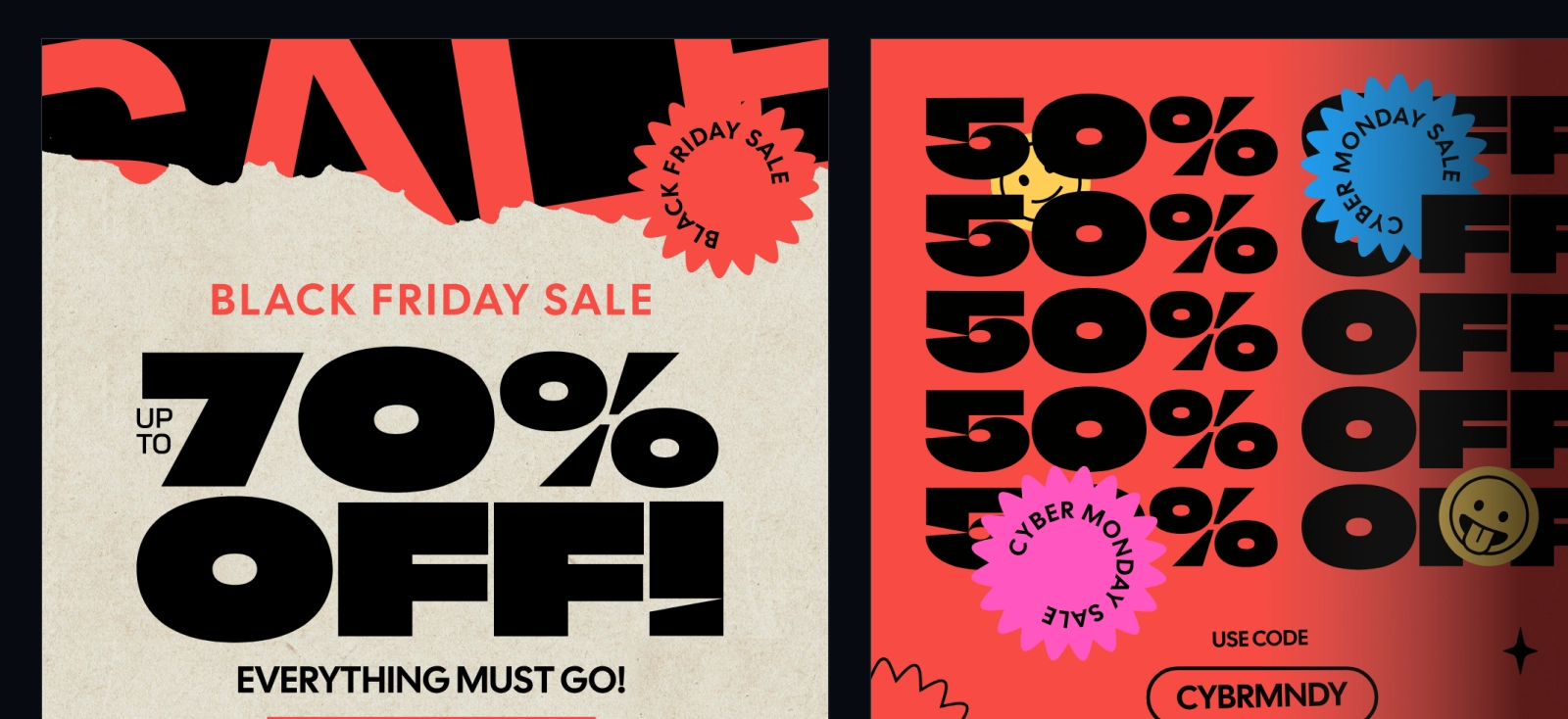
27. Use bold typography and high-contrast colors

Black Friday is a fast environment.
People aren’t reading carefully — they’re scanning. If your message isn’t immediately clear, it’s already competing at a disadvantage.
Typography does most of the work here. Strong hierarchy, clear contrast, and one dominant message make your offer easier to process quickly.
The issue is that many brands rely on safe, default styles — which makes everything look interchangeable.
If your headline isn’t readable at a glance — or from a distance — it’s too weak. Prioritize clarity over decoration.
Kittl’s strength is typography. With a large font library and built-in text effects, you can push headlines further — without manually styling everything from scratch or relying on generic presets.
28. Integrate customer reviews into your visuals
At some point, every campaign runs into hesitation.
No matter how strong your offer is, people still ask the same question: is this actually worth it? Reviews answer that faster than any headline.
The mistake is separating them from the design. If someone has to scroll or click to find reviews, they’ve already lost momentum.
Bring them into the visual instead. A short quote next to the product, a visible rating, or a single line that reinforces quality. It should sit where the decision is happening — not after it.
Choose reviews that answer a specific doubt (fit, quality, value), not general praise. Specificity builds trust faster.
With Kittl, you can create reusable layouts that combine product visuals and review snippets — making it easy to swap content without redesigning each asset.
29. Design custom holiday unboxing materials
The campaign doesn’t end at checkout.
For many customers, the first real interaction with your brand happens when the package arrives. That moment shapes how your brand is remembered.
Most packaging is functional but forgettable.
Adding simple, intentional design elements — thank-you cards, inserts, small branded details — makes the experience feel more considered and more shareable.
It doesn’t need to be complex. It needs to feel connected to what they saw before they purchased.
Design inserts for readability first. People glance at them quickly — keep the message short, clear, and visually aligned with your campaign.
30. Send physical direct mail postcards
Digital channels get crowded. Physical ones don’t.
A well-designed postcard stands out because it reaches people in a space with less competition. It doesn’t rely on algorithms or inbox placement.
The mistake is overloading it.
Too much information reduces clarity and weakens the message. A postcard should communicate one idea, quickly.
That’s what makes it effective.
If the offer isn’t clear within a few seconds, simplify it. One visual, one message, one action is enough.
How to execute these Black Friday marketing ideas faster with Kittl
The hard part of Black Friday isn’t the ideas — it’s producing everything fast enough without your campaign falling apart visually.
You’re not creating one asset. You’re creating an entire system: emails, ads, landing pages, social posts, mockups, product visuals, even motion content. And they all need to feel consistent.
This is where Kittl becomes useful.
You can map your entire campaign on an Infinite Canvas — seeing emails, ads, and landing sections side by side — so nothing drifts visually. Then, instead of starting from scratch, you build from Black Friday templates and adapt them across formats in minutes.
- Need product visuals? Use mockups to present them properly.
- Need fresh assets? Generate them with AI images instead of hunting for stock.
- Need motion? Turn static designs into quick video content with the AI Video Generator.
And because typography carries most Black Friday campaigns, Kittl’s font library and text effects let you create strong, non-generic visuals without slowing down.
This is the difference:
Most teams scramble to produce assets.
The better ones build a system and scale it.
Kittl helps you do the second — without needing five different tools.

Shafira is a content writer who turns boring business talk into reads people actually enjoy. She grew up hoarding $1 novels in Singapore and writing hilariously bad fiction, but now she tackles content marketing with all that creative chaos since 2019. From blogs and newsletters to UX and SEO, she writes how she thinks: nerdy, honest, and a bit offbeat. She believes the best content is human-designed, not just plain text.