Starting an Etsy shop often gets framed as something quick and low-stakes. Open a storefront, upload a few designs, and just see what happens.
In practice, how to start an Etsy shop is not as straightforward as it sounds.
Etsy is a high-speed environment where buyers make decisions with very little context. They scroll through dozens of listings, compare options quickly, and rely almost entirely on what they can understand in a glance.
There’s no real opportunity to explain your product later. Your listing has to do that immediately.
This is where most first launches struggle. Not because the product itself is wrong, but because the presentation is fragmented. Multiple listings, inconsistent visuals, and unclear positioning create a shop that feels unfinished rather than new.
A more effective way to start is to reduce that complexity.
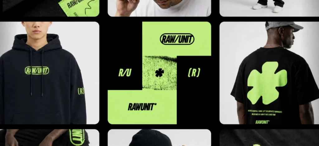
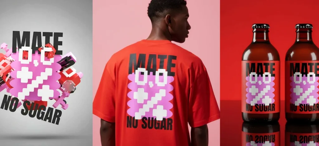
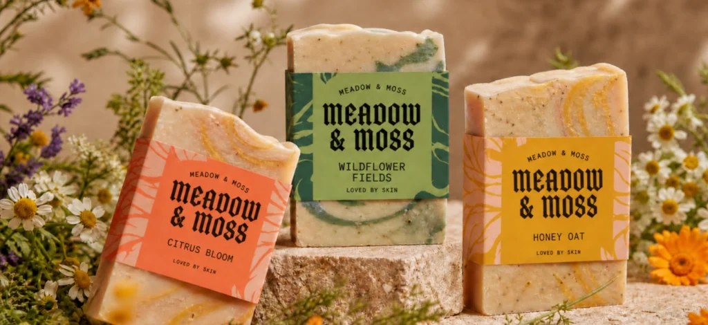
Instead of launching several products at once, this guide focuses on building one product properly and using it to establish a complete, consistent system: your listing images, your video, your social assets, and your shop’s overall visual identity.
The goal isn’t to start small. It’s to start in a way that makes sense to the buyer.
Why starting with one product is the smartest Etsy launch

Launching a single product first is less about limiting yourself and more about controlling the quality of your first impression.
Etsy doesn’t evaluate listings based on how many you have. It evaluates how clearly each one communicates and how buyers respond to it. The platform looks at multiple signals at once: titles, tags, attributes, images, and eventually how people interact with the listing. That means a weak listing doesn’t just sit quietly — it actively underperforms across several dimensions.
At the same time, buyers are making their own rapid assessment. They’re not comparing your effort; they’re comparing clarity. Within a few seconds, they decide:
- Whether they understand what the product is
- Whether the listing feels trustworthy
- And, whether it’s relevant to them.
This creates a simple constraint: your first listing needs to do a lot of work very quickly.
When you start with one product, you can concentrate that effort instead of spreading it thin. You can:
- Make your images actually good (not rushed)
- Build a repeatable visual system (fonts, colors, layout)
- Write one high-quality listing with clean SEO
- Set up your shop look once, then reuse it
- Gather conversion signals and get reviews on your Etsy listings
That structure matters more than volume early on.
A more useful way to think about it
| Common approach | More effective approach |
| Launch multiple products to “test” | Build one listing that clearly communicates |
| Treat images as supporting visuals | Treat images as the primary explanation |
| Focus on adding keywords | Focus on being immediately understood |
| Add more listings to look established | Build consistency so the shop feels intentional |
If your first listing doesn’t convert, don’t add more products yet. Fix the listing. More listings don’t compensate for weak clarity — they just multiply the same problem.
Pick your first product and niche
Choosing your product
Choosing your first product is less about spotting an opportunity and more about removing ambiguity.
On Etsy, recognition tends to outperform originality in the early stages. Buyers aren’t discovering your product in isolation. They’re comparing it against dozens of similar options, often within seconds. If your product requires explanation, it’s already at a disadvantage.
This is why simpler product formats tend to work well as a starting point. Items like T-Shirts, posters, or basic printables have a clear structure. Buyers already know what to expect from them, which allows your design and positioning to carry more weight.
If you can’t tell who the product is for in one sentence, the buyer won’t figure it out either. Clarity at this stage saves you from fixing everything later — design, images, and SEO.
Choosing your niche

A product on its own is rarely enough. What makes it work is the context around it — who it’s for, what it says, and why it exists.
Because Etsy is not just a place to buy and sell, it’s a marketplace driven by recognition and emotional relevance.
People don’t buy posters or T-Shirts in isolation. They buy things that reflect identity, humor, aesthetics, or a specific moment. If your product doesn’t connect to something recognizable, it won’t matter how well it’s designed.
This is where niche comes in. Instead of choosing a broad category, you’re choosing a product + audience combo:
| Broad product idea | More defined direction |
| T-shirt | Minimal typographic tee for book lovers |
| Poster | Retro hiking poster for national park fans |
| Tote bag | Illustrated tote for plant collectors |
When researching a niche, don’t just look at what exists — look at what repeats. Repetition usually signals demand. Your opportunity is to stay within that pattern, but shift the tone or angle slightly.
Understanding your audience (without overcomplicating it)
You don’t need extensive research to define your niche, but you do need to observe patterns.
Every audience already has:
- shared references
- recurring phrases or jokes
- visual preferences
- things they’re tired of seeing
Your job is to find a point within that space that still feels fresh.
For example, take gym-focused designs.
A lot of existing products fall into predictable extremes:
- Overly aggressive (“NO PAIN NO GAIN”)
- Overly generic (“FITNESS LIFESTYLE”)
But there’s often demand for something in between — something more subtle or more self-aware (and less cringe).

That’s the gap you revolve around.
Where to find direction quickly
Instead of trying to invent something from scratch, it’s more effective to look at where your audience already spends time:
- Pinterest → repeated visual styles
- Etsy search → commonly used phrases
- TikTok / Instagram → recurring humor or references
- Kittl templates → existing structures you can reinterpret
You can find inspiration like this in Kitt’s Etsy listing templates as well:

Art Free Etsy Listing Design.
Use Template

Mug Free Etsy Listing Design.
Use Template

T-Shirt Free Etsy Listing Design. Use Template
Just classic pattern recognition and applying it to your products.
Useful pressure-test
Before committing, check:
- Can I describe the buyer in one sentence?
- Can I describe the vibe in three words?
- Can I make 10 variations later without overflowing my workload?
If those answers still feel unclear, the issue is usually not the design — it’s the positioning.
Refining that now makes everything easier in the next steps.
If you can’t tell who the product is for in one sentence, the buyer won’t figure it out either. Clarity at this stage saves you from fixing everything later — design, images, and SEO.
Create the product in Kittl
Once the product and niche are clear, the next step isn’t to start experimenting.
It’s to translate that clarity into something that holds up in a listing.
At this point, you already know:
- who the product is for
- what it’s trying to communicate
- how it should feel
The goal now is to build a design that carries that through consistently, without overcomplicating it.
Start with a structure that already works

You can begin from a blank canvas, but in most cases, it’s more efficient to start from a structure that’s already proven to read well.
Templates are useful here, not as finished designs, but as starting points for layout and hierarchy.
For example:
- a typography-led t-shirt template
- a poster template with balanced spacing
- a design where the focal point is already clear at a glance
What you’re looking for is not originality at this stage. It’s clarity.Kittl’s template library gives you a wide range of starting points across formats like T-Shirts, posters, art prints, bags, and so much more on Kittl. Here’s a sneak peek into it:

Candle Etsy listing design.
Use Template

T-Shirt Etsy listing design.
Use Template

Art Print Etsy listing design.
Use Template
The goal isn’t to use them as-is, but to adapt a structure that already works visually.
A strong layout will outperform a clever idea with weak structure. If the design reads clearly at a glance, you’ve already solved half the problem.
Replace the content with something specific

Once you have a base, the next step is to make it yours.
That usually means:
- Adjusting the wording to better match your niche
- Refining the layout so the message reads immediately
- Removing anything that doesn’t support the core idea
This is where your earlier research comes into play. The phrases, tone, and references you identified should show up clearly in the design.
A useful check here is to zoom out.
If the design loses meaning at a smaller size, it will struggle as a listing thumbnail as well.
Write your phrase before you design it. Trying to “design your way into an idea” usually leads to something that looks finished but doesn’t say much.
Refine the typography

Typography does most of the work in many Etsy products, especially for T-Shirts and posters.
Instead of treating fonts as decoration, think of them as tone.
Kittl’s font library gives you access to a wide range of type styles, including exclusive options you won’t typically find in standard tools. The important part is not variety, but fit.
Choose styles that support the intent of the product:
- More rounded or soft forms for approachable, casual ideas
- Serif styles for something more editorial or refined
- Bold sans-serif styles for direct, high-contrast messages
Adjust the design with the right elements

Once the typography is in place, you can refine the design further using additional elements.
Kittl’s content library gives you access to icons, shapes, textures, and decorative assets that can help support your idea visually.
You can also:
- Draw custom details using the pen tool
- Generate supporting visuals using the AI Image Generator if your concept requires something more specific
Also check out some hacks of the Kittl pen tool here:
Or learn more about the 12 built-in AI models in our article here: Meet the 12 brains behind Kittl’s AI Image Generator.
The key in this stage is restraint.
Most early designs lose clarity because they try to include too much. If the idea is already strong, additional elements should support it — not compete with it.
Place it on a mockup early

Before moving on, it’s useful to see the design in context.
A flat design can read well on its own but behave differently once it’s applied to a product.
Placing it on a mockup helps answer a few practical questions:
- Does the design still read clearly when worn or displayed?
- Does the scale feel right?
- Does anything get lost in context?
Kittl’s mockup workflow allows you to apply designs directly on the canvas, so you can test this without switching tools.
If the design only works on a flat canvas, it’s not ready. Mockups reveal issues that aren’t obvious in the editor — especially scale, contrast, and placement.
Test a few variations

At this stage, you don’t need multiple listings yet, but you do want to understand how flexible the design is.
Small variations are enough:
- a different phrase within the same structure
- slight changes in spacing or alignment
- a second version with a different emphasis
Kittl Flows can help speed this up by generating variations, but the goal isn’t quantity. It’s to see whether your design system holds together.
If small changes break the design, it will be harder to scale later.
Turn one design into Etsy listing images
Once the design is in place, the focus shifts from creating the product to presenting it.
On Etsy, your product doesn’t appear as a design file. It appears as a thumbnail first, then as a sequence of images.
That’s what buyers are actually evaluating.
The 7-image listing set (what each image does)

You can upload up to 20 photos per listing, but you don’t need 20 to start strong. Each image should remove a specific hesitation.
Here’s the smart 7:
- Hero image: “What is it?” (instant)
- Close-up: “Is it high quality?”
- Style/context: “How does it look worn / in real life?”
- Color options: “Which one do I choose?”
- Size chart: “Will it fit?”
- What you get + production info: “What exactly arrives, and how?”
- Brand/trust slide: “Is this shop legit?”
Here’s a more comprehensive example to the set:
| Slide | Purpose (buyer question) | Composition (exact content) | Kittl steps (workflow) | Export |
| Image 1: Hero | “What is this?” | 1 clean tee mockup centered; small headline top-left: “OFFLINE CLUB”; no extra badges; high contrast; generous negative space | Mockup Generator → tee mockup → place design; Brand Styles for consistent text; thumbnail test (zoom out) | 3000×2250 (or ≥2000px) JPG/PNG |
| Image 2: Detail | “Is print quality good?” | Close crop of chest print area; optional callout arrow: “soft-hand print”; tiny note: “colors may vary by screen” | Duplicate hero artboard → zoom/crop; add minimal callout text | Same as above |
| Image 3: Lifestyle/context | “How does it look worn?” | Human lifestyle mockup (street/coffee shop); no text except small bottom label: “Relaxed unisex fit” | Add second mockup on-canvas; keep background | Same as above |
| Image 4: Colors grid | “Which color do I pick?” | 2×2 grid of 4 mockups; labels under each: “Black / Cream / Heather Gray / White” | Duplicate mockup artboard into grid; apply Brand Styles to labels | Same as above |
| Image 5: Size chart | “Will it fit me?” | Simple size chart table; include measurement method graphic (tape measure icon) | Build vector table in Kittl; ensure legibility at mobile size | Same as above |
| Image 6: What you get + POD disclosure | “What arrives? Who prints it?” | Bullet list slide: “1 unisex tee • printed to order • shipped from [country] • production partner disclosed on Etsy” | Typography slide with icons; keep it clean; ensure policy alignment | Same as above |
| Image 7: Brand trust | “Is this shop real?” | Mini brand card: logo/icon; “fast replies • clear sizing • simple returns”; optional QR to socials (not required) | Use Brand Styles; create shop system visuals (icon/banner style match) | Same as above |
If you want to learn more about creating Etsy listing images, check out our article here: How to create Etsy listing images that attract customers and make them buy.
Most buyers decide whether to click before they ever see your second image. If the first image isn’t clear, the rest of the listing won’t get a chance to do its job
Some tips on how to build this set quickly with Kittl:
- Use Infinite Canvas like a mini studio. Put all seven artboards side-by-side: print file, mockups, text slides, size chart, etc. Infinite Canvas is built for “one file for all formats” and for rearranging/duplicating artboards freely.
- Add mockups directly on the canvas. Kittl’s Mockup Generator workflow is designed so mockups live right in your design space — no separate “mockup mode.” You can attach multiple mockups to one artboard and adjust fit/position.
- Clean your images (fast). If you need to remove backgrounds from product shots or elements, Kittl’s AI Background Remover can remove backgrounds directly on the artboard and saves results into your uploads (clipped images).
- Export at the right size. Use Download Settings to export listing images as PNG/JPEG at the right dimensions, and set DPI appropriately for digital visuals (lower) vs print files (higher).
Make a short Etsy listing video from the same product
If photos reduce confusion, video reduces hesitation.
Etsy explicitly says listing videos help shoppers get a better idea of products and can help improve how listings appear in Etsy search.
Etsy’s own guidance also frames product video as a confidence builder.
Keep it simple (5–10 seconds)
You don’t need a whole production, you just need a:
- clear product view
- close-up
- slight movement
- clean ending
Use what you already made
With Kittl:
- reuse mockups
- add subtle motion
- export MP4
No need to start from scratch.
Since you already have mockups and layouts, the video doesn’t need to be built from scratch. With Kittl’s AI Video Generator you can apply motion directly to those assets and export a short clip that fits Etsy’s requirements.
Simple workflow:
Use your hero mockup as the start frame → add an end frame (optional) → prompt motion like “slow zoom in, gentle parallax, subtle grain” → export MP4.
No timeline editing required (by design).Read more into how you can create a video for your Etsy listing in our article here: How to create video for Etsy listings that convert (without filming).
Video works best when it confirms what your images already showed — not when it introduces new confusion.
Etsy video requirements you must follow
Your Etsy listing video:
- Must be 3–15 seconds
- Will have no audio once uploaded
- Must be under 100 MB
- Aspect ratio should be 2:1 or 1:2
- You can add one video per listing
Use the same product to create social launch assets
At this point, you’re not creating new designs. You’re extending the same product into different contexts.
Etsy is where the purchase happens, but discovery often happens elsewhere Social platforms like Pinterest, Instagram, and TikTok are your discovery engine.
The smartest way to avoid design burnout: reuse your product system.
Social asset set (minimum viable launch)
Create these from your existing listing visuals:
- Instagram post (square) – hero mockup + headline
- Instagram story – behind-the-scenes + CTA + shop name
- Pinterest pin (vertical) – “OFFLINE CLUB tee” + lifestyle mockup + keywords
- Short video teaser – reuse the Etsy listing video format, add captions elsewhere (audio removed on Etsy upload, but socials can have sound)
Since your design, mockups, and listing images already exist in one workspace, adapting them becomes mostly a matter of resizing and adjusting layout. The structure stays the same.
This is less about producing content and more about maintaining continuity.
If your social post looks different from your listing, you’re creating friction. Consistency makes the transition from discovery to purchase feel seamless.
Set up your Etsy shop around that one product
A new shop doesn’t need many listings to feel credible, but it does need to feel complete.
Buyers don’t evaluate shops in detail. They scan for signals — whether the shop looks intentional, whether the visuals hold together, whether anything feels unfinished.
Even with one product, that impression can be clear.
In practice, that comes down to a few elements:
- a shop icon that remains readable at small sizes
- a banner that communicates what you’re selling without needing explanation
- a short “About” section that feels human and specific
- basic policies that remove uncertainty around shipping or returns
These are simple details, but they shape how the shop is perceived.
Shop visuals should feel consistent, not assembled
Etsy provides recommended sizes for these assets:
- Shop icon: 500×500px
- Big shop banner: minimum 1200×300px, recommended 1600×400px
- Mini banner: minimum 1200×160px, recommended 1600×213px
- Profile photo: recommended 400×400px
Using the correct sizes avoids obvious issues like blurriness or awkward cropping, which can make a shop feel less polished.
More importantly, the visuals should feel related.
If your listing images, banner, and icon all follow different styles, the shop can feel fragmented even if each piece is fine on its own.
If they share the same typography, color direction, and layout logic, the shop feels intentional almost immediately.
Since these elements are built from the same design system, you’re not designing new assets — you’re extending what already exists.
Optimize the listing for Etsy search
Etsy SEO is often treated as a technical problem, but it’s closer to a clarity problem.
The goal is not just to include keywords. It’s to make the product easy to interpret — for both Etsy and the buyer.
Title: readable first, keyword-smart second
Etsy allows titles up to 140 characters and explicitly recommends using fewer than 15 words, clearly stating what the item is and key details, avoiding repetition and subjective filler.
And Etsy’s newer title guidance encourages sellers not to overload titles because search looks at multiple fields, not just the title
A title template that works:
Primary keyword + product type + audience/use + 1–2 differentiators
Example:
“Offline Club Unisex T‑Shirt – Minimal Retro Typography Tee for Introverts, Focus Gift”
Tags + attributes: do the backend work
Etsy allows up to 13 tags per listing.
Attributes matter because they help Etsy place you in filters and relevant search contexts, and Etsy explicitly includes attributes in listing setup.
Rule of thumb:
Use tags for phrases that attributes don’t cover, and for buyer-intent phrases (“gift for…”, “minimalist”, “retro”). Etsy’s tag guidance frames each tag as an opportunity to match search queries.
Avoid repeating the same idea across multiple tags. You’ll cover more search intent by using variations of how buyers actually phrase things.
Don’t forget conversion fields that affect confidence
Even beyond SEO, Etsy listing setup includes critical fields buyers check (photos/video, shipping/processing, item details, variations). Etsy notes accurate processing/shipping helps set expectations.
Key Takeaways: Scale from one product to a real Etsy shop
Once your first product is live, scaling is not “add 100 designs.” It’s:
- Make version two that fits the same system
- Reuse the listing-image logic
- Reuse the shop branding
- Repeat, with minor evolution
Your second product should be either:
- A variation of the same product (new phrase, new niche angle, same tee style)
- Or the same design on a second product category (tee → hoodie, poster → framed print)
If you designed your first launch in Kittl with Infinite Canvas + Brand Styles, scaling is mostly duplication, not reinvention.
FAQ: How to start an Etsy shop with Kittl
What do you need to start an Etsy shop with Kittl?
You need:
- one product concept + design
- listing visuals that meet Etsy image specs (Etsy recommends ≥2000px)
- a listing video if possible (3–15 sec, one per listing)
- shop branding images sized correctly (e.g., 500×500 icon, 1600×400 banner)
- basic listing SEO (title, 13 tags, attributes). Kittl supports the workflow via multi-artboard design (Infinite Canvas), reusable Brand Styles, mockups, and export controls.
What images should a first Etsy listing include?
At minimum: a clear hero image (first photo should be horizontal or square for thumbnails), a detail/close-up, a size/format image, and one “what you get / key info” slide. Etsy allows up to 20 photos, but clarity matters more than quantity.
Can you use print-on-demand on Etsy?
Yes — POD can fit Etsy’s production partner framework when the items are based on your original designs and production partners are disclosed. Etsy explicitly lists POD services as production partners and requires transparency.
Do Etsy listing videos help?
Etsy says listing videos help shoppers better understand products and can help improve how listings appear in Etsy search. Etsy’s Seller Handbook also frames videos as a confidence booster via increased transparency.
How do tags and attributes work on Etsy?
Tags: up to 13 per listing; each tag is an opportunity to match a shopper’s search. Attributes: structured item qualities (color, size, etc.) set during listing creation and used by Etsy for filters and relevance. Etsy’s search guidance emphasizes multiple listing fields (tags, attributes, etc.) contribute to matching and ranking.

Shafira is a content writer who turns boring business talk into reads people actually enjoy. She grew up hoarding $1 novels in Singapore and writing hilariously bad fiction, but now she tackles content marketing with all that creative chaos since 2019. From blogs and newsletters to UX and SEO, she writes how she thinks: nerdy, honest, and a bit offbeat. She believes the best content is human-designed, not just plain text.