Saw this isometric perspective text effect and thought, I need that for my brand or product visuals? An isometric perspective typography poster is one of those styles that can make a simple idea feel more premium and high-impact instantly.
For creative entrepreneurs, that matters because the same layout approach can work across posters, merch graphics, promo content, and social campaigns. It is not just visually striking. It is also repeatable, which means you can adapt it for different products, niches, and launches without rebuilding everything from scratch.
There is also a clear discovery angle behind the style. Pinterest’s isometric typography poster page shows active interest around related terms like isometric type, isometric typography, perspective typography, and 3D typography. On Dribbble’s isometric poster results, the style is already part of ongoing design exploration through typographic poster work.
So we’ll be teaching you how to recreate that look in Kittl step by step, so you can turn one inspiring visual into something polished, marketable, and easier to reuse.
What is an isometric perspective typography effect?

Motivational Isometric Style Design.
Use this template

Work Hard Motivational Quote – Poster Design.
Use this template
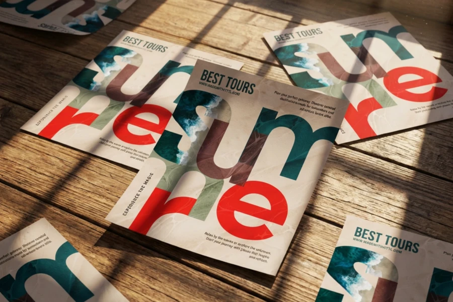
An isometric perspective typography poster is a poster design style that uses large, bold type with depth, scale, and spatial distortion to create a more dimensional look.
It often combines 2D imagery with 3D-looking typography, which gives the layout more structure, movement, and visual tension. This style works especially well with a subject like an athlete, product, or person.
You can already see how that translates commercially in places like Etsy’s running typography market and Redbubble’s isometric typography posters, where the format shows up as wall art, themed designs, and niche poster products.
Why does isometric perspective typography effect work so well for creative entrepreneurs?
- It makes simple visuals feel more premium and high-impact
- It works across posters, merch graphics, promo content, and social campaigns
- It gives you a repeatable layout system you can adapt for different products, niches, or launches
- It already has discovery value. Pinterest’s isometric typography poster page shows 291 people searched this and connects the topic to related terms like isometric type, isometric typography, perspective typography, and 3D typography.
- It has active creative traction, too. Dribbble’s isometric poster results include examples like Typographic Poster and Isometric Typographic Poster, which show that the style is already part of ongoing design exploration.
What defines an isometric perspective typography style

Overcome Every Challenge Design.
Use this template

No Longer Here Book Cover Spread Design.
Use this template
At its core, this style is built on how type interacts with space. The goal is to make the lettering feel more dimensional, more integrated, and more visually active within the layout. These are the design traits that usually give it that effect.
- Oversized display type that anchors the composition
- Isometric or perspective-based letterforms that create directional depth
- Faux 3D or extruded text treatment that adds volume to otherwise flat type
- A mix of 2D subject imagery and 3D-feeling typography
- Masking and occlusion, often through a text behind image effect or text behind subject effect
- Scale contrast between the headline, subject, and supporting details
How to create an isometric perspective typography poster in Kittl

Step 1: Start a new project and add your main headline

Open Kittl and start a new project. Add your text in the center of the canvas, then choose a bold, blocky typeface like Gasock One. Set the size to around 460 and the height to about 40. Make the font color light pink, turn on ligature, and make sure the text is center-aligned.
Step 2: Use Distort to shape the text

Go to the right sidebar and scroll down to Transformation. From there, choose Distort. Start shaping the text into a more squashed, perspective-driven form.
Step 3: Add a second text layer to create volume

Once your first word is distorted, add a second text layer, and write your text above your first word. This word does not need to be transformed.
Step 4: Add an image with one strong focal subject

Next, add an image to the design. You can generate one with Kittl AI image generator or choose from the Unsplash image library inside Kittl. Look for an image with one distinct object or subject in the middle of the frame.
Step 5: Remove the background from the image

Select the image, then go to Tools in the right sidebar and choose Remove background. This will isolate the subject so you can place it more naturally within the typography.
Step 6: Place the subject in front of the typography

Move the cutout image in front of the text so the black typography starts to feel like a shadow or dimensional extension of the object.
This is the part that gives the layout more depth and makes the overall composition feel more immersive. It also helps create that text behind subject effect that makes the style so visually engaging.
Step 7: Add a third word for contrast if needed

If your design includes a third word placed between the two pink text layers, use a contrasting color like black. You can also give it a slightly different angle so it sits more clearly in front of the darker typography.
This helps separate the layers and adds more visual interest without making the design feel too busy.
Step 8: Finish with a background and final adjustments

To bring everything together, add a background behind the object and typography. Then make any final adjustments to spacing, angle, and layering until the composition feels balanced. Once that is in place, your isometric perspective typography poster is ready to go.
Canva vs Kittl for perspective text effects
Both Canva and Kittl can create a strong perspective text effect, but Kittl feels more direct as a Canva alternative for text effects. That gives you more room to explore different angles, surfaces, and placements with less friction. Check out the differences yourself:
| Canva | Kittl |
| Uses a more manual workaround for perspective text. In the workflow you shared, the effect is built through the TypoCraft app, then reshaped by dragging the top corners inward and adjusting each word until it matches the road angle. | The effect feels more native to the text workflow. You can select your headline, open Text Transformation, and use Distort to reshape the text directly inside the editor. |
| Perspective-shaping takes more back-and-forth. You update the element, place it on the canvas, then fine-tune it again if the angle still needs work. | Distort keeps the shaping process more direct. That makes it easier to build a poster-style result without adding extra setup in the middle of the process. |
| Repeating the look across multiple words usually means more repetition. You duplicate the first word, replace the text, and continue adjusting each element one by one. | It is easier to build on the same foundation. You can distort the main word, duplicate layers for volume, and keep refining everything inside one composition. |
| This method works well when the goal is to match text to the exact angle of a photo surface, like a road or floor plane. | The same workflow can stretch across more than one angle. You can use it for text that sits on a floor plane, wraps toward a wall corner, or shifts between a vertical wall feel and a grounded surface effect. |
| The process can feel more plugin-dependent, which gives flexibility but may add a little more decision-making along the way. | The setup feels more streamlined. Instead of sorting through lots of extra tools, the core controls stay closer to the text editing experience, which helps keep the workflow clearer and easier to repeat. |
| Good for a smart perspective workaround. | Stronger for a typography-first workflow, especially when you want to combine Distort, layered text, and a text behind image effect in the same design. It also gives you more flexibility if you want to explore text inside image treatments as part of the same visual direction. |
In the end, Canva offers a creative way to fake the effect, especially for scene-based perspective. But for perspective typography effects like this one, Kittl is easier because Distort is built directly into the text workflow.
This kind of flexibility becomes even more valuable when you want to branch out from perspective text into object typography and other text-image treatments that feel more custom.
Try this isometric perspective typography poster effect in Kittl
Looking for a Canva alternative that makes bold text effects feel easier to build? We’ve got your back.
This Kittl typography tutorial is proof that a strong effect does not need a messy workflow. If you want a Canva alternative for bold type treatments, an isometric perspective typography poster is a very good place to start. It is sharp, flexible, and just theatrical enough to make people think you worked harder than you did.