Some designs just feel… easy to look at.
Not in a boring way — more like your eye doesn’t have to work to understand them. It just moves. There’s no rigid structure pulling you in one direction, no harsh edges stopping your flow. Everything feels connected, almost like it’s breathing.
That’s usually biomorphic design.
You’ve probably seen it in modern branding, abstract posters, UI backgrounds, even AI-generated visuals — those soft, flowing shapes that look like they could be cells, water, or something halfway between the two. You recognize the feeling immediately, even if you’ve never had a name for it.
In this article, we’ll break down what biomorphic design actually is, where it comes from, why it works so well visually, and how you can start using it in your own work without overthinking it.
What is biomorphic design?

At its core, biomorphic design is about using shapes that feel like they come from nature instead of geometry.
That might sound obvious, but the difference is bigger than it seems.
Geometric design relies on precision. Circles, squares, grids — everything is defined, repeatable, predictable. Biomorphic design moves in the opposite direction. It pulls from things that don’t follow strict rules: the way water spreads, how plants grow, how cells divide, even how the human body curves and shifts.
So instead of perfect forms, you get shapes that feel like they’ve been stretched, softened, or grown into place. They don’t look constructed — they look like they’ve formed.
And that’s what makes biomorphic shapes so effective. They feel familiar, even when they’re abstract, because our brains are wired to recognize organic patterns.
If a shape feels too clean or too symmetrical, it’s probably not biomorphic yet. The goal isn’t randomness like abstract design — it’s controlled irregularity.
Where biomorphic design comes from
Biomorphic design didn’t start in graphic design. It comes from a much older idea called biomorphism, an art movement from the early 20th century.
Artists like Joan Miró and Jean Arp were experimenting with abstract forms that didn’t represent anything directly, but still felt alive. Their work often looked like organisms, bodies, or microscopic structures — not realistic, but still somehow familiar.

The goal wasn’t to recreate nature. It was to capture its behavior.
Over time, those ideas started showing up outside of fine art. Architects began designing buildings with flowing, curved structures. Product designers moved away from rigid edges. And eventually, digital designers started applying the same thinking to screens.
Now, biomorphic design is everywhere — especially in digital environments where movement, flow, and softness help balance out otherwise structured layouts.
Biomorphic design works because it taps into something instinctive. You don’t need to understand the shape for it to feel natural.
What defines biomorphic design today
Modern biomorphic design has a few consistent traits — even if the style looks completely different from one project to another.
It’s less about a fixed look, and more about how the shapes behave and interact. Once you understand those behaviors, you start recognizing the style everywhere.
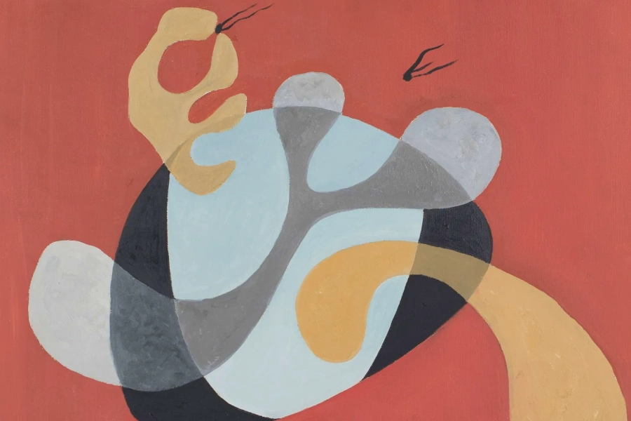
Organic, irregular shapes

Nothing in biomorphic design feels mathematically perfect — and that’s the whole point.
Instead of clean circles or precise vectors, you get shapes that feel like they’ve been pulled, stretched, or grown into place. There’s always a slight imbalance that makes the form feel more natural.
You’ll often see:
- Blob-like forms that don’t resolve into a clear shape
- Curves that tighten and loosen unpredictably
- Silhouettes that feel somewhere between abstract and anatomical
What’s interesting is that these shapes don’t need to represent anything specific. They just need to feel alive. That’s why they often resemble things like cells, liquid, or organic matter — even when that wasn’t the intention.
If you can easily trace your shape back to a circle or rectangle, it’s probably still too geometric. Keep pushing it until that origin disappears.
Soft movement and flow

One of the biggest differences between biomorphic and geometric design is how the composition moves.
Geometric layouts tend to guide your eye in straight lines — left to right, top to bottom, grid to grid. Biomorphic layouts feel more fluid. Your eye drifts, follows curves, and moves in loops or arcs instead of strict paths.
This comes from how elements interact:
- Shapes overlap instead of sitting side by side
- Edges lead into other shapes instead of stopping abruptly
- Negative space feels just as active as the shapes themselves
There’s often no single focal point in the traditional sense. Instead, the composition creates a kind of visual current that pulls you through it.
If your layout feels static, it’s usually because your shapes aren’t interacting enough. Let them touch, overlap, and influence each other.
Natural color behavior

Color in biomorphic design rarely feels flat.
Even when the palette is bold, the way color behaves is closer to how light works in the real world. You’ll see gradients that shift gradually, tones that blend into each other, and transitions that feel soft rather than abrupt.
Instead of:
- Solid fills
- Hard edges
- Sharp color breaks
You’ll often get:
- Layered gradients
- Subtle opacity changes
- Color that feels like it’s moving across a surface
This is what gives biomorphic shapes their sense of depth. They don’t just sit on the canvas — they feel like they exist within it.
If your colors feel too “graphic,” try softening the transitions. Biomorphic design usually feels closer to materials than to flat shapes.
Minimal but expressive layouts
What makes biomorphic design work is the balance between complexity and restraint.
The shapes themselves can be expressive, layered, and visually rich — but the overall layout is often surprisingly simple. There’s usually space for the composition to breathe, and not every area is filled.
This is especially noticeable when typography is involved.
Biomorphic design often pairs complex, organic visuals with simple and clean types.
The contrast is intentional. The shapes create movement and emotion, while the typography anchors the design and makes it usable.
If both are expressive, they compete. If one holds back, the other can stand out.
If your design starts to feel overwhelming, it’s rarely because of one shape. It’s because nothing is holding the composition together. That’s usually where simpler type or more spacing helps.
Where you’ll see biomorphic design
Once you recognize it, you’ll start seeing biomorphic patterns and shapes everywhere.
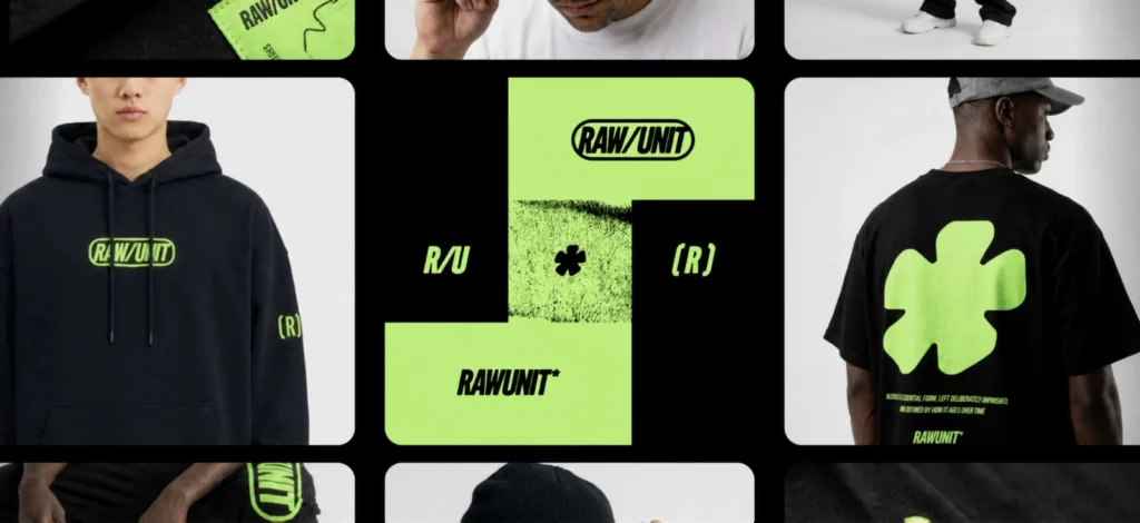
Modern tech and startup branding

This is probably one of the most consistent places you’ll see biomorphic shapes today.
A lot of tech brands — especially in SaaS, AI, or creative tools — use soft, organic shapes in their visuals to balance out what would otherwise feel very technical.
You’ll often see:
- Abstract blob-like backgrounds behind product UI
- Soft gradients with flowing shapes in hero sections
- Organic forms used as part of the brand’s visual system
This became especially popular as brands moved away from ultra-flat design and started reintroducing depth and personality.
If a tech brand feels “friendly but still modern,” there’s a good chance biomorphic shapes are doing part of that work.
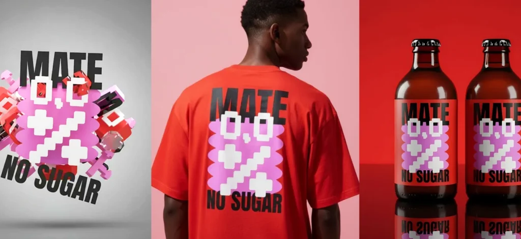
Album covers and cultural visuals
Biomorphic design has a strong presence in music, fashion, and digital culture — especially where visuals are meant to feel emotional rather than literal.
You’ll see it in:
- Ambient or electronic album covers
- Experimental poster design
- Fashion campaign visuals
These compositions often don’t rely on clear subjects. Instead, they use organic shapes and color to create mood.
It’s less about communicating information, and more about creating a feeling.
Product and interface backgrounds
Biomorphic shapes show up a lot in digital interfaces — but usually not as the main focus.
Instead, they sit in the background:
- Soft abstract shapes behind dashboards
- Flowing gradients in app onboarding screens
- Subtle organic layers in website sections
They’re doing something very specific: adding depth without adding distraction.
Geometric patterns can feel rigid or repetitive in UI. Biomorphic forms feel softer and more ambient.
Motion design and animated systems
Biomorphic shapes really come alive in motion.
Because they’re already irregular and organic, even simple animations — like slow morphing or drifting — feel natural.
You’ll often see this in:
- Loading animations
- Brand motion systems
- Looping visuals for social or websites
Unlike geometric shapes, which can feel mechanical when animated, biomorphic forms feel like they’re evolving.
That’s why they’re often used in systems that need to feel continuous and fluid.
AI-generated and generative visuals

This is where biomorphic design has quietly expanded the most.
A lot of AI-generated visuals already lean biomorphic — even when the prompt doesn’t explicitly say so. That’s because AI tends to produce variation and irregularity by default.
But here’s the important distinction: Raw AI output often looks biomorphic. Good design uses that, but doesn’t stop there.
Designers take those outputs and:
- Crop into interesting sections
- Layer multiple results
- Simplify and structure them
So what you end up seeing isn’t “AI art” — it’s biomorphic design that started from AI and was shaped into something intentional.
How to create biomorphic design in Kittl
You don’t need to be an illustrator to create biomorphic shapes. In fact, trying to draw them perfectly is often what makes them feel unnatural.
The goal is to build something that feels organic — not something that looks technically impressive.
Step 1 — Build a shape, then break it using vector controls

Start with something simple in the Kittl Editor — a circle, ellipse, or basic shape from the elements panel. You can also create your own shape with the Pen Tool or combine shapes with the Shape Builder in Kittl’s vector suite.
Then, you can start reshaping the structure:
- Grab individual anchor points
- Pull them outward unevenly
- Adjust the bezier handles to change how the curve flows
- Round or exaggerate specific corners
This is where biomorphic design actually happens — not in the initial shape, but in how you distort it.
At first, it’ll still feel like a modified geometric form. But as you keep adjusting the anchor points, there’s a moment where it stops feeling constructed and starts feeling organic.
That’s the shift you’re looking for.
Step 2 — Duplicate and build relationships between shapes

Once you have one strong shape, duplicate it and start building relationships between forms.
This is where you move from “a shape” to a composition.
Use Kittl’s Shape Builder to:
- Merge shapes together
- Subtract areas
- Intersect overlapping parts
- Create new silhouettes from combinations
Instead of placing shapes side by side, let them:
- Overlap
- Blend into each other
- Create new forms through interaction
Now, you’re no longer designing individual objects — you’re designing how shapes behave together.
The composition should start to feel like it’s evolving, not arranged.
If every shape still feels separate, the design will feel static. The moment shapes start creating new shapes together. Only then will it become biomorphic.
Step 3 — Use gradients and effects to make shapes feel like material

Once your shapes are interacting well, color is what turns them from vector forms into something that actually feels organic.
Instead of applying flat fills, start using Kittl’s gradient and effects tools to introduce depth:
- Apply gradients that shift within the shape, not just across it
- Adjust opacity so layers subtly blend into each other
- Experiment with soft blur or shadow to create separation without hard edges
The goal here is to make the shapes feel like they have substance. Almost like light is passing through them or sitting on top of them.
You’ll notice that even a simple shape starts to feel more alive once the color behaves more naturally.
If your gradients look too clean or linear, they’ll still feel graphic. Slight irregularity or uneven blending usually feels more organic.
Step 4 — Use AI to introduce variation you wouldn’t draw yourself

Now that you’ve built your base manually, this is where AI actually becomes useful.
Open the AI Image Generator and use it to create:
- Additional organic shapes
- Layered abstract compositions
- Subtle textures that you can’t easily build by hand
Try prompts like:
- “biomorphic abstract shapes, flowing organic forms, soft gradients, no text”
- “fluid layered composition, natural movement, subtle texture, no text”
Then bring the result into your canvas and treat it like a resource:
- Remove the background
- Crop into interesting areas
- Layer it with your existing shapes
The key is that you’re not replacing your design — you’re introducing variation.
This is where biomorphic design and AI overlap nicely. AI tends to generate irregularity by default, which fits perfectly into this style.
If the AI result looks like a finished artwork, don’t use it as-is. Crop it down or break it apart until it feels like part of your system.
Step 5 — Add structure without flattening the composition

Now you introduce structure — but carefully.
Use Kittl’s text and layout tools to:
- Add typography
- Align key elements
- Define hierarchy
This is where a lot of biomorphic designs go wrong.
The temptation is to “organize” everything too much, which removes the organic feeling you just built.
Instead, let the shapes stay expressive, and use structure only where necessary:
- Keep typography simple
- Avoid over-aligning everything
- Let some elements feel slightly off-grid
You’re not forcing order — you’re introducing just enough of it.
If your layout suddenly feels stiff, you’ve probably over-aligned. Loosen one element slightly and see how it changes the flow.
Step 6 — Refine through layering, spacing, and restraint

Zoom out and look at the full composition. Then fine tune your design:
- Bring some elements forward, push others back
- Reduce opacity where things feel too heavy
- Adjust spacing so the eye can move naturally
This step isn’t about adding — it’s about editing.
Most biomorphic designs improve when something is removed or softened, not when something new is added.
You’re looking for a point where the design feels effortless — like everything is sitting where it should be without forcing it.
If your eye keeps getting stuck in one area, something is too strong. Either reduce it or give the rest of the design more presence.
Bonus: Biomorphic design free templates
And if you’re needing a little push of inspiration or you need a to grab a quick Biomorphic design template because you don’t have all the time in the world, you’re in the right place.
Enjoy free Biomorphic design templates like these already in design bundles on Kittl:

AI playground Design Bundle Machine Gardening. Use Template

AI playground Design Bundle Machine Weaving. Use Template

AI playground Design Bundle Treasure Hunt. Use Template
Common mistakes in biomorphic design
Creating biomorphic design can be tricky, but the most common mistakes are probably:
- Making shapes too perfect. Smooth curves, balanced layouts, symmetrical shapes — all of that pushes the design back toward geometry.
- Overcomplicating the composition. Biomorphic doesn’t mean “add more shapes.” It means letting a few shapes do more work.
- Issue of control. If every element feels tightly placed and intentional, the design loses that natural quality. There has to be a bit of looseness for it to feel organic.
Biomorphic design isn’t about randomness. It’s about controlled irregularity.
Key takeaways: Why biomorphic design works
Biomorphic design feels natural because it reflects how things exist outside of design systems.
Nothing in nature is perfectly straight or perfectly balanced — and when design starts to mirror that, it becomes easier to engage with.
It softens structure without removing it. It introduces movement without chaos. And it creates visuals that feel more human, even when they’re completely abstract.
That’s why it keeps showing up — not as a trend, but as a way of making design feel less rigid and more alive.
Check out 20 more design style you’d love
We at Kittl love exploring all kinds of design styles and Biomorphic is just one of them. Check out more of these design trends on this Youtube video of ours and stay tuned for more breakdowns on our blog!
Also don’t forget to drop by our 2026 design style trends to stay ahead here: Steal the start: 10 graphic design trends 2026 by Kittl. Find trends like:
- Naive Design
- Blueprint Graphic Design
- Kidcore Design
- Frutiger Aero Aesthetic
- Type Collage
- Trinket Design
- Punk Grunge
- Future Medieval
- Distorted Portrait Design
- Surveillance Design Trend
- Grainy Blur
- Signal Graphics
Have fun exploring!
FAQ: Biomorphic design
What is biomorphic design?
Biomorphic design is a style that uses organic, flowing shapes inspired by nature instead of rigid geometric forms.
What are biomorphic shapes?
They are irregular, fluid shapes that resemble natural forms like cells, plants, or anatomy.
Where is biomorphic design used?
It’s commonly used in branding, posters, UI design, and digital art.
Is biomorphic design abstract?
Yes, but it’s a specific type of abstract design inspired by natural forms. Can I create biomorphic design using AI?
Yes. AI tools like Kittl can generate organic shapes that you can refine and integrate into your designs.

Shafira is a content writer who turns boring business talk into reads people actually enjoy. She grew up hoarding $1 novels in Singapore and writing hilariously bad fiction, but now she tackles content marketing with all that creative chaos since 2019. From blogs and newsletters to UX and SEO, she writes how she thinks: nerdy, honest, and a bit offbeat. She believes the best content is human-designed, not just plain text.