Faces have always been a powerful visual subject. In branding, posters, album covers, and digital campaigns, portraits help communicate emotion, identity, and intent faster than almost any other visual element.
But in 2026, portraits are no longer expected to look perfect.
Instead, designers are stretching, warping, fragmenting, and distorting faces on purpose. The result is a growing design trend known as distorted portrait design — a style that feels expressive, uncomfortable, playful, and deeply human all at once.
This article explores where the trend comes from, why it’s gaining momentum now, what defines its visual language, and how designers are creating distorted portraits using tools like Kittl.
As part of the wider landscape of graphic design trends in 2026, distorted portraits reflect a broader shift toward imperfection, experimentation, and emotional clarity.
Origins of distorted portrait design

Distorting the human face isn’t new. Artists have been doing it for decades — long before it became a graphic design trend.
Early influences can be traced back to:
- Expressionist art, where emotional impact mattered more than realism
- Surrealist portraiture that bent facial proportions to reflect inner states
- Punk and grunge visuals that deliberately rejected polish and symmetry
In graphic design, distorted faces began appearing more prominently in underground posters, album artwork, and experimental editorial layouts. The goal was rarely to be beautiful in a conventional sense. Instead, distortion was used to provoke reaction, create unease, or signal subculture.
As digital tools evolved, distortion techniques became more accessible — shifting from niche experimentation to a recognizable design language. By the time distorted portraits entered mainstream visual culture, they were no longer just artistic rebellion. They became a way to communicate complexity.
This lineage places distorted portrait design alongside other expressive movements like punk grunge design and the deliberately imperfect feel of naive design, both of which challenge traditional ideas of “good taste” in favor of honesty and impact.
Why distorted portraits are trending now
As digital visuals become increasingly polished, designers are reintroducing friction. Distorted portraits interrupt perfection — stretching, blurring, or fragmenting faces just enough to slow the viewer down.
The appeal lies in tension. These visuals feel expressive rather than finished, allowing emotion, humor, or discomfort to surface without literal storytelling. In a culture of constant self-curation, distortion becomes a way to explore identity beyond clean presentation.
With experimentation now easier and faster, the focus has shifted from technical execution to intent. Distortion isn’t used for spectacle, but to shape mood and meaning — which is why distorted portraits feel so relevant in 2026’s visual landscape.
The anatomy of distorted portrait design
While distorted portraits come in many forms, the most effective examples share a few recognizable characteristics.
Intentional facial manipulation

Distortion is never random. Designers stretch features, misalign eyes, blur expressions, or fragment faces with purpose. Each adjustment contributes to the emotional tone of the design.
Imperfect realism

Faces often remain recognizable, even when heavily altered. This balance between familiarity and disruption is what makes distorted portraits compelling rather than abstract.
Texture and visual noise

Grain, blur, overlays, or rough edges are commonly used to enhance the sense of tactility. These details make designs feel layered and lived-in.
Strong contrast

Distorted portraits frequently rely on bold typography, stark color palettes, or sharp layout contrasts to ground the visual chaos.
Emotion over symmetry

Traditional portrait rules — balance, proportion, clarity — are often ignored. Instead, emotion and mood drive the composition.
This emphasis on structural clarity paired with visual disruption echoes trends like blueprint-inspired design, where rigid systems coexist with expressive visuals.
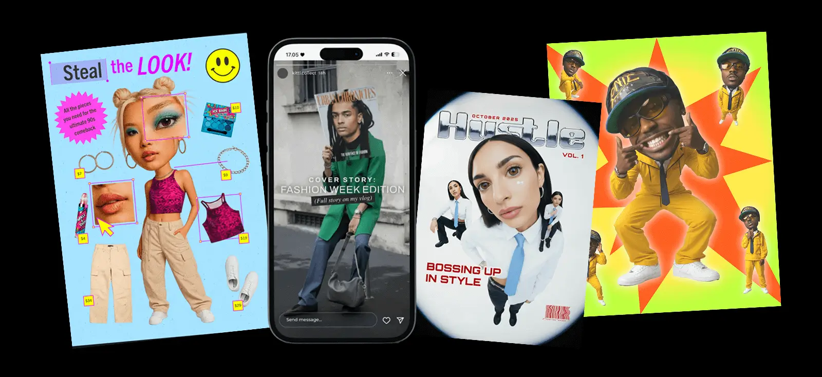
Where distorted portraits are showing up in 2026

Distorted portrait design is gaining traction across multiple creative industries.
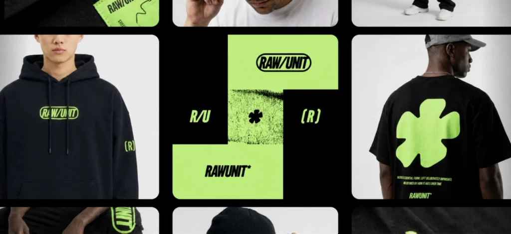
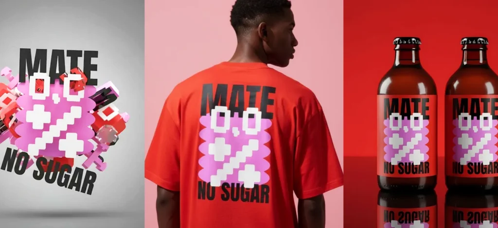
In branding, it’s used to signal boldness and cultural awareness — especially for fashion, music, and creative studios. Editorial designers lean on distortion to visually represent complex themes like identity, mental health, or transformation.
In digital campaigns and social media, distorted faces stand out instantly. They disrupt scrolling behavior and invite closer inspection. Event posters, album covers, and experimental packaging also benefit from the emotional punch this style delivers.
As part of the broader ecosystem of graphic design trends in 2026, distorted portraits are less about shock value and more about intentional expression.
Creating distorted portraits in Kittl
Designing distorted portraits doesn’t require complex workflows or external tools. Inside Kittl, designers can explore this style end-to-end — from concept to final layout.
Step 1: Pick the one distortion you want to lead with

Before you touch the canvas, decide what kind of distortion you’re chasing. A few strong directions:
- Stretch / pull (elongated features, warped proportions)
- Fragment / cut-up (collage-like face shifts, broken symmetry)
- Blur / smear (motion-like distortion, melting edges)
- Glitch / interference (digital artifacts, jitter, scanlines)
- Abstract facial geometry (planes, masks, uncanny angles)
Pro Tip
Commit to one dominant distortion per portrait. If everything is distorted, nothing stands out—and the idea gets muddy.
Step 2: Generate portrait variations with AI Image Generator

Use Kittl’s AI Image Generator to create portraits that already contain the distortion language you want — so you’re not “forcing” the style later.
A practical approach: generate 6–12 variations that share the same subject but explore different distortion intensity.
What to aim for in your prompts:
- a clear subject description (so it stays portrait-first)
- one distortion direction (so results are consistent)
- a mood or material cue (so it doesn’t look random)
Once you have a few solid options, bring them onto the canvas and treat them like raw material.
Step 3: Build distortion through composition (not effects)

A distorted portrait becomes designed when the composition starts doing work.
On the canvas, push it further using:
- cropping hard (cut into the face to create tension)
- layering duplicates (offset copies for jitter/echo)
- overlays (textures, shapes, gradients, noise)
- masking with type or shapes (hide/reveal features with intention)
This is where the portrait stops being “an image” and starts becoming “a poster.”
Step 4: Explore multiple versions side by side on Infinite Canvas

Distorted portrait design is iterative by nature — you don’t find the right outcome immediately.
With Infinite Canvas, you can:
- place multiple portrait directions next to each other
- test different crops and type treatments without creating new pages
- keep failed experiments nearby (they often become your best idea later)
Think of it like a wall of drafts — only faster.
Step 5: Use typography to anchor the chaos

Distortion grabs attention, but typography gives the viewer a way in. The contrast is the whole point: expressive image + controlled type.
In Kittl, use the font library to create structure through:
- strong hierarchy (one clear entry point)
- restrained alignment (grid-like placement against chaotic visuals)
- confident contrast (clean type against messy portrait treatment)
Pro Tip
Let type do the “explaining.” Distortion can stay strange if the text gives the viewer orientation.
Step 6: Generate concept alternatives quickly with Kittl Flows

Once your base direction works, Kittl Flows helps you expand the idea without redoing everything.
Use it to explore:
- new crops and layouts
- alternate type directions
- different distortion intensity (without changing the concept)
It’s a fast way to shift your energy from execution to art direction — which is where distorted portraits really get interesting.
Explore more 2026 design trends

Distorted portraits are just one piece of the visual landscape shaping the year ahead. If you want a deeper look at emerging styles, patterns, and creative directions, explore the full 2026 Design Trend Report.
Key takeaways
Distorted portrait design reflects a broader shift toward expressive imperfection in 2026. By intentionally disrupting facial realism, designers create visuals that feel emotional, human, and impossible to ignore.
As tools evolve, the power of this trend lies not in technique, but in intent. Distortion becomes a language — one that communicates tension, identity, and mood with striking clarity.
To explore how distorted portraits fit alongside other graphic design trends in 2026, dive into the full trend report and start experimenting directly on canvas.
Ready to experiment with distorted portraits?
Generate expressive portraits, remix them with typography, and push distortion as far as your concept needs — all in one place.

Shafira is a content writer who turns boring business talk into reads people actually enjoy. She grew up hoarding $1 novels in Singapore and writing hilariously bad fiction, but now she tackles content marketing with all that creative chaos since 2019. From blogs and newsletters to UX and SEO, she writes how she thinks: nerdy, honest, and a bit offbeat. She believes the best content is human-designed, not just plain text.