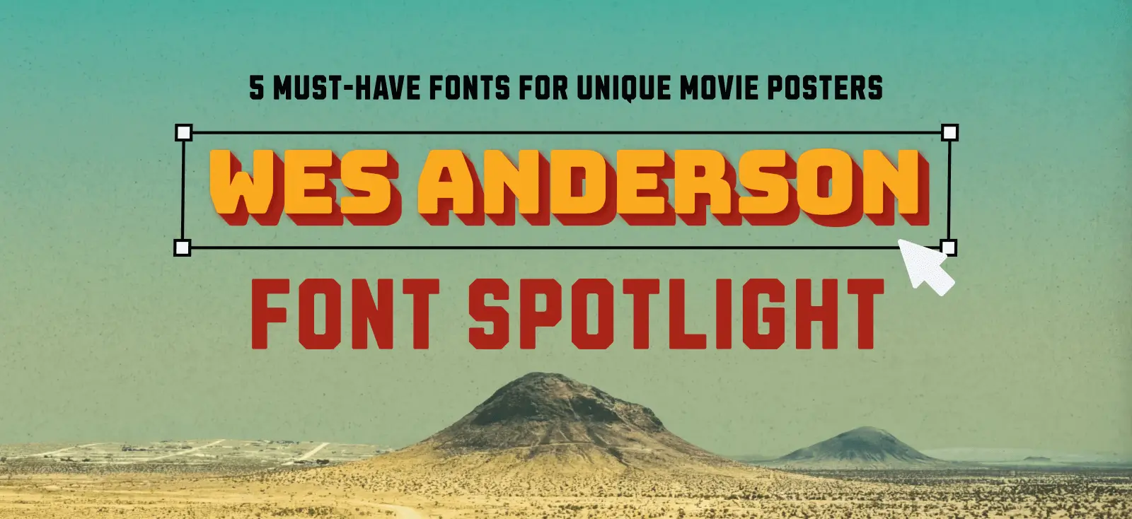
If there is one director who treats typography as a main character, it’s Wes Anderson.
From the pastel symmetry of The Grand Budapest Hotel to the mid-century nostalgia of Asteroid City, Anderson doesn’t just choose fonts. He casts them! Typography in his films is a character in itself — often deadpan, geometric, and obsessively centered.
But why is this Wes Anderson fonts aesthetic so evergreen?
It’s because Anderson’s typography evokes a very specific feeling: order in a chaotic world. It creates a sense of storybook nostalgia that brands and designers love to emulate because it feels instantly curated, expensive, and intentional.
At Kittl, typography is in our DNA. We didn’t just add fonts as an afterthought. The platform was born from a love of heritage type and vintage lettering. We know that getting this look right isn’t just about picking “Futura” — it’s actually about nuance.
If you are looking to channel that cinematic aesthetic without spending hours hunting for expensive typefaces, here are 5 free Wes Anderson fonts inside Kittl that nail the look perfectly!
The Wes Anderson type collection
Based on our latest tutorial, here are the direct Kittl alternatives to the iconic Wes Anderson fonts used in his filmography.
1. Figtree (The Royal Tenenbaums look)

The Vibe: Geometric, Clean, Modernist.
The Inspiration: The Royal Tenenbaums / Futura.
When to use it: This is your workhorse font. It works for everything from main titles to body copy. Wes Anderson is famous for his love of Futura and Helvetica. Figtree is Kittl’s answer to that obsession. It is a geometric sans serif with forms based on simple circles and lines — notice the perfectly round ‘O’!
2. HT Modern Hand Slab (Mendl’s pastry box from Grand Budapest Hotel!)

The Vibe: Utilitarian, Friendly, “Train Station Signage.”
The Inspiration: The Grand Budapest Hotel.
When to use it: Small text, cast lists, or “official” documents that need to look friendly rather than bureaucratic.
HT Modern Hand Slab is a semi-wide slab serif that has slightly rounded feet, giving it a warm, tactile feel. It lacks the sharp aggression of a digital font, making it feel like it was printed on a letterpress in the 1930s.
3. Pinyon Script (The Moonrise Kingdom romance)

The Vibe: Whimsical, High-Contrast, Storybook.
The Inspiration: Moonrise Kingdom.
When to use it: Use this for large titles only. Because of the delicate lines, it disappears at small sizes. It’s perfect for wedding invites or “Patisserie” style packaging.
Not everything in Anderson’s world is blocky. Pinyon Script captures the romantic, juvenile intrigue of Moonrise Kingdom. It has a high stroke contrast (very thick vs. very thin lines) and a steep slant.
4. Bungee (The Asteroid City signage)

The Vibe: Urban, Vertical, Mid-Century American.
The Inspiration: Asteroid City.
When to use it: Posters and heavy headers. While Grand Budapest is European, Asteroid City is distinctly American Desert Retro. Bungee is a display font inspired by urban signage — think motels, gas stations, and diners. It has a consistent thickness that demands attention.
Pro Tip
Use Kittl’s Text Effect to add a “Block Shadow.” This mimics the 3D-painted signage look seen throughout the movie.
5. Brookfield (The Grand Budapest Hotel)

The Vibe: Rectangular, Bold, Newspaper-Ready.
The Inspiration: The French Dispatch.
When to use it: When you need to fit a long title into a tight space, or for “Breaking News” style headers.
Brookfield is a condensed serif that feels like it was ripped straight from a 1960s magazine masthead. It is uppercase only and packs a visual punch without taking up much horizontal space.
Love cinematic design breakdowns? If you enjoy deconstructing pop-culture aesthetics, check out our guides on The Last of Us Part II Design Style or test your knowledge with ourStar Wars Outfit & Design Quiz.
Can’t find the perfect font? Build it with AI!

Sometimes, even a library of thousands of Wes Anderson fonts isn’t enough. You have a specific shape in your head — maybe something sharper, weirder, or more specific to your brand — and scrolling through font foundries just isn’t working.
In the past, making your own font required mastering complex software like FontLab and understanding Bézier curves. Sadly, it took weeks.
Now, thanks to Kittl Flows, you can generate custom letterforms using AI and turn them into a working font file in under an hour!
Learn to see how it works in just 5 steps:
- Prompt
Use Kittl Flows to generate a letter set (e.g., “Generate a Gothic alphabet in flat-nib style”). - Expand
Ask the AI to generate the rest of the alphabet, numbers, and punctuation in that exact same style. - Export
Download your glyphs. - Build
Use a free tool like Calligrapher to map your images to keys and export a .TTF file. - Design
Upload your custom font back into Kittl and use it in your projects.
We have a complete, step-by-step breakdown of this workflow. If you are ready to stop compromising and start creating your own typography, read the full guide here.
Key takeaways: How to nail the Wes Anderson look
Symmetry is non-negotiable
Anderson’s style is defined by perfect centering. Avoid asymmetrical layouts; keep your hero image and text right in the middle.
Tracking is the secret
To make a modern Wes Anderson fonts look “cinematic,” use the Tracking slider in Kittl to increase the space between letters, especially for uppercase titles.
You don’t need “Futura”
Use Figtree for that classic geometric look, or HT Modern Hand Slab for a vintage, friendly signage vibe.
Pastels & palettes
Stick to muted earth tones or soft pastels (pinks, mints, yellows). Avoid neon or highly saturated colors.
Custom is an option
If the library doesn’t have the exact quirkiness you need, use Kittl Flows to generate a custom AI font from scratch.
Your design, directed by YOU!

Finding the perfect cinematic symmetry or engineering a brand-new typeface from scratch might seem like different disciplines, but they serve the same master: intentionality.
The best designers don’t just pick a font because it’s “nice.” They pick it because it casts the right mood for the scene. With Kittl’s heritage-rich library and new AI tools, you have everything you need to control that narrative!

Shafira is a content writer who turns boring business talk into reads people actually enjoy. She grew up hoarding $1 novels in Singapore and writing hilariously bad fiction, but now she tackles content marketing with all that creative chaos since 2019. From blogs and newsletters to UX and SEO, she writes how she thinks: nerdy, honest, and a bit offbeat. She believes the best content is human-designed, not just plain text.