Soft gradients. Glowing edges. Film-like texture.
The grainy blur effect is becoming one of the most recognizable aesthetics in 2026 design. Instead of sharp edges and perfectly clean gradients, this style embraces softness, glow, and texture to create visuals that feel emotional and immersive.
You’ll see it everywhere — from music posters and editorial layouts to social graphics and experimental branding. The combination of blur, gradient color, and grain texture creates depth that feels cinematic and atmospheric.
And thanks to modern design tools — including AI image generation, texture libraries, and gradient effects — creating this look is more accessible than ever.
In this article we’ll explore:
- where grainy blur design appears today
- why the grainy blur effect is trending in 2026 among the 10 other graphic design trends in 2026
- the visual characteristics behind the style
- and how to create grainy blur graphics using Kittl.
What is the grainy blur effect (and what is grainy blur design)?

The grainy blur effect combines soft-focus blur with visible film-like grain to create images that feel atmospheric rather than perfectly sharp. Instead of crisp edges and clean gradients, the visuals appear hazy, glowing, and slightly textured — almost like looking through fogged glass or an old camera lens.
Grainy blur design takes that effect further and makes it part of the layout itself. Designers use blur and grain not just as filters, but as structural elements that shape the mood of a composition. Background gradients become soft color clouds, objects glow with halo-like edges, and textures give digital graphics a tactile, cinematic feel.
You’ll often see this style expressed through:
- glowing gradient shapes
- blurred flowers or botanical elements
- fuzzy character illustrations
- airbrush-style color transitions
- grainy textures layered over gradients
The result is a visual language that feels dreamy, nostalgic, and emotional — a strong contrast to the ultra-sharp, hyper-polished aesthetic that dominated digital design for years.
Grainy Blur also connects with several other design trends emerging right now. For example, designers often pair it with Type Collage, placing bold typography over soft, hazy backgrounds to create contrast between structure and atmosphere.
In other cases, the glowing gradients and neon color palettes echo the playful chaos of Signal Graphics, while the abstract shapes and painterly textures overlap with the experimental visuals seen in AI Abstract design.
Check out how to ace the Signal Graphics design trend in our video here:
In other words, Grainy Blur isn’t just a filter. It’s becoming a visual foundation for several modern design directions — especially in posters, editorial graphics, album covers, and digital branding.
Pro Tip
When analyzing a grainy blur composition, look for two elements working together: soft edges and visible grain texture. Without grain, blur can feel flat. Without blur, grain just looks like noise. The magic happens when the two are layered carefully.
Where the grainy blur aesthetic comes from
The visual roots of grainy blur go back to film photography and airbrush illustration.
Film cameras naturally produced visible grain because of the chemical particles used to capture light. Meanwhile, blur appeared through motion, shallow depth of field, or soft-focus lenses. These imperfections gave images a cinematic warmth that digital photography later tried to replicate.
In the late 1990s and early 2000s, designers began intentionally recreating these qualities in digital layouts. Editorial spreads, album covers, and experimental posters used soft gradients, glow effects, and noise overlays to create atmosphere.
Today’s grainy blur trend builds on those ideas — but with modern tools.
Design platforms like Kittl now make it possible to generate gradients, textures, and atmospheric visuals quickly, letting designers experiment with blur, color, and composition without complicated workflows.
Instead of recreating analog effects manually, creators can now explore dozens of variations in minutes.
Why the grainy blur effect is trending in 2026
Designers are exploring more atmospheric visuals
Many modern layouts focus less on rigid structure and more on mood and emotion. Grainy blur backgrounds act almost like lighting in a photograph — setting the tone for the entire composition.
This makes the style particularly effective for posters, music visuals, editorial graphics, and storytelling-driven branding.
Gradients and soft lighting are evolving
Gradients have been popular for years, but designers are pushing them further. Instead of smooth vector gradients, grainy blur adds texture and depth, making colors feel richer and more dynamic.
These textured gradients often become the structural background of the layout, not just decoration.
AI tools make atmospheric visuals easier to create

One of the biggest reasons this trend is growing is how easy modern tools make it to experiment.
With AI image generators, gradient tools, and texture overlays, designers can quickly produce visuals that once required complex photo manipulation.
In Kittl, for example, creators can generate abstract gradients, glowing objects, or blurred illustrations using the AI Image Generator, then refine them with grain textures, color adjustments, and typography.
The result is a workflow where AI helps generate visual exploration, while designers shape the final composition.
Where you’ll see grainy blur design
Grainy blur visuals are already appearing across several creative industries. The style works particularly well in projects where emotion and atmosphere matter more than perfect clarity.
Designers are using grainy blur backgrounds and gradients in:
Editorial posters
Magazine covers and poster graphics often use grainy gradient blur layouts to create depth behind typography.
Album covers
The dreamy glow of blurred gradients pairs naturally with music visuals, especially for indie, electronic, and experimental genres.
Fashion campaigns
Soft blur effects create a cinematic mood that complements modern fashion photography.
Social media graphics
Grainy blur backgrounds help posts stand out in feeds dominated by sharp vector graphics.
Creative branding
Brands looking for a nostalgic or artistic feel are using grainy blur textures in campaigns and product launches.
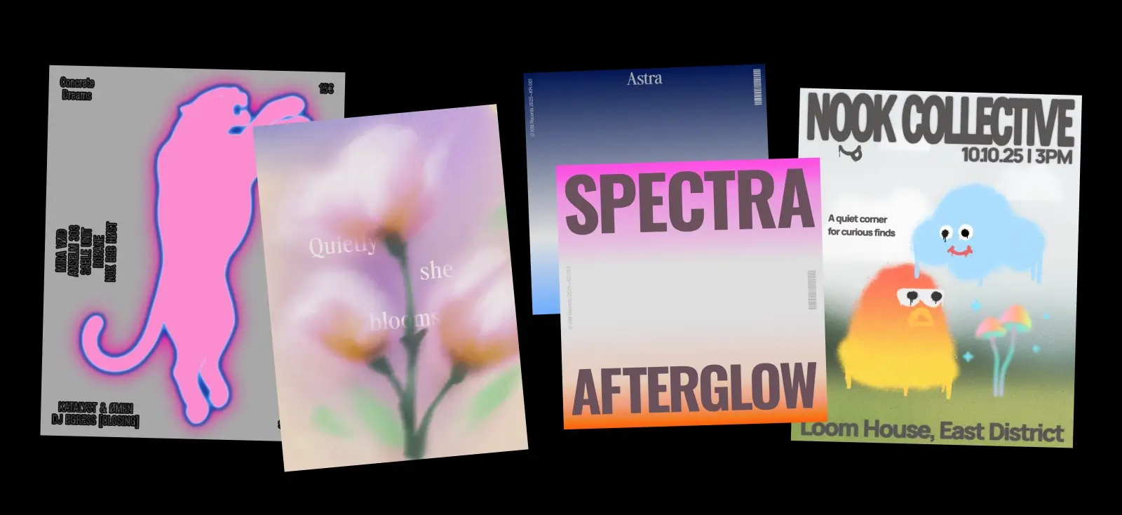
The 4 styles of Grainy Blur designers are using
Grainy blur isn’t just one look. Designers are experimenting with several variations of the aesthetic, each using blur and grain in slightly different ways.
Understanding these variations can help you decide how to apply the style in your own work.
1. Structural gradient layouts

In this version, large gradient fields become part of the layout structure.
Instead of placing blur behind an image, the gradient itself acts as the background, dividing sections of the design. Grain texture is added on top so the colors feel atmospheric rather than flat.
You’ll often see:
- vertical or diagonal gradient fades
- text floating over soft color transitions
- subtle grain layered across the entire composition
These layouts feel minimal but expressive, which makes them popular for posters, editorial spreads, and modern brand campaigns.
Pro Tip
When creating gradient layouts, keep typography relatively simple. The blur already creates visual energy, so clean type helps maintain balance.
2. Acid blur graphics

Acid blur is the most intense variation of the style.
Instead of calm pastel gradients, designers use saturated colors, glowing edges, and rough grain textures. The result feels almost like spray paint or airbrushed neon light.
Typical characteristics include:
- glowing color halos
- intense gradient transitions
- grain that spreads outward from the shape
- vibrant neon palettes
This version works particularly well for music visuals, streetwear graphics, and experimental posters where energy and movement matter more than precision.
3. Blurred botanicals

Another direction designers are exploring is blurred floral imagery.
Instead of detailed botanical illustrations, flowers dissolve into soft gradients and glowing color clouds. Grain overlays add depth and prevent the image from feeling overly smooth.
This variation feels:
- dreamy
- atmospheric
- editorial
- slightly nostalgic
It’s often used in magazine layouts, art posters, book covers, and cultural campaigns where mood is more important than realism.
4. Fuzzy gradient characters

One of the most playful versions of the trend introduces soft, fuzzy characters made from gradients.
These shapes often look like glowing creatures with simple eyes or facial expressions. The blur gives them a plush, airbrushed quality, while grain texture adds depth.
You’ll typically see:
- blobby or star-like shapes
- soft rainbow gradients
- minimal cartoon faces
- glowing edges
Because they feel friendly and surreal at the same time, fuzzy characters work well for creative brands, community projects, and experimental poster design.
How to create grainy blur designs in Kittl
You don’t need complex photo editing to experiment with this aesthetic. With the right gradient, blur, and texture layers, you can build a convincing grainy blur composition in minutes.
Here’s a practical workflow you can try.
1. Start with a grainy blur template

Templates are a great starting point because they already combine gradients, blur, and typography in a balanced way.
When choosing one, look for designs that feature:
- strong gradient backgrounds
- soft lighting effects
- simple typography layouts


Pro Tip
Instead of rebuilding the entire design, try swapping the color palette first. Grainy blur styles often transform completely with different gradient combinations.
2. Build your type pairing

Most grainy blur designs begin with a soft gradient background.
In Kittl you can:
- apply gradient fills to shapes
- blend multiple colors together
- adjust softness and transitions
Try using color combinations like:
- pink → orange → violet
- blue → purple → cyan
- peach → lavender → cream
Gradients should feel smooth and atmospheric, almost like colored light rather than flat paint.
3. Add blur and glow effects

Next, introduce blur to soften the edges of shapes or images.
This helps create the hazy atmosphere that defines the style.
You can apply blur to:
- shapes
- photos
- gradient objects
- illustrations
Some designs also include subtle glow or halo effects around shapes to create a luminous look.
Pro Tip
Use blur selectively. Too much blur across the entire layout can make the design feel muddy. Let some edges remain sharper to create contrast.
4. Layer grain or texture

Grain is what gives the style its character.
Without it, gradients can feel overly digital. Grain texture introduces the slight irregularity that makes the image feel more tactile.
In Kittl you can add:
- noise textures
- film grain overlays
- subtle speckled effects
Lower the opacity until the texture blends naturally into the gradient.
Pro Tip
A light grain overlay across the entire design usually works better than applying grain only to specific elements.
5. Use the AI Image Generator to create base visuals

If you want to create unique grainy blur graphics quickly, the Kittl AI Image Generator can help produce atmospheric visuals you can refine in the editor.
Here are some prompt ideas that work well with this trend.
Prompt: dreamy gradient blur background
“soft gradient blur background, glowing pastel colors, grainy film texture, atmospheric lighting, abstract design, no text”
Prompt: blurred botanical visual
“soft focus flower illustration, dreamy pastel colors, grainy texture, glowing gradient lighting, minimal background”
Prompt: fuzzy gradient creature
“soft fuzzy gradient character, glowing edges, colorful pastel gradient, grainy texture, simple cartoon eyes”
Prompt: acid blur graphic
“neon gradient abstract shape, glowing blur edges, vibrant colors, grainy spray paint texture”
After generating the image, you can refine it by:
- adjusting colors
- adding typography
- layering grain textures
- combining multiple gradient elements
Want to learn more about prompting to AI? Find everything you need to know about it in our prompting guide here.
Pro Tip
Adding “grainy texture” or “film grain” to your prompt helps AI produce visuals that match the grainy blur aesthetic more closely.
FAQ: Grainy Blur
What is the grainy blur effect in graphic design?
The grainy blur effect combines soft blur with film-like grain texture to create images that feel atmospheric and cinematic. Instead of crisp edges and perfectly smooth gradients, the design includes subtle noise and soft focus that adds depth and mood.
Designers often use this effect in posters, album covers, editorial graphics, and social media visuals where emotion and atmosphere are more important than perfect clarity.
Why is grainy blur design trending in 2026?
Grainy blur design is trending because it introduces texture and emotion into digital visuals. The combination of gradients, blur, and grain creates graphics that feel cinematic and immersive.
Modern tools also make it easier for designers to experiment with these effects. With gradients, textures, and AI image generation, creators can quickly explore different atmospheric visuals and build unique compositions.
How do you create the grainy blur effect?
The grainy blur effect usually combines three elements:
- Soft gradients or blurred imagery
- A grain or noise overlay
- Sharp typography for contrast
In Kittl, designers often start with a gradient background, add blur effects to shapes or images, and then apply a grain texture overlay to create depth.
Can AI help create grainy blur visuals?
Yes. AI tools can generate abstract gradients, blurred objects, and atmospheric visuals that work well with the grainy blur aesthetic.
For example, designers can use Kittl’s AI Image Generator to create:
- blurred botanical images
- glowing gradient shapes
- fuzzy gradient characters
- abstract color fields
These visuals can then be refined in the editor with textures, typography, and layout adjustments.
Where is grainy blur design commonly used?
Grainy blur visuals appear in many creative projects, including:
- album covers
- editorial posters
- fashion campaigns
- social media graphics
- experimental branding
Because the style emphasizes mood and atmosphere, it works especially well in designs where emotional impact is important.
Explore more 2026 design trends
Grainy blur is just one of the many aesthetics shaping visual culture in 2026.
This year’s trends explore new ways to combine texture, typography, objects, and AI-assisted visuals — from chaotic Type Collage layouts to nostalgic Punk Grunge graphics and structured Trinket Design collections.Explore the Kittl 2026 Design Trend Report o see what else is rising — from Punk Grunge and Type Collage to Blueprint layouts, Surveillance Design, and beyond.

Key takeaways
Grainy blur design shows how powerful atmosphere can be in modern visuals.
By combining soft gradients, subtle blur, and textured grain, designers can create compositions that feel emotional, cinematic, and immersive.
And with tools like AI image generation, gradient effects, and texture overlays, experimenting with these visuals has never been easier.
If you’re looking for a style that adds mood and depth to your work, grainy blur is a trend worth exploring.

Shafira is a content writer who turns boring business talk into reads people actually enjoy. She grew up hoarding $1 novels in Singapore and writing hilariously bad fiction, but now she tackles content marketing with all that creative chaos since 2019. From blogs and newsletters to UX and SEO, she writes how she thinks: nerdy, honest, and a bit offbeat. She believes the best content is human-designed, not just plain text.