Chinoiserie design is one of those design styles that makes people pause — before they even know why. A single branch, a bird, a hint of porcelain blue, and suddenly a brand feels more expensive, more thoughtful, more… put together.
That’s exactly why it keeps coming back.
But chinoiserie was never just a “pretty” aesthetic. It started as a European interpretation — often a fantasy — of Chinese and broader East Asian design, shaped by imported porcelain, silk, and lacquerware, then exaggerated through decorative arts and Rococo taste.
For designers today, that history isn’t just context — it’s direction. Because using chinoiserie well isn’t about copying the look. It’s about understanding the language behind it — and deciding how far you want to push it.
What is chinoiserie design?

The definition of chinoiserie
The word itself comes from the French chinois, meaning “Chinese” or “in the Chinese style” — which already tells you a lot about how this aesthetic came to be.
The most common chinoiserie pronunciation is:
“sheen-WAH-zuh-ree.”
You might also hear slight variations, but that’s the one designers tend to stick with.
What is chinoiserie design or chinoiserie art?
At its core, chinoiserie design is a decorative style that originated in Europe, inspired by Chinese and broader East Asian art, architecture, and culture.
But here’s the kick: Chinoiserie isn’t traditional Chinese design, it’s a European interpretation of it. And not always an accurate one.
It emerged at a time when Europe had limited access to Asia, so most references came through imported objects — porcelain, silk, lacquerware — and secondhand ideas.
That’s why chinoiserie often feels:
- Romanticized
- Stylized
- Sometimes slightly surreal
And that’s also why it translates so well into modern graphic design.
Because when you strip it down, chinoiserie isn’t about realism — it’s about atmosphere. It builds visual worlds using recurring elements like birds, botanicals, ornamental details, and scenic compositions that feel more symbolic than literal.
Need some inspiration? Check out our modern take on chinoiserie design templates here:

Blue Chinoiserie Design Art Print.
Use Template

Floral Chinoiserie Design Art Print.
Use Template

Green Chinoiserie Design Art Print.
Use Template
If you’re using chinoiserie in your work, don’t treat it like a checklist of motifs. Focus on the feeling — layered, decorative, slightly dreamlike — and build from there.
History & evolution of chinoiserie
Chinoiserie didn’t appear fully formed. It evolved in layers, shaped by trade, taste, and whatever fragments of visual culture made their way into Europe at the time.
In the early stages, it was closely tied to imported objects — porcelain, silk, lacquerware — that designers studied, admired, and, inevitably, reinterpreted. But instead of aiming for accuracy, the style quickly drifted toward something more expressive.

By the Rococo period, that shift was complete.
Chinoiserie became less about reference and more about world-building. Interiors were covered in scenic wallpaper panels, furniture featured intricate ornamentation, and compositions leaned into asymmetry and movement rather than structure.
This is where a lot of the visual DNA we still use today was established:
- layered, narrative compositions
- decorative surfaces that feel immersive
- motifs that interact instead of repeating
And then — like most styles — it didn’t disappear. It just adapted.
Through the 19th and 20th centuries, chinoiserie faded in and out of popularity, resurfacing in smaller revivals and reinterpretations. Each time, it absorbed something new — different palettes, looser compositions, modern materials — while holding onto its core identity.
That’s why it doesn’t feel locked to one era.
And it’s also why it works so well now.
Because what we’re seeing today isn’t a revival of chinoiserie as it was — it’s a continuation of how it’s always behaved: evolving, remixing, and adjusting to the visual culture around it.
Don’t treat chinoiserie like a fixed historical style. The most compelling work comes from reinterpreting it — just like designers have been doing for centuries.
Key characteristics of chinoiserie design
Now that we’ve seen how chinoiserie evolved, the real question is:
What actually makes something feel chinoiserie?
Because it’s not just about throwing in a bird to your design and calling it a day.Chinoiserie works because of a very specific mix of elements — and more importantly, how they’re composed together. Once you understand that, you can recreate the style without copying it.
Nature is always the starting point
You’ll almost always see:
- flowering branches
- birds
- butterflies
- garden-inspired elements
But again, it’s not about what is used — it’s about how it flows across the composition.
Nature isn’t just decoration here. It’s structure.
It’s built around scenes, not just patterns

Chinoiserie isn’t just decorative — it’s narrative.
Instead of repeating a single motif over and over, it usually creates a small world:
- A branch stretching across space
- A bird interacting with it
- Maybe a hint of architecture or landscape in the background
It feels intentional, almost like a snapshot from a larger story.
If your layout feels flat, you’re probably designing a pattern — not a scene. Add depth, overlap, or interaction between elements.
Asymmetry is doing a lot of the work
Chinoiserie rarely feels centered or rigid.
Elements are often placed slightly off-balance — but still visually harmonious. That’s what gives it that effortless, almost “hand-placed” look.
It’s controlled imbalance.
Which, ironically, is much harder to get right than symmetry.
Start with one strong natural element (like a branch), then build everything else around it. Don’t add five competing focal points.
It balances detail with breathing room

This is the part that makes chinoiserie feel premium instead of cluttered.
There’s usually a contrast between:
- highly detailed motifs
- and large areas of negative space
That’s what gives it that porcelain-like elegance.
Too much detail everywhere, and it starts to feel chaotic. Too little, and it loses its identity.
It’s inspired by materials, not just visuals
Historically, chinoiserie lived on:
- porcelain
- lacquerware
- silk
- hand-painted wallpaper
And you can feel that in the design.
Even digitally, it often mimics:
- smooth, glossy finishes
- soft brush-like lines
- subtle texture instead of flat color
That’s why it pairs so well with tactile, slightly imperfect design trends today.
Color is iconic — but not limited
Yes, blue-and-white is the most recognizable version.
But it’s not the rule.
Chinoiserie also works beautifully in:
Blue & White (Porcelain classic)
- Deep cobalt: #2F5D8C
- Soft porcelain blue: #6F9BC2
- Warm white: #F7F4ED

Black & Gold (Lacquer-inspired)
- Ink black: #1C1B1A
- Antique gold: #B68B5A
- Soft ivory: #F3EDE4

Jade & Cream (Soft, botanical feel)
- Jade green: #4F7A6A
- Muted sage: #8FAF9D
- Cream: #F5EFE

Soft Neutrals & Ink (Editorial, minimal chinoiserie)
- Warm taupe: #B8A999
- Dusty beige: #E6DED3
- Ink gray: #2E2E2E

Pick one dominant color, one supporting tone, and one neutral base. Chinoiserie falls apart fast when every color tries to compete for attention.
Where chinoiserie works in modern graphic design
Chinoiserie isn’t one of those styles you use everywhere.
But when it fits, it really fits.
Because at its core, chinoiserie has always been about decorated surfaces — and that maps almost perfectly to a lot of what designers create today.
Think about it.
You’re not designing entire rooms anymore, but you are designing:
- labels
- packaging
- posters
- social graphics
- covers
Same idea. Different medium.
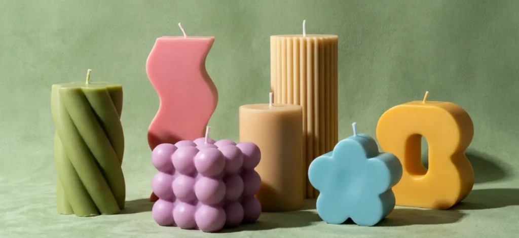
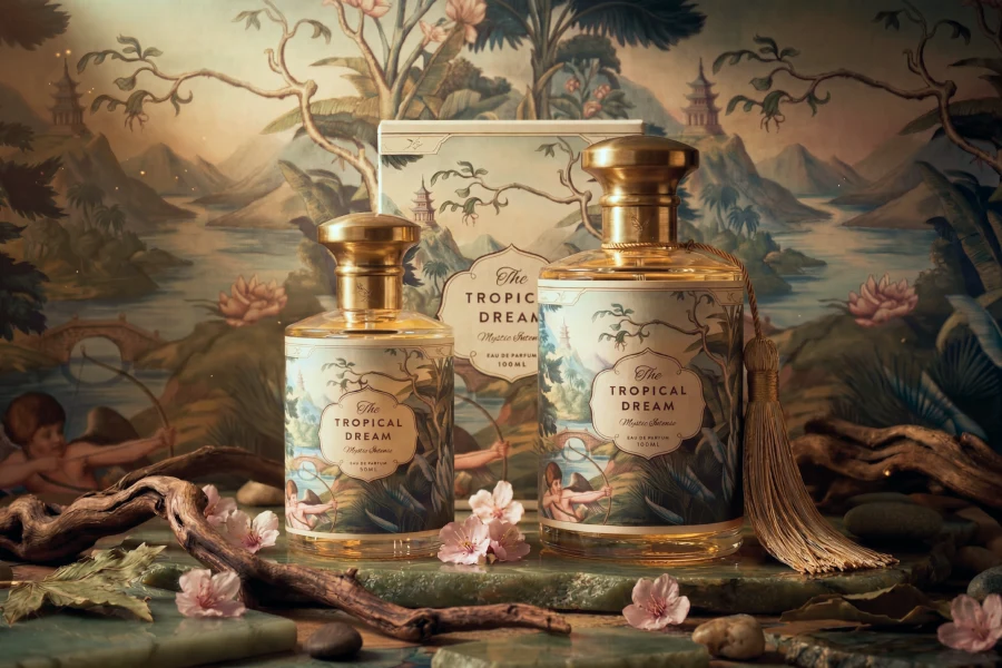
Packaging & labels

If there’s one place chinoiserie feels completely at home, it’s packaging.
Especially for products that benefit from a sense of:
- craftsmanship
- tradition
- indulgence
Think candles, tea, perfumes, skincare, specialty foods.
A chinoiserie-inspired label instantly adds depth — it makes the product feel considered, not mass-produced.
If your product sits on a shelf next to 20 others, chinoiserie can be your unfair advantage. It adds detail without needing louder colors or bigger type.
Editorial & print design
Posters, book covers, art prints — this is where you can push it further.
Because you’re not limited by branding rules, you can:
- go heavier on detail
- build full scenic compositions
- experiment with layering and texture
This is where chinoiserie stops being “decorative” and starts feeling expressive.
Wedding & event design

This one’s almost a given.
Chinoiserie naturally leans romantic, ornate, and slightly nostalgic — which makes it perfect for:
- invitations
- save-the-dates
- menus
- signage
It also adapts really well to custom color palettes, so you can keep it on-theme without losing the style.
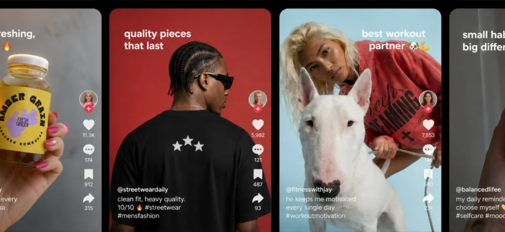
Social media (yes, but carefully)
Chinoiserie can work beautifully on social — but it needs restraint.
Feeds move fast. Too much detail gets lost.
The sweet spot is:
- one strong motif
- clean typography
- plenty of negative space
That way, it still reads instantly — even on a small screen.
Design for scroll speed. If your chinoiserie layout only works when someone zooms in, simplify it.
Where it doesn’t work (or needs a lighter touch)
Not every brand needs this level of ornament.
Chinoiserie can feel out of place when the brand is built around:
- speed
- utility
- ultra-minimalism
- tech-forward clarity
That doesn’t mean you can’t use it at all — it just means you use it sparingly.
A border. A background. A subtle pattern.
Sometimes that’s all you need.
How to create chinoiserie designs in Kittl
Chinoiserie works best when it feels cohesive across multiple touchpoints — labels, posts, packaging, prints — not like a one-off experiment.
And Kittl is surprisingly well-suited for that kind of workflow.
Start with a real use case (not a blank canvas)

Before you add a single branch or bird, decide what you’re actually designing.
Is it:
- a candle label?
- a tea package?
- a wedding invite?
- a social post?
Chinoiserie needs context to work. It’s not just decoration — it’s applied decoration.
Once you have that, set up multiple artboards so you can think beyond one layout from the start.
You can also check out our templates here to give you a solid kickstart:

Timeless Elegance Chinoiserie Design. Use Template

Porcelain Dreams Chinoiserie Design. Use Template

Well With My Soul Chinoiserie Design. Use Template
Designing one layout is easy. Designing a system is what makes your work look professional.
Build your motif library first

Instead of jumping straight into layout, gather your visual ingredients:
- birds
- branches
- florals
- ornamental frames
- subtle scenic elements
You can:
- pull from Kittl’s elements library
- or generate your own using Kittl’s AI Image Generator
The key is consistency. Everything should feel like it belongs to the same world.
Use AI — but lock in a style early

The AI Image Generator or other AI tools can speed things up — but it can also completely derail your design if every element looks like it came from a different universe.
Chinoiserie especially relies on visual consistency, so the goal isn’t to generate more — it’s to generate cohesively.
Start by creating a small, controlled set of assets:
- One hero motif (e.g. bird + branch)
- One supporting element (frame, corner ornament, or floral accent)
- One background or repeat pattern
Then build everything else from that foundation.
Chinoiserie falls apart fast when every element looks like it came from a different prompt. Consistency > quantity.
Prompt ideas that actually work
Instead of vague prompts like “chinoiserie bird”, you want to anchor the style with material, composition, and mood:
Hero motif (main visual)
“hand-painted chinoiserie bird perched on flowering branch, delicate ink outlines, porcelain style, ivory background, elegant composition, minimal color palette”
Supporting element (frame or ornament)
“ornamental chinoiserie border frame with floral vines, symmetrical corners, vintage engraving style, fine linework, subtle gold accents”
Pattern / background
“seamless chinoiserie pattern with peonies and butterflies, soft blue and white porcelain style, balanced spacing, repeat tile”
Find one prompt that works, then iterate on it instead of starting fresh every time. Consistency in wording = consistency in visuals.
Compose like a surface designer
Now you can start building your layout.
Think in layers:
- Background (clean or lightly textured)
- Hero motif (main visual focus)
- Supporting elements (branches, borders, accents)
- Typography
Don’t try to fill every space.
Let the composition breathe — that’s what gives chinoiserie its elegance.
Handle typography carefully

Chinoiserie is already expressive. Your type doesn’t need to compete.
Skip novelty or faux “Asian-style” fonts.
Instead, go for:
- High-contrast serif
- Refined script
- Elegant display type
Let the visuals carry the theme. Let the typography anchor it.
Turn one design into multiple outputs
Once your first layout works, duplicate it across formats:
- Square post
- Vertical story
- Packaging mockup
- Print version
This is where Kittl’s workflow really shines — because you can quickly create and resize artboards for multiple channels with our flexible infinite canvas.
Mock it up (don’t skip this)

This is the difference between “nice design” and “sellable design.”
Place your work on:
- Packaging
- Products
- Prints
Achieve this in seconds with Kittl’s mockups and see them live on the product!
Chinoiserie especially benefits from context — it was never meant to live on a blank canvas.
Key takeaway: Build the feeling, not just the look
Chinoiserie isn’t coming back just because it’s beautiful.
It’s coming back because people are craving something to feel again.
It gives you permission to:
- be a little more expressive
- a little more ornamental
- a little more indulgent
To romanticize the layout instead of just solving it. It builds a little world inside the frame and everything feels placed, not just positioned.
If your design feels forgettable, it’s not missing more elements — it’s missing atmosphere.
And that’s where Kittl fits in.
Because chinoiserie isn’t a one-off design. It’s a system:
- a set of motifs
- a consistent style
- a composition approach that carries across everything
Kittl gives you the tools to actually build that system — generate your visuals, refine them, keep them consistent, and apply them across real formats without starting over every time.
So instead of designing something that just looks good on one screen, you’re creating something that holds up everywhere.
Check out 20 more design style you’d love
We at Kittl love exploring all kinds of design styles and Chinoiserie and Biomorphic are just a few of them. Check out more of these design trends on this YouTube video of ours and stay tuned for more breakdowns on our blog!
Also don’t forget to drop by our 2026 design style trends to stay ahead here: Steal the start: 10 graphic design trends 2026 by Kittl. Find trends like:
- Naive Design
- Blueprint Graphic Design
- Kidcore Design
- Frutiger Aero Aesthetic
- Type Collage
- Trinket Design
- Punk Grunge
- Future Medieval
- Distorted Portrait Design
- Surveillance Design Trend
- Grainy Blur
- Signal Graphics
FAQ: Chinoiserie design
What is chinoiserie design in simple terms?
Chinoiserie design is a European decorative style inspired by imagined versions of Chinese and East Asian art. It’s not an exact representation — it’s a stylized interpretation built around ornamental detail, nature motifs, and scenic compositions.
In modern graphic design, it shows up as layered, atmospheric visuals that feel more like a scene than a flat pattern.
How to pronounce chinoiserie?
The most common chinoiserie pronunciation is:
“sheen-WAH-zuh-ree.”
It comes from the French word chinois, meaning “Chinese,” which reflects the style’s origins — even if the visuals themselves are more interpretive than literal.
Is chinoiserie always blue and white?
No — not at all.
Blue-and-white is the most recognizable version because of porcelain, but chinoiserie also appears in:
- Black and gold
- Jade and cream
- Soft neutrals with ink accents
The style is defined more by composition and detail than by a fixed color palette.
What are the key characteristics of chinoiserie design?
Chinoiserie is defined by a combination of:
- Scenic, story-like compositions
- Birds, florals, and natural elements
- Asymmetry and flowing layouts
- Ornamental detail with breathing room
It’s less about repeating patterns and more about creating a layered visual atmosphere.
Where is chinoiserie used in modern design?
Today, chinoiserie is commonly used in:
- Packaging and labels
- Wedding and event design
- Editorial graphics and posters
- Social media visuals
It works especially well for brands that want to feel premium, expressive, or rooted in storytelling.
Is chinoiserie the same as Chinese design?
No — and this distinction matters.
Chinoiserie is a European interpretation of East Asian design, often blending influences and relying on imagination rather than accuracy.
If a project requires cultural authenticity, it’s better to research and reference actual Chinese design traditions instead.
How can I create chinoiserie-style designs?
Start by building a small visual system:
- Choose a consistent motif (like a bird or branch)
- Define a color palette
- Create a composition with depth and negative space
From there, you can expand it across different formats like packaging, posts, or prints. Tools like Kittl make it easier to generate, refine, and reuse these elements in a cohesive way.

Shafira is a content writer who turns boring business talk into reads people actually enjoy. She grew up hoarding $1 novels in Singapore and writing hilariously bad fiction, but now she tackles content marketing with all that creative chaos since 2019. From blogs and newsletters to UX and SEO, she writes how she thinks: nerdy, honest, and a bit offbeat. She believes the best content is human-designed, not just plain text.