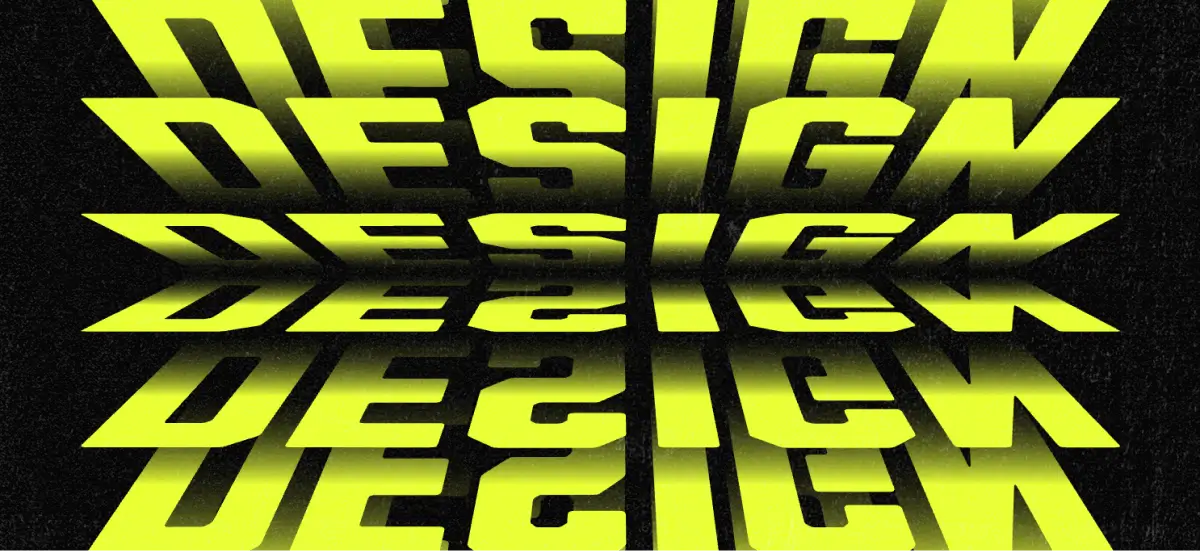
Flip text effect has that sleek, mechanical vibe that makes typography feel instantly more designed. It’s crisp, retro in the right way, and it just looks good on headlines.
A lot of people land here for the same reason: you want the effect, not the extra homework. Illustrator can absolutely do it, but it can start feeling easy to break. Change the copy, adjust the font, and suddenly you are back in the weeds rebuilding parts of the stack.
And when there’s a deadline involved, that rebuild time hurts. If you’re making something real like merch, a poster, or a quick promo graphic, you want a method that gets you to the result faster, not a long checklist.
If you’re still deciding what kind of POD products to focus on, this list of 10 easy design business ideas you can start from home can help you pick a profitable angle before you choose your next platform.
Why this flip text effect is faster without Illustrator?
If you’ve made the flip text effect in Illustrator before, you already know the vibe.
It’s not difficult, it just turns into a chain of steps that behaves nicely until you tweak one thing, then you’re suddenly walking backward through the process:
- Set up the file (artboard, background, lock layers)
- Type and align (align-to-artboard settings, center everything)
- Convert text to outlines so you can distort it
- Perspective distorts the top half
- Duplicate, scale, and align the second shape
- Blend the two shapes usingthe specified steps
- Expand the blend and ungroup everything
- Nudge spacing so it actually reads like a flip effect
- Add a gradient and dial in the angle
- Reflect (copy) to create the bottom half
- Manually align both halves, then group and center
With Kittl, you’re skipping a lot of the “no turning back” moments, so it feels easier to experiment with your flip text effect as you go.
If you want to try a different word or font, you’re not reopening a whole chain of expanded steps, and color variations are quick because you can tweak one gradient and see a whole new look instantly.
Want to see it in action? Follow along with the tutorial below.
Build the flip text effect in Kittl in 7 steps tutorial
Before we start building the flip layers, do a quick setup so everything stays clean and easy to control.
Pick your font first, then turn on the grid in Settings and keep it at a comfortable size so you can actually count the boxes. Type your word, center it, and scale it to a consistent height.
If you want a quick reminder of the different ways designers turn products into revenue, check out how to make money online with design before you pick your next platform.
1. Create the first flip text effect layer with Distort

Select your text and open the Distort transformation. Pull the left and right sides inward by one grid box, holding Shift to keep it controlled.
2. Duplicate and build the stacked depth

Duplicate the text with Alt/Option + drag, then move the copy up by one grid box. Repeat the process, using Distort each time to bring the bottom three anchor points inward, until the stack reaches about one grid box tall at the top.
3. Tighten the spacing for a cleaner flip illusion

Select the stacked layers and bring them closer together so your arrangement looks like a flip text effect. Keep the layers aligned while you adjust.
4. Add the gradient fade to sell the motion

Select one layer, switch the fill from Solid to Linear color, and set your top stop to your chosen color. Turn the bottom stop off so the text fades out.
5. Apply the same gradient across the whole stack

Select the other layers and open Group Colors. Choose the gradient swatch you just made to apply it across the stack.
6. Duplicate the group and flip it vertically

Select everything and duplicate it with Alt/Option + drag. Right-click the duplicate group and choose Flip vertical.
7. Experiment with color for different looks

Select the top gradient color and try different colors or matched combinations. Keep the bottom stop off so the fade stays consistent.
Frequently asked questions about the Rolodex flip text effect
Why does my flip text look stair-step instead of smooth?
Tighten the spacing between layers until the stack reads like one continuous flip.
Why does Distort look uneven or warped?
Redo the distortion while holding Shift, and pull the left and right sides in evenly.
Why does the stack feel too tall or too short?
Adjust your starting text height on the grid, then rebuild the stack to match.
Why does the gradient look harsh or muddy?
Turn the bottom gradient stop off, and keep the color only on the top stop.
Why don’t the top and bottom halves line up?
After Flip vertical, nudge the duplicated group until the seam looks clean and centered.
What fonts work best for a clean flip look?
Bold weights work best. The distortion + stacking + gradient fade can thin out details fast, so Bold / Extra Bold / Black usually stays clean and readable. If you go lighter, keep it to Medium at minimum and scale up the text so it doesn’t disappear after the fade.
How do I distort text in Kittl?
Select your text, then open the Transform menu on the right-hand panel and choose Distort. Drag the side handles (or anchor points) to reshape the text, and hold Shift while dragging to keep the distortion controlled and consistent.
Can I combine transformations with decorations/shadows?
Yes. You can apply a transformation (like Distort) and then add decorations and shadows on top to increase depth and separation. A simple combo is: distort your stacked layers first, then add a subtle shadow or outline so the layers read more clearly.
More text effects to try with Kittl templates
Once you’ve built the flip text effect, templates are a great shortcut for exploring other text effects.
Even when text effects have their own unique charms, the idea is the same: start from a strong base, then tweak the text, spacing, and colors to make it yours.
Here are a few template-friendly effects worth trying next:
- Cut text effect for bold, high-contrast headlines
- Bouncy stacked text for playful, dimensional type
- Cinematic crawl text for that “space intro” vibe
- Duplicate text stacks for depth without complicated setup
- Floating text for soft, layered motion
- Warped text effects when you want energy and distortion

Flip Text Effect. Edit this template

Silent Truths. Edit this template

Plot Twist. Edit this template

Floating Text Minimalist Typography. Edit this template

Bold Typography Quotes.
Edit this template

Quiet Mode On. Edit this template

Waiting The Sky Minimalist Typography. Edit this template

Introvert Brand Design.
Edit this template

Minimalist Typography.
Edit this template
Key takeaway: Flip text effect without Illustrator
If you’ve ever built it in Illustrator, you know the flip text effect workflow works, but it can get step-heavy and easy to “break” the moment you change copy or try a new font.
In Kittl, you can get the same sleek, flip-board vibe with fewer moving parts, so it’s easier to build, easier to tweak, and faster to ship. Remember:
- Start with the grid and size your text to a consistent height (four boxes is a solid baseline).
- Use Distort with Shift to keep the shape controlled and clean.
- Build the stack with Alt/Option + drag, moving each copy up one grid box.
- Tighten spacing, then add a gradient fade (top stop on, bottom stop off).
- Duplicate the full group and Flip vertical to complete the effect.
If you want to keep experimenting, templates are a great next step for exploring other typography looks like stacked text, warped and wavy styles, floating type, and 3D treatments.
Want to try more looks like this? Open Kittl and start with a template, then swap the text and colors to make it yours.