Some design trends come from nostalgia. Others come from technology. Signal graphics design is a mix of both.
This emerging graphic design trend for 2026 pulls inspiration from early computer graphics, VHS-era visuals, experimental MTV motion design, and the primitive CGI shapes that defined the early days of digital media.
Instead of ultra-polished visuals, signal graphics design embraces the quirks of early digital aesthetics: low-resolution 3D shapes, neon gradients, pixel typography, and chaotic layouts that feel playful and slightly surreal.
Designers are rediscovering the visual language of early retro computer graphics, but now they’re recreating it intentionally using modern tools and AI workflows.
The result is a bold aesthetic that feels nostalgic, experimental, and perfectly suited for the visual culture of today.
What is signal graphics design?

Signal graphics design is a visual style inspired by early computer graphics from the late 1980s and early 1990s.
The trend combines elements from:
- retro CGI graphics
- pixel typography design
- neon gradient visuals
- VHS aesthetic design
- experimental motion graphics
Instead of realistic rendering, signal graphics celebrate the limitations of early digital technology. Shapes appear primitive, lighting is dramatic, and objects often look like they were rendered using early 3D software.
In many ways, the style sits at the intersection of several other emerging trends. It shares the nostalgic energy of Kidcore, the chaotic visual rhythm of Type Collage, and the experimental machine-made aesthetic seen in AI Abstract Art.
Signal graphics design brings those influences together into a playful retro digital aesthetic.
Check out how to ace the Signal Graphics design trend in our video here:
Pro Tip
When analyzing a grainy blur composition, look for two elements working together: soft edges and visible grain texture. Without grain, blur can feel flat. Without blur, grain just looks like noise. The magic happens when the two are layered carefully.
The origins of signal graphics
Signal graphics design didn’t appear out of nowhere. It pulls inspiration from several visual movements that defined early digital culture.
Early CGI graphics
During the late 80s and early 90s, computer rendering technology was still developing.
3D shapes were created with very few polygons, which resulted in objects that looked faceted, geometric, and slightly artificial.
Those early retro CGI graphics are now instantly recognizable and have become a major inspiration for this design trend.
MTV motion graphics and experimental television design
The golden era of MTV graphics in the late 80s and 90s introduced chaotic visual systems built from:
- bright neon colors
- abstract shapes
- playful typography
- surreal compositions
Signal graphics borrow heavily from this experimental design language.
Early video games and computer interfaces
Another key influence comes from early video game graphics and operating systems.
Pixel typography, glowing gradients, primitive shapes, and lo-fi digital visuals were common in early software interfaces.
Today, designers reinterpret those visuals as a retro digital design aesthetic rather than a technical limitation.
Key characteristics of signal graphics design
Most signal graphics share several visual traits that help define the style.
Low-resolution CGI shapes

Primitive geometric objects are central to the look.
Common elements include:
- spheres
- pyramids
- torus shapes
- cubes
- prisms
These shapes often resemble early CGI graphics from the 1980s and 1990s, with visible polygon faces and simple lighting.
Neon gradients and saturated colors

Signal graphics design frequently uses vibrant color combinations such as:
- electric purple
- neon green
- bright yellow
- cyan blue
- hot pink
Gradients help add depth and recreate the lighting style of retro computer graphics.
Pixel typography and digital fonts

Typography plays a big role in this style.
Designers often use:
- pixel fonts
- monospaced digital fonts
- retro screen typography
These fonts reinforce the feeling of early computer interfaces and digital displays.
VHS and analog textures

To push the retro aesthetic further, designers sometimes introduce effects like:
- VHS scanlines
- film grain
- glow effects
- color distortion
These textures recreate the visual imperfections of older digital media.
Where you’ll see signal graphics today

Signal graphics design is appearing in many creative fields.
Music visuals and album covers
The chaotic, colorful aesthetic works especially well in music culture.
You’ll often see signal graphics used in:
- album artwork
- music festival posters
- electronic music branding
Social media graphics
The bold colors and unusual shapes stand out immediately in social feeds.
This makes signal graphics useful for:
- promotional visuals
- content campaigns
- digital posters
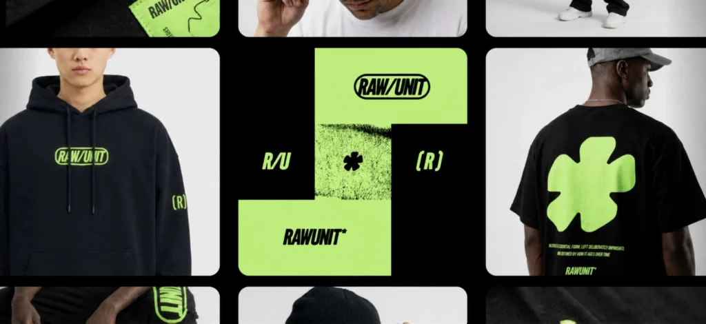
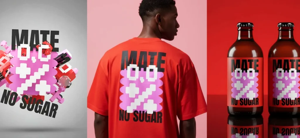
Streetwear and fashion design
Retro digital aesthetics are popular in fashion branding.
Signal graphics appear in:
- clothing graphics
- lookbooks
- marketing campaigns
- merchandise designs
How to create signal graphics design in Kittl
You don’t need 3D rendering software to experiment with this style.
With modern tools and AI workflows, it’s surprisingly easy to create signal graphics elements.
1. Start with simple geometric shapes.
These shapes were the building blocks of early CGI graphics, when computers could only render objects with a limited number of polygons. That “low-detail” look is exactly what gives this trend its retro charm.

In Kittl, you can start by drawing simple shapes using the shape
Almost every Signal Graphics composition begins with primitive objects: spheres, pyramids, cubes, torus shapes, or abstract polygon panel or the pen tool. Don’t worry about making them complex. In fact, the simpler they are, the more authentic the style will feel.
Try placing several shapes on the canvas in different sizes and positions. Think of them less like finished objects and more like raw ingredients for the design.
Pro Tip
Signal Graphics works best when shapes feel slightly awkward or imperfect. If everything looks too symmetrical or polished, simplify it.
2. Turn your shapes into retro CGI elements using AI

This is where the style really comes to life.
Instead of manually building 3D objects in separate software, you can transform your flat shapes into retro CGI graphics using Kittl’s AI Image Generator.
Upload or reference the shapes you created and generate an image using a prompt like:
turn these flat shapes into low resolution CGI from 1982 to 1992, primitive polygon rendering, early computer graphics style, dark blue background
You can also try other prompts of your liking! To learn more about prompting to AI, find everything you need to know about it in our guide here.
The result will often look like something pulled straight from an old computer animation: chunky shapes, faceted lighting, and slightly strange shading.
Don’t expect the first generation to be perfect. Part of the fun with this trend is experimenting with multiple generations until you find something interesting.
Pro Tip
If the result looks too modern or realistic, add phrases like “primitive polygons,” “retro CGI,” or “low resolution rendering.” These help push the output toward the vintage aesthetic.
3. Remove the background and build your composition

Once you generate your retro CGI shapes, you can remove the background and reuse them as graphic elements.
This is where Signal Graphics becomes flexible. Those objects can now be:
- scaled
- rotated
- layered
- repeated
- combined with other shapes
Try spreading them across the canvas or stacking them around typography.
Many Signal Graphics layouts treat these shapes like floating visual anchors rather than the central focus. They help guide the viewer’s eye around the design while adding a playful, surreal energy.
Pro Tip
Don’t overfill the canvas. Two or three well-placed shapes often look stronger than a dozen scattered ones.
4. Add pixel or digital typography

Typography plays a big role in selling the aesthetic.
Signal Graphics often uses fonts that feel like they belong on early computer interfaces or video game displays. Pixel fonts, monospaced digital fonts, or display typefaces with a “screen-like” appearance work especially well.
In Kittl, try searching the font panel for keywords like:
- pixel
- digital
- mono
- screen
Once you choose a typeface, experiment with simple layouts. Signal Graphics typography usually feels bold and direct rather than complex.
A short phrase or title often works better than a long paragraph.
Pro Tip
Pure white text can sometimes look too modern. Try slightly muted gray or off-white instead to mimic older display screens.
5. Introduce gradients and glow

Color is what gives Signal Graphics its playful energy.
Neon gradients were common in early computer graphics because they helped create the illusion of lighting and depth. You’ll often see combinations like purple fading into blue, bright green highlights, or warm orange glows.
In Kittl, you can apply gradients to backgrounds, shapes, or even typography. Radial gradients often work particularly well behind floating shapes.
Adding glow effects or soft shadows can also help your objects feel more dimensional.
Pro Tip
Dark backgrounds usually make neon gradients pop more. Deep navy, black, or dark purple are great starting points.
6. Finish with analog textures

The last step is adding subtle imperfections.
Signal Graphics often includes small touches that make the design feel slightly analog or nostalgic. This might include grain overlays, glow effects, or faint VHS-style distortions.
You don’t need much. Even a very light texture layer can push the design closer to that retro digital look.
In Kittl, try experimenting with:
- grain textures
- glow effects
- soft blur
- subtle color distortion
These finishing touches help the design feel less like modern vector graphics and more like something captured from early digital media.
Pro Tip
If the design starts feeling messy, reduce texture opacity. Signal Graphics should feel nostalgic and experimental — not chaotic to the point of distraction.
Common mistakes when designing Signal Graphics
Signal Graphics may look chaotic and experimental, but there’s still a balance that makes the style work. Here are a few pitfalls designers often run into when trying it for the first time.
Making the shapes too realistic
The charm of Signal Graphics comes from primitive digital aesthetics. If your objects start looking like modern 3D renders, the nostalgic effect disappears.
Instead of detailed models, aim for shapes that feel simple and geometric. Slightly awkward lighting and visible polygon edges actually help sell the style.
Signal Graphics may look chaotic and experimental, but there’s still a balance that makes the style work. Here are a few pitfalls designers often run into when trying it for the first time.
Overloading the canvas with objects
It’s tempting to fill the entire design with shapes and gradients, but that can quickly become overwhelming.
Signal Graphics often works best when shapes act as accent elements that support the layout rather than dominate it.
Give the design space to breathe so the shapes and typography can stand out.
Using overly polished typography
Clean modern fonts can clash with the retro digital aesthetic.
Instead, look for fonts that feel like they belong on a screen or old computer interface. Pixel fonts, digital-style typefaces, and monospaced fonts tend to work best.
Forgetting about contrast
Bright neon gradients are a major part of the style, but they only work when there’s strong contrast.
Dark backgrounds help make shapes glow, and slightly muted text colors help prevent the design from feeling too modern.
Treating the shapes as decoration only
The most interesting Signal Graphics designs treat shapes as part of the composition.
They can frame text, guide the eye across the layout, or create a sense of motion in the design. Thinking of them as structural elements instead of decoration often leads to more interesting results.
Explore more 2026 design trends

Signal Graphics is just one of the many creative styles shaping design in 2026.
This year’s trends show designers embracing experimentation, nostalgia, and unexpected combinations of digital and analog aesthetics.
Some other trends from the Kittl 2026 Design Trend Report explore similar creative territory. For example:
- Grainy Blur, which uses soft gradients and texture to create dreamy atmospheric visuals
- Type Collage, where typography becomes the main visual element of the design
- Trinket Design, which turns collections of objects into graphic compositions
- Future Medieval, blending ancient symbolism with futuristic visuals
Together, these trends show how designers are pushing visual language in new directions while drawing inspiration from the past.
If you’re curious to see how these styles connect, explore the full report below.
Key takeaways: Why Signal Graphics is worth experimenting with
Signal Graphics proves that not every design trend needs to be polished or minimal.
Sometimes the most interesting visuals come from revisiting the strange, experimental graphics of the past and giving them a modern twist.
By combining retro computer graphics, pixel typography, neon gradients, and AI-generated elements, designers can create visuals that feel playful, nostalgic, and surprisingly fresh.
Even if Signal Graphics doesn’t become your everyday style, experimenting with it can sharpen your eye for color, composition, and visual rhythm.
And sometimes the best ideas come from styles that feel a little weird at first.
FAQ: Signal Graphics design
What is Signal Graphics in graphic design?
Signal Graphics is a design style inspired by early computer graphics from the late 1980s and early 1990s. The style uses low-resolution CGI shapes, pixel typography, neon gradients, and VHS-style textures to create visuals that feel retro and experimental.
Designers use Signal Graphics to recreate the charm of early digital aesthetics while combining them with modern tools and layouts.
Why is Signal Graphics trending in 2026?
Many designers are exploring nostalgic digital aesthetics again. Early computer graphics, VHS visuals, and experimental motion design have become a source of inspiration for modern graphic styles.
Signal Graphics taps into that nostalgia while also benefiting from modern tools like AI image generation, which makes it easier to recreate retro CGI visuals without complex 3D software.
Do you need 3D software to create Signal Graphics?
Not necessarily.
While early versions of the style were created using 3D rendering tools, modern workflows make it easier to generate similar visuals.
Designers can create simple shapes and transform them into retro CGI elements using tools like Kittl’s AI Image Generator, then integrate them into layouts with typography and gradients.
Where can Signal Graphics be used?
Signal Graphics works especially well in projects that benefit from bold and experimental visuals.
Common applications include:
- album covers
- music posters
- social media graphics
- streetwear design
- digital art and editorial visuals
Because the style is colorful and nostalgic, it often stands out in fast-moving digital environments.

Shafira is a content writer who turns boring business talk into reads people actually enjoy. She grew up hoarding $1 novels in Singapore and writing hilariously bad fiction, but now she tackles content marketing with all that creative chaos since 2019. From blogs and newsletters to UX and SEO, she writes how she thinks: nerdy, honest, and a bit offbeat. She believes the best content is human-designed, not just plain text.