Most product photography advice is stuck in the wrong decade. It still talks like the goal is one clean photo on one product page. That isn’t how small brands sell anymore. Your product image has to work across your store, your marketplace listing, the launch email, an Instagram post, a paid ad, a mockup, the wholesale sheet, and a short video. One photo, many jobs.
So your photoshoot isn’t the strategy. It’s the input. The strategy is what you build from it.
What is product photography, actually?
Product photography is the commercial imagery that shows what a product looks like, how it works, and why it’s worth buying. It covers studio shots on a plain background, close-up detail, lifestyle scenes, packaging, scale references, and the product in use.
Each type answers a different question. Strong product photography doesn’t only make something look good. It tells a shopper how big it is, what the color really is, how the texture reads, and whether the quality holds up. It answers the questions they’d ask if they could pick the thing up.
Your shoppers want more photos than you’re giving them
Now, let’s start with the real problem.
Shoppers do not experience your product page like a neat landing page. They scan. They zoom. They compare. They look for proof.
A Forrester survey cited by NIQ found that 63% of consumers use product images when shopping online, 61% use multiple images, and 66% rely on zoom. NIQ also found that 40% of top retailers showed two or fewer images on average, while less than 30% shared more than four images on product pages. This is why one hero image is never enough.
That gap is your opportunity.
Most brands do not lose because they lack one “nice” product photo. They lose because the visual system is thin.
Below, you’ll find what to shoot, how to light it, and how to get there without a studio.
The new rules of product photography
A small brand doesn’t need more content. It needs a system it can reuse.
That system starts with one accurate master photo. Not the moodiest shot. Not the most “creative” shot. The most truthful one. That means a clear label, real colour, correct shape, sharp edges, visible material, and enough resolution to survive a zoom. No odd shadows. No texture that isn’t there.
That image is your anchor. Everything else comes off it: cutouts, branded layouts, mockups, ads, social posts, and motion. All built from one source, so your product looks like itself everywhere it shows up.
The product stays real. The campaign starts moving.
Do not let AI invent the product
Now the uncomfortable part.
Fully AI-generated product photography isn’t always the smart move. If the product is fictional, go wild. If the product is real, be careful.
Your logo can’t come out “almost right.” Your label can’t shift. Your bottle can’t grow a new curve. Your candle jar can’t float like it skipped physics.
That isn’t a design problem. It’s a trust problem. A shopper who spots one thing that looks off stops believing the rest of the page, including your copy, your reviews, and your price.
So use AI for the environment, not for the product itself.
Start with a real photo of the real thing. Then build the world around it: the surface it sits on, the light, the season, the room it belongs in. Same bottle, same label, ten different scenes. In Kittl, you upload your own product shot as the reference, so what you’re generating is the setting, not the thing you’re selling.
Start with the real product. Then build better worlds around it.
The six assets your product photo should become
One master product photo should become at least six practical assets.
Not because “more content” sounds good, but because each asset answers a different buyer question.
| Assets | Buyer question | What to do in Kittl |
| Product-only image | What exactly am I buying? | Clean cutout on a neutral background |
| Detail close-up | What does it feel like up close? | Cropped texture, label, material, or finish |
| Scale image | How big is it in real life? | Product beside a hand, shelf, pouch, or object |
| Lifestyle scene | Where does this fit in my life? | AI-assisted background or styled composition |
| Social post | Why should I care now? | Template with one message and one product |
| Campaign banner | What is the launch story? | Branded hero with headline, product, and offer |
The goal is not to make every image beautiful. The goal is to make every image useful.
Beauty helps. Clarity sells.
Your lifestyle image needs proof, not just vibes
Lifestyle images aren’t decoration. They show the product in the buyer’s world.
PowerReviews’ 2024 visual UGC report, based on 15,870 U.S. consumers, found that 60% of shoppers always search for user-generated photos or videos before purchase. Shoppers looking for visual UGC mainly want to see what a product looks like in real life, understand size or sizing, and judge quality or performance.
Read that as a brief. Those are the three questions your images have to answer before a shopper will commit.
Lifestyle scenes work because they close the gap between what you’re showing and what the buyer has to imagine. Don’t make someone picture the candle on a bedside table. Show it there.
Don’t make them work out how the serum fits into a morning routine. Show the hand, the shelf, the light. Don’t leave them wondering whether the tote print looks cheap. Show the weave up close.
Then build out from your one real product photo. Bathroom shelf, desk, kitchen counter, gift box, seasonal set, retail display. Same product, more proof, and no reshoot.
Brand imagery doesn’t replace customer photos. The same report found nearly a quarter of shoppers won’t buy without them. Your lifestyle scenes carry the page until real customer photos start arriving, and then they work alongside them.
UGC-style assets are now part of the product page
Your polished brand photos aren’t enough. PowerReviews found that 91% of shoppers are more likely to buy a product when its reviews include photos and videos, not just text. And 23% won’t buy at all without customer photos or videos. Among Gen Z, that’s 36%.
That’s not permission to fake customer content. Don’t. It means your own visuals should sit closer to how people actually shop. A hand holding the item. A bathroom shelf shot. A desk flat lay. An unboxing-style image. A “what’s inside” carousel. A before-and-after, when it’s accurate.
Format these in Kittl for your PDP gallery, social, and ads. Keep the product accurate. Keep the layout quick. Keep the message simple.
Don’t over-polish until it reads as fake. The shopper wants proof.
Give them proof.
Your buyers research you on social too
Your product page isn’t the only place people research you.
GWI reports that search engines and social media are close for product research, with 50% of consumers using search engines and 45% using social media. For Gen Z, social networks already lead, with 50% using social networks for product research compared with 45% using search.
That changes the brief. Your product photo can’t only work as a square on your own site. The same shot has to hold up as a Reel cover, a Story, a Pinterest pin, a paid ad, and a launch post, at five different crops and three different aspect ratios.
Which is what templates are actually for. Not to save you from thinking. To hold the line when the volume goes up and the deadline doesn’t move.
This is where the brand kit earns its keep. One product photo, one set of brand settings, and every format you need for the week. Your listing and your Reel cover look like the same brand, because they came from the same place.
Your gear isn’t what makes you look like a brand
A better camera helps. It isn’t what sets you apart.
Anyone can buy a lightbox. Anyone can follow a white-background tutorial. Anyone can shoot in portrait mode. What’s harder to copy is consistency: your product looking like itself on the site, in the ads, in the emails, and on the shelf.
That means the same colours, the same crops, the same shadows, the same scale, and the same type, every time. Not because a rulebook says so, but because that repetition is what makes a small brand read as a real one.
Kittl’s Brand Kit is where those settings live. Set them once, and everything you build after that pulls from the same place. Consistency stops being something you have to remember.
New campaign. New SKU. New season. Same brand.
That’s how small brands look bigger. Not by making more assets. By making connected assets.
Mockups are not fake when the product is still in progress
Some brands wait too long to make launch visuals. They wait for final packaging, then the shoot, then the edits, and launch day slips again. Mockups solve a different problem.
They let you sell, test, and present before anything is physically ready: packaging concepts, label previews, print-on-demand listings, wholesale decks, investor updates, retail outreach, pre-launch pages, and internal approvals.
Pick from thousands of mockups right in your browser, and download them watermark-free. A mockup won’t replace final product photography forever. But it moves you forward while the product is still becoming real.
Motion is no longer optional for product brands
Static images still matter. But video is part of the buying journey now.
Wyzowl’s 2026 survey found that 96% of people have watched an explainer video to learn about a product. 85% have been convinced to buy after watching one. 89% say video quality affects brand trust. And 63% prefer short video when they’re learning about a product.
That doesn’t mean you need a film crew.
It means your campaign should include motion. A rotating mockup. A short launch clip. A benefit animation. A moving ad creative. A before-and-after scene. A 6-second vertical product reveal.
Turn static mockups into short product videos, right on the same canvas. Animate your social content and keep the same layouts and type across every frame.
Your product photo becomes a campaign. Your campaign becomes motion.
How to do product photography, not just taking product photos
Here is the practical system of product photography setup that you need to know.
Start with one accurate product photo, then build nine outputs. Here’s what that looks like, built out in Kittl.
1. Clean ecommerce image
Remove the background. Place the product on a clean neutral layout. Keep the label readable. This is your primary product-page image.


Try this prompt in Kittl
Create a clean e-commerce product photograph of [OBJECT/REFERENCE PICTURE] isolated on a pure white studio background. Show only the object, with no props, no hands, no packaging, no lifestyle elements, and no decorative background details. Keep the composition minimal, premium, and commercially usable.
Photograph the object in a dynamic but versatile hero angle, such as a slightly rotated three-quarter view or a clean front-facing angle that clearly shows the product shape, depth, and key design details. The pose should feel polished and professional, while remaining neutral enough to work for many different product types later. Make the object the sole focus, centered or slightly offset with generous negative space, so the setup can be easily reused for another product input.
Use soft diffused studio lighting with balanced highlights, controlled reflections, and a subtle natural shadow beneath the object to ground it realistically on the white background. Preserve accurate material behavior, true color, realistic texture, and crisp edge definition. Maintain sharp focus across the product, with high-detail commercial product photography quality suitable for e-commerce listings, catalog assets, marketplace thumbnails, and product page hero images.
Requirements: photorealistic, isolated object, pure white background, clean studio look, premium catalog quality, realistic reflections, subtle contact shadow, no clutter, no text, no watermark.
Recommended Image Model : Nano Banana 2
2. Detail close-up
Crop into texture, label, material, ingredients, print finish, stitching, or packaging detail – a vital point in your e-commerce product photography. This helps shoppers inspect quality,


Try this prompt in Kittl :
Create an extreme macro product photograph of [OBJECT FROM THE REFERENCE IMAGE], using the reference image as the exact source of truth for its design, proportions, colors, construction, and materials. Preserve the product unchanged. Do not redesign, simplify, recolor, replace, or invent any component. Use a dedicated macro lens, approximately 100mm, at very close shooting distance. Use controlled shallow depth of field, with the key material detail in razor-sharp focus and the surrounding areas falling into a smooth, gradual blur. Apply focus stacking where necessary so the important texture remains readable without making the image unnaturally flat. Light the object with a soft directional key light that skims across the surface to reveal relief and texture, a subtle fill light to preserve shadow detail, and restrained rim lighting to separate the edges from the background. Keep reflections controlled and physically plausible. Use a clean pure white studio background, with only a faint natural grounding shadow when visible.
Recommended Image Model: Nano Banana Pro 4K
3. Scale reference
Place the product near a hand, shelf, tote, pouch, bathroom counter, or comparison object. The buyer should understand size without reading specs.

Try this prompt in Kittl :
Create a clean commercial product photograph of [PRIMARY OBJECT FROM THE REFERENCE IMAGE], using the reference image as the exact source of truth for its design, shape, proportions, colors, construction, materials, and surface details.
Before generating, replace every placeholder with the correct product and comparison measurements. Do not estimate or invent missing dimensions.
Primary object details
- Object type: [INSERT OBJECT TYPE]
- Height: [INSERT HEIGHT + UNIT]
- Width or outer diameter: [INSERT WIDTH OR DIAMETER + UNIT]
- Depth or thickness: [INSERT DEPTH + UNIT]
- Additional relevant measurement: [INSERT INNER DIAMETER, CAPACITY, BAND WIDTH, HANDLE LENGTH, OR OTHER DIMENSION]
Comparison object details
- Comparison object: [INSERT FAMILIAR COMPARISON OBJECT]
- Exact height: [INSERT HEIGHT + UNIT]
- Exact width or diameter: [INSERT WIDTH OR DIAMETER + UNIT]
- Exact depth or thickness, when relevant: [INSERT DEPTH + UNIT]
- Quantity: [INSERT NUMBER OF COMPARISON OBJECTS]
Show the primary object at a believable real-world scale by placing it side by side with the comparison object. Position both objects on the same flat surface plane, with matching camera perspective and no overlap. Leave a small, even gap between them so their relative sizes can be compared immediately.
Scale both objects according to the supplied measurements. The size relationship must be physically plausible and mathematically proportional. Do not enlarge the primary object for emphasis, shrink the comparison object, or use perspective distortion to manipulate their apparent dimensions.
Keep the primary object as the hero subject. The comparison object should remain secondary, but fully visible, recognizable, and large enough to function as a clear size reference.
Preserve the primary object unchanged. Maintain its exact geometry, component placement, proportions, colors, materials, textures, finishes, logos, labels, decorative details, and craftsmanship from the reference image. Do not redesign, simplify, recolor, replace, remove, or add any component.
Photograph the scene from a slightly elevated three-quarter angle or near top-down angle, selected to show the primary object’s dimensions clearly while keeping both objects equally readable. Avoid extreme wide-angle lenses or dramatic camera angles that could distort scale.
Recommended Image model : Nano Banana Pro 4K or Seedream 5 Pro
4. Lifestyle scene
Use the real product as the anchor. Build the scene around it. Keep the setting relevant to the product use case.

Try this prompt in Kittl
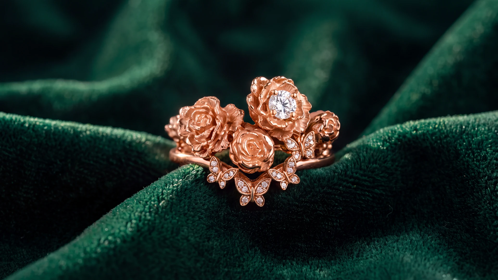
Create a lifestyle product photograph featuring the ring from the reference image as the hero subject. Treat the reference as the source of truth for the ring’s design, proportions, floral arrangement, gemstone placement, band structure, metal color, finish, and craftsmanship. Preserve the product unchanged. Do not redesign, simplify, recolor, resize, replace, remove, or add any component. Stage the ring inside a Victorian dressing room with the atmosphere of a vanity in a stately home. Place it naturally on an ornate carved-wood dressing table beside an antique hand mirror, crystal perfume bottle, silver hairbrush, porcelain trinket dish, lace, velvet ribbon, or jewelry box. Keep supporting objects secondary. Avoid clutter and exclude electronics, furniture, and branding. Use authentic materials and styling: polished mahogany, antique brass, aged silver, crystal, ivory porcelain, cream lace, floral wallpaper, and dusty rose velvet. Render each surface with believable detail, including wood grain, tarnished metal, translucent glass, woven lace, plush velvet, polished gemstones, and reflective rose-gold metal. Photograph the scene with a wide-lens look using a 35 mm lens from a elevated three-quarter tabletop angle. Show more of the vanity and room while keeping the ring dominant. Make the ring appear small and delicate within the composition, occupying less of the frame, with more environment and negative space. Keep the ring sharp with softer falloff behind it. Use warm window light as the key light, fill from the opposite side, and a restrained rim highlight. Create reflections, gemstone brilliance, contact shadows, and believable light falloff. The final image should feel romantic, aristocratic, intimate refined and Victorian, polished for a luxury jewelry campaign. Editorial lifestyle photography, accurate product fidelity, realistic scale, elegant composition, no text, no hands, no people, no altered jewelry, no excessive sparkle, and no distracting props.
Recommended Image Model : Nano Banana Pro 4K or ChatGPT 2.0
5. Collection image
Line up SKUs with consistent scale and spacing. This helps shoppers compare variants, scents, colors, sizes, or bundles.


Try this prompt in Kittl
Recreate the reference image in [insert Hex color or material color].
Recommended Image Model : Nano Banana Pro 4K or Seedream 5 Pro
6. Social post
Turn the product into a message. One claim. One hook. One visual idea. Do not cram five selling points into one square.

Try this prompt in Kittl
Create a premium square social media post about wedding proposals, featuring the proposal ring from the reference image as the hero product, with no humans in the scene. Treat the reference image as the exact source of truth for the ring’s design, proportions, floral arrangement, gemstone placement, band structure, metal color, finish, and craftsmanship. Preserve the ring unchanged. Do not redesign, recolor, simplify, resize disproportionately, remove, replace, or add any jewelry components.
Stage the ring in a romantic proposal-inspired setup. Place it inside an open heart-shaped ring box made from rich red velvet, positioned as the main visual anchor. Surround it with a tasteful arrangement of soft roses, scattered rose petals, and elegant proposal details such as a silk ribbon, soft cream fabric, or subtle candlelit ambience, while keeping all supporting elements secondary. The scene should feel emotionally charged, luxurious, and aspirational, evoking the anticipation and tension of waiting for a proposal.
Compose the image so the ring box sits slightly off-center, with the ring clearly visible and sharply rendered. Leave clean negative space for the headline. Use warm, romantic lighting with soft shadows, controlled gemstone brilliance, and realistic material behavior across velvet, petals, metal, and gemstones. The atmosphere should feel intimate, elegant, and cinematic without looking cluttered or overly theatrical.
Add the exact hook:
“Still Waiting For Forever?”
Set the text in elegant, high-contrast serif typography, large enough to read instantly on mobile. Keep the text separate from the ring and detailed objects. Use strong visual hierarchy and refined spacing. The palette should center on deep red, blush, ivory, and soft metallic accents.
Recommended Image Model : Ideogram 4.0 for initial post idea, then use it as reference on ChatGPT2.0
7. Paid ad creative
Use the product, one pain point, one benefit, and one action. The layout should work fast on mobile.

Try this prompt in Kittl
Create a premium square paid-social advertisement, presenting its reference ring as an object of ethereal beauty engineered for real-world endurance. Feature the ring as the dominant hero product, standing upright and completely intact on a refined stone or brushed-metal pedestal. Preserve the ring’s exact design, proportions, gemstone placement, metal finish, construction, and craftsmanship from the reference image. Do not redesign, recolor, simplify, enlarge disproportionately, remove, or add components. Place fragments of an inferior broken ring on the lower edge of the composition. Include a snapped band, bent prongs, a detached gemstone, and small damaged metal fragments. Keep these pieces clearly separated from the Telesca ring so they represent the customer’s fear of fragile jewelry, not damage to the hero product. Render the fragments with dull metal, weakened joints, and restrained detail. They must remain secondary. Give the Telesca ring a poised, commanding presentation rather than a delicate or helpless appearance. Use a slightly low camera angle, controlled rim lighting, and a clean vertical silhouette to communicate confidence, resilience, and quiet authority. Balance this strength with luminous gemstones, refined floral details, graceful curves, and a subtle ethereal glow. Add the exact headline: BEAUTY WITH BACKBONE. Add the supporting line: Ethereal design. High-endurance craftsmanship. Include a compact trust statement: Protected by a lifetime warranty. Add one clear call to action: CHOOSE A RING THAT ENDURES Use elegant high-contrast serif typography for the headline and a restrained modern sans-serif for supporting copy. Build a clear hierarchy that reads quickly on mobile. Keep the text away from the product and broken fragments. Luxury jewelry advertising, one pain point, one benefit, one action, dramatic but refined lighting, realistic metal stress and gemstone behavior, crisp product detail, premium ivory, silver, charcoal, and muted blush palette, square 1:1 composition, no people, no hands, no unrelated props, no excessive sparkle, no clutter, and no additional messaging.
Recommended Image model : Nano Banana Pro, then improve it using Seedream 5 Pro

Jewelry Ad Template. Use Template

Pink Jewelry Ad Template. Use Template
8. Mockup
Apply the product or design to packaging, apparel, stickers, mugs, boxes, pouches, or retail displays. Use this for launches, pitches, and pre-production assets.


Try this prompt in Kittl
Create a premium product mockup presentation featuring the ring from the reference image as the hero product. Treat the reference image as the source of truth for the ring’s design, proportions, floral arrangement, gemstone placement, band structure, metal color, finish, and craftsmanship. Preserve the product unchanged. Do not redesign, simplify, recolor, resize, replace, remove, or add any component.
Design the mockup so it clearly explains how the product is used. Show the ring being worn naturally on the ring finger in a refined commercial lifestyle setup, so the viewer immediately understands its purpose as wearable jewelry. Include one elegant hand with realistic anatomy and correct finger count, posed naturally to display how the ring sits on the finger. Keep the hand secondary and the ring as the hero. Show enough of the hand posture to clarify fit and wear.
Support the main in-use view with additional mockup cues that reinforce usage, such as the ring placed beside an open ring box, a jewelry tray, or styling items associated with wearing and storing fine jewelry. Make burgundy silk sateen a key styling material in the mockup, used as a luxurious draped fabric beneath or around the ring, adding sheen and romantic depth.
Use clean, high-end commercial styling with soft diffused lighting, controlled reflections, subtle contact shadows, and realistic gemstone brilliance. Render believable skin texture, polished metal, gemstone clarity, and the smooth lustrous surface of burgundy silk sateen with accurate material behavior. Keep the visual language elegant, practical and easy to understand and use.
Aim for a luxury editorial-meets-ecommerce aesthetic that helps customers imagine how the ring is used in real life. The final result should feel like a polished mockup for product marketing, campaign planning, or social, with clear product function, realistic scale, elegant composition, no text, no logo, no altered jewelry, no clutter, and no distracting props.
9. Short video
Animate the product, mockup, or campaign graphic. Keep it short, clear, and branded.That is the production stack. Not random content. A system.
Try this prompt in Kittl
Create a refined lxury jewelry video that helps potential buyers understand the ring’s dimensional floral construction, gemstone placement, and how it looks from different angles.Keep the movement subtle and physically accurate. The fingers should make tiny natural adjustments while maintaining a secure grip. Preserve the exact proportions, floral arrangement, rose-gold color, stone count, gemstone shapes, band structure, and craftsmanship shown in the reference image. Use soft diffused daylight with mild directional highlights that reveal the texture of the metal and the depth between each flower. Maintain sharp focus on the ring while the fingers and background remain softly rendered.
Recommended Video Model : Seedance 2.0 4K, using Reference mode.
Product photography tips & ideas by category
Different products need different visual proof. The best product photography ideas respond to the questions customers ask before buying, such as how large the item is, how it feels, how it fits, and how it looks in a real setting. Instead of applying the same product photography setup to every object, choose backgrounds, lighting, camera angles, props, and lifestyle scenes that communicate the product’s specific value.
Candles and home fragrance
Candle photography sells atmosphere without hiding the candle. Build bedroom, bathroom, dinner table, gifting, self-care, and seasonal scenes so customers can picture when and where they’d use the fragrance. Pair those lifestyle product photos with clean packaging shots that keep the label, vessel color, wax texture, and product size easy to read.
Shoot the candle lit and unlit. A burning candle carries warmth and ambience. An unlit shot usually gives a clearer view of the label and packaging. Glass and flames throw strong reflections and blow out highlights, so keep your lighting soft and controlled, and check the packaging still reads accurately.
Cosmetics and skincare
Beauty product photography builds trust by showing texture, ingredients, scale, and where the product sits in a routine. Alongside clean cosmetic product photography on a white or neutral background, shoot texture swatches, ingredient compositions, bathroom scenes, hand-held product shots, and step-by-step routine images.
Show the formula, not just the closed packaging. Customers want to see whether it’s a cream, gel, serum, balm, oil, or mist. Product-order visuals tell them when to apply it. Scale references tell them how big the bottle, jar, or tube actually is. Keep the packaging text legible, and retouch lightly enough that the color and finish still match what arrives in the box.
Food and beverages
Food product photography creates appetite while keeping the packaging and serving format clear. Build a varied image set: package shots, ingredient layouts, plated servings, pour shots, preparation moments, close-up food textures, and bundle offers. These creative food photography ideas show customers both what’s inside and how to enjoy it.
Use light and composition to push the freshness cues. Condensation, steam, crisp surfaces, bubbles, glaze, and visible ingredients all do that work.
Keep the styling in service of the product, though. For packaged food and drink, customers should still recognize the brand, flavor, quantity, and container at a glance.
Apparel and merchandise
Clothing photography has to carry identity, design, fit, fabric, and scale. Apparel mockups and T-shirt product photography let you test a design or build campaign concepts quickly.
When silhouette, fit, drape, or fabric weight drives the decision, add model photography, lifestyle images, flat lays, close-up material shots, and front, back, and side views.
Mockups are the fast way to see one design across garments, colors, and customer segments.
Real model and product photos are the stronger proof of how the piece actually fits and moves.
For printed merchandise, add close-ups of print placement, texture, stitching, and color contrast, with the artwork left undistorted.
Jewelry and accessories
Jewelry product photography carries craftsmanship, material quality, scale, and wearability. Combine macro shots with clean-background product images, hand or neck shots, styled flat lays, gift-box scenes, and understated lifestyle photography. Customers get the close detail and a realistic sense of how the piece reads when worn.
Diffused lighting keeps reflections under control on polished metal, gemstones, glass, and watch faces.
Macro photography picks up stone settings, clasps, engraving, surface texture, and every small imperfection, so clean the piece thoroughly before you shoot.
Scale references earn their place here. An isolated shot can make a delicate piece look far bigger than it is.
Packaged consumer goods
Packaging photography runs on recognition and accuracy. Start with dependable product images: front, back, side, label, closure, and three-quarter view. Once the core packaging is represented correctly, build campaign scenes around it with lifestyle settings, ingredient props, seasonal concepts, color themes, or customer-use moments.
Keep logos, typography, label information, package proportions, and brand colors consistent across every product photo. In ecommerce product photography, the main image makes the item recognizable in a split second. Supporting images carry the features, quantities, variants, bundles, ingredients, and use cases. Style the campaign around the package, never over it.
Where product photography usually goes wrong
The mistake isn’t bad photos. It’s treating a product shoot as a one-time task. Shoot, upload, done.
That’s one job out of ten. One shoot should give you the source file for an entire launch: the product-only image, the close-up, the scale reference, the lifestyle scene, the collection shot, the social post, the ad, the mockup, and the short video.
Most tools stop at background removal. That’s where the work actually starts. In Kittl you keep going in the same workspace: build the scene, apply your brand styles, drop it into mockups, and make it move.
Shoot product photography for the campaign, not the page
Don’t shoot for one page. Shoot for the whole campaign.
A strong product photo shouldn’t die on the product page. It becomes the source image for your store, your marketplace listings, social, ads, mockups, wholesale, and motion.
That’s how small brands move fast and keep the product looking real.
Start with the real product. Build the world around it. Turn one honest photo into the full launch stack.

Kezia Sabrina is a biotechnologist turned Product Manager who pairs deep user insight with unconventional product strategy. Having worked across healthcare, e-commerce, and now graphic design, she builds pages for two distinct audiences: bots and real humans. At Kittl, she’s reworked the blog into something cleaner and easier to navigate, and occasionally writes for it herself. She owns several of its content categories, including AI Research, and writes on product thinking and SEO experimentation for e-commerce sellers, with just enough creative weirdness to stay memorable.