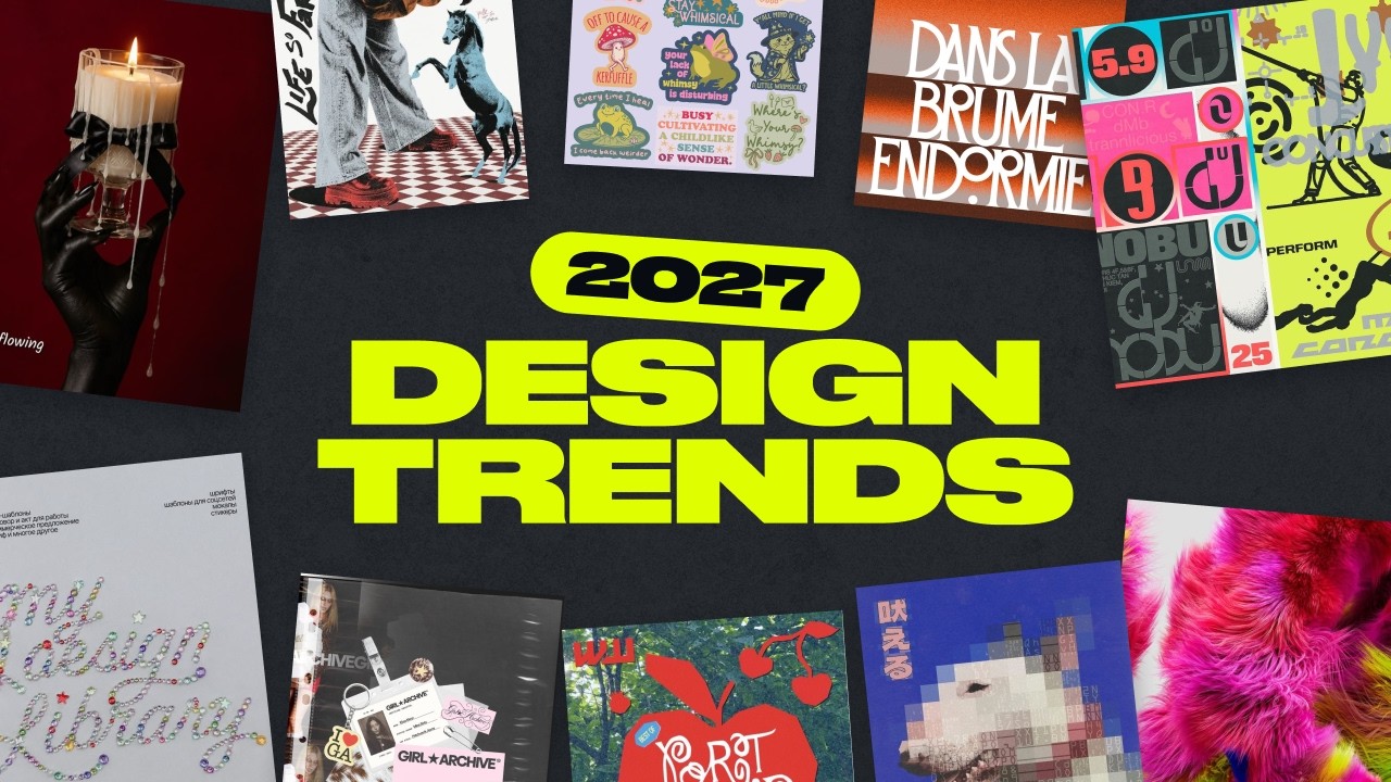
The short answer: The 10 graphic design trends for 2027 are human craft, bedazzled, collage, whimsical, mixed media, dark and gothic, low fidelity, AI hyperrealism, editorial layout, and Y2K retro. To catch the next wave first, start with editorial layout, collage, mixed media, and low fidelity. What ties all 10 together is a reaction to polished, generic AI visuals.
Our design team spent months collecting references, then voted on the styles with the most momentum. Then we checked each one against real data: what people search for online, and what creators actually design inside Kittl. This year we’ve also covered how each style works in motion, because AI tools have made video far easier to create.
One thing before we start: a trend isn’t a rule. Your brand doesn’t need all ten. Use this list to pick the one or two that fit what you sell.
The 2027 graphic design trends at a glance
Here’s the whole list on one page. Each trend shows what it looks like, where it works best, and one online demand signal, the change in searches for a related term over the past year. Skim it, pick the one or two that fit what you sell, then dive into the full breakdown below.
What’s driving design in 2027
Three forces sit behind almost every trend on this list.
1. The AI-polish backlash. Feeds are full of smooth, generic AI images. When everything looks equally polished, imperfection becomes the fastest way to show a real person runs the brand. Etsy saw the same shift: its 2026 forecast centered on “perfectly imperfect” style (VITA Daily).
2. Personality over white space. After a decade of clean minimalism, brands want character. Etsy’s Spring and Summer 2026 report named “World of Whimsy” a top trend, with whimsical jewelry searches up 84% (Etsy).
3. Video got easier. AI models can now generate, edit, and stitch short clips, so motion styles like stop-motion and video collage are no longer agency-only. That’s why this year’s list covers static and moving formats.
10 styles of graphic design trends 2027, and how brands can use them
Each trend below covers what it looks like, why it’s rising, what the search data says, and how to use it for a product brand or a print-on-demand shop.
1. Human craft and handmade
Human craft is a style built on visible imperfection: wobbly lines, naive drawings, and stamped or pressed type that proves a person made it. Yes, that means the colored pencils in the back of your drawer.
What it looks like
- Hand-drawn, naive illustration, like simple line drawings across a label
- Soft, imperfect geometric shapes with warm colors and friendly type
- Type mashups: organic letterforms, spray-paint texture, and small chromatic glitches
- Tactile type that looks stamped, engraved, or pressed into paper, clay, or metal
- In motion: stop-motion, or hand-drawn animation layered over footage
Why it’s rising: Feeds are full of polished AI images, so a visible human touch is now the fastest way to show a real person makes the product. It’s the same instinct that put chalkboard lettering in every coffee shop in the 2010s. On Kittl, the share of creators using handmade templates nearly doubled in a year.
How to use it: A hand-drawn line illustration on your label says “small batch” before anyone reads a word. It fits coffee, bakery, candles, and any food or drink brand. Keep the product name and key info clean, so the handmade part reads as a choice. Selling print-on-demand? Doodle tees, naive art prints, and sticker packs are its natural home. In Kittl, snap a photo of your sketch, vectorize it, and pair it with a hand-drawn font for a print-ready label.

Human craft and handmade trends, metal-touch. Use Workflows

Human craft and handmade trends, funny logo. Use Workflows
2. Bedazzled
Bedazzled is the rhinestone, gemstone, and crystal look applied to everything: type, logos, product photos, and the products themselves. Someone reading this just got excited. Someone else just sighed.
What it looks like
- Rhinestone and gem textures on typography, photos, and product surfaces
- Sparkle flares, highlights, and light refraction
- Candy pinks, neon blue-green, silver, and iridescent tones
Why it’s rising: It’s built for Gen Z feeds. A product dripping in crystals stops the scroll, even for people who won’t buy it. Sparkle is growing everywhere: “bedazzled” searches are up about 20% on both online search demand and Kittl.
How to use it: Treat it as a moment, not a rebrand. A bedazzled hero shot makes a strong launch teaser, holiday campaign, or limited edition, and it fits beauty, fragrance, jewelry, and streetwear best. For POD shops, rhinestone-effect hoodies and phone cases are where the demand is. Upload a product photo and run the rhinestone workflow to cover it in crystals.
Bedazzled phone case product scene with sparkly rhinestones on Iphone 18 Pro Max Burgundy. Use Workflows
Bedazzled Ipad Case product scene with sparkly rhinestones. Use Workflows

Bedazzled style product scene, jelly lip stain in red color by Smooch. Use Workflows

Bedazzled style product scene, coconut dream flavour by Jelies. Use Workflows
3. Collage
Collage is a layered composition that mixes photos, paper, drawings, app pop-ups, and video stills in one frame. Think camera roll, notifications, a magazine page, and old notebook doodles all landing on one screen.
What it looks like
- App UI layered over photos: AirDrop pop-ups, music player widgets, comment threads, and notifications
- Cut-out products with numbered references in a magazine-style layout
- Editorial “shot list” setups that show products mid-shoot or mid-edit
- Overlapping layers, mixed scale, and deliberately busy framing
- In motion: several clips in one frame, showing product details and hands using it
Why it’s rising: Collage never left, but it’s back in a phone-native form: UI pop-ups, polaroids, and torn paper in one frame. It takes real art direction to get right, which is exactly why it stands out. Collage searches on Kittl grew faster than almost any other style last year.
How to use it: Use it to sell, not as a print. Build your launch carousel as a collage: the product cut out with numbered callouts, a customer message styled as a notification, and a short clip of hands using it. It works for every category, especially apparel drops and skincare launches. POD sellers can use the same idea for listing images: lifestyle shot, close-up, and size chart in one frame. Turn one product photo into an animated ad with the stop-motion collage workflow.
Candle product photo with male model. Use Workflows
Strawberry jam as product highlight, using stop-motion collage style. Use Workflows

Collage social media post about Matcha + Ube drink. Use Workflows

Collage social media post about Matcha drink with super creamy thick milk foam. Use Workflows
4. Whimsical
Whimsical design is playful, maximal, and a little odd: mascots with googly eyes, swirling pixel lettering, and products posed next to props that make you look twice. Odd, but not too odd.
What it looks like
- Pixel and stitch-style lettering, swirls, and medieval ornaments over vintage-feeling images
- Mascots, eyeballs, watercolor textures, and a visibly handmade finish
- Unexpected props and slightly random compositions around the product
- Saturated, mismatched palettes that still feel intentional
- In motion: bouncy characters, wiggling stickers, and props that pop into frame
Why it’s rising: After years of white-space minimalism, people want brands with personality. Etsy named “World of Whimsy” a top trend for 2026 (Etsy), and on Kittl, the most-searched whimsical word is “mascot”.
How to use it: Give your brand a mascot, or put your product in a scene that tells a tiny story: a candle on a mossy cake, a hot sauce on a beach towel. It fits home, food and drink, and kids’ products naturally, and even a serious brand can borrow one odd prop for a seasonal campaign. For POD shops, whimsical sticker packs in a clear niche (pets, plants, books) are the easy win. Place your product in a playful setting with the whimsical scene workflow, or turn it into a short clip.

Surreal pastel workflows, featuring a girl wearing pastel color outfits. Use Workflows

Whimsical product scene, featuring a bottle of perfume, caterpillar and butterfly. Use Workflows

Girl in pastel color outfit – riding a whimsical fish Use Workflows

Whimsical product scene, featuring a Daruma, Japanese doll. Use Workflows
5. Mixed media
Mixed media is collage’s louder, rougher cousin: torn paper, tape, fabric, paint marks, and real objects photographed together, with a DIY finish.
What it looks like
- Layered materials: torn paper, tape, fabric, and found objects
- Screenprint and stencil textures with visible misregistration and ink bleed
- Distressed, high-contrast finishes and block-print shapes
- Unexpected scale, like oversized type next to tiny objects
- In motion: stop-motion builds, layers sliding into place, and grain over footage
Why it’s rising: It’s the louder cousin of handmade: same anti-polish energy, turned up. Halftone, grunge, and distressed textures are among the fastest-growing searches on Kittl, while online search demand has barely moved. That physical, slightly messy finish is still hard to get from a generic AI prompt.
How to use it: Use it for announcements: a drop date, a pop-up, a new collection. It suits streetwear, makers, ceramics, and music or event merch. Keep your logo clean on top so the chaos still reads as your brand. POD sellers can lean on gig posters, zine-style prints, and screenprint textures that make a digital design feel limited-run. In Kittl, layer your product photo over paper and grain textures, then add a stencil font for the headline.

Mockingjay design, inspired by Hunger Gamers. Use Workflows

A day in my life, mixed media design style. Use Workflows

Revolution theme, style in hand-crafted design workflow. Use Workflows

Japanese-folklore inspired style in hand-crafted design workflow. Use Workflows
6. Dark and gothic
Dark and gothic design is moody, metallic, and dramatic: deep shadows, sharp silhouettes, chrome details, and flashes of red against heavy gradients.
What it looks like
- Sharp silhouettes, low-key lighting, and dramatic shadows
- Metallic details in silver, chrome, or pewter
- Deep red accents on black and charcoal (green or yellow work too)
- “Grim gradients”: murky color fades that feel uneasy and atmospheric
- In motion: slow reveals out of darkness, flickering light, and fog drifting past the product
Why it’s rising: Goth is having a pop-culture moment, and our team expects an emo revival as a new generation finds mid-2000s music. It’s steady rather than surging, and it peaks every year from August to October. On Kittl, “skull” is one of the most-searched words across all ten trends.
How to use it: It’s a natural fit for fragrance, jewelry, candles, and beauty. Plan gothic campaigns for late summer into the holidays: a dark version of your hero shot, with one metallic accent and a flash of red, can carry a whole seasonal drop. For POD shops, totes, Halloween collections, and whimsigoth designs (moons, mushrooms, moody florals) do the work. Apply a dark AI Style to a product photo in Kittl, then finish it with gothic fonts and mockups.

Grim gradient style – typographic poster. Use Workflows

Gothic dark product scene with candles, pomegranates and Japanese daruma doll. Use Workflows

Perfume product scene, gothic photoshoot theme. Use Workflows

Serum product scene, being held in black leather gloves. Use Workflows
7. Low fidelity
Low fidelity is a deliberate choice not to be perfect or high-res: chunky pixels, bitmap dithering, triangle-built 3D, and flash photos that look unedited. Think lo-fi music, recorded on a phone, and better for it.
What it looks like
- Tactile, slightly “yummy” 3D renders finished with AI-assisted post-production
- Low-poly 3D: flat, triangle-based shapes that cross over with meme culture
- Archive digital: bitmap, pixel art, and stochastic pixelation
- Sun-bleached palettes
- In motion: choppy frame rates, pixel-dissolve transitions, and squishy 3D objects that wobble
Why it’s rising: When anyone can generate a photoreal image, looking obviously unedited becomes the more interesting choice. Bitmap graphics go back to the first Macintosh in 1984, low-poly 3D to 1990s game consoles, and a younger audience is rediscovering both. On Kittl, pixel and glitch templates took off last year, even though online searches stayed flat.
How to use it: Put it in your marketing, not your core identity: a pixelated teaser, a lo-fi flash photo from the studio, or a low-poly version of your product as a meme-style ad. It suits streetwear, snacks and drinks, and any brand talking to Gen Z. POD sellers should skip plain pixel characters, which are crowded, and try dithered or bitmap effects on photos instead. Kittl’s pixel, bitmap, and CGI AI Styles turn any product shot into a lo-fi variant.

Three fingers design, inspired by Hunger Gamers. Use Workflows

Tsunami strikes in Lo-fi digital style. Use Workflows

Low fidelity design trends, orange cat that looks annoyed. Use Workflows

Low fidelity design trends, capybara lying leisurely. Use Workflows
8. AI hyperrealism
AI hyperrealism is photoreal imagery and video, made with AI, of people, products, and places that look shot on location, down to skin texture, condensation, and natural light. It takes more skill than it looks.
What it looks like
- Realistic AI models who wear, hold, or use the product
- True-to-life detail: fabric weave, reflections, and condensation
- Natural, cinematic lighting with accurate depth of field
- Believable everyday settings, not surrealism
- In motion: natural movement, lifelike expressions, and weather and light that match the scene
Why it’s rising: New image and video models have brought studio-level realism to small brands. A campaign that once needed a crew, gear, and a location can now be built in an afternoon. Searches for “ai ugc” more than tripled last year, and about 1 in 5 Kittl AI Workflows users has already made model or lifestyle scenes.
How to use it: This is the biggest opportunity on the list for product founders. Put your real product on a realistic model, in a real-looking kitchen, gym, or bathroom, and build lifestyle shots, ads, and a short Reel from one session. Keep the product itself accurate, and check each marketplace’s AI disclosure rules before you list. POD sellers can use the same approach for lifestyle mockups that make a listing look like a real brand. Start with the AI hyperrealism workflow, or refine your shots with the Creative Agent.
AI Hyperrealism pizza advertorial. Use Workflows
AI Hyperrealism, fish eye product scene. Use Workflows
9. Editorial layout
Editorial layout makes product visuals look art-directed for a magazine: strict grids, curated photography, and found objects styled like a luxury spread.
What it looks like
- Structured grids, columns, and precise alignment
- Art-directed imagery with intentional crops and unexpected framing
- Objects and props arranged in a clear outline
- Scanned setups: objects laid flat and shot from above, “everything in my bag” style
- Studio still life: cool greys, chrome, hard flash or soft light, and film grain
Why it’s rising: A structured, art-directed layout reads as “high quality” at a glance. The grid comes from 1950s Swiss design, and it still shapes magazines today. It’s the standout in our data: editorial searches nearly doubled on Kittl last year, while online search demand didn’t move.
How to use it: This is how a small brand earns a premium price. Use it for your website hero, lookbook, wholesale line sheet, and stockist pitch, especially in beauty, jewelry, fragrance, and specialty food. A flat-lay “what’s inside” grid is one of the most reusable assets you can make. POD sellers can use grid-style thumbnails to make a shop look curated. In Kittl, build one grid layout with your product shots and props, then reuse it for every new SKU.

Clothing brand editorial product scene. Use Workflows

Coffee brew editorial product scene. Use Workflows

Room spray editorial product scene. Use Workflows

Perfume editorial product scene. Use Workflows
10. Y2K retro (again)
Y2K retro is playful digital nostalgia: early-internet graphics, glossy synthetic materials, chrome, jelly plastic, airbrushed 3D, and bold, saturated color. It might be a hall-of-fame trend. It never leaves. It just comes back as a new sub-style.
What it looks like
- Retro 3D: airbrushed gradient characters and objects with a grain overlay
- Retro pop: vintage packaging in a glossy, saturated product setting
- Y2K retro-futurism: grunge, glitch type, and neon color blocking
- Glossy surfaces: chrome, jelly plastic, and translucent shells
- In motion: glitch transitions, spinning chrome logos, and grainy 3D loops
Why it’s rising: The kids who grew up on the first Y2K revival are now building brands, and they’re remixing it with grain, gloss, and grunge. It’s cooling as a mood, but it’s still huge: about 1 in 5 Kittl template users picked a Y2K template last year.
How to use it: Use it for packaging and limited drops aimed at Gen Z: a chrome logo, a jelly-plastic product render, or retro-pop packaging. It suits beauty, snacks, drinks, and streetwear. On the merch side, Y2K tees and stickers still sell, so skip generic “Y2K aesthetic” designs and go after a specific niche. In Kittl, combine a chrome text effect, an airbrushed 3D element, and a grain overlay for a Y2K label or social graphic.

Retro label gives a brand-new product instant character, bold statement. Use Workflows

Labels with Y2K retro feel, using 3D style. Use Workflows

Steakhouse label design using Y2K style. Use Workflows

Fried chicken food business label design. Use Workflows
What Kittl creators see before Internet does : the 2027 design trends inside the editor
Every trend starts somewhere. We compared what shoppers search on internet with what creators search inside Kittl for each of the 10 trends. Most of the time, the two agree.
The standout: editorial searches nearly doubled on Kittl last year. On online search demand, they didn’t move.
- The next wave: editorial, collage, mixed media, and low fidelity. Creators are designing with them now. Shoppers haven’t caught up yet. If you want your brand to look early in 2027, start here.
- Mainstream now: human craft, bedazzled, whimsical, and AI hyperrealism. They’re growing on both sides, so they’re safe bets if you want to look current.
- Steady classics: Y2K and gothic. Not growing, but far from gone. Y2K is still the most-used style on our list: about 1 in 5 Kittl template users picked a Y2K template last year.
Two more things we spotted inside Kittl:
- Handmade templates nearly doubled. No other style grew faster.
- Sparkle is in short supply. Creators search for rhinestones and glitter more than ever, but use fewer sparkle templates. There’s room for more.
What creators actually type into Kittl
| Trend | Most-searched terms (Oct 2025 to Sep 2026) |
| Human craft | stamp, doodle, scribble, hand drawn |
| Bedazzled | sparkle, diamond, glitter, rhinestones |
| Collage | collage, polaroid, torn paper, scrapbook |
| Whimsical | mascot, whimsical, retro mascot |
| Mixed media | halftone, grunge, distressed |
| Dark and gothic | skull, gothic, goth, medieval, vampire |
| Low fidelity | pixel, glitch, pixelated, pixel art |
| Editorial layout | magazine, flat lay, magazine cover |
| Y2K retro | y2k, y2k logo, chrome |
How we measured it: Kittl figures are the share of Kittl creators whose editor search (template and element search) or template use matched each trend’s keywords and tags. Google figures are Ahrefs US search estimates for one broad style term per trend; a different term can give a different number, as the trend sections show. Both compare Oct 2025 to Sep 2026 with Oct 2024 to Sep 2025. We report shares and growth only, never totals. AI Workflows data covers Jun to Oct 2026.
How to pick the right 2027 trend for your brand
You don’t need ten trends. You need one for your core look and two or three for campaigns across the year. Start with your category.
| Your category | Core look | Campaign trends (and when) | Go easy on |
| Home, fragrance and candles | Human craft, editorial | Gothic (Aug to Oct), Bedazzled (Nov to Jan) | Low fidelity |
| Apparel and streetwear | Mixed media, Y2K retro | Y2K (Jul to Aug), Bedazzled (Nov to Jan), Collage video (Oct to Dec) | Editorial grids on every post |
| Food, drink and specialty goods | Human craft | Whimsical (Jul to Sep), Y2K retro pop (Jul to Aug) | Dark and gothic |
| Beauty and skincare | Editorial, AI Hyperrealism | Bedazzled (Nov to Jan), Gothic (Aug to Oct), | Mixed media |
| Makers, jewelry and ceramics | Editorial, Himan craft | Bedazzled (Nov to Jan), Gothic (Aug to Oct), | Low fidelity |
Before you commit these 2027 design trends
- Does it match your price? Editorial and gothic read premium. Lo-fi and whimsical read playful. Pick the one your price can back up.
- Can every touchpoint carry it? Label, product page, ads, and Reels. If it only works in one place, it’s a post, not a campaign.
- Is it rising or cooling? Check the Kittl data above. Human craft, editorial, collage, low fidelity, and mixed media are growing on both measures.
Running a POD shop? Flip the order. Test a trend on 5 to 10 listings a month before its peak, then scale what sells. Right now, the fastest-growing product searches are bedazzled phone cases, whimsical stickers, Y2K graphic tees, and rhinestone hoodies.
Don’t miss our Youtube videos to get more unique insights!
Start with one trend this week
Pick the trend that fits your category, run it on your hero product, and see how it lands. Upload a product photo to Kittl, try the rhinestone, stop-motion collage, or AI hyperrealism workflow, and build your first campaign assets in the same session. Need 2026 reference? Explore through Kittl’s 2026 design trends.
Frequently Asked Question
What are the biggest graphic design trends for 2027?
The 10 biggest are human craft and handmade, bedazzled, collage, whimsical, mixed media, dark and gothic, low fidelity, AI hyperrealism, editorial layout, and Y2K retro. Most are a reaction to generic AI visuals. Bedazzled and AI hyperrealism show the fastest search growth in our data.
Is Y2K still in style in 2027?
Yes, but it’s past its peak. On Kittl, Y2K search share fell 16% and template use fell 42%, yet about 1 in 5 template users still picked a Y2K template. On Google, “y2k aesthetic” fell 36% while “y2k graphic tee” grew 23%. Use it for merch and drops, not a full rebrand.
Will AI replace handmade design trends?
No. Both are growing, for different jobs. “naive art” searches rose 36%, and “ai ugc” rose 267%. Handmade proves a real person made the product. AI hyperrealism shows real people using it, at scale. Most brands in 2027 will use both.
What colors will be popular in 2027?
Across these trends: candy pinks and iridescent tones (bedazzled), deep red on black and charcoal (gothic), chrome and silver (editorial and Y2K), sun-bleached palettes (low fidelity), and saturated, mismatched color (whimsical).

Kezia Sabrina is a biotechnologist turned Product Manager who pairs deep user insight with unconventional product strategy. Having worked across healthcare, e-commerce, and now graphic design, she builds pages for two distinct audiences: bots and real humans. At Kittl, she’s reworked the blog into something cleaner and easier to navigate, and occasionally writes for it herself. She owns several of its content categories, including AI Research, and writes on product thinking and SEO experimentation for e-commerce sellers, with just enough creative weirdness to stay memorable.