Ever tried explaining quarterly sales projections to a room full of executives who are already checking their phones? Or teaching cellular respiration to students who’d rather be literally anywhere else? Welcome to the magical world of infographics, where boring data goes to get a makeover.
Our brains process visuals 60,000 times faster than text, which explains why those dense spreadsheets make everyone’s eyes glaze over, while a well-crafted infographic makes them go “Oooh, I get it now!”.
In this article, we’ll explore winning infographic examples, practical infographic templates for all kinds of use cases, and insider tips to create infographics that communicate effectively (and keep clients off your back about endless revisions).
You can access all our 100+ infographic templates here
What are infographics? (And why do they matter?)
Infographics combine visuals and text to explain complex information quickly and clearly. They’re not just pretty pictures — they’re visual storytelling tools with serious psychological backing.
Not to mention, its a very powerful tool for any business because content with relevant imagery gets 94% more views than content without.

Even the keyword Infographic has a staggering amount of 301,000 monthly searches on Google. Simply put: people are constantly looking for it.
So by all means, let’s start designing great infographics with these templates below.
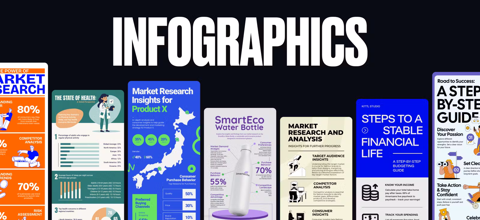
Good infographic examples for every use case
Infographic examples for business
When clients say “business infographic,” most designers suppress a yawn. Another chart with blue bars and corporate jargon? Not exactly the creative playground we dreamed of in design school….
But actually, business infographics can be your creative sweet spot where visual storytelling meets actual impact. They’re actual visual problem-solvers that can make or break business decisions (and yes, win you repeat clients).
Anxious about the short deadlines? Simply click any of the Use this template buttons below, use Kittl’s one-click color palette tool to change to the brands colors, slap on the logo, and you’re done in minutes!
Market research infographics
Transform dry market data into strategic visual insights with bold brand colors for your client’s metrics. Highlight unique market differentiators that instantly clarify positioning. See these competitor analysis infographic examples:

Market Research Infographic Design. Use Template

Projected Market Infographic Design. Use Template

Smart Spoon Market Research Design. Use Template
Want to see more competitor analysis templates from Kittl? Check out it out here.
Customer journey infographics
Visualize customer emotional states throughout their experience with a brand. Highlight the critical “moment of truth” that determines whether they stay or leave.
A study found that mapping the customer journey allows businesses to reduce churn by up to 30% while creating better-aligned internal processes across sales, marketing, and support.
You can instantly use the templates we’ve curated below or you can check out more here: Customer Journey Infographic Kittl Templates.


Business process infographics
Turn complex workflows into intuitive visual journeys with consistent iconography and clear directional cues. Add time estimates for each step to increase practical value.
Check out some great infographic roadmap examples below, or check out more on this page.

Business Roadmap Design.
Use Template

Blue Theme Roadmap Design.
Use Template

Yellow Theme Roadmap Design. Use Template
Design your process steps to work both horizontally and vertically so clients can repurpose them for different formats without requiring a redesign
Business growth and productivity tips
Tired of designing the same old conventional business advice? Turn them into visually engaging roadmaps that feel actionable rather than preachy. Use progressive steps with vibrant iconography to make complex strategies feel achievable.

Effective Time Management Poster Design. Use Template

Boost Productivity Infographic Design. Use Template

Teamwork Infographic Design.
Use Template
Education infographic examples for students
The modern classroom battles constant distractions. Great educational infographics cut through the noise, transforming complex concepts into visual stories that stick in students’ minds long after the bell rings.
So, let’s dive into how to actually make one that can align how students naturally learn — visually.
Infographics for kids or teenagers
Young learners connect with colorful, character-driven visuals that make abstract concepts concrete. The best infographics for kids balance engagement with actual learning objectives. Check out these examples

Jade Rabbit Retro Infographic Design. Use Template

Life Cycle of a Cat Design.
Use Template

Day Off Routine Infographic Design. Use Template
There are hundreds more in our Infographic Templates page here.
Infographics for college students and researchers
College students and researchers need infographics that clarify complexity without oversimplifying. A good academic visual cuts through information overload and highlights what matters.

Mental Health Research Poster Design. Use Template

Environmental Research Poster Design. Use Template

Integrate visual mnemonic devices in academic infographics by connecting abstract concepts to familiar visual anchors. This technique significantly improves information recall during exams and presentations, a benefit you can explicitly highlight when pitching to academic clients.
Engaging infographics for social media
Social feeds move at lightning speed, and your infographic needs to work harder than anywhere else. It must instantly communicate value while fitting platform-specific constraints. When using Instagram marketing software, ensure your designs are optimized for engagement.
The most successful designs blend eye-catching aesthetics with bite-sized insights that feel worth saving or sending to a friend.
Check out these sharable infographic example templates that we have:

Emotion Infographics Design.
Use Template

Time Management Infographic Design. Use Template

Healthy Lifestyle Poster Design. Use Template
See the pattern of what works here? If your infographic has one or two of these, you’re pretty much already good to go:
- Immediate visual hook – Opening with a compelling image or statistic that demands attention
- Scannable structure – Organizing information in a way that can be understood in seconds
- Platform-specific sizing – Designing with the viewing context in mind (Instagram square, Twitter rectangle, etc.)
Check out ALL our infographic templates here
Good infographic examples for various types
After exploring how infographics serve different audiences, let’s talk about structure and format — because your choice of visual architecture can make or break your message. While purpose determines why you create an infographic, type determines how your information breathes and moves.
Ready to match the right visual framework to your information challenge? Let’s break down the most effective formats that designers are using right now.
Data driven & statistical infographics
In a world drowning in numbers, statistical infographics are the life rafts that make data meaningful. They transform what would be spreadsheet-induced headaches into visual stories that reveal hidden patterns and relationships.
The magic happens when abstract statistics become visual and concrete:

Worldwide Infographic Design.
Use Template

Futuristic Scenario Infographic Design. Use Template

Camping Guide Infographic Design. Use Template
What separates mediocre data visualization from great statistical infographics? Context and comparison. These examples don’t just present isolated figuresthey create visual relationships that help viewers understand significance.
They answer not just “what is the number?” but “why should I care about this number?”
Choose this format when your primary goal is helping people understand relationships between numbers, spot trends, or grasp proportions that would be invisible in text form.
Experiment with different fonts and text effects to make your stats pop in the best ways. Nothing beats the effect typography has to any kinds of design.
Timeline infographics
Ever notice how a well-designed timeline can make historical events or processes feel like a compelling story rather than a boring sequence? That’s because timeline infographics tap into our natural love of narratives with beginnings, middles, and ends.
These visual storytellers create a sense of journey and progression:

Design Evolution Timeline.
Use Template

Retro Key Moments Trend Design. Use Template

The best timeline designs strike a balance between maintaining a clear path forward while creating enough visual variety to keep viewers engaged. They use visual hierarchies to distinguish major milestones from minor ones and create a rhythm that pulls viewers through time.
Choose this type when you need to show evolution, historical progression, or any information where sequence and time relationships are essential to understanding the big picture.
Need more examples? Check all of our timeline type infographics in this page or see some more samples below:

Gaming Evolution Pixel-Themed Timeline. Use Template

Coffee Evolution Timeline. Use Template
When designing timeline infographics, vary the visual weight of events based on importance rather than chronological order. This creates a narrative hierarchy that guides viewers to key moments while maintaining chronological accuracy.
Listicle or how-to type
The humble how-to or list infographic isn’t just popular — it’s the reigning champion of visual communication, consistently earning the highest engagement across platforms. There’s a reason this format dominates: it simply just works.
When tackling how-to layouts, play with the visual rhythm! While design instinct might push you toward perfect symmetry, the most engaging list infographics deliberately break patterns to create visual landmarks.
Check out these amazing infographic examples template below:

Brew The Perfect Coffee Cup Infographic. Use Template

Achieve Your Goals Infographic. Use Template

Time Management Strategies Infographic. Use Template
Notice how these examples create distinctive “stepping stones” through information? That’s no accident.
Effective how-to or list designs use visual hierarchy to create what we call “pause points” — moments where the eye naturally rests before moving to the next section. This visual breathing room prevents the cognitive overload that makes viewers abandon complex content.
Choose this format when clients come to you with sprawling, complex processes that make you want to hide under your desk.
The list format helps transform this information spaghetti into a clear path forward that even the most distracted audience can follow.
Report infographics
Report infographics are your secret weapon when clients dump massive research documents on your desk with the impossible request to “make this digestible.”
These comprehensive visual narratives require a different design approach than their simpler cousins. One of the many examples of this report type is the market research infographic we explored in the business use cases section often enhanced with Excel report infographics for better data visualization. However, we can use this report type for many other use cases.
Check out these other examples:


Choose this format when you’re facing the “data avalanche” scenario — clients with extensive research findings, complex statistical relationships, or multi-faceted topics that resist simplification into a single narrative thread.
Color coding becomes your best friend in report infographics. Where simpler formats might use color primarily for aesthetic appeal, report designs leverage color strategically to create visual categorization systems that help viewers mentally organize information as they consume it.
Our love-hate relationship with infographics
As designers, our relationship with infographics is complicated. We love the challenge of turning complex data into something visually engaging. But let’s be honest — they can be a real pain to create. One of the many reasons:
- Making something legible on mobile that contains 6 charts and a timeline
- The existential crisis of choosing between being accurate or actually looking good
- That sinking feeling when you realize your perfectly balanced layout needs a complete overhaul because the data changed AGAIN
But despite all the headaches, infographics aren’t going anywhere. They still drive engagement, clients still want them, and audiences still consume them.
So instead of focusing on the inevitable, let’s focus on some practical hacks to make the process hurt less.
The dos and don’ts when designing infographics
DO: Hook viewers in 3 seconds flat
Most people will give your masterpiece about 3 seconds of attention. Make sure they get the point in that time, then reward the ones who stick around with the deeper details.
DON’T: Create data soup
Nobody wants to swim through an ocean of numbers and charts looking for meaning. Be ruthless about cutting anything that doesn’t directly support your story.
DO: Design a fool-proof journey
Create a visual flow so intuitive that even someone half-paying attention during a boring Zoom call can follow along and get the point.
DON’T: Use tiny type to solve space problems
Life’s too short to strain eyes over 8pt font. If your dad would need reading glasses to see it on her phone, it’s too small.
DO: Remix the best ideas out there
See an infographic technique that made you go “damn, that’s clever”? Steal it, adapt it, make it yours. Great designers are shameless idea collectors.
DON’T: Trust sketchy data
Nothing tanks your credibility faster than visualizing numbers that don’t add up. Double-check everything before you make it look pretty.

Time to quit juggling apps and focus on creating killer infographics with Kittl
Despite all the challenges, infographics remain an essential tool in your design arsenal. What needs to change isn’t the end product, but the fragmented process of creating them.
Kittl brings together everything advanced designers need in one cohesive platform:
- AI Vector Generator to transform even the most abstract ideas into precise visual elements. Best for creating custom charts, icons, and visual elements and saving hours of manual illustrations.
- Massive content library for you to access 10,000+ professionally crafted illustrations and icons to customize and match your infographics style.
- Instant design optimization with tools like the one-click AI Background Remover to clean up images, AI Image Vectorizer to vectorize raster images in a few seconds, and so much more.
For too long, professional designers have accepted the inefficiency of juggling multiple applications as “just part of the process.” But Kittl was designed specifically for advanced graphic designers who need both powerful tools and seamless collaboration.
Your audience deserves infographics that inform, inspire, and innovate. Your design workflow deserves Kittl.
Good luck and have fun creating!

Shafira is a content writer who turns boring business talk into reads people actually enjoy. She grew up hoarding $1 novels in Singapore and writing hilariously bad fiction, but now she tackles content marketing with all that creative chaos since 2019. From blogs and newsletters to UX and SEO, she writes how she thinks: nerdy, honest, and a bit offbeat. She believes the best content is human-designed, not just plain text.