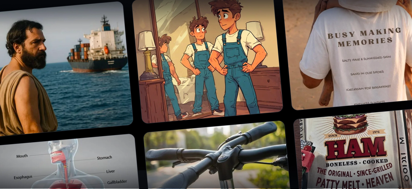
AI art fails have become their own genre of internet comedy. It even has its very own SubReddit called r/aifails. Scroll through it and you’ll find odd hand placements, illogical setups, and suddenly an infographic of the human body states that the stomach is located on the throat:

But funny AI image fails are easy to enjoy when someone else generated them.
They are less charming when a client is waiting, a campaign is due, and the algorithm has just spent your credits turning a simple product photo of your brand’s T-Shirt on a model…. with 4 hands.
For working designers, sellers, and marketers, AI image fails cost more than a laugh. They cost time, tokens, and usable ideas.
This guide dissects ten of the funniest failures, explains why image models produce them, and shows you how to fix the broken part without sacrificing everything that already works.
Along the way, you will learn when a clearer prompt is enough, when to edit one area, and when Kittl tools such as Agentic AI, AI Image Boards, Flows, and overall AI Image Generation can shorten the route from bizarre first draft to production-ready design.
Ready to test the fixes? Open Kittl’s AI design tools, generate your starting image, and keep this guide nearby when the fingers begin multiplying.
Why do AI-generated images fail?
AI image generators do not understand bodies, buildings, words, or gravity as people do. They learn visual associations from large collections of images and predict which pixels are likely to belong together. The result can look convincing without being physically or logically correct.
A model may associate hands with fingers but fail to maintain a reliable count when fingers overlap. It may recognize that shop signs contain letter-like forms without treating every character as part of a correctly spelled word.
When several subjects touch, it can blend their boundaries because it has learned appearance, not a strict three-dimensional model of the scene.
The more a request depends on exact counting, spatial relationships, readable copy, or the preservation of a specific detail, the more opportunities there are for AI-generated image fails. Better models reduce these errors, but no image generator eliminates them entirely.
You’d might also want to check out our guide to AI image generation here: AI image generation complete guide for designers in 2026.
All these errors lead to one question: Is the concept wrong, the prompt unclear, or one local area broken? Each problem needs a different fix.
10 hilarious AI art fails and how to fix them
1. The mystery of the extra fingers and limbs

The classic AI hands fail never truly gets old. You can never really expect where a surprise limb would pop up in the image.
Hands are difficult because they are flexible, frequently overlap other objects, and appear from countless angles. Fingers also form a repeated pattern, so a model can reproduce the general idea of “many narrow shapes attached to a palm” without maintaining a correct count. A crowded composition increases the confusion.
For a machine that is blending patterns together, it can be confusing and all it can do is guess.
You can fix this by reducing ambiguity in the prompt:
- State how many people appear and where each person stands.
- Describe the visible hand position: “right hand resting flat on the table” or “both hands outside the frame.”
- Avoid asking several people to hold overlapping objects at once.
- If the selected model supports negative prompting, exclude “extra fingers, fused fingers, duplicated limbs, malformed hands.”
If the image is already strong, do not regenerate the whole scene to repair one hand. In Kittl, use Edit Area to brush over the problem, then request “one natural human hand with five anatomically correct fingers, resting flat on the table.” A tight selection gives the model less room to alter the face, clothes, and composition you wanted to preserve.
If hands are not important to the story, crop them out, place them behind an object, or choose a pose that keeps them outside the frame. A smart composition can solve the problem before generation begins.
2. The terrifying multi-row teeth smile

Some funny AI fails begin with the innocent instruction “smiling.” The result is a grin so enthusiastic to the point of discomfort. Teeth repeat, merge, stretch across the face, or appear as one uninterrupted white strip.
Like fingers, teeth are small repeated elements. They also sit behind lips, change visibility with expression and camera angle, and reflect light. When the prompt heavily emphasizes happiness, excitement, or a huge grin, the model can exaggerate the most recognizable symbol of that emotion.
Again, AI are not human they don’t know how a human would smile or what rate of grin is “appropriate” as an expression.
To avoid this, prompt for the expression you actually need rather than its most dramatic version. Try “a relaxed expression with a subtle closed-mouth smile,” “a gentle natural smile with minimal teeth visible,” or “calm, friendly expression.” Include the head angle and lighting so the model does not improvise an extreme beauty-shot pose.
If only the mouth failed, select that area and regenerate it locally with the Edit Area brush. Keep the instruction plain: “natural closed-mouth smile matching the existing face and lighting.” Expanding the edit into the cheeks, jaw, or entire head gives the model more opportunities to change the person’s identity.
Also learn more about the Edit Area feature here:
3. The physically impossible architecture

AI-generated architecture can look convincing at first glance but then you realize that the staircase leads nowhere, railings pass through walls, and (like the image above) windows turn corners mid-frame.
It’s crossing a real thin line between an AI-generated architecture catalog with liminal spaces taken straight from Backrooms.
The model has learned what architectural images tend to look like, but it is not checking a floor plan, calculating load paths, or testing whether a person could walk through the room. Repeated structures such as steps, arches, columns, and windows are particularly vulnerable to drift across a wide image.
For the fix, give the prompt a structural hierarchy:
- Name a recognized style, such as Bauhaus, Georgian, Brutalist, or Japanese minimalism.
- Specify the viewpoint, camera height, lens, and perspective.
- Define major relationships: “a straight staircase connects the ground floor to the visible second-floor landing.”
- State the room type, number of levels, main materials, and location of doors or windows.
- Ask for realistic proportions and structurally plausible construction.
Reference images can also communicate spatial intent more clearly than adjectives alone. Even then, treat generated architecture as concept imagery, not a construction plan. For commercial property, product, or editorial work, inspect every junction before publishing it.
Use one-point or two-point perspective language when geometry matters. “Beautiful luxury interior” describes a mood; “symmetrical two-point perspective from eye level” gives the model a camera system.
4. The bizarre background amalgamation

The main subject is great. The background, however, becomes quite horrifying. This is one of the most common AI image prompt mistakes: the prompt carefully describes the subject but leaves the rest of the frame undefined, so the model fills empty space with plausible-looking visual noise.
Instead of “a woman holding a tote bag outdoors,” specify the scene in layers: “waist-up portrait of one woman holding a cream tote bag, standing beside a plain brick café wall, soft greenery far in the background, shallow depth of field, no other people or street signs.”
Useful background controls include:
- Exact location and time of day
- Foreground, middle ground, and background elements
- Whether the scene is busy or minimal
- Depth of field and focus falloff
- Objects or people that must not appear
If the unwanted object occupies a small area, edit or remove it locally. If the entire setting is wrong but the subject is valuable, isolate the subject and rebuild the background as a separate step. This is often more reliable than repeatedly asking one generation to satisfy every layer at once.
5. The animal-human-furniture hybrid

Few funny AI image fails are as unsettling as a beloved pet merging with its owner, blanket, or chair. Close interaction creates overlapping boundaries, and similar colors or textures make those boundaries harder for the model to maintain. A fluffy cream dog on a cream sofa is practically an invitation to invent a new species.
Describe each subject independently before describing the interaction. For example: “one adult woman in a blue sweater sits on the left. One small brown dachshund sits fully visible on her lap. Her two hands rest gently on the dog’s back. The dog has four legs, two ears, and a clearly separated body.”
Also consider simplifying the contact. Generate a pet beside its owner rather than tangled in an embrace, or create the subjects separately and compose them afterward. Specific breed, coat, posture, and placement language gives the model stronger boundaries than “a woman cuddling her cute dog.”
When one paw or sleeve melts into another object, use a targeted edit that includes enough surrounding context to reconstruct the edge. Selecting only three incorrect pixels may be too narrow; selecting the paw plus a small section of the sofa gives the model room to establish separation.
You can also learn how to create a great prompt here: Writing AI prompts: Tips & tricks for creatives.
6. The dead and misaligned artificial eyes

If you’ve ever thought “I can’t just put my finger on it, the image just doesn’t look…. “alive””, then you’ve probably come across this common ai image fail. Eyes are even harder to understand for machines, because again, the human body is flexible. AI can mistake “a good eye” but generate it with misaligned pupils, inconsistent irises, missing catchlights, and asymmetric eyelids. This is what makes your image feel less human.
Faces demand precise symmetry while still containing natural variation. Eye shape also changes with head angle, expression, glasses, hair, and shadows. If the face is small in the frame, the model has fewer pixels available to resolve these details.
Ask for “direct eye contact with the camera, both pupils aligned, natural symmetrical eyes, one soft catchlight in each eye.” Define the portrait angle and keep the face large enough to render. Avoid combining an extreme side angle with a demand for direct eye contact unless that tension is deliberate.
For a local fix, select both eyes together rather than repairing them separately. The model then has a chance to align their gaze, scale, light, and color as a pair. Keep the prompt focused on the eyes so the edit does not redesign the entire face.
If you want to prevent this altogether, check out our prompt cheat sheet video:
7. The melting, unreadable gibberish text

AI text fails are where comedy collides most directly with commercial risk. A fictional shop sign can be amusing. A misspelled product name, price, ingredient, or event date can make a finished campaign unusable.
Traditional image models learned text largely as visual patterns. They could imitate the shape and rhythm of signage without reliably constructing a sequence of correct characters. Newer models have improved, especially on short phrases, but long copy, unusual names, tiny text, and repeated labels can still drift.
Improve the first result by:
- Placing exact required wording in quotation marks.
- Keeping generated text short.
- Describing the hierarchy: headline, subheading, price, and supporting copy.
- Specifying where each text block belongs.
- Generating at a size where the lettering has enough pixels to resolve.
Inside Kittl, GPT Image 2 is a strong option for text-heavy concepts and structured layouts. It can produce more readable packaging, posters, labels, and editorial compositions than older image models.
You can also learn more about which aspects GPT Image 2 excels in compared to other models in our review here: Kittl Review: GPT Image 2.
Still, generated words remain part of a raster image. If the copy must be exact, editable, localized, or legally reviewed, replace it with real Kittl text layers before delivery.
That workflow separates two jobs: let AI explore the visual direction, then use editable typography for the final information. It is safer than spending ten generations trying to correct a single character in a finished image.
Treat generated text as concept copy until it has been checked character by character. Prices, dates, ingredients, warnings, addresses, and brand names should always receive a manual proofread.
8. You changed the shirt color, AI changed the entire art style

The first seven AI art fails are often funny. This one is simply expensive. You finally have the right composition, character, linework, and mood. You ask for one blue shirt to become red. The next result changes the face, pose, lighting, background, and entire visual language.
This happens because a standard prompt can be interpreted as a request to create a new image, not to perform a constrained edit. Repeating every detail from the original prompt does not guarantee preservation, and adding more instructions can create new conflicts.
Use the tool that matches the size of the change:
- In Kittl, select the generated image and open Edit Area.
- Brush only over the shirt, keeping the face, hands, and background outside the selected region.
- Prompt: “Change only the shirt fabric to deep red. Preserve the existing illustration style, folds, shadows, linework, pose, and all unselected areas.”
- Compare the result with the original at full size before continuing.
For a new concept, Kittl Agentic AI can interpret a plain-language brief, then select a model and set up the generation. Describe the outcome you need rather than wrestling with parameters. For example: “Create a playful flat-vector campaign illustration of a barista in a red work shirt, using three ink colors and screen-print-friendly shapes.”
Agentic AI can improve the starting direction, but it is not a literal “lock style” switch. When a specific existing image needs one small correction, a local edit remains the more controlled option.
9. Your image reference mutates in a complex prompt

Reference images are powerful, but they are not always treated as protected source files. A model may borrow the overall style while redrawing the mascot, warp a logo on a product, or blend several references into one confused composition. The more competing instructions and reference images you add, the easier it is for the hierarchy to disappear.
Begin by deciding what the reference controls:
- Content reference: Keep the subject, layout, or core object.
- Style reference: Borrow the palette, texture, lighting, or illustration language.
- Composition reference: Follow the arrangement and camera angle.
- Brand asset: Preserve an exact logo, wordmark, or graphic without redrawing it.
Do not ask a generative model to recreate an asset that must remain exact. Place the real logo or graphic as a design layer after generating the scene, or use a mockup workflow that keeps the source art separate from the generated environment.
For connected exploration, Kittl Flows can pass creative context from an existing artboard, image, logo, or branding frame into an AI Image Board, Mockup Board, or another linked step. Because the next board works from that frame instead of an unrelated blank artboard, campaign variations can follow the approved brand direction more faithfully. A practical workflow looks like this:
- Build the core character, graphic, or brand frame on an artboard.
- Connect that artboard to an AI Image Board so the next generation receives its visual context.
- Generate a controlled variation or use Remix when you want a new treatment based on an existing image.
- Use Edit Area for minor corrections rather than sending the whole composition through another broad regeneration.
- Reapply exact logos and editable copy as real design layers where precision matters.
Kittl’s AI Image Style Reference can also reuse the overall look and feel of an image. That is useful for a consistent campaign mood, but a style reference is not the same as preserving every element pixel for pixel. For a logo, legal mark, or product label, exact source artwork should remain exact source artwork.
10. You waste generation after generation fixing one word

The real AI image fail is not one spectacular disaster. It is the slow drain of generating version after version because “MARGHERITA” keeps acquiring new letters. Perhaps the text improves, but then the pizza changes. The pizza returns, but the price disappears. By version nine, the original layout was better.
Use a text-capable model for the concept, then stop asking the image generator to behave like layout software. In Kittl, a packaging workflow can follow these steps:
- Open AI Mode and start an AI Image Board.
- Choose GPT Image 2 from the available image models.
- Describe the object, camera angle, material, visual style, and layout hierarchy.
- Put the exact short headline in quotation marks. For example: “Create a top-down kraft pizza box design. Center the heading ‘NIGHT OWL PIZZA’ in bold red condensed type. Add three short menu categories beneath it with clear spacing.”
- Generate several focused options and choose the composition with the strongest hierarchy.
- Move the selected result into the wider design flow. Use Remix or a connected board when you need another treatment that retains more context than a fresh prompt.
- Rebuild critical wording, prices, ingredients, and legal copy with editable Kittl text layers.
- Apply the approved design to a realistic mockup and inspect it at the final viewing size.
Kittl describes GPT Image 2 as particularly useful when prompt accuracy, text rendering, and layout matter. That makes it well suited to pizza boxes, coffee packages, posters, labels, and similar concepts. “Better text” is the defensible promise. “Perfect text every time” is not.
If you only need to change the background or one product detail, use a linked Flow, Remix, or Edit Area instead of writing a new prompt from zero. More context reduces unnecessary reinvention, but always compare the result against the approved design. No generation tool should be trusted to preserve critical typography absolutely without review.
How to fix an AI image fail without starting over
When an image breaks, the fastest repair depends on what actually failed. Use this decision guide before spending another token.
| What went wrong? | Best next move | Why |
| The whole concept or composition is wrong | Regenerate from a revised brief | There is little value to protect yet |
| The model misunderstood the subject or setting | Rewrite the prompt with clearer relationships | Better scene logic can solve a broad misunderstanding |
| One hand, eye, object, or color is wrong | Use Edit Area | It limits change to the selected region |
| You need a related variation based on approved work | Use an image reference, Remix, or Kittl Flow | More visual context carries the direction forward |
| You want the system to interpret a plain-language creative brief | Use Agentic AI | It can choose the model and generation setup for the task |
| The wording must be exact and editable | Replace generated copy with real text layers | Typography software provides control an image cannot |
| A logo or brand asset must remain unchanged | Place the original asset as a separate layer | An exact asset should not be regenerated |
This is the central hack behind most professional AI image fails: do not regenerate more of the image than the problem requires. A broken idea needs a new generation. A broken finger needs a local edit. A misspelled label needs real typography.
Turn funny AI fails into better design decisions
The internet will never run out of bad AI-generated images, and that is probably for the best. Extra fingers and haunted typography deserve their moment. But professional design work needs a better ending than “generate again and hope.”
The most useful response to AI art fails is diagnosis. Clarify prompts when the scene is confused. Edit locally when one detail is broken. Carry visual context through Kittl Flows when a campaign needs related variations. Use GPT Image 2 to improve text-heavy concepts, then replace critical copy with editable typography before it reaches a customer.
That is how you turn AI from a slot machine into a workable creative system: protect what is good, repair only what failed, and keep exact brand assets under human control.
Create, correct, and continue in one workspace. Explore Kittl’s AI tools to move from first prompt to editable design, targeted repair, and campaign-ready mockup without restarting every time the algorithm gets weird.
FAQ: AI art fails
Why do AI image generators mess up hands and fingers?
Hands can take many poses, overlap objects, and appear at difficult angles. Image models learn the appearance of hands from examples but do not always maintain anatomical rules or count fingers consistently. Clear pose instructions, simpler interactions, and local editing can reduce AI hand failures.
How can I stop AI from generating unreadable gibberish text?
Use a model built for stronger text rendering, keep the phrase short, put exact wording in quotation marks, and define its position and hierarchy. For final commercial work, replace important generated text with editable text layers so spelling, spacing, and wording remain under your control.
What causes AI art to look distorted or merged?
Distortion often appears when subjects overlap, the prompt leaves spatial relationships unclear, or several similar textures meet. Describe each subject, its position, and its interaction separately. If only one boundary is broken, edit that region instead of regenerating the whole image.
How do you keep a character consistent in AI art generation?
Start from the same approved character reference, keep the defining traits explicit, and carry that visual context through connected generations. Kittl Flows and AI Image Boards can help link an existing character or artboard to later steps. Preserve exact brand elements as separate layers, and use local edits for small changes.
Which AI image generator is best for spelling words correctly?
No image generator gets spelling right every time. GPT Image 2 is a strong current option inside Kittl for readable text and structured layouts, particularly for packaging, labels, posters, and editorial concepts. Important copy should still be proofread and rebuilt as editable typography when accuracy is essential.
How can I change one detail in an AI image without ruining the rest?
Select only the problem area and describe the replacement precisely. Kittl’s Edit Area is designed for this workflow, letting you brush over one region and regenerate it without intentionally rebuilding the entire image. Keep the selected area tight, but include enough surrounding context for edges and lighting to blend naturally.

Shafira is a content writer who turns boring business talk into reads people actually enjoy. She grew up hoarding $1 novels in Singapore and writing hilariously bad fiction, but now she tackles content marketing with all that creative chaos since 2019. From blogs and newsletters to UX and SEO, she writes how she thinks: nerdy, honest, and a bit offbeat. She believes the best content is human-designed, not just plain text.