Creating a logo has always been a severely underestimated task. I mean, as a business owner, if you compare designing the products, creating the launch plan, and all to creating a logo, the latter seems like a walk in the park.
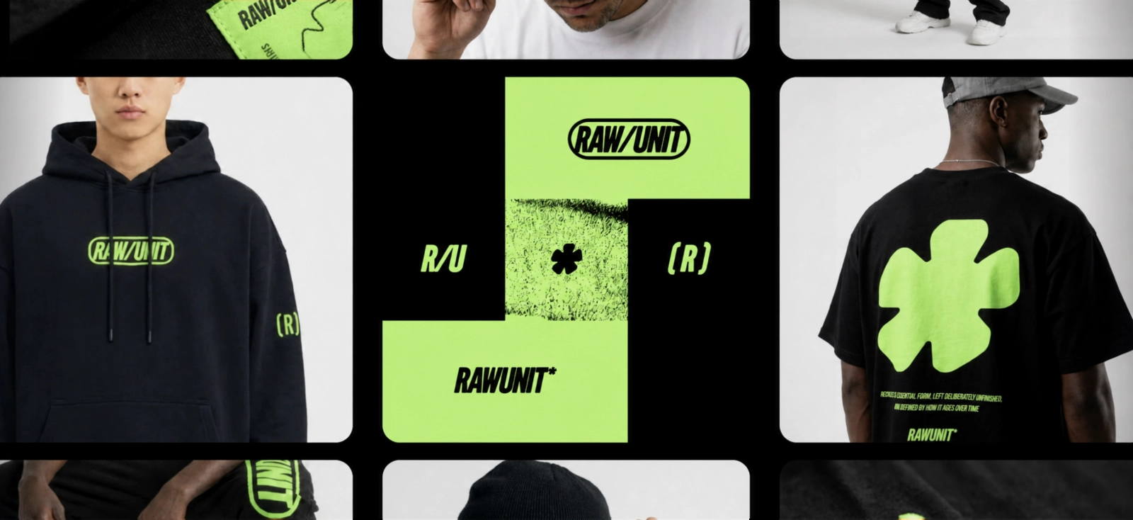
It just seems so easy to put things together and slap on a unique font you found on the marketplace. But a logo, no matter how put together, can still look odd when put to the test in different spaces. How would it be on a cap, a label, or your social media avatar?
It leaves the question, what are common mistakes in logo designs?
The most damaging ones are overcomplicated effects, poorly chosen typography, weak spacing, generic symbols, low contrast, excessive detail, and file formats that cannot scale cleanly. These problems become especially obvious when the logo moves beyond a white digital canvas and onto real products.
This guide diagnoses the aesthetic and technical causes behind an amateur-looking logo. You will also learn how to rebuild, test, and export a more resilient version in Kittl.
The diagnostic reality check: Why good-looking logos fail on real products
It’s “logical” to assume the worst of logos when asked what are common mistakes in logo design. You’d think it would be because of an ugly font or clashing colors. Of course, that is the obvious, but usually, the deeper problem is mostly functional.
A production-ready logo must survive several conditions:
- It must remain recognizable when reduced.
- It must work against light and dark backgrounds.
- It must hold together in one color.
- It must reproduce through print, embroidery, cutting, engraving, and digital display.
- It must exist in file formats suitable for each use.
A logo that passes only the full-size screen test is basically unfinished. Certain companies specialize in helping companies create logos that reflect all brand elements from their premium name to the industry.
The canvas illusion vs. tangible execution
A large white artboard is unusually forgiving. It gives great room for details to breathe, outlines are crisp, and even the smallest taglines remain readable. Colors can be maximized and shadows thrive in their full range.
A product, however, does not offer the same protection.

Imagine a small candle label. The tagline may shrink and make it feel like an eye-test for those who read it. After all, it is already small, it’s already hard to read to begin with.
And now imagine a dark T-Shirt. Your white logo might now appear as a visible rectangle. And the examples can go on.
The question is not simply, “Does this logo look attractive?”
Ask: Can this logo still do its job after the material, size, background, and production method have changed?
Review your logo at approximately the size at which customers will encounter it. It’s easy to think your logo looks good as a large image filling your monitor. But how would it really look as a label?
The cost of a wobbly brand identity
A “fragile” logo is a logo that can’t be sustained against every setting and in every material it is on. And a fragile logo creates work every time it is used.
What would you do if your logo’s background needs to be darker like the product’s color? You’d have to change the background. And you’d have to do extra work if the package supplier requests a vector file or if another vendor asks for a more simplified artwork.

Ultimately, the founder begins making a new variation for every platform.
That inconsistency makes a young brand look less established than it is. It also raises production costs because suppliers must redraw, simplify, or clean up files before they can use them.
Understanding what are common mistakes in logo design therefore protects more than appearance. It protects the repeatability of the entire brand.
Aesthetic logo design mistakes: The pitfalls of visual clutter
The first group of common logo design mistakes to avoid concerns what viewers can see immediately: excess decoration, unsuitable typography, weak hierarchy, and borrowed ideas.
1. Overcomplicating the mark with excessive text effects
Drop shadows, outlines, bevels, gradients, highlights, extrusions, and curved lettering can all work in a logo.
But what it can’t do is ask every effect to perform at once.
When several effects compete for attention, the wordmark loses its silhouette. It becomes hard to distinguish letterforms in reduction. A gradient-designed logo might lose its purpose when reproduced as a one-color stamp, cut vinyl shape, engraving, or embroidery file.
It’s easy to think that you just have to remove every expressive detail and reduce it into any other minimalist logo. But where’s the fun in that?
It’s better to decide which effect you truly want to highlight.
For example:
- A heavy block shadow may suit a retro workshop logo.
- A thin inline may suit a heritage badge.
- Curved text may help form a compact emblem.
- A subtle offset may add energy to an apparel mark.
Choose the strongest device and let the typography remain readable beneath it.

How to fix excessive effects in Kittl
Select the text or artwork and inspect each applied treatment separately. Temporarily disable shadows, outlines, decorative layers, and extra contours.
Then ask:
- Does the name remain readable without the effect?
- Does the overall silhouette still feel distinctive?
- Does the effect improve the concept or merely fill empty space?
- Can the logo still work in one solid color?
Kittl includes text effects and vector editing within the same editor, so you can compare decorative and simplified versions without rebuilding the composition elsewhere.
Duplicate the logo before simplifying it. Keep one expressive primary version and develop a reduced production version rather than forcing one file to handle every situation.
2. Choosing the wrong font for the brand context
Typography carries personality before the customer reads the word.
- For a delicate high-contrast serif may suggest fashion, fragrance, editorial publishing, or hospitality.
- A compressed grotesk can feel industrial or assertive.
- A loose handwritten script may suit a personal maker brand but feel unreliable for a technical consultancy.
One of the most common logo design mistakes is choosing a font because it looks fashionable in isolation, without asking what it communicates in the category.
A font mismatch may look like:
- A playful bubble font for a premium financial consultancy
- A narrow luxury serif for a rugged children’s sports brand
- An elaborate script for a company whose name must be read quickly from a vehicle
- A distressed display font used at a size where its texture closes the letters
The goal is not to obey category stereotypes. It is to understand them well enough to depart from them with control.

How to choose a better logo font in Kittl
Start with descriptive terms that refer to the brand’s character or visual heritage, such as:
- Editorial
- Geometric
- Industrial
- Humanist
- Grotesk
- Serif
- Script
- Retro
- Blackletter
- Minimal
Kittl provides a curated font library within the editor, allowing you to test typefaces directly in the logo composition rather than judging them from a specimen alone.
Set the real business name in each candidate. A font that looks compelling in a sample word may behave differently when faced with repeated letters, wide capitals, awkward pairs, or a long company name.
Next, correct the spacing. Kerning controls the space between individual letter pairs, while tracking adjusts spacing across a broader selection.

Blur your eyes slightly while looking at the wordmark. Uneven dark patches often reveal kerning problems faster than inspecting each gap separately.
3. Blindly following short-lived design trends
Trends are always useful. But make you sure you can distinguish between trend awareness and trend dependence.
A logo becomes vulnerable when its entire identity rests on a visual device already shared by hundreds of businesses. Common examples include:
- Generic abstract swooshes
- Stock leaf circles used for every wellness brand
- Letterforms connected by an arbitrary line
- Human figures made from a V-shaped body and circular head
- Default crowns for premium brands
- Predictable rooflines for property companies
- Sparkle symbols applied to almost every AI or beauty business
These symbols are not automatically unusable. The problem appears when the symbol is the whole idea.

Before choosing an icon, examine competitor logos side by side. If several brands already use the same motif, a new version needs a more specific concept, composition, or visual language.
A useful logo does not have to illustrate the product literally. It can represent the brand’s behavior, origin, method, audience, location, name, or attitude.
Remove the company name and compare the icon with ten competitors. If it could belong to any of them without modification, the concept needs another round.
Functional logo design mistakes: The production blind spots
Some logo design mistakes remain hidden until files are sent to a printer, manufacturer, sign maker, or merchandise supplier.
These failures are particularly expensive because they appear late.
4. Ignoring scalability and responsive logo needs
A logo is not scalable merely because the file can be resized.
The structure itself must remain understandable after resizing.

As an example, a detailed crest may work across a storefront but fail inside a small circular profile image. A thin script may look elegant on a box but disappear on a pen.
This is why responsive logo systems use several related configurations:
- Primary logo: The complete composition
- Secondary logo: A more compact horizontal or stacked arrangement
- Logo mark: The symbol without the full wordmark
- Micro mark: A simplified symbol or monogram for very small spaces
- One-color version: A production-safe silhouette

The favicon test is useful because it exposes weak complexity quickly. Reduce the symbol to roughly 24 or 32 pixels and examine whether its main shape remains distinct.
Do not expect a full tagline, detailed illustration, and fine border to remain readable at that size. Create a purpose-built micro version.
When people ask what are common mistakes in logo design, failing to develop smaller responsive versions belongs near the top of the list.
A practical reduction test
Place the logo at several widths on one artboard:
- 300 px
- 150 px
- 75 px
- 32 px
At each stage, note what disappears first.
If the business name vanishes before the decorative border, the hierarchy is backwards. If small internal gaps fill in, simplify the geometry. If the symbol becomes indistinguishable from a circle or square, strengthen its outer silhouette.

The favicon test is useful because it exposes weak complexity quickly. Reduce the symbol to roughly 24 or 32 pixels and examine whether its main shape remains distinct.
Do not expect a full tagline, detailed illustration, and fine border to remain readable at that size. Create a purpose-built micro version.
When people ask what are common mistakes in logo design, failing to develop smaller responsive versions belongs near the top of the list.
A practical reduction test
Place the logo at several widths on one artboard:
- 300 px
- 150 px
- 75 px
- 32 px
At each stage, note what disappears first.
If the business name vanishes before the decorative border, the hierarchy is backwards. If small internal gaps fill in, simplify the geometry. If the symbol becomes indistinguishable from a circle or square, strengthen its outer silhouette.
| Format | Best used for | Important note |
| SVG | Websites, cutting workflows, scalable digital use | Retains vector paths |
| Printers, packaging partners, document sharing | Confirm the supplier’s requested setup | |
| PNG | Digital use requiring transparency | Export large enough for its intended placement |
| JPG | Previews and simple digital placements | Does not support transparency |
| Original editable file | Future revisions and master storage | Keep text, paths, and colors editable |

How to export a usable logo from Kittl
Before exporting:
- Hide or remove any background layer that is not part of the logo.
- Check for stray shapes outside the intended composition.
- Confirm that the correct logo variation is selected.
- Export a transparent PNG for suitable digital uses.
- Export an SVG when a scalable vector version is required.
- Keep an editable master project for future revisions.
Kittl’s Vectorizer can convert PNG and JPG artwork into editable, scalable SVG paths for use across packaging and merchandise.
Access to vector files may depend on the Kittl plan being used, so confirm export availability before promising a particular deliverable to a printer or client.
A transparent background does not mean the logo will work on every color. Prepare light and dark logo variants rather than relying on one colorway everywhere
6. Failing to test against real production constraints
A logo can technically be a vector and still be difficult to manufacture.
Vector paths solve scaling and edge-quality problems. They do not guarantee that every line, gap, cutout, or color separation can be reproduced by every process.
Common risk areas include:
- Hairline strokes
- Tiny counters inside letters
- Closely spaced parallel lines
- Small reversed text
- Several overlapping outlines
- Intricate distress textures
- Low contrast between logo and material
- Too many separate vinyl colors
- Details that depend on subtle transparency

Embroidery replaces drawn lines with thread, so tiny gaps can close and narrow lettering can lose definition. Vinyl cutting follows vector paths, and multicolor artwork may require separate layers to be cut and applied.
Printers and manufacturers have different minimums based on machinery, material, thread, ink, substrate, and final size. Avoid presenting a single universal line-width rule as though it applies everywhere.
Instead, request the supplier’s current artwork specifications.
Use mockups as stress tests
A mockup should answer a production question.
For example:
- Is the logo readable on a curved coffee cup?
- Does the dark version separate clearly from black fabric?
- Does the horizontal version fit the box panel?
- Does the mark remain recognizable after being reduced on a neck label?
- Is the clear space adequate when placed near packaging copy?
Kittl provides mockups for previewing designs in realistic applications, including merchandise and packaging contexts.
A mockup can reveal obvious application problems before files are finalized. It cannot predict every physical result. For critical production work, follow the manufacturer’s template, request a proof, and order a sample.

Test the worst-case application first. A logo that works on a small woven label or single-color stamp will usually adapt upward more easily than a poster-sized logo adapts downward
Tutorial: How to rebuild a scalable logo in Kittl
Once you understand what are common mistakes in logo design, the repair process becomes more focused. You are not simply trying to make the logo prettier. You are building a cleaner system.
Step 1: Generate or rebuild a clean vector foundation
Open a Kittl project and place the existing logo on the canvas as a reference.
If the concept is fundamentally weak, use Kittl’s AI Vector Generator to explore cleaner symbol directions. Kittl describes the tool as a way to create editable vector artwork, while its Vectorizer converts existing raster images into scalable paths.

Write a prompt that defines the structure rather than filling it with decorative adjectives.
For example:
Single-color emblem for an independent coffee roaster, bold symmetrical silhouette, simplified mountain and coffee plant motif, thick shapes, clear negative space, suitable for packaging stamp and embroidered cap, no text, gradient, or mockup.

Useful prompt details include:
- Brand category
- Central subject or metaphor
- Desired construction
- Approximate complexity
- Number of colors
- Production use
- Elements to exclude
Generate several directions, but treat them as source material. Inspect the output for unnecessary nodes, awkward joins, accidental tangencies, generic symbols, and details that collapse at small sizes.
Step 2: Refine vector mechanics, typography, and hierarchy
Place the strongest symbol beside the business name.
Start with the hierarchy:
- Business name
- Distinctive mark
- Descriptor or tagline, when genuinely needed
The tagline should not compete with the name. In many small applications, it should be removed altogether.
Correct the typography by adjusting:
- Font choice
- Weight
- Capitalization
- Kerning
- Tracking
- Line spacing
- Relative scale
- Alignment with the symbol

Then inspect the vector artwork.
Remove points that do not contribute to the contour. Smooth lumpy curves. Open tight gaps. Check whether separate paths accidentally touch. Make repeated elements geometrically consistent where consistency improves the design.
Test the entire logo in black before refining the color palette. Starting with the silhouette makes structural problems harder to hide. Looka also recommends beginning without color so shape and readability can be judged first.
Build the responsive set now
Create several artboards or grouped variations:
- Full primary logo
- Compact secondary logo
- Symbol
- Micro mark
- Black version
- White version
Do not wait until export day. Responsive behavior should influence the design while it is still editable.
Check the logo both normally and mirrored. Flipping the composition temporarily can make balance errors easier to notice because you stop reading it as familiar content.
Step 3: Vectorize a legacy raster logo carefully
It’s easy to mistake solutions as simply needing a new logo, but most businesses just need a clean master file of the logo they already use.
Upload the highest-quality source available. Avoid starting from a screenshot when an original PNG, PDF, or larger export exists.
Use Kittl’s Vectorizer to convert the raster image into editable paths. The tool is designed to transform PNG and JPG artwork into scalable SVG graphics.

After conversion, inspect:
- Outer contours
- Small counters
- Circular shapes
- Corners
- Overlapping paths
- Number of colors
- Unwanted background areas
- Ragged edges inherited from compression
Do not assume automatic vectorization produces a finished master. A low-resolution source can create bumpy paths or excessive nodes. Simplify and redraw important geometry when needed.
Should you upscale before vectorizing?
Not automatically.
Kittl includes an image upscaler for increasing image definition, but additional pixels do not restore the original geometry of a badly compressed logo.
Upscaling may help the Vectorizer interpret a slightly soft source. It can also preserve or exaggerate artifacts. Compare the vector result both with and without upscaling, then choose the cleaner path structure.
For very simple marks, manual reconstruction with basic shapes may be faster and more accurate than tracing a damaged image.
Judge a vectorized logo by the quality of its paths, not by whether the conversion finished successfully.
Step 4: Proof the logo on real-world mockups
Once the core system is ready, place it into several Kittl mockups.
Select applications that reflect the business rather than choosing products randomly. A candle company should test jars, labels, shipping boxes, and retail cards. A streetwear brand should test chest prints, neck labels, embroidery-style placements, and hang tags.
Review each mockup at normal viewing size.

Check:
- Legibility
- Contrast
- Placement
- Curvature
- Clear space
- Visual weight
- Whether the correct logo variation was used
- Whether the mark competes with product information
A horizontal logo may suit a website header but feel weak on a square label. A circular emblem may fit a jar lid but waste space on a narrow neck tag. Use the responsive system instead of stretching one configuration into every placement.
Kittl’s mockup library is designed to preview work realistically across product contexts.
Finally, send the supplier the requested file type and specifications. Where possible, approve a digital proof and order a physical sample before a large run.
The ultimate logo design checklist for founders and creators
If you are still asking what are common mistakes in logo design, use this checklist as a preflight test.

| Test | Production-ready condition | Warning sign |
| Small-size test | Main shape remains recognizable at avatar or label size | Details merge into a blob |
| Silhouette test | Logo reads clearly in solid black | Concept depends on effects or color |
| One-color test | Mark works in black or white | Elements disappear without gradients |
| Background test | Light and dark variants remain clear | One version is placed everywhere |
| Typography test | Name reads quickly at realistic size | Decorative font slows recognition |
| Spacing test | Letter and element gaps look optically balanced | Mechanical spacing creates dark patches |
| Hierarchy test | Business name receives proper emphasis | Tagline or ornament dominates |
| Originality test | Symbol has a brand-specific rationale | Icon could belong to any competitor |
| Responsive test | Primary, compact, and micro versions exist | Full logo is merely shrunk |
| Vector test | Master artwork has clean editable paths | Only a small JPG is available |
| Transparency test | PNG export has no unwanted rectangle | White background is baked into the file |
| Mockup test | Logo works on relevant products | Logo was judged only on a white artboard |
| Supplier test | Files follow current production requirements | Artwork was sent without checking specifications |
| Sample test | Physical proof or sample has been reviewed | Large order is based only on a mockup |
A logo does not need to be minimal, monochrome, geometric, or trend-free to pass. It needs a clear visual idea and a disciplined set of variations that can survive actual use.
Final diagnosis
So, what are common mistakes in logo design?
The visible mistakes include poor font choices, generic icons, cluttered effects, weak hierarchy, and uneven spacing. The costlier mistakes are often technical: fragile detail, insufficient contrast, missing responsive versions, raster-only files, opaque backgrounds, and failure to test the logo on real applications.
The fastest improvement rarely comes from adding something new. It comes from identifying what breaks first.
Reduce the logo. Test it in black. Shrink it. Place it on the actual product. Remove the tagline. Check the paths. Export the right files. Ask the supplier what the production process requires.
A professional logo is not simply the version that looks best on the canvas. It is the version that keeps working after it leaves
Frequently asked questions
What are common mistakes in logo design that hurt product printing?
The most harmful printing mistakes include hairline details, very small text, tight gaps, low contrast, excessive colors, transparency-dependent effects, raster-only files, and logos designed without considering the final material or process. Always request the printer or manufacturer’s current artwork requirements because production limits vary.
Why does my logo look blurry on large banners but clear on my screen?
Your logo is probably a raster image with insufficient pixel dimensions for the enlarged output. Raster files become visibly pixelated when scaled beyond their available resolution. A clean vector master, such as an SVG, can scale without the same loss of edge quality.
How many fonts should be used in a professional logo layout?
One font is often enough. Two can work when they have distinct roles, such as a display face for the business name and a quieter supporting face for a descriptor. Looka recommends that beginners generally stay with one or two fonts.
Adding a third font usually creates more hierarchy problems than it solves.
What is the difference between a raster logo and a vector logo for small businesses?
A raster logo is built from pixels and has a fixed resolution. PNG and JPG are common raster formats. A vector logo is built from mathematical paths, making it more suitable for scaling and editing. SVG is a common vector format.
Small businesses should keep a vector master and export raster versions from it as needed.
Why is a transparent background essential when exporting logo assets?
Transparency allows the logo to sit on colored, photographic, or dark backgrounds without displaying a rectangular background block. PNG supports transparency, while JPG does not.
You should still create separate light and dark logo versions to preserve contrast.
How can I check whether my logo design is scalable before manufacturing?
Reduce it to the smallest likely application, test it in one color, inspect internal gaps, and place it on a relevant mockup. Then ask the manufacturer to confirm whether the line weights, text sizes, color setup, and file format suit the selected production process.
What are the most overused logo clichés that make a brand look generic?
Frequent clichés include abstract swooshes, generic leaf circles, roof icons, crowns, handshake symbols, arbitrary monograms, sparkle marks, and V-shaped human figures. A familiar symbol can still work when it is transformed by a specific brand story, unusual composition, custom lettering, or ownable visual detail.
What are common logo design mistakes when using an AI logo generator?
Common mistakes include accepting the first output, keeping distorted lettering, using generic symbols, failing to clean vector paths, adding too much detail, and skipping responsive or one-color versions.
AI can provide a useful starting direction. The logo still needs human review, typography correction, production testing, and a structured export package.

Shafira is a content writer who turns boring business talk into reads people actually enjoy. She grew up hoarding $1 novels in Singapore and writing hilariously bad fiction, but now she tackles content marketing with all that creative chaos since 2019. From blogs and newsletters to UX and SEO, she writes how she thinks: nerdy, honest, and a bit offbeat. She believes the best content is human-designed, not just plain text.