Pride Month is one of the most joyful moments on the design calendar. It is bright, expressive, emotional, and full of visual language people recognize instantly: flags, color, movement, hand-lettered signs, bold posters, playful merch, and messages that make people feel seen.
That is what makes designing for Pride so exciting. It also makes the choices matter.
A good Pride Month design is not just colorful. It feels welcoming. It reads clearly. It fits the moment, whether you are making a poster for a local march, a flyer for a community event, a social post for your shop, or a t-shirt people will actually want to wear. The best designs celebrate identity and belonging while still feeling specific to the people, place, or brand behind them.
Templates help you get there faster. They give you a strong starting point for Pride posters, flyers, social media posts, invitations, stickers, shirts, and campaign graphics. From there, you can shape the message, adjust the colors, choose the type, and make the design feel like it belongs to your event, community, or shop.
Below, you’ll find 32 Pride Month design ideas and templates you can customize in Kittl for celebrations, campaigns, merch drops, and community moments worth sharing.
When is Pride Month?
Pride Month is celebrated every June. It is a time to honor LGBTQ+ history, celebrate queer identity, support visibility, and bring communities together through marches, events, performances, fundraisers, campaigns, and personal acts of expression.
June is connected to the Stonewall Uprising in New York City in June 1969, a defining moment in the modern LGBTQ+ rights movement. That history is part of what gives Pride its depth. It is joyful, but it is not empty. It is celebratory, but it is also rooted in visibility, resilience, and community.
That balance is useful to remember when you design for Pride. A Pride poster can be playful. A merch design can be funny. A social post can be bright and simple. But the strongest designs still feel considered. They know who they are speaking to and why the message matters.
What makes a strong Pride Month design?
Strong Pride Month design starts with care.
That does not mean every design has to be serious. Pride can be loud, funny, tender, glamorous, rebellious, soft, nostalgic, or completely over the top. The point is to make the design feel like it was made for a real audience, not just for “Pride” as a general theme.
Before you customize a Pride Month template, ask what the design needs to do.
Is it inviting people to an event? Helping a small business announce a Pride collection? Creating merch for a fundraiser? Sharing a message of support? Decorating a storefront? Promoting a local celebration?
Each format has a different job.
| Design type | What it needs to do | What to focus on |
|---|
| Pride poster | Catch attention in a public space | Large type, strong contrast, clear message |
| Pride flyer | Share event details quickly | Date, time, location, and hierarchy |
| Pride social post | Feel native to the feed | Mobile-readable text and a clear visual hook |
| Pride merch | Feel wearable and giftable | Strong composition and product-friendly layout |
| Pride invitation | Set the mood for a gathering | Personality, warmth, and clear details |
| Pride banner | Work at a larger scale | Simple message, bold shapes, clean spacing |
A Pride Month design does not need to say everything at once. In fact, it usually gets stronger when it has one clear idea. One message. One visual center. One tone that feels right for the moment.
Kittl’s top 32 Pride Month templates
The right Pride Month template gives you momentum without making the final design feel generic.
Use these templates for Pride posters, LGBTQ+ event flyers, Instagram posts, Facebook graphics, t-shirt designs, stickers, tote bags, mugs, invitations, workplace campaigns, storefront signage, and fundraiser assets.
Start with the template that gets closest to your tone. Then make it specific. Add the event name, city, shop name, organization, slogan, collection title, or fundraiser detail. Adjust the colors. Change the type. Swap the layout if the format needs it.
A good template gets you moving. The details make it yours.
01. Pride posters, signs, and banners
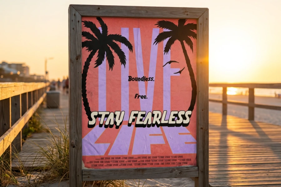
Pride posters, signs, and banners are made to be seen. They show up in parades, storefronts, community centers, campuses, offices, venues, and streets. They help people find the event, join the moment, and feel part of something bigger.
For posters and signs, clarity matters. A short message with confident type can be more powerful than a crowded layout with too many symbols. For event posters, the name, date, time, and location should be easy to find. For banners, keep the design bold enough to work from a distance.
Use Pride poster templates for:
- Pride marches and parades
- Local community events
- Fundraisers
- Storefront displays
- Workplace Pride celebrations
- School or campus events
- Stage backdrops
- Booth signage
- Event announcements
This is where you can let the energy show. Go bold with type. Use color generously. Build a layout that feels open, celebratory, and easy to read.
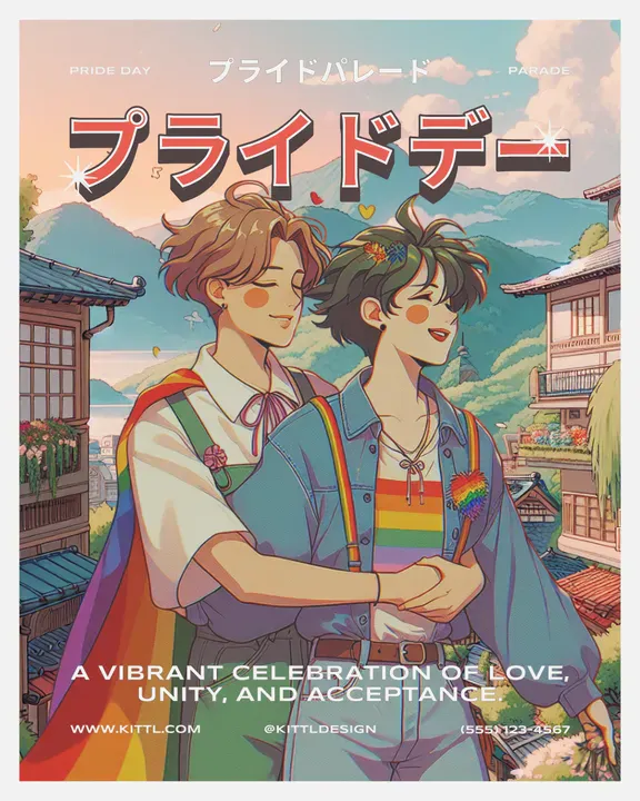
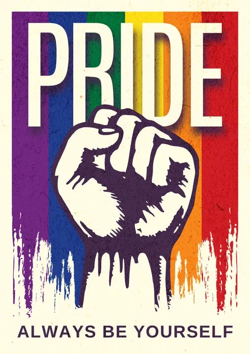
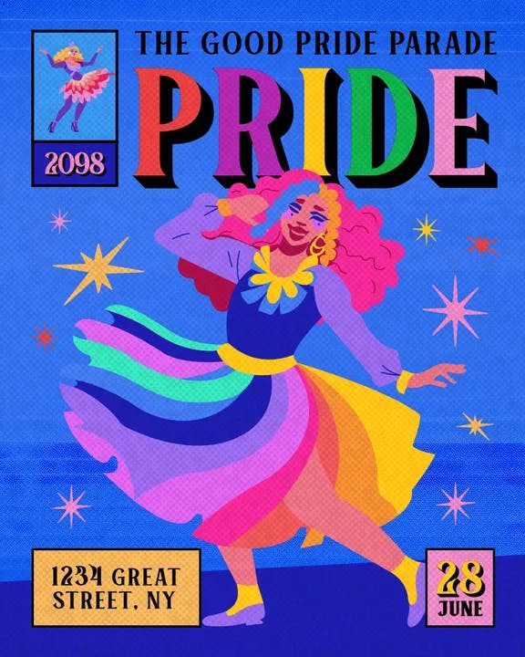
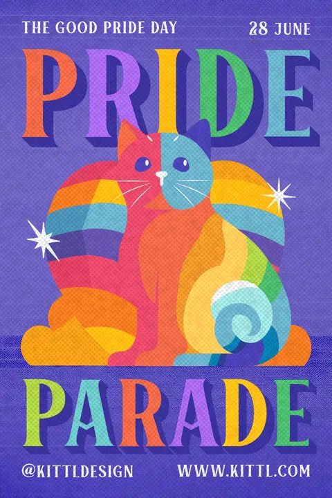
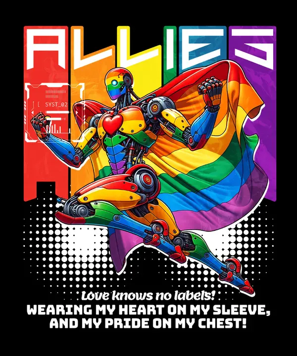
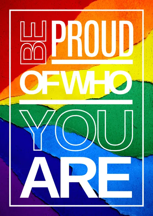
Start with the main poster, then duplicate it into a flyer, banner, and social post. Keep the same color palette and type style so every asset feels connected, but adjust the layout for each format.
02. Pride social media templates
Pride social media post templates work best when they feel clear, warm, and easy to share.
A good post might announce an event, celebrate a community, launch a Pride collection, share a quote, spotlight a queer-owned business, or invite people to support a fundraiser. The design should make that purpose obvious in the first second.
For social, keep the message short. Preview the design on your phone before publishing. If the headline disappears on a small screen, simplify it.
Use Pride social media templates for:
- Instagram posts
- Instagram stories
- Facebook event graphics
- Countdown posts
- Quote graphics
- Profile frames
- Product launch posts
- Pride sale graphics
- Community spotlight posts
- Event recaps
The goal is not to make every post look identical. It is to make the whole campaign feel like it came from the same place.
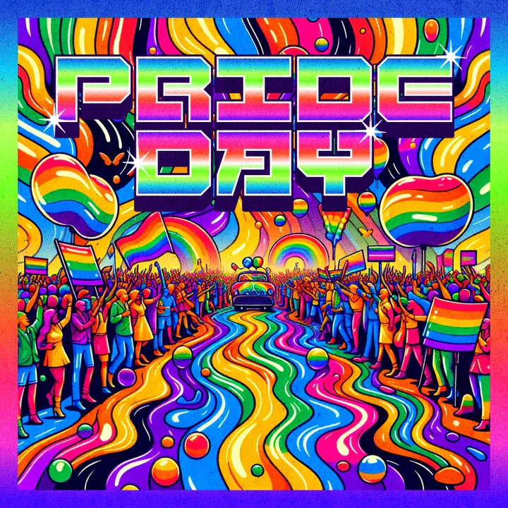
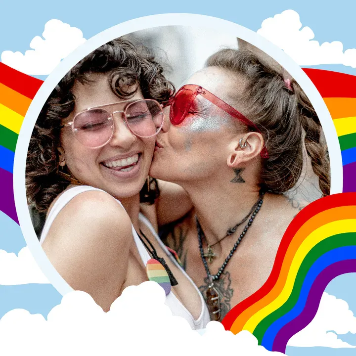
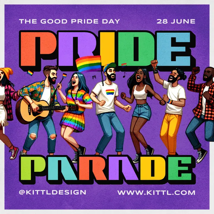
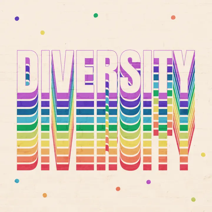
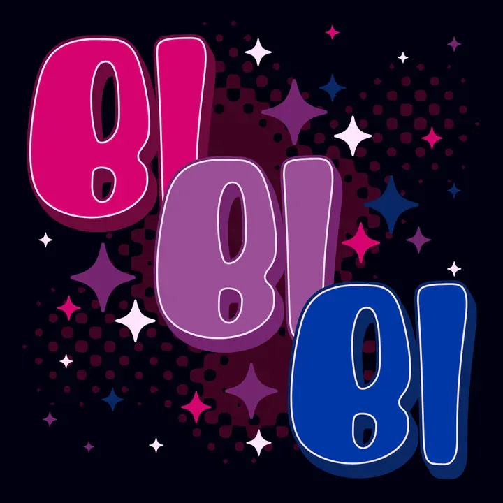
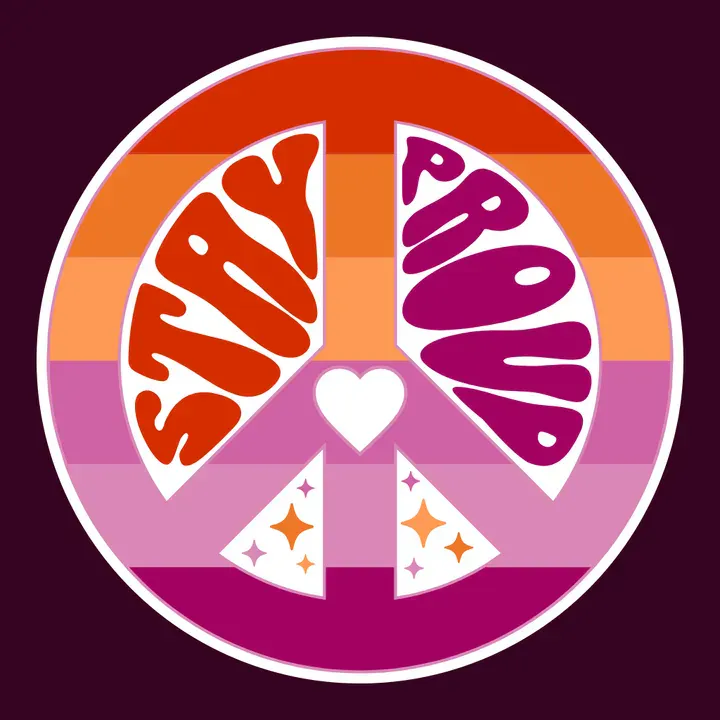
Create a small Pride social set: one announcement post, one story version, one quote graphic, one reminder, and one recap post. That gives your campaign a complete rhythm without starting from scratch every time.
03. Pride merchandise designs
Pride merch is personal. People wear it, gift it, carry it, sell it, and keep it after the event is over.
That is why a Pride t-shirt design needs to feel more than decorative. It should feel like something someone would choose because it matches their humor, identity, mood, politics, or sense of style.
For small businesses and POD sellers, this is where design quality matters. Pride shirts, stickers, mugs, and totes are everywhere in June. The designs that stand out are usually the ones with a clear point of view: a phrase that feels real, typography with personality, a graphic that works on the product, or a palette that feels more considered than a default rainbow gradient.
Use Pride merch templates for:
- T-shirts
- Hoodies
- Tote bags
- Stickers
- Mugs
- Posters and prints
- Digital downloads
- Fundraiser merch
- Event merch
- Small business Pride collections
Before exporting, place the design on a mockup. A graphic that looks great on the canvas may need more spacing, stronger contrast, or a different size once it sits on a shirt, mug, or tote.
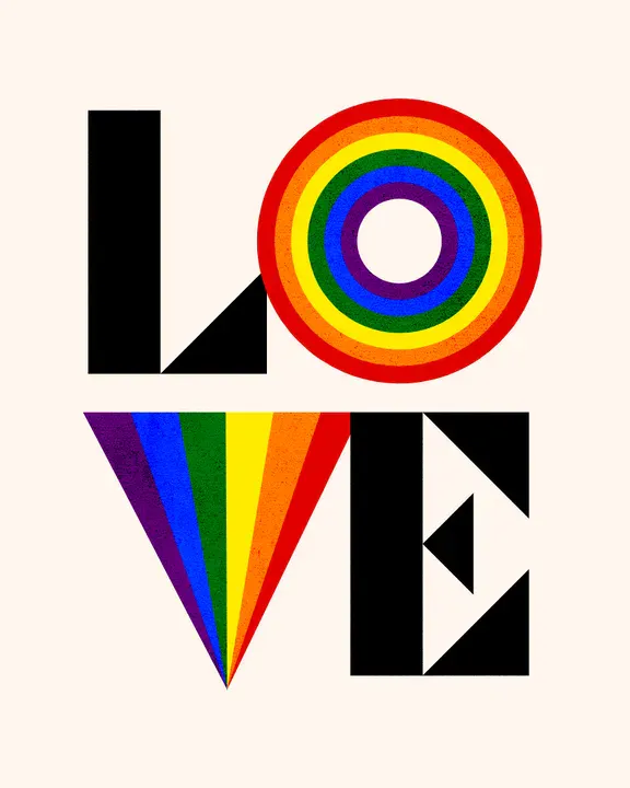
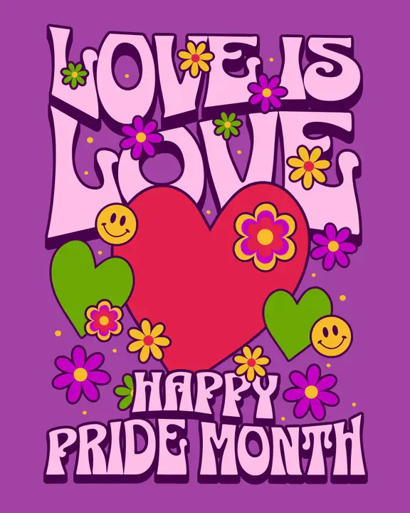
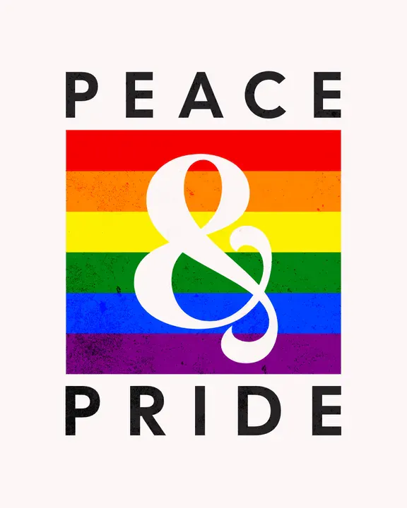
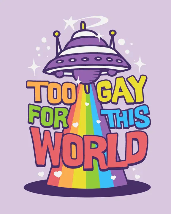
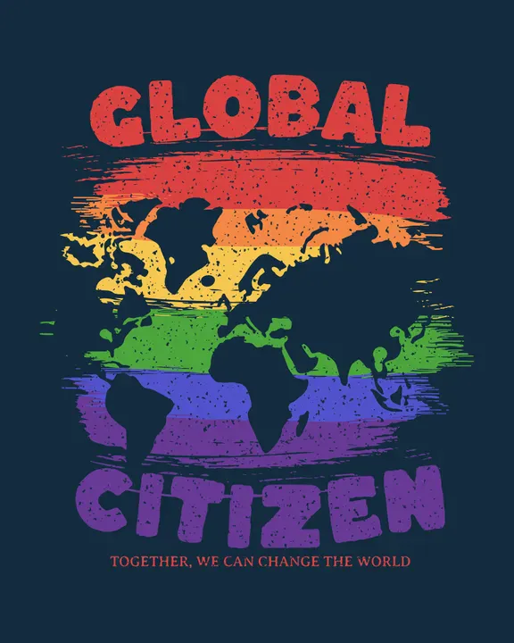
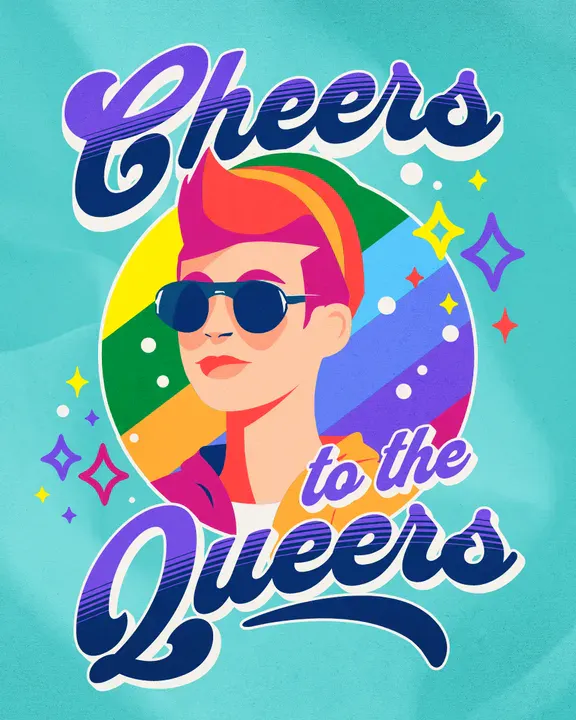
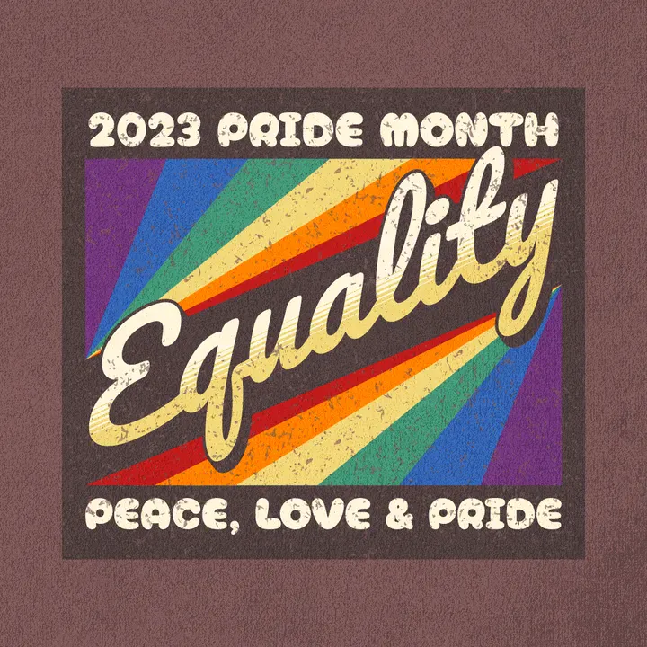
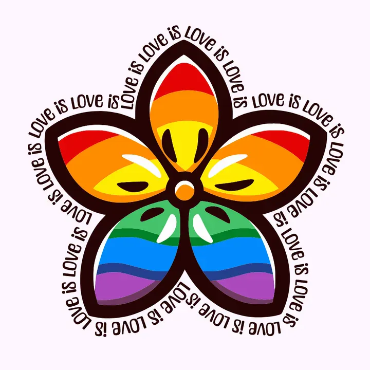
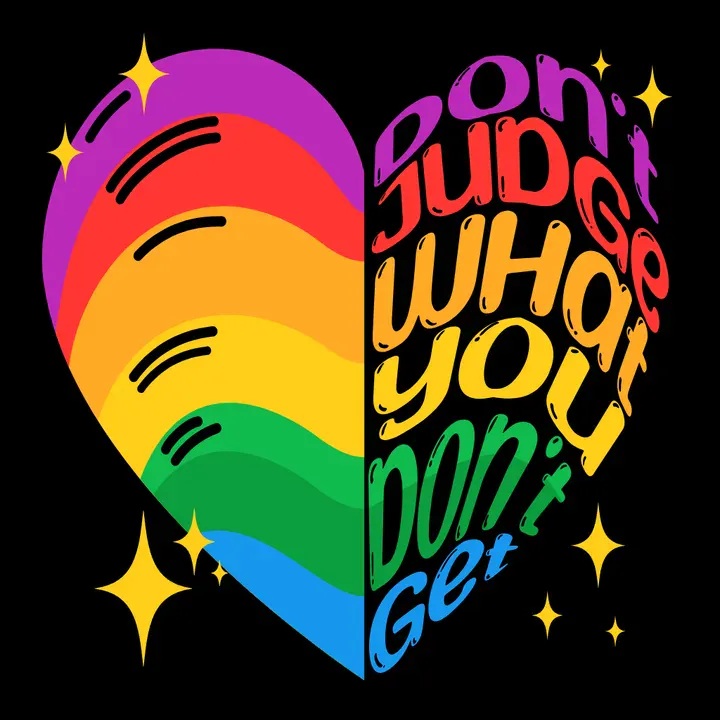
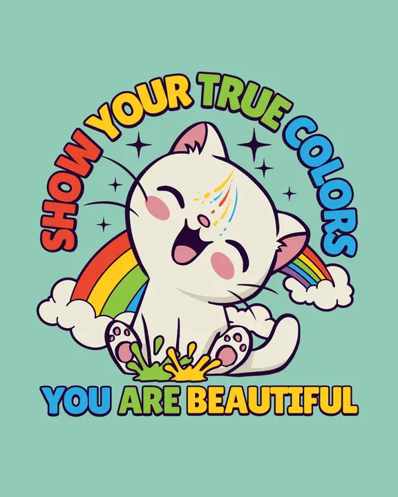
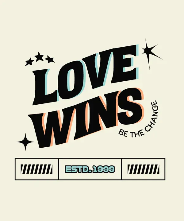
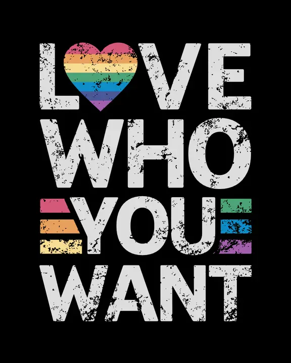
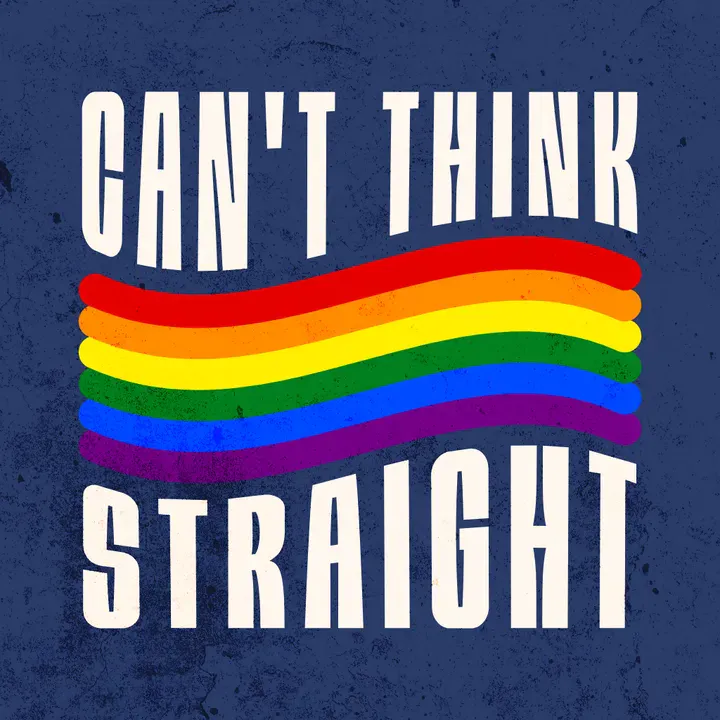
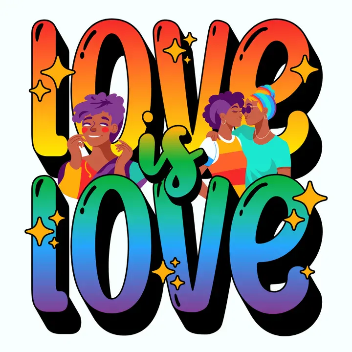
Create at least two mockups before listing Pride merch: one clean product view and one closer detail crop. This helps buyers understand the design faster, especially on Etsy, Shopify, Printify, or Printful listings.
04. Pride event invitations
Pride Month includes big public events, but it also includes smaller, more personal celebrations: parties, dinners, fundraisers, drag brunches, workplace events, coming-out celebrations, weddings, and community gatherings.
Invitations and cards should set the tone before anyone reads the details. A gala might need elegant type and rich color. A Pride party might need playful lettering and movement. A community dinner might need warmth. A fundraiser might need clarity and trust.
Use Pride invitation templates for:
- Pride parties
- Fundraisers
- Community dinners
- Workplace celebrations
- Pride nights
- Coming-out parties
- Wedding invitations
- Greeting cards
- Holiday cards
- Support cards
Keep the basics easy to find: what the event is, when it happens, where it is, and what people should do next. Then let the visual style carry the feeling.
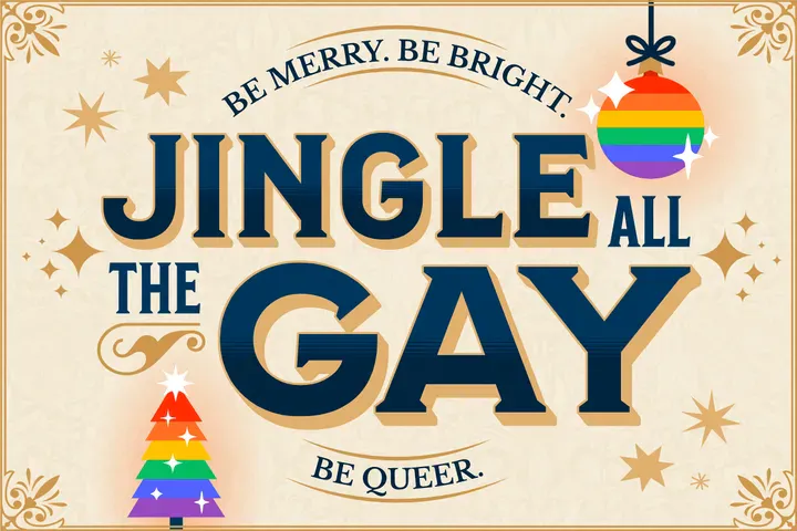
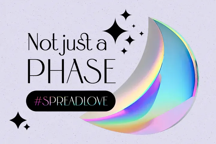
Make one detailed invitation for print or email, then create a simplified social version. The social version should carry the mood and main information without trying to fit every detail.
How to customize Pride Month templates in Kittl
A template becomes stronger when the details feel specific. The colors, type, layout, and message should all point back to the real purpose of the design.
Start with the message
Before changing the palette or font, write the main message in one sentence.
For example:
- Join us for Pride Night.
- Celebrate Pride with our local community.
- Shop our Pride collection.
- Support queer-owned businesses.
- Pride fundraiser, June 15.
- Love belongs here.
- March with us.
- All identities welcome.
Once the message is clear, the design choices become easier. A fundraiser needs trust. A parade poster needs energy. A merch design needs personality. A workplace campaign needs clarity and warmth.
Use Pride colors with care
Pride colors are meaningful, so use them with intention.
Generally speaking, understanding the color wheel can help you make choices that feel vibrant, intentional, and full of life. You can even select colors by adjusting the warmth or coolness of your Pride Month design to match the energy of your event.
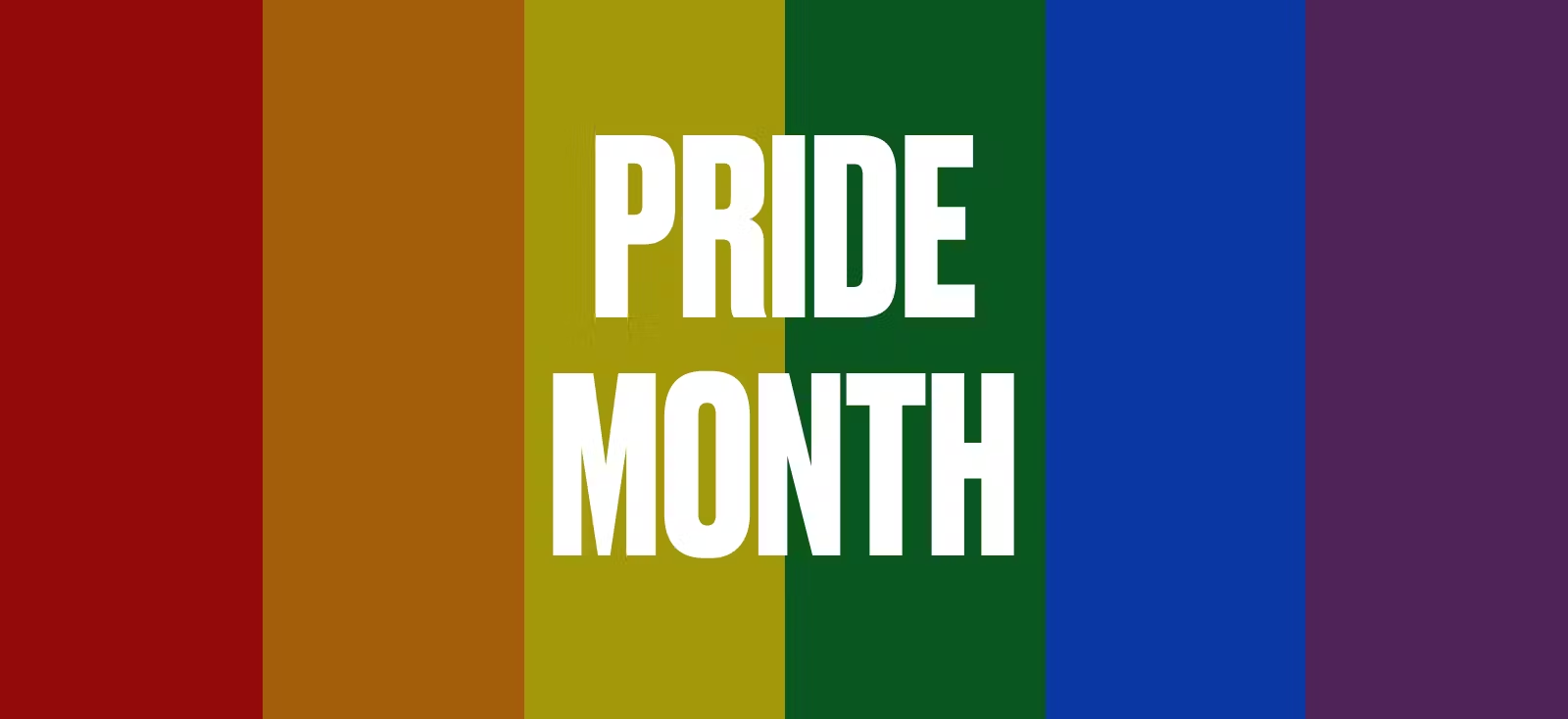
But the easiest tie-breaker is to follow the Pride flag color scheme to create your design.
While the classic rainbow flag is instantly recognizable, there are lots of other Pride flags that represent different parts of the LGBTQ+ community, and each one tells its own story.
Here are a few you might want to explore:
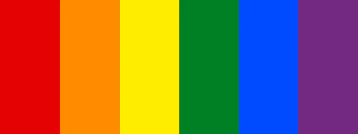
01. Classic Rainbow Pride Flag
Color palette: Red (#E40303), Orange (#FF8C00), Yellow (#FFED00), Green (#008026), Indigo (#004CFF), Violet (#732982)
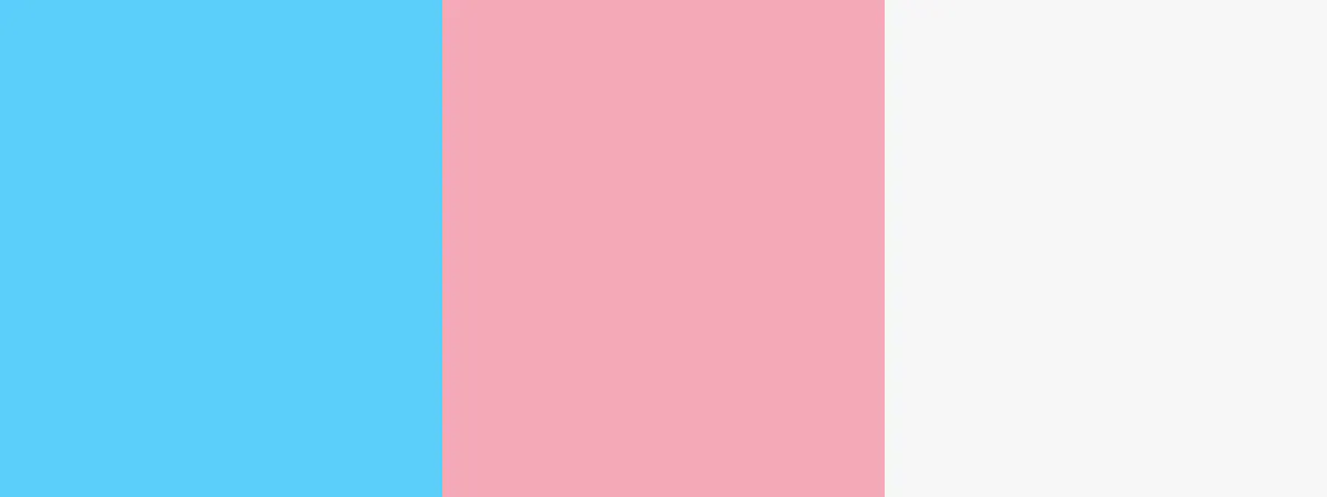
02. Transgender Pride Flag
Color palette: Light Blue (#5BCEFA), Pink (#F5A9B8), White (#FFFFFF)
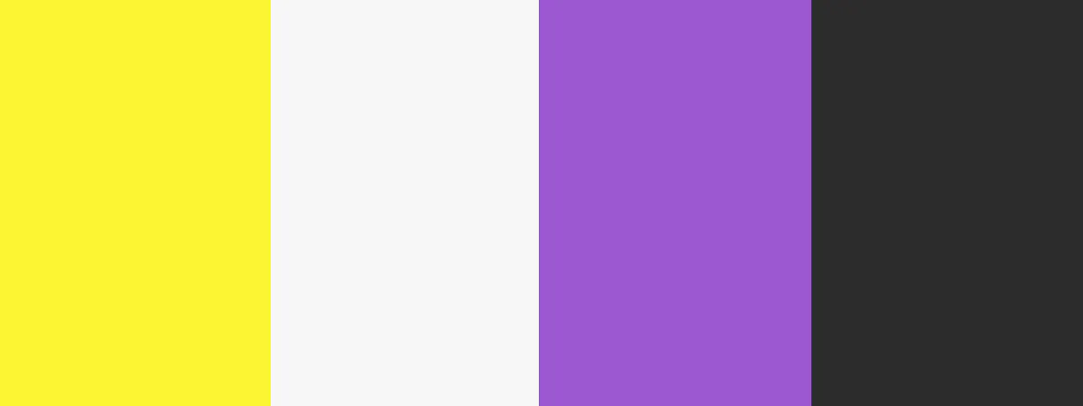
03. Nonbinary Pride Flag
Color palette: Yellow(#FCF434), White (#FFFFFF), Purple (#9C59D1), Black (#2C2C2C)
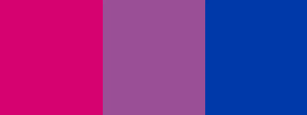
04. Bisexual Pride Flag
Color palette: Pink (#D60270), Purple (#9B4F96), Blue (#0038A8)
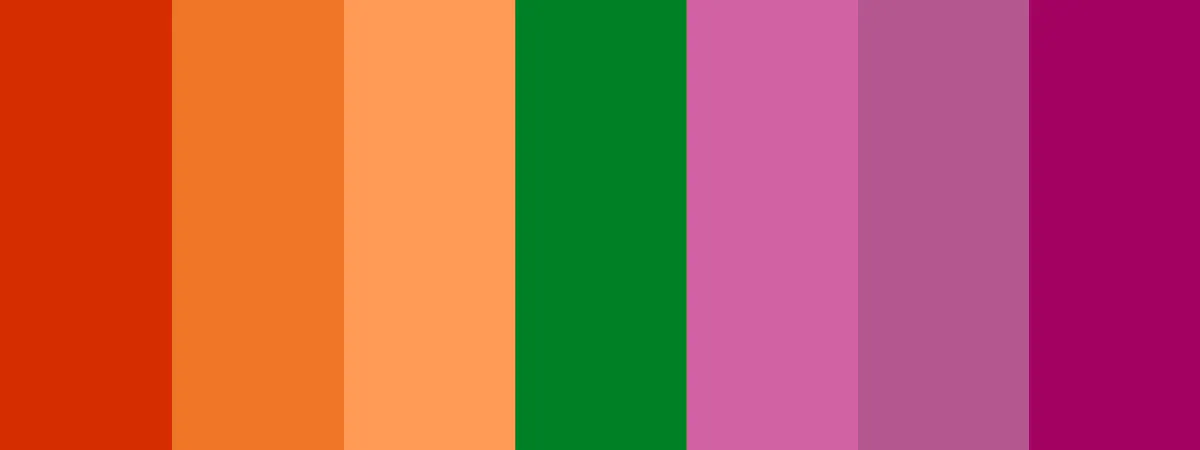
05. Lesbian Pride Flag
Color palette: Dark Orange (#D52D00), Orange (#EF7627), Light Orange (#FF9A56), White (#008026), Pink (#D162A4), Dusty Pink (#B55690), Dark Rose (#A30262)
Building a color palette isn’t just about picking random hues. Good design often taps into the basics of color theory understanding how colors interact, complement, or contrast can help you create a stronger emotional impact.
If you’re blending Pride colors with brand colors, it helps to explore the best color combinations for fresh, cohesive results. And if you want to dig deeper into how colors influence feelings like how purple symbolizes spirit, or blue conveys serenity you’ll benefit from learning about color psychology.
Also, you do not have to use every color literally in every design. In fact, reducing a palette can make the design feel more sophisticated. You might use the full flag palette for a poster, a three-color accent system for social posts, and a single stripe or shadow treatment for merch.
The question is not “how many colors can I use?” The question is “what does the color need to do here?”
For brand campaigns, you can blend Pride colors into the existing brand system instead of replacing it completely. A brand might keep its core black, cream, or neutral base and introduce Pride colors through type shadows, borders, gradients, badges, icons, or campaign illustrations.
That way, the design still feels like Pride, but it also still feels like the brand.
If you want to brighten things up even more, don’t be afraid to lean into neon colors for your designs, especially in graphics for energetic Pride social media or youth Pride events.
Choose typography that fits the tone
Typography is where Pride design gets its voice.
The same phrase can feel completely different depending on how it is typeset. “Love is Love” in a chunky retro font feels playful and nostalgic. In a clean sans serif, it feels direct and public. In an elegant serif, it can feel formal or romantic. In wavy, distorted type, it can feel expressive and full of movement.
That is why font choice should come after tone.
When you’re deciding on typography, think about the vibe you want to bring forward:
- Bold, celebratory fonts help rally crowds and create posters that demand attention. You could lean into bold vintage styles with these retro fonts perfect for graphic design to bring a fun, nostalgic energy to your project.
- Rounded, playful fonts work beautifully for family-friendly events or upbeat social media posts. You might even experiment with colorful, flowing styles like retro wavy stacked text effects to add movement and extra joy to your designs.
- Elegant serif or hand-drawn styles are ideal for invitations, formal galas, or commemorative merchandise. If you’re aiming for something even more personal and expressive, you might find inspiration in this beginner’s guide to digital calligraphy, showing how easy it can be to create beautiful lettering.
- Clean, minimalist fonts fit professional campaigns and workplace Pride celebrations where simplicity and clarity shine. Or, if you want a more dramatic edge, explore some gothic font styles that add strength and character to your design.
The best Pride typography often has contrast. One font brings the personality. Another font keeps the information readable.
If every line is decorative, nothing feels important.
Choosing the right pairings can completely change the mood of your project, and you’ll find more ideas for balancing type styles in this guide to font combinations.
Use Kittl’s text effects to give the headline motion, shape, or depth, then keep event details in a simpler type style. This keeps the design expressive without making the practical information hard to read.
Add details that make it yours
The easiest way to make a Pride template feel less generic is to add real details.
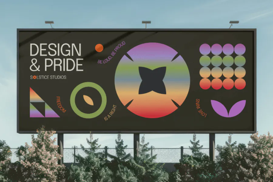
Templates are a starting point, but the real magic happens when you make them your own.
Adding personal touches (like your group’s colors, a meaningful logo, or a custom graphic) turns any design into something that feels alive and connected.
Some easy ways to personalize:
- Add your event name, city, or group slogan into the design
- Swap out generic icons with your organizations logo or custom art
Change background textures or patterns to match your brand style (think glitter, pastel gradients, or graphic patterns) - Include photos of your community members, volunteers, or supporters if you’re creating invites or recap posters
These details do more than fill space. They make the design feel grounded. They tell the viewer this is not a generic Pride graphic. It belongs to a real gathering, real shop, real cause, real community, or real product drop.
For small businesses, that specificity is especially useful. “Pride collection now live” is clear. “Limited Pride capsule supporting queer youth programs in Austin” is stronger because it gives people a reason to believe the campaign has substance.
For events, the same rule applies. The design can be beautiful, but if people cannot find the time, location, or next step, it is not doing its job.
If you’re building multiple designs for a Pride campaign or event, staying consistent can make everything feel even stronger.
That’s why using a tool like Kittls Brand Kit, where you can upload your own logos, fonts, and color palettes, can be a game-changer. It keeps everything organized and makes it easier to create designs that feel cohesive without starting from scratch every time.
Pride is about visibility so dont be shy! Adding real names, faces, or local touches makes designs feel personal, proud, and rooted in community.
Create a full campaign set
A single Pride design is useful. A Pride design system is better.
Most Pride campaigns need more than one asset. The poster announces the event. The flyer carries details. The social post spreads the message. The story version creates reminders. The merch turns the idea into something people can wear. The recap post lets the moment live a little longer.
Instead of making those one by one from scratch, build them as a connected set.
A simple Pride campaign set might include:
- Main poster
- Event flyer
- Instagram post
- Instagram story
- Facebook header
- Storefront banner
- T-shirt design
- Sticker or badge
- Email graphic
- Recap post
Keep the same visual language across the set: palette, type style, shapes, illustration style, and overall tone. Then adjust each layout for the format.
That balance matters. Consistency makes the campaign recognizable. Adaptation makes it usable.
Pride Month design mistakes to avoid
Pride design is generous by nature. It invites color, expression, and personality. The mistakes usually happen when that energy is not directed.
Here are the checks worth making before you publish, print, or sell.
Making the design too general
A broad slogan and a rainbow palette can work, but they need enough character around them to feel alive.
Add something specific: a city, a collection name, a visual style, a fundraiser detail, a community reference, a better phrase, or a stronger type treatment. The goal is not to make the design complicated. The goal is to make it less interchangeable.
Using every idea at once
Pride design can be maximal, but maximal does not mean uncontrolled.
Too many icons, gradients, fonts, outlines, shadows, flags, stickers, and slogans can bury the message. Decide what the viewer should notice first. Then make the rest support that first read.
Making the text too small
Small text is one of the fastest ways to weaken a Pride design.
Posters need to work from a distance. Social posts need to work on mobile. Merch needs to work as a thumbnail. Invitations need to make the event details easy to find.
Preview the design in its real context before you call it finished.
Treating every format the same
A poster layout will not automatically work on a t-shirt. A t-shirt design will not automatically work as an Instagram story. A square social post may not work as a flyer.
Keep the campaign style consistent, but rebuild the layout for the format. That is how a design system stays polished without becoming rigid.
Forgetting that merch has to be worn
Pride merch should look good as a product, not just as a graphic.
Check the design on different garment colors. Make sure the slogan sits well on the chest. Watch for tiny details that may not print cleanly. Think about whether the design still feels appealing after Pride Month.
The best Pride merch often has life beyond the campaign because the design feels personal, stylish, funny, or beautifully made.
Letting AI-generated text slip through
AI can help explore visual styles, generate backgrounds, or speed up idea development, but final text needs human control.
Check spelling. Check letterforms. Check slogans. Check whether the phrase says what you actually mean. For Pride designs especially, a small mistake can make the whole asset feel careless.
Use AI to move faster. Use your judgment to finish well.
Choose Kittl for your Pride Month designs
Pride Month is full of color, joy, visibility, and care. The best designs help that feeling travel.
Whether you are making posters for a march, social posts for a campaign, merch for your shop, flyers for a local event, or invitations for a celebration, Kittl helps you build the whole asset set in one place.
Start with a Pride Month template. Shape the message. Refine the colors. Choose type that fits the tone. Turn one design direction into posters, social posts, invitations, stickers, shirts, and campaign assets that feel connected.
The template gets you moving. Your message gives it meaning.
FAQ
What are Pride Month designs?
Pride Month designs are visual assets created for LGBTQ+ Pride celebrations, campaigns, events, merch, social media, and community messages. They can include posters, flyers, banners, invitations, t-shirt designs, stickers, profile frames, and social posts.
The strongest Pride Month designs use color, typography, symbols, and layout to communicate a specific message, not just a general Pride theme.
When is Pride Month?
Pride Month is celebrated every June. It is connected to the Stonewall Uprising in June 1969 and is now marked through marches, community events, fundraisers, campaigns, performances, and celebrations around the world.
What should I include in a Pride poster?
A Pride poster should include a clear headline or message, strong contrast, readable typography, and any important event details such as date, time, location, organizer, and CTA.
For public posters, keep the main message large and easy to read from a distance. For event posters, make sure the practical details are not hidden behind decorative elements.
What are good Pride Month design ideas?
Good Pride Month design ideas include event posters, parade signs, fundraiser flyers, Pride t-shirts, stickers, tote bags, Instagram posts, profile frames, invitation cards, workplace campaign banners, and community spotlight graphics.
The best idea depends on the purpose. A local march needs a different design direction from a merch drop, social campaign, or formal invitation.
What colors should I use for Pride designs?
You can use the classic rainbow Pride flag colors or colors from specific Pride flags, such as the transgender, nonbinary, bisexual, lesbian, asexual, pansexual, or progress Pride flags.
Use the colors with intention. If the design represents a specific community, make sure the palette matches that identity. For brand campaigns, you can also blend Pride colors with your existing brand palette through accents, borders, shadows, or type treatments.
How do I make Pride merch designs?
Start with a clear phrase, symbol, or visual idea. Choose typography and colors that fit the tone, then place the design on a product mockup to check scale and readability.
For t-shirts, hoodies, mugs, stickers, and tote bags, make sure the design works on the actual product, not just on the canvas. Export in the file format your printer or POD platform requires.
Can I use Kittl for Pride Month templates?
Yes. Kittl has editable Pride Month templates for posters, social media posts, merch designs, flyers, invitations, and campaign assets. You can customize the text, colors, typography, layout, and export format, then adapt one design into multiple assets for print, social, or merch.