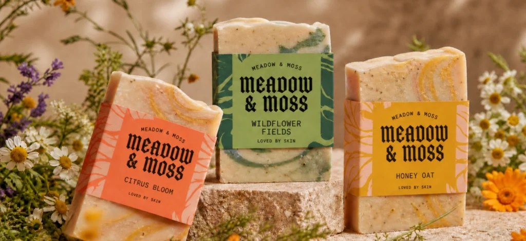
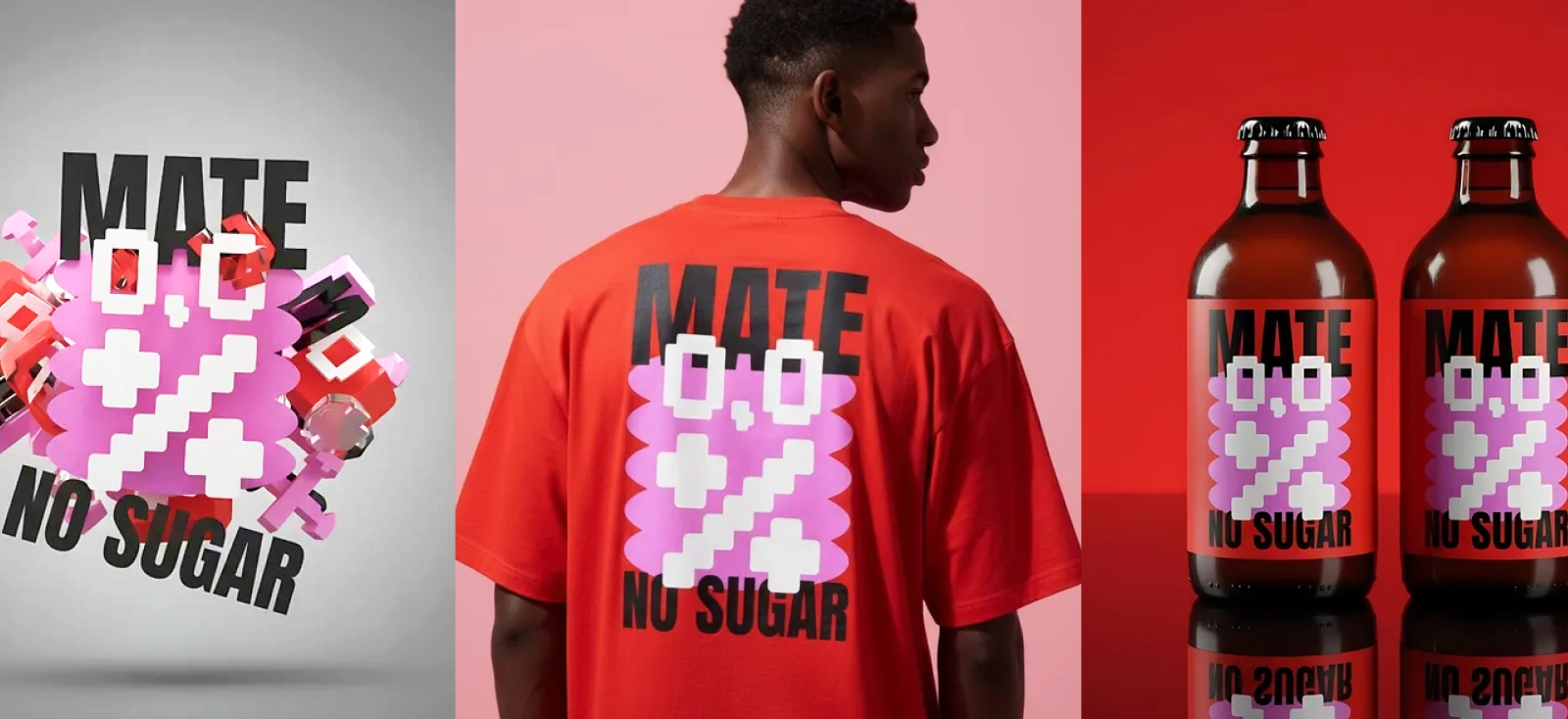
Ask ten small business owners what “brand consistency” means and how to maintain brand consistency, most of them will describe a cage. Same logo, colors, and layout that they repeat for a lifetime because someone once told them that changing anything would confuse their customers.
When actually, brand consistency is rarely about repetition and more about recognition.
Your customer doesn’t need to see the exact same graphic every time to know it’s yours. They need to feel the same thing:
- A dog-mom shop can go coquette one drop and Y2K the next without losing a single regular, as long as the character, the type, and the layout logic still whisper “this is us” underneath whatever trend is on top.
- A freelance client can approve five wildly different mood boards in an afternoon and still recognize their own brand in every one of them, because the thing that actually makes it theirs never moved.
That’s the real unlock here: one strong core design, treated as a system instead of a finished file, can turn into ten, twenty, or fifty sellable variations. The anchor stays put, but the surface keeps changing.
This guide breaks down how to actually build that system, so your production keeps up with trends instead of getting flattened by the same three safe designs on repeat.
1. Establish a visual anchor to maintain brand consistency
Every consistent brand has one thing that never moves, no matter how many times the rest of the design gets reinvented.
Call it the anchor.

It might be a mascot, a badge outline, a signature illustration style, a layout grid, or a specific piece of brand geometry, like a particular curve or icon shape that shows up everywhere.
It doesn’t have to be complicated. It just has to be the one element you’d never trade away, even for the trendiest style in the world.
Here’s where most people trip: they change the anchor along with everything else, and then wonder why the “refresh” feels like a rebrand.
Take a shop with a best-selling dachshund t-shirt, simple line illustration, curved wordmark on top. That same dog can go five different directions and still be unmistakably the same design family:
- A coquette cut with a bow and a softer palette
- A riso print run with grain and a two-ink limit
- An ink-wash version with loose, expressive brushwork
- A Y2K take with chrome lettering and a starburst
- A pixel-art version built for the gamer-pet-owner crowd
Different outfit, same dog. That’s the whole test: could a repeat customer glance at the new version and still clock it as the shop they already follow? If yes, you kept the anchor. If no, you accidentally launched a new brand.
Before you remix anything, name your one non-negotiable element out loud. Mascot pose, logo placement, badge shape, whatever it is. If you can’t name it, you don’t have an anchor yet, you have a vibe, and vibes drift.
Lay out the original design dead center, then ring it with five style variations, Coquette, Riso, Ink wash, Y2K, Pixel. The anchor should be instantly spottable in every single one, almost like a spot-the-difference puzzle where the difference is everything except the one thing that matters.
2. Maintain brand consistency while adapting to design trends
Trend cycles don’t wait for your production schedule to catch up.
Coquette bows are everywhere for one month. Pixel art takes over next. By the time you’ve manually redrawn a design in a new style, the window’s already closing on the last one.
Freelancers feel this pressure too: a client wants to see three or four directions before lunch, and nobody has time to build each one from a blank canvas.
Kittl’s Smart Board and AI style tools exist for exactly this bottleneck. Instead of rewriting your prompt or starting the illustration over, you hold the core concept steady and layer a new aesthetic on top of it.

Here’s the actual workflow:
- Drop your core design onto the canvas, whether it’s a mascot, a t-shirt graphic, or an early logo concept.
- Move it onto a Smart Board so every variation you generate lives in one organized place instead of scattered across tabs.
- Leave the base prompt or design direction untouched, that’s what keeps the output tethered to the original idea instead of drifting into something unrecognizable.
- Hit the Style button under the AI image board.
- Pick a new direction, Coquette, Riso print, Ink wash, Y2K, Pixelated, retro comic, vintage engraving, soft watercolor, whatever the trend calls for.
- Generate a batch of variations off that same base.
- Hold each result up against your anchor and ask if it still passes.
- Take the winners and finish them off with your standard fonts, colors, and export settings.
See how to use Kittl Flows like this:
Don’t fall in love with a variation just because it looks striking. Ask whether a stranger scrolling past would still understand what the product actually is. A style that buries the joke, the phrase, or the mascot underneath itself isn’t a variation, it’s a different product wearing your brand’s name.
Build a four-panel walkthrough graphic: the original design, the Style button, the menu of aesthetic options, and the finished variation grid. Useful for a blog post, more useful as a cheat sheet you’ll actually reuse.
3. Ensure brand consistency during client revisions
Agencies and freelancers run into a version of this problem that has nothing to do with trends and everything to do with vague feedback.
You already know the emails. “Can we make it feel more premium?” or “Less colorful, maybe.” Every one of those is a fair ask.
The fix is locking the client’s identity down first, then generating controlled directions around it instead of guessing blind.
Say a café client has a colorful mascot, a grinning coffee cup with retro type, and they want to explore something calmer for a new premium packaging line without losing the character everyone already recognizes.
Kittl’s Remix Image and Style tools let you hold that mascot steady while testing a minimalist line-art version, an so many other art styles without a single new sketch. The cup stays the cup. The name stays the name. Only the mood shifts underneath it.
That changes what a revision round actually feels like for the client. Instead of ten scattered options that all read as guesses, you’re handing them one identity, shown through four or five specific commercial lenses.

It reads as strategy instead of trial and error, which is exactly what agencies need when a single brand has to show up differently across packaging, social, merch, and a seasonal push, while still obviously belonging to the same company.
Name your options by what they’re for, not by what they’re called. “Premium packaging direction” gets a faster yes than “ink wash style,” because the client can picture the shelf instead of googling the term.
4. Standardize typography and brand voice
Art direction is allowed to chase trends. Typography’s job is to stay put.
That doesn’t mean your fonts are frozen forever. It means type becomes the thing customers can lean on while everything else is in motion.
You don’t need a complicated system to pull this off:
- One headline font
- One supporting font
- A fixed rule on all-caps versus sentence case
- A fixed rule on curved, stacked, or centered type
- Consistent CTA phrasing
- A consistent naming convention for products, scents, or collections

For a POD shop, this matters more than it sounds like it should. A teacher shirt, a coffee shirt, and a pet shirt reaching for three different fonts because the niche changed makes the storefront feel like five unrelated sellers sharing a URL by accident.
Voice works the same way. A sarcastic brand shouldn’t suddenly sound like a press release just because the layout went minimal, and a soft, cozy brand shouldn’t start shouting just because Y2K is having a moment everywhere else.
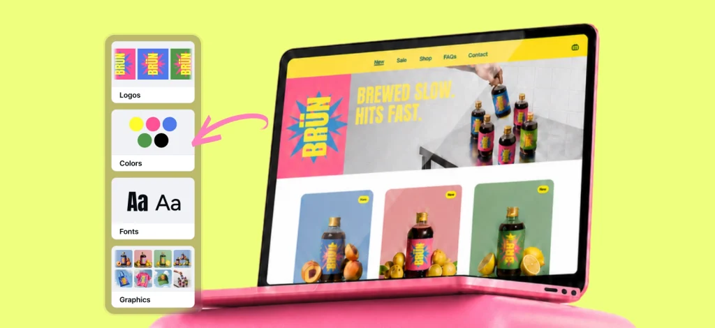
Kittl makes the discipline part easier, at least: save your fonts, colors, and layout rules once, and apply them across every new variation you generate, so the visuals can wander while the voice stays locked in place with the Kittl Brand Kit.
When the artwork is loud, keep the type quiet. When the type gets experimental, keep the artwork simple. Pick one element to take the risk at a time, never both in the same design.
5. Maintain brand consistency in production
Consistency doesn’t fall apart at the concept stage nearly as often as it falls apart at export.
You’ve got five design variations that all look great in the file. But it can show up way differently when in print. It might look like a creative problem, but it’s actually a workflow problem.
This is where AI-generated variations specifically need a second pass. Backgrounds need cleaning, edges need checking, placement needs to match across the whole set, and everything needs to leave the workspace at a consistent size before it lands on Etsy, Shopify, or a client’s shared folder.

With Kittl, there are multiple features you can use to help with this. Grouping them into several infinite canvases is a good idea where you can easily spot an error that stands out.
You can also easily clean up graphics with Kittl’s AI Background Remover. It handles the cleanup on generated graphics fast, and the batch editing tools let you push a whole set of variations through at once instead of babysitting each file individually.
Before anything goes live, run it against a short list:
- Backgrounds are clean and consistent
- Edges are checked for stray pixels or halos
- Print placement matches across the set
- Canvas size is identical file to file
- File names actually make sense six months from now
- Export format is correct for the destination
- Every variation is mocked up on the same product blank
- The whole set has been reviewed together, not one file at a time
For a POD seller, this checklist is quietly the difference between a shop that looks like one brand and a shop that looks like five people uploaded separately at 1 am.
6. Check brand consistency across digital and physical mockups
A design that looks premium in the Instagram post and awkward on the actual shirt hasn’t actually solved anything yet.
That gap shows up constantly once product gets involved. You can run into a graphic that doesn’t look as great on fabric or a color that somehow changes its contrast when printed. Mockups are where a design actually gets tested against reality, not just approved in theory.
For POD sellers, that means running every remixed design through a realistic mockup before it goes anywhere near a listing, the exact shirt color, cut, and print position you’re planning to sell, judged as a finished product rather than a floating graphic.
For small businesses, it means comparing the same design across every place it’ll actually live: shirt, hoodie, tote, label, sticker, packaging insert, social post, banner, email header.
None of those have to be identical to each other. They do need to share a signal, the same color story, the same typography, the same motif, something a customer could clock across all of them without reading a single word.

Kittl’s Mockup Generator is built for that exact check. Place the remixed design on apparel, packaging, or a promo scene and see whether it holds up before you spend real money printing it wrong.
Test the design on your worst-case product color first, not your best one. If it still reads clean there, the system underneath it is solid.
7. Centralize assets to ensure brand consistency
Consistency quietly falls apart the moment your files stop living in one place.
The core file is buried in someone’s downloads folder. The remixed version got saved somewhere else entirely. Someone on the team is still using the old logo because nobody told them it changed. A seller downloads five near-identical exports and, inevitably, uploads the wrong one.
None of these are dramatic mistakes on their own. Stacked together over a few months, they’re exactly how a brand starts to look disjointed without anyone deciding that on purpose.
A centralized workflow fixes this by keeping the core design, every remixed variation, your palettes, fonts, mockups, and export files under one roof, so nobody’s hunting for the “final_v3_ACTUAL” version of a mascot ever again.
For a POD seller, this is what actually makes it realistic to turn one core design into a hoodie, a tote, a sweatshirt, and a seasonal drop without rebuilding the layout from memory each time.
For an agency, it’s what keeps a client’s revision history from turning into an unsearchable graveyard of loose files. For a small business, it’s what keeps packaging, social, and product pages all pulling from the same source instead of five slightly different ones nobody remembers approving.
Kittl handles this by keeping designs, templates, remixes, mockups, and brand assets in one workspace, so a new style becomes part of an ongoing system instead of a one-off file you’ll have to reverse-engineer the next time you need it.
A structure this simple covers most of what you’ll ever need:
- Core design
- Approved brand assets
- Style remixes
- Product mockups
- Client revisions
- Export-ready files
- Seasonal variations
- Archived versions
It looks almost too obvious to write down, but it’s the difference between starting from a blank canvas every time a trend shows up and starting from a system that already works.
Never touch the original core file directly. Duplicate it first, remix the copy, and keep the original untouched as your control sample, the thing every future variation still has to answer to.
Consistent, not repetitive
The laziest way to stay consistent is to repeat the exact same design forever. It also happens to be the fastest way to make a brand feel dead on arrival.
The better approach is controlled variation. Keep the anchor, let the aesthetic move. Keep the typography, let the texture change. Keep the layout logic, let the color story shift with the season.
For a POD seller, that’s how one proven t-shirt concept becomes a whole product line without a single customer wondering if they’ve wandered into the wrong shop.
For a freelancer, it’s how you hand over faster options without ever losing the thing that made the client hire you in the first place. For a small business, it’s how a campaign chases a trend without the brand underneath it going unrecognizable.
That’s the actual line between staying consistent and just standing still, and it’s the difference between a brand that ages and one that just repeats.
Build a brand system that can move
Brand consistency was never supposed to freeze your designs in one look forever. Done right, it just gives them a foundation solid enough to move into new styles without ever losing the thread back to who you actually are.
For small businesses, POD sellers, freelancers, and agencies, the pressure is real and it isn’t slowing down: more assets, more trends worth testing, more client feedback to fold in, all while trying to ship faster than last quarter. Rebuilding from scratch every single time isn’t a workflow, it’s a slow way to burn out a team that’s already stretched thin.
The better system starts with one core design. Build the anchor. Lock the typography. Keep the voice steady. Remix the style. Clean the files. Test the mockups. Keep it all in one place instead of five. That’s what actually separates a brand that stays consistent from a brand that’s just standing still, and it’s what keeps the work feeling current, flexible, and worth someone’s money.
FAQ
How to maintain brand consistency when scaling product design?
Start with one core visual identity anchor, a logo, mascot, layout, type system, or badge shape, and hold that steady while everything else, style, color, texture, product format, is allowed to move. Templates, Brand Kits, mockups, and an organized file system all help make sure each new piece still traces back to the original brand.
What is the difference between brand consistency and repetitive design?
Brand consistency means a customer can recognize your work across very different assets. Repetitive design means every asset looks nearly the same. A consistent brand can absolutely chase new aesthetics, seasons, and product formats, as long as the core identity, typography, tone, and layout logic underneath it never actually change.
How can agencies ensure brand consistency during client revisions?
Lock the client’s core identity in place first, then build controlled style directions around it instead of guessing blind. A colorful mascot logo, for instance, can become a minimalist, ink-wash, Y2K, or premium packaging version while the mascot, name, and structure stay exactly where they were.
What tools help how to maintain brand consistency in production?
Brand Kits, reusable templates, AI style remixing, background removal, batch editing, mockup generators, and a centralized asset library. Together, they keep color, type, file formats, and placement consistent across a set instead of leaving it to whoever happens to be exporting that day.
How do you adapt a brand design to new aesthetics without losing identity?
Fix one or two anchors, the mascot, the logo, the core shape, the type system, and let everything else move around them: texture, illustration style, palette, aesthetic direction. That’s the whole mechanism that lets a brand follow a trend without losing the thing that made it recognizable to begin with.
Why is visual hierarchy important for brand consistency?
Hierarchy tells a viewer what to notice first, second, and third. Keep that order the same and customers recognize the brand fast, even when the style around it has completely changed. If the product name, mascot, tagline, and CTA always land in the same order, the design stays legible across products and platforms no matter how much the surface keeps shifting.

Shafira is a content writer who turns boring business talk into reads people actually enjoy. She grew up hoarding $1 novels in Singapore and writing hilariously bad fiction, but now she tackles content marketing with all that creative chaos since 2019. From blogs and newsletters to UX and SEO, she writes how she thinks: nerdy, honest, and a bit offbeat. She believes the best content is human-designed, not just plain text.