Finished watching Bridgerton? You might already be feeling inspired by its romantic visual world.
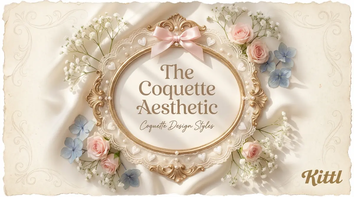
The coquette design style is all about softness, sentimentality, and visual romance. It draws from vintage fashion, handwritten details, and traditionally feminine elements such as ribbons, florals, and lace-inspired textures.
Unlike minimalist styles that rely on restraint, coquette embraces decoration and emotion. It uses gentle color palettes, layered details, and delicate compositions to create a sense of intimacy and charm.
In recent years, coquette design has seen a strong resurgence across digital platforms, fashion branding, and social media. Its growing appeal reflects a broader cultural shift toward emotional visuals and nostalgic aesthetics, especially among Gen Z audiences who are drawn to softness, personality, and self-expression over polish and perfection.

Coquette Perfume Template. Use Template

Coquette Design Carousel Template. Use Template
What is coquette design style?
Coquette design style is a romantic, soft visual aesthetic built around delicacy, nostalgia, and emotional expression. It uses gentle color palettes, decorative elements like bows and lace, vintage inspired typography, and intimate imagery to create designs that feel personal rather than performative.
At its core, coquette design style prioritizes feeling over function. It leans into traditionally feminine symbols and quiet ornamentation, embracing softness as a strength rather than something to minimize. Unlike minimalist or highly structured design styles, coquette welcomes decoration, sentimentality, and visual vulnerability.
The result is a style that feels intimate, curated, and human. It looks less like a brand speaking at an audience and more like a person sharing something personal.
Key visual traits of coquette design style
Coquette design style blends historical romanticism with modern digital softness. It draws visual influence from Rococo art and Victorian ornamentation, while contemporary references include photographers like Petra Collins and fashion branding such as Sandy Liang. The style combines pastel palettes, delicate decoration, and nostalgic femininity to create intimate, emotionally expressive visuals.
Here are the summarized traits:
- Soft pastel color palettes such as blush pink, cream, ivory, and faded blue
- Decorative elements like bows, lace, hearts, pearls, and florals
- Vintage or handwritten typography with elegant curves
- Romantic imagery inspired by old photographs, diaries, and fashion editorials
- Light textures that feel delicate rather than gritty


Coquette design vs similar design styles
Coquette design does not exist in isolation. It sits alongside several romantic and expressive design styles that often get confused with one another. Understanding the differences helps you choose the right visual language, not just the right aesthetic.
| Design style | Core feeling | Visual traits | What makes it different |
|---|---|---|---|
| Coquette design style | Soft, intimate, romantic | Pastel colors, bows, lace, pearls, vintage typography, delicate textures | Focuses on emotional closeness and intentional softness. Feels curated, personal, and expressive rather than worn or playful. |
| Shabby Chic | Cozy, nostalgic, comforting | Distressed textures, faded florals, worn materials, muted tones | Rooted in domestic warmth and lived-in charm. Feels inherited and home-focused rather than fashion-led or digital. |
| Kid Core | Playful, joyful, nostalgic | Crayons, stickers, bold colors, naive shapes, doodles | Draws directly from childhood visuals. Louder, brighter, and more playful than coquette’s quiet romance. |
| Romantic Vintage | Timeless, classic, elegant | Antique typography, aged photography, historical layouts | Preserves historical aesthetics. Coquette modernizes romance instead of preserving the past. |
Why is coquette design style so popular right now?
Coquette design is rising because visual culture is tired.
Years of minimalism, perfect grids, and AI-smoothed outputs have flattened brand expression. Everything looks clean. Everything looks correct. And everything starts to blur together. Coquette design pushes back. It feels softer, slower, and emotionally present.
Generational shifts amplify this change.
Gen Z values self-expression over polish. Vulnerability over perfection. Identity over uniformity.
Coquette design fits naturally into this mindset. Influencers like Lana Del Rey, whose visuals lean heavily into nostalgic femininity and romantic melancholy, helped popularize this softness long before it became a defined trend.
Digital platforms accelerate the trend. Pinterest, Instagram, and TikTok reward aesthetics that communicate mood instantly. Coquette design does exactly that. Pastel tones, delicate details, and romantic imagery send a clear emotional signal in seconds. Viral bow trends and hyper-feminine mood boards have reinforced the aesthetic across fashion and lifestyle content.
Tools matter too. Modern design platforms and AI-assisted workflows remove friction. Designers can experiment with typography, ornamentation, and texture quickly. What once felt niche is now easy to explore and scale.
In a world optimized for speed and efficiency, coquette design resonates because it chooses softness. And softness feels human.
Modern use cases of coquette design style with real brand examples
Today, coquette design style shows up across fashion, beauty, and digital culture. Not as a gimmick, but as a deliberate way to signal softness, intimacy, and emotional connection.
Fashion branding and lookbooks
LoveShackFancy is one of the clearest coquette examples. Its branding leans heavily on pastel tones, lace details, bows, and romantic typography. Campaigns feel nostalgic and feminine, drawing from vintage photography and diary-like storytelling.
Sandy Liang blends coquette softness with modern fashion. Ribbons, delicate graphics, and playful femininity appear across lookbooks and digital visuals, often paired with contemporary styling.
These brands use coquette design to feel personal rather than aspirational. The message is intimacy, not distance.

Coquette Fashion Moodboard Template. Use Template
Beauty and skincare packaging
Glossier has occasionally leaned into coquette-adjacent visuals, especially in limited campaigns and social content. Soft color palettes, handwritten typography, and minimal but gentle compositions create a sense of closeness and authenticity.
Smaller indie beauty brands often use coquette design more fully. Pastel packaging, romantic type, and decorative details help products feel tender and emotionally driven rather than clinical.
Social media graphics and digital collages
Coquette design thrives on platforms like Pinterest and Instagram. Mood boards filled with bows, lace textures, soft photography, and handwritten text perform well because they communicate emotion instantly.
Creators use coquette visuals to build personal brands that feel diaristic rather than promotional. The aesthetic reads as “shared,” not “marketed.”
Personal blogs, mood boards, and editorial layouts
Many personal blogs and digital zines use coquette design style to frame content as intimate storytelling. Soft layouts, vintage imagery, and gentle typography make the reader feel like they are entering someone’s private world.
This is where coquette design feels most at home. It mirrors the format of journals, scrapbooks, and letters.
Coquette Cats Look Book Template. Use Template
Coquette Ribbon Look Book Template. Use Template
Lifestyle products and packaging
Coquette design appears in stationery, candles, accessories, and small lifestyle products. Brands use it to create objects that feel sentimental and giftable. Packaging often looks delicate, keepsake-like, and emotionally charged.
These products succeed because they feel meaningful, not mass-produced.
Key takeaways: Why Coquette is worth to try
Coquette design style is having a moment because it feels human. Soft, romantic, and emotionally expressive in a visual world that has become overly polished and predictable.
That is exactly why it works so well in Kittl. The platform makes it easy to explore delicate typography, decorative details, and gentle color palettes without overthinking or overengineering the process. You can move fast, experiment freely, and keep the softness intact.
Kittl’s templates, fonts, decorative assets, and AI tools make it easy to explore pastel palettes, romantic typography, and delicate compositions without over-polishing the result. Whether you are designing social graphics, packaging, or editorial visuals, you can move quickly while keeping the softness and intimacy the style requires.
If you are looking for a design style that feels personal, current, and creatively refreshing, coquette is a great place to start. And Kittl is one of the easiest ways to bring it to life.

Kezia Sabrina is a biotechnologist turned Product Meownager, blending deep user insight with out-of-the-box product strategy. With experience across healthcare, e-commerce, and now the graphic design space, she focuses on building lovable tools and thoughtful pages for her users. At Kittl, she’s shaped the blog into a more seamless experience and occasionally contributes as a writer, combining her product thinking, SEO experimentation, and just enough creative weirdness to stay memorable.