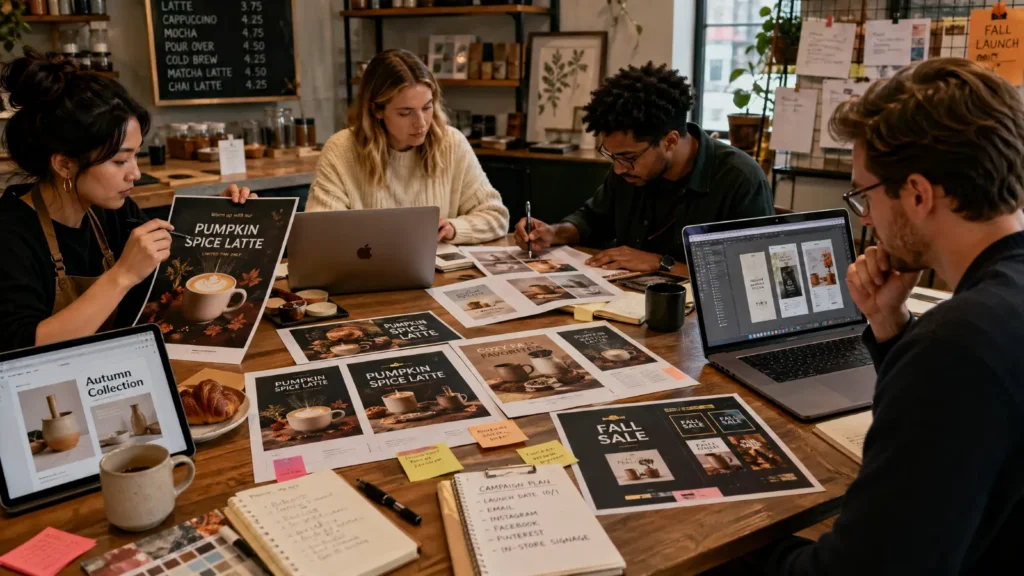
Template fatigue is real.
The same layouts keep showing up. The same badges. The same font pairings. The same polished, safe decisions.
Templates still help creators move fast. But when too many people use the same starting point, the work starts to feel interchangeable.
That is the real problem.
Creators are not tired of templates. They are tired of looking like one.
Take a close look at this template from one of Kittl’s creators. It is easy to see why it spread. Nearly 500,000 people saved it as inspiration, and more than 5,000 people love it. That kind of popularity proves the template works. But it also reveals the tension inside template culture.

The more widely a design gets reused, the more likely it is to lose its sense of authorship. The real uh-oh moment is not when a template becomes popular. It is when that same idea starts showing up everywhere, including on someone walking past you on the street.
What template fatigue means
Template fatigue is the pushback against design that feels too familiar.
The work is polished. It is usable. Nothing is obviously wrong with it. But it still feels generic.
People notice the pattern before they notice the point.
That is where template smell comes from. It is the moment the viewer can still see the template underneath the finished work. Not because the design looks bad. Because it looks expected.
Templates are not the issue.
Template-looking work is.
Why template fatigue is happening now
Template fatigue is growing because polished design is easier to produce than ever.
AI tools and template-first platforms have made clean, usable output cheap, fast, and widely available. That is good news. But it also creates a flood of sameness. Once polished design becomes common, polish stops being a differentiator. The value shifts to taste, identity, and recognizability.
That is why more creators are moving toward texture, warmth, rough edges, personality, and visible choices. Not because clean design stopped working. Because clean design alone stopped standing out.
Kittl’s template usage data makes that shift easier to see. Across millions of uses during past 3 months, a narrow set of high-aesthetic templates absorbed a disproportionate share of usage activity. In Streetwear & Apparel, Y2K Collection #1 led with 12.81%, followed closely by Y2K Aesthetic Flash Sheet at 12.75%. In Illustration & Graphic Motifs, Human Being reached 10.47%.
Even in Text-Led / Statement Design, top formats such as Overthinking Solves Nothing and Introvert concentrated attention around familiar visual formulas.
The pattern is clear: users are not just choosing templates for efficiency. They are choosing templates that already come with a strong point of view. That makes creation faster, but it also makes repetition easier. Over time, the look becomes recognizable before the message does.

Research helps explain the shift
Research by Science Direct does not appear to use “template fatigue” as a formal term. But adjacent research points to the same pattern. This does not directly prove template fatigue, but it helps explain why repeated visual formulas may lose impact.
In psychology, habituation describes what happens when repeated exposure reduces response over time. Template fatigue appears to follow a similar pattern. Repetition can make familiar design feel legible at first, then predictable, then easy to ignore. In marketing, research on repetition often finds an inverted-U effect: repetition can help at first, then slide into boredom or irritation.
Other research on distinctiveness shows that people notice and retrieve information more easily when it stands apart from competing stimuli. Work on visual aesthetic fatigue points in a similar direction. Repeated exposure can lower preference over time.
Taken together, the pattern is simple.
When people keep seeing the same visual formula, that formula gets easier to ignore. Distinctive work becomes easier to notice, easier to remember, and harder to confuse with everything around it.
What template smell looks like
Template smell usually shows up through safe choices that became too common.
Each one works on its own. That is why they spread. But once too many of them appear together, the work starts to feel prebuilt instead of authored.

You can usually spot template smell before you can name it. A few “different” designs start to blur together. The headline sits in the same place. The badge lands in the same corner. The font pairing feels familiar. The glow, spacing, and layout all look polished, but expected.
That is the trap. None of these choices are wrong on their own. The problem is what happens when too many of them show up together. The work stops feeling authored and starts feeling prebuilt.
Template smell is rarely one bad choice. It is usually a stack of safe ones.
Default font pairings
A bold sans serif headline and a softer supporting font is a safe formula. It is popular for a reason. But when the same combination appears everywhere, it starts to advertise the tool instead of the creator.
Recycled badges
“New,” “sale,” “limited,” and “best seller” labels often use the same shapes, shadows, and corner placements. They stop feeling useful and start feeling automatic.
Predictable layouts
Centered headline. Centered subhead. Centered button. It is clean, easy to scan, and easy to make. It is also one of the fastest ways to make a design feel templated.
Polished but empty visuals
Everything is aligned. The spacing is solid. The gradient is smooth. Nothing is wrong. Nothing is memorable either.
That is the trap.
Safe design helps you publish. It rarely helps you stand out.
Why original design matters more now
Original design matters more now because people decide fast.
In visual design, first impressions form almost instantly. Research on website aesthetics found people can judge visual appeal in as little as 50 milliseconds, and design factors like color and typography shape those judgments early.
That matters in feeds, previews, product grids, search results, and AI summaries. Once the same visual formula shows up often enough, it gets easier to recognize, and easier to skip.
Because familiarity without identity is easy to ignore.
What creators really want
Creators still want speed.
They still want simplicity.
They just do not want the finished work to feel borrowed. What they want is original design that still moves at template speed.
That is the shift.
More creators want design that feels authored. That usually means:
- type with more personality
- texture that adds depth
- layouts that feel composed, not assembled
- imperfect crops, contrast, and layering
- small choices that signal intent
The goal is not chaos.
It is ownership.
Original design is not the opposite of speed. It is the thing that keeps fast work from feeling interchangeable.
The best work now does not just look good. It feels specific to the person who made it.
Why templates are not the enemy
Templates are not the problem. They are still useful. They save time, reduce friction, and help more people make things.
Kittl’s export data makes that clear. Among users who exported, 32.1% had at least one template-based activity in their workflow.
Templates are not going away.
Template fatigue is not a backlash against templates themselves. It is a backlash against final work that still looks too obviously templated.
The problem starts when the template stays visible in the final result.
A template should help you start. It should not decide the whole outcome.
The more a creator wants a distinct visual identity, the less they can rely on untouched defaults. That is not a flaw in templates. It is the tradeoff that comes with speed.
What this means for creative tools
The opportunity now is not just faster design.
It is faster design that still feels original.
That is a much harder problem, and a much more valuable one.
Creators want tools that help them move quickly without pushing them toward the same obvious outcomes. They want speed, but they also want room for style, judgment, and experimentation.
That is where the market is moving.
The best tools will not just help people publish more.
They will help people make work that still feels like theirs.
The takeaway
Template fatigue is growing because polished design is now easy to make and harder to differentiate.
When everyone has access to the same shortcuts, the work that stands out is the work that still feels human, specific, owned, and original.
Templates are not dead, but template fatigue is real.
The creators who win will not be the ones who reject systems. They will be the ones who use systems to create original design without letting the system show.
The winning tools will not remove templates. They will make authorship easier to preserve

Kezia Sabrina is a biotechnologist turned Product Meownager, blending deep user insight with out-of-the-box product strategy. With experience across healthcare, e-commerce, and now the graphic design space, she focuses on building lovable tools and thoughtful pages for her users. At Kittl, she’s shaped the blog into a more seamless experience and occasionally contributes as a writer, combining her product thinking, SEO experimentation, and just enough creative weirdness to stay memorable.