The World Cup gives product brands a rare kind of buying moment.
According to Numerator, 89% of US World Cup viewers expect to make a purchase connected to watching the games, with snacks, drinks, prepared foods, sweets, and frozen appetizers leading the list.
The same report estimates roughly $7.5 billion in consumer spending tied to World Cup viewing. Their average spend beats the Super Bowl crowd and laps the Winter Olympics audience.
That money will not go only to official sponsors. It will also move through small brands that show up with the right product, the right packaging, and the right campaign assets when customers are already planning watch parties, gifts, bundles, and match-day rituals.
These 15 world cup promotion ideas are built for product-based brands that need a repeatable sales workflow: limited labels, packaging inserts, storefront banners, email headers, social content, creator kits, and offer graphics that look like one campaign from the first match to the final whistle.
What is a World Cup promotion strategy?
A World Cup promotion strategy is a structured marketing framework used by brands to launch seasonal product campaigns, coordinate multi-channel brand assets, and capture highly engaged customer attention during the tournament window.
The commercial architecture of a World Cup campaign
Global sporting events do something no paid ad campaign can replicate: they create a shared cultural calendar that consumers opt into emotionally. People plan around matches. They buy for matches.
They gather, they celebrate, and they spend repeatedly, across the full tournament window. That’s not one sales moment.
For a 40-day tournament like the 2026 World Cup, that’s a structured sequence of consumption spikes you can build repeat product launches around, phase by phase, from Group Stage through to the Final.
The 2026 edition raises the stakes further:
- First men’s World Cup on North American soil since 1994
- First ever held across three countries simultaneously.
- 48 teams, 104 matches, 16 host cities.
The audience is bigger, younger, and more purchase-ready than any previous edition on this continent.

Here’s what that means practically. A brand that plans well doesn’t launch one campaign for the World Cup. It launches several:
- a limited-edition packaging drop for the Group Stage
- a bundle promotion for the Knockout Rounds
- a flash offer tied to regional results
- a post-Final collection to close the window.
Each one anchored to a moment the audience is already paying attention to.
What makes that repeatable launch structure work is visual brand consistency across channels. Your packaging, your homepage banner, your email header, and your retargeting ad all need to look like they came from the same campaign.
This isn’t an artistic destination, it’s a functional engine for perceived value and customer acquisition. A customer who sees your tournament-edition label in an Instagram ad, lands on a homepage banner that matches it, and opens a box with an insert that continues the same visual language is experiencing a brand. A customer who sees three different visual treatments across those same touchpoints is experiencing confusion. Confusion doesn’t convert.
The football promotion ideas below are grouped by where they sit in the customer journey: product experience, digital storefront, organic social, and commercial mechanics. Build the visual system first. The repeat launches follow.
Build around “match night,” “kickoff,” “extra time,” “host mode,” “final whistle,” and “watch party” instead of official event branding. You still get the football feeling without making your packaging look like licensed merchandise.
Categorized World Cup promotion ideas for product brands
Most “marketing ideas” lists are just content calendars with a sports theme stapled on. Post a bracket. Run a poll. Use a football emoji. None of it is connected to a business outcome, and none of it compounds.
The World Cup promotion ideas below are grouped by what they actually do commercially: product presentation, digital storefront, organic social, and conversion mechanics. Work through them in that order and you’ll have a full solid campaign system.
Category A: Product presentation and limited packaging workflows
This is where the commercial opportunity is most underused. Your packaging is already going to a customer’s hands. The question is whether it’s doing any work when it gets there.
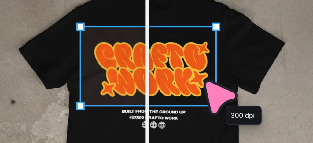
1. Limited-edition tournament product packaging

Launch a temporary, tournament-themed label or packaging iteration on your core SKUs. Remember, this is not a rebrand, so don’t treat it like one. It’s a seasonal edition with a clear end date.
The commercial logic is simple: A standard candle at $28 and a “Tournament Edition” candle at $28 are the same product. But only one of them creates a reason to buy this week instead of next month.
Limited packaging creates urgency, drives collectible appeal, and gives you something genuinely new to announce to your email list without changing your product at all. With this limited edition version, you also technically “force” repeat purchases from customers who already know and trust your product. Because they weren’t going to reorder yet, but now they have a reason to.
On the IP side, this is where small brands get nervous and shouldn’t. You don’t need official marks to make the association land. Stadium green and gold palettes, clean soccer geometry, and tournament language like “match day” or “finals week” all communicate the cultural moment without touching anything FIFA legally protects.
Country-inspired color references work the same way: they nod to national identity without reproducing an official crest. Consumers are smart. They’ll understand immediately what the packaging is referencing. It reads as a deliberate design choice, not a workaround, because that’s exactly what it is.
Build your tournament packaging label as a template from day one. Lock your brand colors and typography as the base layer, apply the seasonal visual treatment on top. When Group Stage becomes Knockout Round, you’re swapping a color accent and copy so you’re not rebuilding a label from scratch.
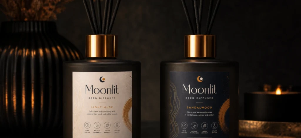
2. Regional co-branded flavor or variant labels

The 2026 World Cup has three host countries. That’s three built-in audience segments with distinct national identities, each of which responds to products that acknowledge them directly.
Designing variant-specific labels referencing major participating regions is a good marketing move with a strong targeting decision with a strong sales outcome.
A customer who receives your product with a label that references their national identity is more likely to gift it, photograph it, and share it than someone opening standard packaging. Perceived local relevance increases perceived product value, and it costs you nothing beyond the label design itself.
This works especially well for food, drink, candle, and skincare brands where the label does most of the selling. Same bottle. Three different labels. Three different customer conversations.
3. Custom promotional box inserts and unboxing assets

Don’t just be like most ecommerce brands that ship a product. Ship an experience.
A tournament-themed thank-you card and a match-countdown discount insert cost pennies per order, but they do real work. They boost post-purchase retention by giving a customer who already bought once a specific, time-pressured reason to come back. And they funnel offline buyers back to your digital store. A printed code in a box only converts if the person opening that box still has somewhere obvious to use it.
And they route an offline moment directly back to your digital store. The unboxing should feel like the same campaign as the homepage the customer bought from. Same color palette, same typography weight, same visual language. When it does, that’s the thing customers photograph and post. And that becomes free UGC. Simply because you took the time to change the unboxing experience.
Design your box insert at the same time as your limited-edition label. Brief your designer with both in the same session. They should feel like the same campaign.
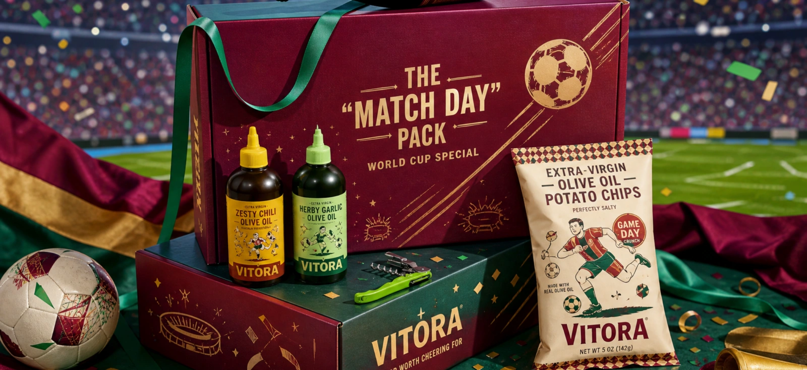
4. Tiered multi-pack bundling sleeves

Take two or three existing SKUs, wrap them in a custom cardboard sleeve branded as a “Match-Day Survival Kits” or “Tournament Pack,” and price the bundle to make individual purchase feel like the worse option. The sleeve is the product upgrade. Nothing else changes.
This is a direct average order value (AOV) play. Most customers don’t arrive on your site planning to buy three items. A structured bundle path gives them one, with a built-in reason to take it: the kit is positioned and priced to feel like the obvious choice over piecing the same items together separately. That’s a higher cart value per transaction, achieved without adding a single new SKU to your catalog.
World Cup demand isn’t limited to official jerseys. It spreads into lifestyle, home, and gifting categories. This works well if you specifically sell small, impulse-friendly products that sit comfortably inside a watch-party context.
A bundle sleeve repositions your product from “item I considered” to “set I need for the occasion.”
Bold, clean typography does most of the work. A sleeve that looks like it belongs on a specialty retailer’s shelf (tight layout, confident color blocks, not much assets to prevent clutter) earns the price premium you’re asking for.
Price the bundle so the savings are obvious at a glance but modest in dollar terms. The sleeve and the framing should be doing more conversion work than the discount.
Category B: Digital campaign assets and storefront optimization
Your physical packaging is one half of the campaign. The customer who buys it almost certainly discovered you online first. That digital journey needs to match.
5. Dynamic match-day homepage banners

Your website homepage during a 40-day tournament should not look the same on June 12 as it does on July 18. A storefront that doesn’t acknowledge the biggest sporting event in four years tells a customer your brand isn’t paying attention. That’s not a feeling that converts.
Refreshing your hero banner to mirror the active tournament phase gives you a live reason to send email traffic to a seasonal landing page instead of a generic homepage. Design for:
- Group Stage arrival energy
- Knockout Round urgency
- Finals countdown
Build the template system before the tournament with the same visual identity. Swap the copy and urgency treatment as the bracket advances. Running a month-long campaign and doing a month of design work is a huge difference. Make sure you’re not doing the latter.
Prepare at least four banner variations before June 11: Group Stage, Knockout Round, Semi-Final, and Finals. Calendar the swaps. The brands that go visually quiet in week three are the ones who didn’t plan in week minus-six.
6. Urgency-driven email header variations

Your email subscribers chose to hear from you. During the World Cup, give them a reason to actually open.
Coordinated email headers tied to the match calendar make your campaigns feel current rather than scheduled. “Final 48 hours before the semi-final” is a sharper subject line than “sale ends Sunday.”
The header sets the visual context for the offer. It should have the same seasonal palette and typography treatment as your homepage banner. Build the template system once, then swap the match reference and the countdown. And voila, you have an agency-quality visual sequence you can use across direct communication channels. All you have to do now is click send.
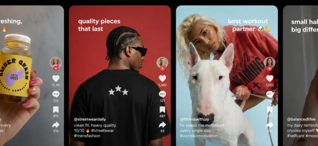
7. Multi-channel social feed match cards

Every matchday is content. The problem is most small brands either skip it entirely or share a blurry screenshot from a sports app that looks nothing like their brand.
Deploy uniform static match countdown and schedule cards built from a single template. Same color palette, typography, and logo placement every time. With that you get timely content while keeping your brand consistent. You’re not reinventing a design every 48 hours, you’re basically filling in the match name and the date.
Remember these are presence posts. It is not your usual conversion post. Their job is to keep your brand visible across 40 days of tournament activity so that when your promotional offer drops, you’re posting to an audience that’s been seeing your name the whole time.
8. Retargeting ad visual frameworks

The moment after a massive major win (especially regional victories) is one of the sharpest consumer sentiment spikes of the entire year. Consumers during the tournament are deciding later and converting faster. If your retargeting visuals aren’t pre-built and ready to go live within the hour, you’re advertising a moment that has already passed.
Build a high-impact, clean ad framework before the tournament. Product shot, high-contrast color system and clear Call-To-Action (CTA) blocks are all locked. The only variable per result is the copy. “Your team won. Your order ships tomorrow.”
Build a post-match deployment checklist before June 11: Which result triggers which ad? Who approves the copy change? Who updates the discount code in the backend?
Answer these questions before kickoff. Don’t wait for the final whistle.
Category C: Organic social and video commerce execution
People will be scrolling through World Cup content for weeks. Your brand does not need to act like a sports publisher to be part of that moment. It just needs product content that feels current, branded, and worth stopping for.
The mistake is treating tournament content like a quick overlay job. A flag in the corner, a rushed caption, and a random match reference will not make a product video feel relevant. The better move is to build simple video formats in advance, then adapt them as the tournament moves from group stage to final.
9. Product-focused social reels banners

Your product video doesn’t need a soccer pitch in it. It needs an overlay, a title card, and a visual treatment that ties it to the campaign running across every other channel.
Use a product lifestyle clip as the base, then add a title card, lower-third, or short offer line that ties it back to the campaign. The design does not need to shout “football” in every frame. It just needs to use the same color system, type treatment, and offer language customers are already seeing on your packaging, homepage, and email.
That is what makes the video feel connected to the campaign instead of looking like a one-off post made five minutes before kickoff.
10. Digital “Tournament Pass” loyalty graphics

A 40-day tournament is a natural container for a 40-day loyalty mechanic. Most brands don’t build one because it feels complicated. It isn’t.
A “Tournament Pass” is a digital graphic emailed to your list at the Group Stage that tracks reward unlocks at each knockout milestone. It makes your repeat-purchase program feel like something worth following rather than a standard points scheme.
This is where your design will make a difference. A loyalty card that looks like a premium tournament credential earns engagement. One that looks like a 2014 stamp-card template doesn’t.
Run it via email with one graphic per phase. Then, tie the reward to each new round. The customers who follow it through to the Final are your most engaged buyers by July 19. They are also the most likely to convert when your post-tournament collection drops.
11. Coordinated social giveaway announcement kits

A World Cup giveaway works because the audience is already in event mode. People are planning watch parties, talking about match results, and sharing the same cultural calendar for weeks. Your job is to make the prize feel like part of that moment, not like a random product drop with a soccer caption attached.
Build the giveaway as a small campaign kit: announcement post, reminder post, final call, and winner graphic. When those assets look connected, the prize feels more credible and the brand looks more prepared.
Frame your giveaway prize as a version of your Match-Day Bundle. It reinforces your limited-edition positioning and doubles as a product showcase. Your giveaway is also your best-performing ad.
12. “Pick your strategy” interactive social Stories templates

Everyone has an opinion about the tournament. Give your audience a channel to express it through your brand.
Build the poll template, lock your brand elements, swap the question per matchday:
- “Which limited-edition label should we bring back after the final?”
- “Pick your match-day product.”
- “Which regional variant are you ordering?”
The commercial benefit compounds. Interactive Stories content drives organic reach and algorithmic favor, which means your next promotional drop lands with a larger audience than the last one did.
Category D: High-conversion offers and commercial mechanics
Good world cup marketing ideas without a purchase mechanic behind them are brand awareness at best. This is where the commercial intent gets explicit.
13. Progressively scaling knockout discounts

A flat 20% discount running for 40 days teaches customers to ignore it. A discount that grows with the tournament does something different: it gives people who didn’t buy in week one a genuine reason to come back in week three.
Progressively scaling knockout discounts usually shows an increasing offer value as each elimination round drops. It solves the mid-tournament drop-off that kills most seasonal campaigns.
The brand that’s still posting something worth clicking in week three is the one that built the escalation structure before it all even started. Each banner in the sequence should feel like a new event, not just a number swap. Different urgency weight, different visual intensity, however, with the same brand system underneath.
14. Flash victory code graphics

This is the world cup promotions idea on this list that requires the most preparation and returns the fastest commercial result.
A flash victory code is a simple graphic you post after a relevant win, upset, or elimination. The offer does not need to be complicated. It can be “10% off for 24 hours,” “free shipping until midnight,” or a small bonus gift with orders placed that day. What matters is that the design is already made, the code is already created, and someone knows when to post it.
Build a few versions in advance:
- Home team wins
- Home team exits
- Major upset
- Final-week push
Then leave only the small things open, like the team reference, discount code, and deadline. That way, you are not designing from scratch while everyone else is already posting, shopping, and reacting to the result.
The brands that pull this off look like they have a full creative team watching every match in real time. In practice, they built the templates in advance, set up the codes in their ecommerce backend before kickoff, and had one checklist ready to execute. The preparation window is six weeks out. The execution window is 90 minutes after the final whistle.
Build at minimum two victory graphic versions per scenario: one for your core market’s home team result, one as a universal “big match” offer that deploys regardless of who won. No match should end without a graphic ready to post.
15. Post-final collection launch campaigns

This is the world cup promotions idea on this list that requires the most preparation and
The tournament ends July 19. This is where most brands stop.
But a post-Final collection, like a commemorative restock of your tournament packaging, a “finals week” bundle, a season-closing drop; actually gives you a high-margin release moment at the exact point when global sentiment around the World Cup peaks.
The audience is already emotional. The winner just lifted the trophy. Your brand has been present for 40 days. This is the campaign that converts that presence into a final revenue spike before the cultural window closes.
It also sets a template. Brands that run World Cup campaigns with a proper launch arc (teaser, tournament run, post-final release) are building a repeatable seasonal workflow.
The 2030 World Cup is already scheduled. Your templates, your brand system, and your audience will be ready.
The strategic implementation timeline: from conception to final whistle
These world cup promotion ideas work best when the asset system is built before the tournament, but that does not mean late-starting brands are out of the game.
If you’re building before the tournament, start six weeks out. If you’re already inside the tournament window, don’t panic; just stop trying to build the whole campaign at once.
Pick one packaging asset, one landing page banner, one email header, and one social template. That small set can still carry the rest of the tournament.
Six weeks out: asset architecture and direction
Establish your visual system:
- tournament color treatment
- typography decisions
- label structure
- and the design direction that carries every asset from packaging to retargeting ad.
The template you build here is the source file for everything else. Every hour spent here saves three hours in week two of the Group Stage.
Four weeks out: cross-channel asset synchronization.
Your digital store banners, print-ready label files, email header templates, social graphics, and retargeting ad frameworks all go into final production simultaneously. If your packaging and your homepage look like different campaigns at this stage, you’ve lost brand consistency before you’ve launched.
Two weeks out: teaser deployments and audience warm-up.
Start posting. Tease the limited-edition packaging, announce the giveaway, send the Tournament Pass to your email list. This phase tests your channels and builds anticipation before June 11.
Tournament window: real-time execution workflows.
By this, it’s not the time to create your assets, you’re deploying them:
- Match result triggers the flash victory graphics
- New phase triggers the homepage banner swap
- Knockout round triggers the next email header
If you’re briefing a designer during the tournament, narrow the brief. Ask for the four assets that matter most first: packaging, homepage banner, email header, and one social template.
Navigating intellectual property with strategic design
Understandably, this is one of the biggest worries of small business owners. Because, yes, if you get it wrong accidentally, you’ll spend more time responding to legal notices than counting sales.
The protected assets are clear: the FIFA World Cup name as an official mark, the tournament trophy image, official team crests, and any wordmark or emblem directly connected to the sanctioned event. Using these on commercial packaging or promotional materials without a licensing agreement is an ambush marketing risk FIFA actively enforces (and has done so publicly around previous tournaments).
What you can use freely:
- clean soccer vector geometry
- national flag color palettes without official crests
- generic tournament language
- stadium-inspired color systems
Used well, these cues are enough. Customers will understand the football reference without needing an official logo, and your campaign will still feel like your brand instead of borrowed tournament branding.
You can theme products around national teams using country colors, generic soccer motifs, and fan-culture references. You can reference the tournament window, the match schedule, and knockout stages by name. You just can’t reproduce the official tournament brand identity and claim commercial association with it.
Before any campaign asset goes to production, run one check: does anything directly reproduce an official emblem, wordmark, or licensed image? Replace anything that does with a generic equivalent. The visual impact is nearly identical. The legal exposure is not.
Build your World Cup campaign system in Kittl
A strong World Cup promotion is not about adding soccer graphics to random products at the last minute. It is about building a repeatable visual campaign system that connects packaging, storefront banners, email headers, social graphics, offer mechanics, and print-ready product assets into one recognizable brand experience.
That is where Kittl becomes useful for small brands. Instead of briefing every asset from scratch, you can build one tournament-inspired design system in Kittl, then adapt it across labels, box inserts, homepage banners, social posts, email headers, giveaway graphics, and POD-ready product files. The goal is not just to make the campaign look better. It is to make the campaign easier to launch, easier to update, and easier to scale from the first match to the final whistle.
The brands that win during the tournament will be the ones that prepare their assets before kickoff, keep their visuals consistent across every customer touchpoint, and move quickly when match-day attention spikes. Limited-edition labels create urgency. Bundles raise order value. Email and homepage graphics keep the offer current. Social templates keep the brand visible. Real-time discount graphics convert attention while it is still fresh.
The safest and smartest approach is to avoid official tournament marks, trophies, crests, and protected wording, then build your campaign around generic soccer geometry, match-day language, national color inspiration, and a strong branded visual system. With Kittl, those assets can feel polished, commercial, and campaign-ready without making your promotion look like unauthorized merchandise.
In short: build the visual system first in Kittl. Once the design foundation is in place, every product label, promotional graphic, social post, offer banner, and POD file becomes faster to create and easier to keep on brand.
FAQ
What is the safest way to brand a football promotion without using protected trademark names?
Use generic visual language and tournament-adjacent terminology: soccer geometry, national color palettes without official crests, and match-day copy like “tournament week” or “knockout round.” Your world cup promotion ideas don’t need an official logo to feel culturally relevant. You don’t have to use the trademark. The association comes from the design system.
How early should an ecommerce brand begin creating visual assets for seasonal marketing campaigns?
Six weeks out is the minimum for asset architecture. Four weeks out for full cross-channel synchronization. If you’re starting production during week one of the Group Stage, you’ve already missed your packaging window and your teaser campaign.
Why does brand consistency across packaging and social media affect customer acquisition during global events?
Because consumers are seeing hundreds of tournament-adjacent messages from dozens of brands simultaneously. A brand that looks visually consistent across packaging, homepage, email, and social looks established. One that doesn’t looks like it threw something together. Perceived brand quality directly affects willingness to purchase and willingness to share.
What types of product packaging modifications drive the highest return for small businesses?
Limited-edition label iterations on existing core SKUs, followed by bundling sleeves that increase average order value without new product development. Both require template-based design systems to execute efficiently. The ROI compounds when the packaging is also the social content. When your unboxing is good enough that customers photograph and share it.
How can direct-to-consumer businesses use real-time match outcomes to structure discount campaigns without constant redesigns?
Build the templates before the tournament. Every scenario (home team wins, home team exits, major upset) should have a corresponding graphic already designed, approved, and ready to deploy. The variable is the copy and the code. The design stays constant. This is how a solo founder executes world cup promotions ideas at the speed of match results without a design team on standby.
What are the must-have assets in a multi-channel promotional graphics kit?
Homepage hero banners in four tournament-phase variations, email header templates with countdown-based copy, social feed match cards, Stories poll templates, retargeting ad frameworks in two formats, and a packaging label template with a seasonal overlay applied. Build these from a single visual system and your world cup marketing ideas stay consistent across every channel your customer touches.

Shafira is a content writer who turns boring business talk into reads people actually enjoy. She grew up hoarding $1 novels in Singapore and writing hilariously bad fiction, but now she tackles content marketing with all that creative chaos since 2019. From blogs and newsletters to UX and SEO, she writes how she thinks: nerdy, honest, and a bit offbeat. She believes the best content is human-designed, not just plain text.