A blurry print is not just a production mistake. For small business owners, it can turn into a negative Etsy review, a refund request, and a customer who never orders again.
That is the part many POD sellers discover too late. A file can pass upload, look clean on a mockup, and still arrive as a disappointing product.
That is the part many POD sellers discover too late. The shirt graphic looks soft, sticker edges look ragged, and the label that looks clear on screen becomes hard to read in real life. And most of the time, the problem started earlier than anyone wants to admit: in the source file, the canvas size, or the export setting someone trusted without checking.
That is why understanding what is DPI in printing is crucial. If you sell through Printify, Printful, Etsy, Shopify, or your own storefront, DPI sits right at the point where design becomes merchandise. Get it right, and your products look sharp, credible, and worth the price. Get it wrong, and even the strongest design can look cheap.
The frustrating part is that most sellers do not find out through a warning message. They find out through a sample order, a customer photo, or a review that says the print looked blurry. By then, the product has already carried the cost of a file decision that happened much earlier.
What is DPI in printing?
DPI stands for Dots Per Inch. That is the simplest DPI meaning: it refers to how many printed dots of ink fit into one inch of physical output. For POD sellers, DPI helps determine how crisp a design will look when it is printed on a shirt, sticker, mug, label, or poster.
If you have been wondering what is dpi resolution, think of it this way: it is the relationship between the amount of image detail you have and the size at which you expect that detail to print. The same artwork can look excellent at one size and poor at another. The lower the DPI, the cheaper the merchandise will look.
For most POD products viewed up close, 300 DPI is the standard. That is the number most sellers should work around. Still, DPI on its own does not rescue a weak file. If the artwork is too small, stretched, or exported badly, typing in “300 DPI” at the end will not save it.
The easiest way to think about it is this: DPI is not a magic quality sticker. It only matters when the file has enough real image information for the size you want to print. A tiny graphic exported at 300 DPI is still a tiny graphic pretending to be stronger than it is.
A file is only truly print-ready when its pixel dimensions, print size, and export format all make sense together.
Why POD sellers feel this problem faster
Traditional print buyers often work with print shops, prepress teams, or packaging vendors who catch issues early. Many POD sellers are doing that work alone. They are designing, exporting, listing products, building mockups, and launching a store in one workflow. That means resolution mistakes travel straight from screen to customer.
This is also why generic DPI advice can feel so unhelpful. A photographer preparing an art print, a designer sending a brochure to a printer, and an Etsy seller uploading a transparent shirt graphic are not solving the same problem. POD sellers need the production logic, but they also need it translated into product decisions they make every day.
DPI vs. PPI: clearing the confusion
This is where print language gets unnecessarily slippery.
PPI means Pixels Per Inch. It describes the digital image: how many pixels sit inside one inch of your artwork.
DPI means Dots Per Inch. It describes the printed result: how many dots of ink a printer places inside one inch of paper, fabric, ceramic, or whatever product you are printing on.
A simple way to think about it is like a mosaic. PPI is the number of tiny digital tiles you have in the artwork. DPI is how those tiles get painted onto the physical product. If the mosaic only has a small number of tiles, the printer cannot suddenly paint a detailed mural from it. It can only spread the limited information across the shirt, sticker, or poster.

That is why the terms often get used interchangeably in POD workflows. When a platform asks for a “300 DPI file,” it usually means it needs a digital file with enough pixels to print cleanly at 300 DPI at the chosen size.
If you create a file that is 3000 pixels wide and print it at 10 inches wide, you are effectively working at 300 PPI, which supports a 300 DPI print outcome.
The mistake happens when sellers only look at one number. They see “300 DPI” somewhere in the file settings and assume the product is safe. But the more useful question is whether the file has enough pixels for the physical size of the print.
When a POD platform asks for high-resolution art, treat that as a size question first. Ask: How large will this actually print?
The 300 DPI standard: Do you always need it?
Once you understand what is DPI in printing, the 300 DPI standard becomes easier to judge. It is not a magic number for every product. It simply hits the sweet spot for print because it sits close to what the human eye can comfortably resolve at arm’s length.
This is called the Viewing Distance Rule: the farther away someone stands from a print, the less resolution the print needs to look sharp. Up close, the eye can catch small gaps, jagged edges, and blurry details. From farther away, the eye blends those dots together.
That does not mean every printed object in the world needs 300 DPI. A large banner seen from several feet away can get by with less. A billboard needs far less. But POD is usually intimate. People hold it, wear it, unwrap it, examine it.
This is a useful distinction for sellers because it prevents both panic and laziness. You do not need billboard-level rules for a sticker, and you do not need sticker-level rules for a wall tapestry. The job is to match the resolution to the product, viewing distance, and customer expectation.

DPI resolution by POD product type
| Product type | Typical viewing distance | Safer target |
| T-shirts and hoodies | Close | 300 DPI |
| Stickers and labels | Very close | Strictly 300 DPI |
| Mugs | Close | 300 DPI |
| Art prints and postcards | Close to medium | 300 DPI |
| Posters | Medium | 150 to 300 DPI |
| Large wall decor / banners | Farther away | 100 to 150 DPI |
The most dangerous assumption in Print-on-Demand is that a “valid” file is the same as a “quality” file. Most platforms prioritize technical acceptance over visual excellence, meaning a file might pass the initial upload check but fail the “reality test” once it arrives on a physical product.
To avoid this, you need to shift your workflow from reactive to proactive: stop asking “will this upload?” and start asking “what will this look like at actual size?”
Use 300 DPI for products people hold or wear. Let viewing distance guide the exceptions.
The blurry POD print problem (and how to fix it)
If you’re wondering why most designs look good on screen but terrible on the product, well, most POD print failures come from one of four things:
- The artwork started too small
- The file was enlarged too far
- Fine details were too delicate for the substrate
- The seller trusted the mockup more than the production file
This is where people start blaming the printer when the real problem began upstream.
That does not mean printers never make mistakes. Of course they do. But if the same kind of softness, jaggedness, or dullness keeps appearing across your products, the first place to check is the file. Most recurring print issues are not bad luck. They are patterns.

The resize trap
This is the mistake that catches sellers over and over.
A small raster file cannot become a strong print file just because you change the export settings at the end. If a web image starts at 72 DPI and you manually export it as 300 DPI, you are not creating detail. You are basically just stretching what was already there.
This is called upsampling. The software adds extra pixels to make the file larger, but those pixels are guesses based on the information already there. That can make the image bigger, but it does not make the artwork sharper. In print, the result often looks soft, jagged, or strangely swollen around the edges.
The mathematical problem is simple: stretching a raster image effectively halves its DPI every time its physical size is doubled. A 300 DPI file printed at 10 inches wide becomes 150 DPI if you stretch it to 20 inches wide. Stretch it again to 40 inches wide, and it drops to 75 DPI. The pixels did not disappear, but they are being spread across a larger area.
Think of it like enlarging a small thumbnail for a storefront window. You can make it physically larger, but the original detail was never there. The image may technically fill the space, but it will not behave like proper production artwork.
The safer move is to start with a file that is already large enough for the product, or build the artwork with vector elements so it can scale cleanly before export.

This is where Kittl’s vector-based graphics from the content library can help. Vectors are built from paths, curves, and shapes instead of fixed pixels, so they can be scaled up or down without the same quality loss you get from stretching a raster image.
You can build a badge, quote graphic, mascot, logo, or sticker-style illustration in Kittl, resize it for a shirt back print or poster, then rasterize it only at the final export stage as a high-resolution PNG for platforms like Printify or Printful.
That workflow changes the risk. Instead of stretching a weak file and hoping it survives production, you keep the artwork flexible until the moment you export the exact file your POD product needs.
You can also use our AI image upscaler to increase the size and resolution of your image automatically to a maximum of 4096×4096 pixels, and then apply it directly to your artboard in place of the original.
This is useful for improving certain image-based assets, but it should not be treated as a substitute for clean source artwork or vector graphics when the design needs crisp edges.

Resolution debt
Every time you enlarge a raster image significantly, you are borrowing against quality. Eventually the bill arrives in print.
If the design is a photo or texture, start with the largest clean source you can. If it is a logo, badge, icon, or text-based graphic, use vector elements whenever possible. Vector artwork gives you more freedom because it scales by paths, not by stretching a fixed grid of pixels.
Mockup-to-print mismatch
A mockup exists to sell the product. A production file exists to survive the material. Confusing those two is where many POD sellers get into trouble.
On screen, your design is being shown through light. A retina display can make edges look sharper, colors look brighter, and small details feel cleaner than they really are. Many screens display artwork around 72 to 144 PPI, but they also use brightness, contrast, and smoothing to make the image feel polished.
Print is less flattering. Ink has to land on paper, cotton, ceramic, vinyl, canvas, or another physical substrate. Each surface changes how sharp the design feels. Coated paper holds ink more tightly, which is why posters, cards, and glossy stickers can keep edges looking crisp. Uncoated paper and fabric absorb more ink, which can cause dot gain: ink spreads slightly on the surface, softening edges and lowering the perceived sharpness.
This can also explain why your shop has views but is not landing sales yet.
For apparel, compensate before export. Give small text more weight, increase contrast slightly, and avoid ultra-thin linework when the detail needs to survive fabric. If you’re using a distress texture, make it large enough to read as texture, not accidental grain. This is especially important for dark shirts, vintage-style graphics, and small chest prints.
Practical fixes that help immediately
| Problem | What it usually means | Better move |
| Soft edges | File too small | Rebuild at the correct dimensions |
| Jagged curves | Raster art enlarged too far | Use vector elements where possible |
| Weak garment print | Fine details too delicate | Increase contrast and simplify detail |
| White box around artwork | Wrong file type | Export a transparent PNG |
| Dull print result | Screen and print mismatch | Adjust expectations and test samples |
Best files for printing
The best files for printing are the ones that match the product, print method, and material. A transparent PNG might be right for a DTG shirt, while a PDF may be safer for packaging, labels, or paper goods.
That is where many generic guides fall short. Best files for printing depends on whether the product needs transparency, whether the artwork is vector-based, and what the POD vendor accepts.
The file format decides more than people think. It affects transparency, compression, scalability, supplier handoff, and how much control you keep after export. Choosing the wrong one can create problems that have nothing to do with the quality of the design itself.

For apparel, a transparent PNG is often the cleanest choice because it lets the garment color show through instead of printing an unwanted background box. For packaging or paper goods, PDF may be more suitable because the layout needs to stay structured. For logos and icons, SVG or PDF can preserve scalability when the workflow accepts it.
If transparency matters, JPEG is the wrong answer almost every time.
The POD print export checklist: Preparing files for Printify & Printful
This is the part sellers actually need at the moment of export.
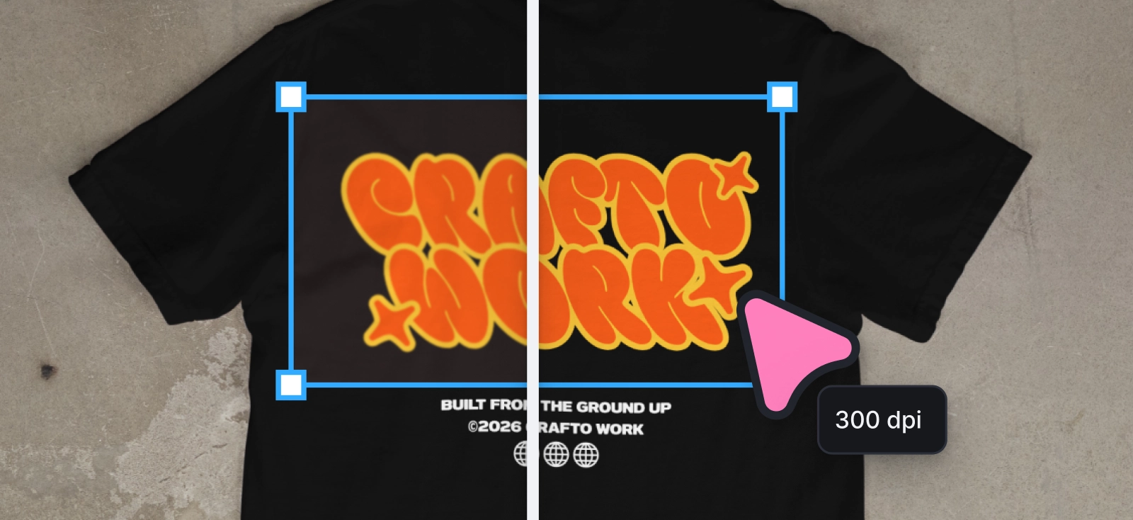
By now, the design may look finished. But for POD, “finished” inside the editor is not the same as ready for production. Export is where the design becomes a manufacturing file, so the question changes from “does this look good?” to “will this print correctly at the product size?”
Use this checklist before uploading to Printify, Printful, or any other POD partner.

1. Start with the product’s exact print area

Do not export from a random canvas and resize later. Check the product template or print area first. A T-shirt front print, hoodie back print, sticker sheet, mug wrap, poster, and packaging insert all need different dimensions.
For example, a standard full-front T-shirt design is often prepared around large pixel dimensions such as 4500 × 5400 px, but this can vary by product, provider, and placement. Always follow the exact product requirement inside your POD platform.
2. Match the required pixel dimensions
DPI only works when the file has enough pixels for the final print size. If the print area is large, the file needs to be large too.
A simple rule:
print size in inches × 300 = required pixels
So if you want a 15-inch-wide print at 300 DPI, your file should be around 4500 px wide.
3. Use 300 DPI for close-range products

For apparel, stickers, mugs, labels, cards, packaging inserts, and small art prints, treat 300 DPI as the safe baseline. These are products customers hold, wear, photograph, and inspect closely.
For larger posters, wall art, blankets, or banners, a lower effective DPI may work because the product is viewed from farther away. Still, check the platform’s product-specific guidance before assuming.
4. Choose the right file format
The format should match the product and print method.
| Product or use case | Safer format |
| DTG apparel graphics | Transparent PNG |
| Stickers and decals | PNG or SVG |
| Posters and full-bleed artwork | JPEG, PNG, or PDF |
| Labels and packaging | PDG, SVG, or CMYK-ready files |
| Logos and icons | SVG or PDF |
For DTG shirts and hoodies, a transparent PNG is often the cleanest option because it prevents an unwanted background box from printing. For paper goods or packaging, a PDF may be the better handoff file because it preserves layout structure more cleanly.
5. Choose the right color profile

Color profile depends on the production method.
Many DTG workflows use RGB or sRGB because the POD provider converts the file internally for print. Some commercial print workflows, especially paper goods and packaging, may ask for CMYK because the file is being prepared closer to traditional ink output.
The safest rule: follow the provider’s product guidance. Do not assume CMYK is always better, and do not assume RGB is always wrong. The correct profile is the one the printer asks for.
6. Check transparency before export

If your design should sit directly on a garment, sticker, or product without a visible background, export with a transparent background. This is especially important for DTG apparel.
A JPG cannot carry transparency, so it can leave an unwanted rectangular box around your artwork. Use PNG when transparency matters.
7. Review the design at actual print size
Before downloading, check the file the way a customer will experience it. Small type, thin lines, delicate textures, and low-contrast elements should still hold up at the real product size.
This is where many “accepted” files fail. The platform may accept the upload, but the product can still look weak if the details are too small or too soft for the material.
8. Export, upload, and sample important products

If you remember one thing from this guide to what is DPI in printing, make it this: export settings only work when the file was built for the correct product size from the start.
Once the file matches the print area, format, resolution, transparency, and color guidance, export and upload it to your POD platform. For hero products, seasonal launches, premium items, or anything you plan to advertise, order a sample before pushing the listing hard.
Samples are not a delay. They are where you find out whether the file, material, color, and mockup promise are actually aligned.
“Accepted by the platform” does not mean “strong enough for the product.” Always check size, format, transparency, and real product readability before launch.
How Kittl helps keep POD files print-ready
The hardest part of POD file prep is not knowing that 300 DPI matters. It is keeping the whole workflow clean while you move from design to product to mockup to export.
That is where Kittl fits naturally.

You can build designs with vector-based graphics, editable typography, and scalable elements, which helps avoid the Resize Trap before it starts. Instead of enlarging a weak raster file and hoping it prints well, you can create the artwork with paths, shapes, and type that stay flexible until the final export.

When the design is ready, Kittl also helps with the practical export decisions. You can prepare high-resolution files, use transparent backgrounds when a DTG apparel design needs to sit cleanly on fabric, and export print-friendly formats such as PNG, JPEG, PDF, or SVG depending on the product and provider.
In the export flow, creators can choose the file type, prepare a transparent background for apparel graphics, and download the design in the format their product needs. That keeps the technical decision close to the design itself, instead of turning export into a separate production headache.

Kittl’s mockups also give sellers a useful checkpoint before upload. They help you review placement, scale, contrast, and product feel, which is especially helpful when adapting one design across shirts, stickers, mugs, posters, or packaging. The mockup is not a substitute for the production file, but it helps catch visual problems before the customer does.
Kittl workflow table
| Workflow stage | What to focus on in Kittl |
| Build the design | Use scalable elements, clear type, and clean composition |
| Adapt for product size | Adjust the layout based on the print area |
| Check product feel | Use mockups to review scale and presence |
| Export | Choose the right format, pixel dimensions, and transparency |
| Final validation | Review at real size and sample before launch |
Good POD products rarely come from one perfect export setting. They come from a workflow that respects the final product from the beginning. That means starting with strong artwork, checking scale, choosing the right format, and remembering that every file is making a promise the printed product has to keep.
DPI in printing FAQ
What is the dpi meaning in printing?
The simplest dpi meaning is Dots Per Inch. It describes how many printed dots of ink fit into one inch of physical output. Higher DPI usually allows finer detail, sharper edges, and cleaner print results when the file is built at the correct size.
What is dpi resolution for POD products?
DPI resolution describes how much print detail is available at a specific physical size. For example, a 3000 px wide file printed at 10 inches wide gives you 300 DPI. Print that same file at 20 inches wide, and the effective resolution drops to 150 DPI.
Is 300 DPI always required for printing?
No. It is the safest standard for most POD products viewed up close, but larger items seen from farther away can often print well at lower effective resolution.
What happens if my DPI is too low?
The product may print with soft edges, jagged curves, weak detail, or an overall cheap-looking finish.
What is the difference between DPI and PPI for printing?
PPI refers to the pixel density of the digital file. DPI refers to the dot density of the printed output. In everyday POD language, people often blur the distinction, but the underlying difference still matters.
What are the best files for POD printing?
For many shirt graphics, transparent PNG is the safest choice. For posters, labels, or paper goods, JPEG or PDF may make more sense. It depends on the product.
Why do my POD prints look blurry?
Usually because the source file was too small, enlarged too far, exported in the wrong format, or designed with details too delicate for the material.
How do I fix pixelated shirt designs?
Start with higher-quality source art, rebuild the design at the correct dimensions, and use vector elements where possible. Do not rely on upscaling a small image.
Should I use PNG or JPG for printing?
Use PNG when you need transparency. Use JPEG when the artwork has a solid background and transparency is irrelevant.
What are the best export settings for Printify and Printful?
In most apparel cases, use the exact print dimensions required by the product, aim for 300 DPI, and export as a transparent PNG if the design needs the garment color to show through.
How large can you print 300 DPI artwork?
That depends on the pixel dimensions. A 3000 x 3000 px file, for example, prints cleanly at about 10 x 10 inches at 300 DPI.
Can vector files replace DPI concerns?
They help a great deal, because vectors scale cleanly. Still, once you export for a specific product, final size and export settings still matter.
Why do digital mockups look sharper than real prints?
Screens are luminous and naturally crisp. Printed ink behaves differently, especially on fabric and uncoated surfaces. Mockups often flatter the art more than the physical product will.

Shafira is a content writer who turns boring business talk into reads people actually enjoy. She grew up hoarding $1 novels in Singapore and writing hilariously bad fiction, but now she tackles content marketing with all that creative chaos since 2019. From blogs and newsletters to UX and SEO, she writes how she thinks: nerdy, honest, and a bit offbeat. She believes the best content is human-designed, not just plain text.