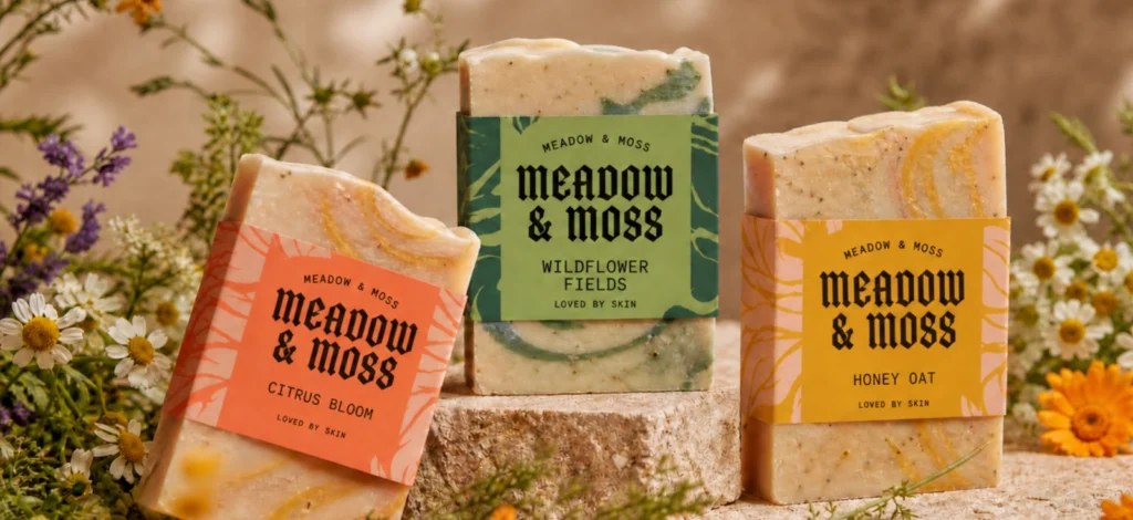
Most people do not study a brand before they judge it. They make a reading of it quickly, often before they know they have done it.
That reading comes from the usual places: color, composition, photography, packaging, language. But typography carries a particular kind of authority because it sits closest to the message. It does not just hold the words. It changes how those words arrive.
That is why typography is important to branding. The same product name can feel established, delicate, utilitarian, expensive, playful, or forgettable depending on the type around it.
For small brands especially, this matters because every label, website header, launch post, and product card is doing reputation work. The type has to help the business look as intentional as the product already is.
Choosing a font is the easy part. Building a typography system is where the brand starts to hold together. In this guide, we’ll look at what typography in branding really means, why it affects trust and recognition, and how to choose fonts that can grow with your brand.
What is brand typography?

Brand typography is the system of typefaces, fonts, sizes, spacing, and text styles a business uses across its visual identity. It covers the obvious places, like your logo and headlines, but also the more subtle ones: product details, packaging copy, website sections, social posts, email banners, ads, and instructions.
A typeface is the design family. A font is a specific version of that family, such as a bold weight or italic style. Typography is the way those choices are arranged so people know what to read first, what to trust, and what belongs together.
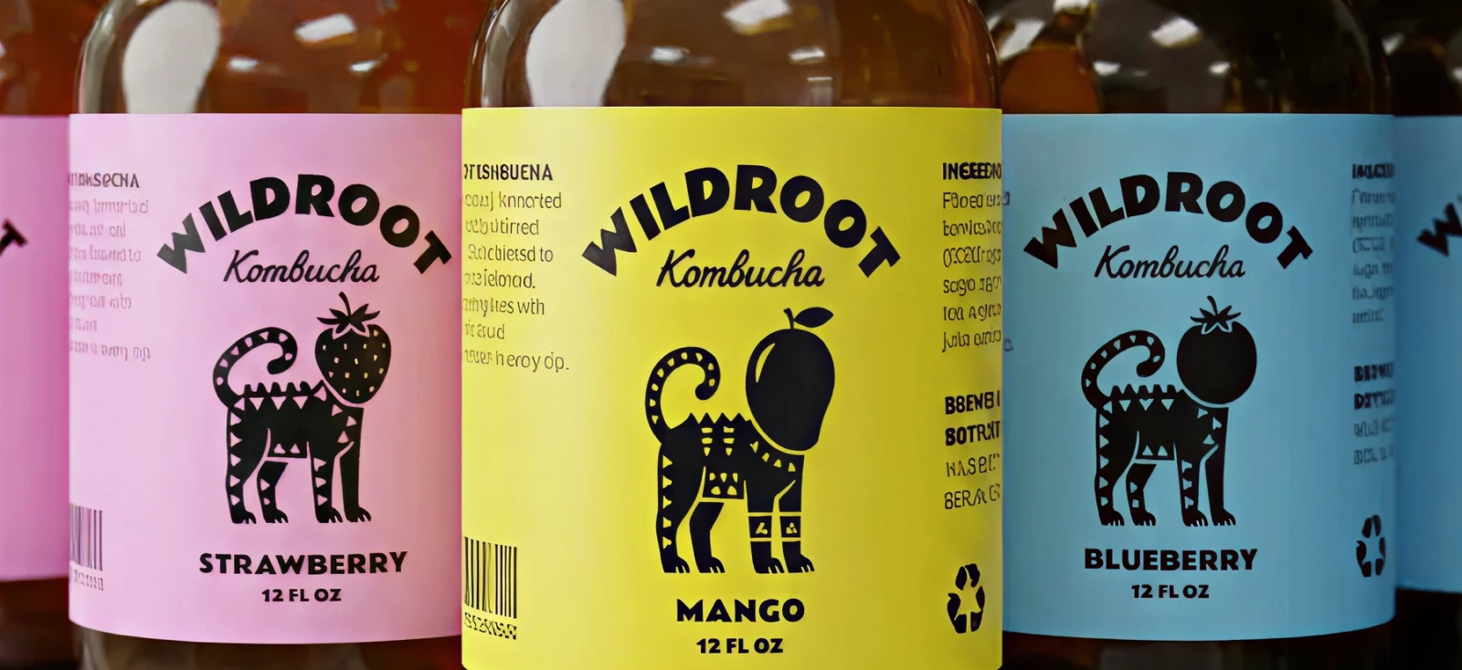
In branding, typography gives every piece of text a role. The most distinctive type may belong in the logo, product name, or campaign headline. The clearer, more restrained type often has to carry the product description, ingredients, sizing, instructions, or body copy. When those roles are defined, the brand feels consistent without looking repetitive.
That is the importance of typography in design. It is not the final layer added after the “real” brand decisions are made. It is one of the decisions that shapes the brand in the first place.
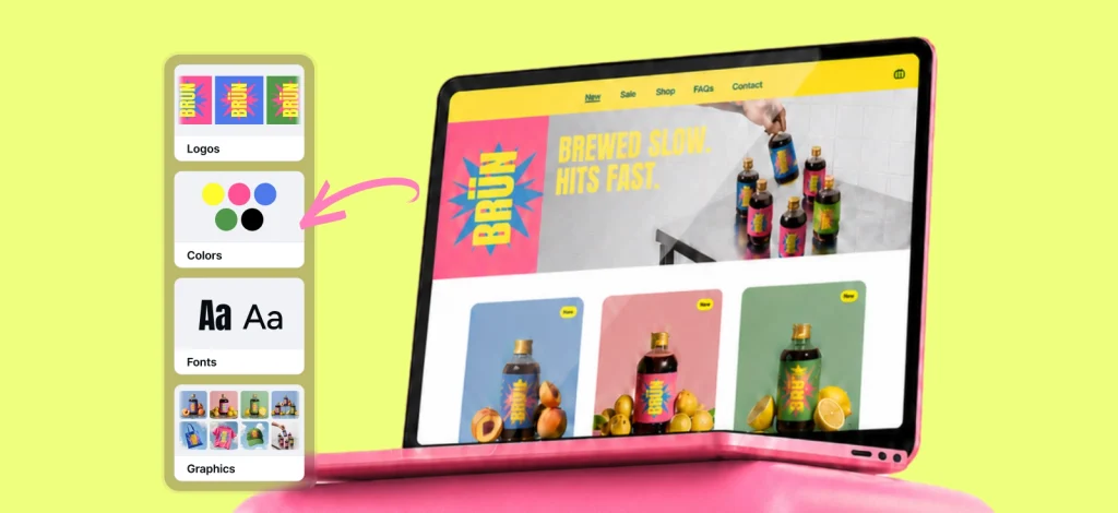
In Kittl, this becomes easier to understand because you can explore fonts beyond a dropdown. You can try them on labels, packaging layouts, product mockups, social posts, and brand assets in the same workspace, which is where typography starts to make sense as a system instead of a single choice.
Why is typography important to branding?
Typography matters because people read more than the words. They read the level of care behind the product, the kind of price point it belongs to, and whether the brand feels worth trusting.
That is why typography in branding is not only a visual decision. It helps shape recognition, personality, readability, and credibility before a customer has the full story.
1. Typography helps people recognize your brand

Recognition does not always begin with a logo. Sometimes it starts with the shape of a headline, the rhythm of a product name, or the way a label looks from a few steps away. Over time, those details become part of how people remember you.
This is why consistency matters so much. If your packaging, website, product cards, and social posts all use different type styles, your brand has to reintroduce itself every time, your brand has to reintroduce itself every time. Nothing has time to become familiar.
A strong typography system gives people something to return to. They may not know the font name, but they start to recognize the presence of the brand. That familiarity is where trust begins to build.
For small businesses, this is one of the most practical reasons to take typography seriously. You may not have the budget of a household-name brand, but you can still create a visual pattern people learn to associate with you.
That is also why having simple brand guidelines for small business is useful. Learn more about creating brand guidelines for your brand in our article here: Brand guidelines for small business: Do you really need them?.
2. Typography gives your brand a point of view
A font choice is rarely neutral. Even the simplest typeface carries some kind of attitude. It can make a product feel more measured, expressive, technical, nostalgic, refined, direct, or deliberately plain.
This does not mean every serif feels traditional or every sans serif feels modern. The meaning comes from the type itself, the product it sits on, the space around it, and the audience reading it. A typeface should make sense next to the product, the price, and the kind of customer the brand wants to reach.
When those things line up, typography gives the brand a clearer position. When they do not, the brand can start sending mixed signals without meaning to.
Before choosing a font, write down three words your brand needs people to feel. Then test whether the typography supports those words on a label, website header, and social post.
3. Typography makes information easier to understand
Good typography gives information an order. It decides what should be noticed first, what should support it, and what can stay quiet until someone needs it.
That matters because most brand materials are scanned quickly. A customer may glance at a product page, compare two labels, or skim an email before deciding whether to keep reading. If every piece of text has the same size, weight, and spacing, the customer has to sort the information alone.

A strong type system gives each font type a job:
| Text layer | What it does | Typography direction |
| Brand name | Builds recognition | Most distinctive type treatment |
| Product name | Tells people what they are buying | Clear, visible, easy to scan |
| Variant, scent, flavor, or shade | Helps people compare options | Slightly smaller, but still quick to find |
| Key detail or benefit | Gives one reason to care | Short, readable, placed near the product name |
| Ingredients or instructions | Supports trust and clarity | Simple type, generous spacing, no decorative fonts |
| Weight, size, or legal copy | Handles the required details | Smallest type, but still legible |
A clear type system does that work for them. The product name can lead. The variant, scent, flavor, or shade can support it. Ingredients, instructions, and legal copy can stay readable without taking over the design. The result is not just easier to read. It makes the brand feel more certain about what matters.
4. Typography builds trust before the customer has proof
Trust is not always built through big claims. Sometimes it starts with whether a brand looks like it knows what it is doing.
If the product name is hard to read, the spacing feels cramped, or the label looks like every decision was made separately, the customer may not stop and think, “This typography is weak.” They are more likely to feel a small hesitation they cannot quite name.
That hesitation matters. A founder can spend months getting the product right, but the customer often meets it through packaging, a product page, or a social post.
This is especially important for brands selling products where quality is judged before use. Type is not pretending to be the product. It is helping the product get believed.
This does not mean every trustworthy brand has to look minimal or serious. A playful brand can still feel trustworthy. A handmade brand can still feel premium. The point is to make sure the typography has enough discipline to carry the personality without making the brand feel unstable.
Take one piece of brand copy, such as a product description or label front, and reduce it to three levels: must read first, useful next, and only needed later. Then check whether the typography reflects that order. If everything looks equally important, the hierarchy is not helping the customer trust the information.
The anatomy of a brand typography system
A brand typography system is not a folder of nice fonts. It is a set of decisions about which type should do which job. Most small brands only need two or three typefaces with clear roles: one for character, one for structure, and one for practical reading.
The goal is not to make every asset look identical. It is to make every asset feel related, whether someone sees your product on a label, a website, a launch post, or a packaging mockup.
Kittl makes this easier to test visually. You can place different font roles on one canvas, compare options side by side, and see whether the system still works once it moves beyond one perfect headline.

Primary typeface: the brand’s strongest typographic signal
Your primary typeface is the one people are most likely to remember. It may appear in your logo, product name, major headlines, campaign titles, or packaging front. Because it carries the most personality, it can usually be more distinctive than the rest of the system.

But distinctive does not mean difficult. A primary typeface still needs to work at different sizes and in different contexts. If it only looks good when it is huge, centered, and surrounded by space, it may be better as an accent than as the foundation of the brand.
Secondary typeface: the one that keeps the system working
The secondary typeface’s job is to support the brand voice without competing for attention. It might appear in subheadings, product variants, taglines, section titles, or short campaign copy.

This is where contrast matters:
- If the primary typeface is expressive, the secondary typeface should bring control.
- If the primary typeface is quiet and refined, the secondary typeface can add a little more clarity or rhythm.
The two should not look like strangers, but they also should not be so similar that the hierarchy disappears.
The easiest mistake is pairing two fonts that both want to be the main character. That creates a “noisy” brand feel. A good pairing gives the eye somewhere to land and somewhere to rest.
If you want to learn more about font pairings, check out our article about it here: Font pairing examples for 2026: Trends, principles, and how to use them.
For a small product brand, this matters because the secondary typeface often does a lot of the day-to-day work. It carries most of the details on your products. It is not always the first thing people notice, but it often decides whether the whole system feels usable.
Tertiary typeface: the practical layer that earns trust
The tertiary typeface handles the information people need to read without effort: product descriptions, ingredients, instructions, sizing, captions, email copy, and other longer or smaller text.

This is usually not the place for the most expressive font in the system. It is the place for the one that behaves well. It should stay legible at smaller sizes, work across digital and print, and feel consistent with the brand without asking for attention.
A simple rule helps here: let the expressive type create the first impression, and let the practical type protect the customer experience.
Iconic examples of typography in branding

Big brands are useful here, not because small businesses need to imitate them, but because they show what happens when typography becomes inseparable from the brand itself. The lesson is not “make a famous logo.” The lesson is to make type choices consistent enough, specific enough, and appropriate enough that people start to associate them with you.
Coca-Cola: typography as memory
Coca-Cola’s script is one of the clearest examples of typography becoming part of a brand’s memory. The lettering does not just spell the name. It carries the brand’s sense of heritage, familiarity, and old-school pleasure before any campaign line appears.
What makes it work is not only the style of the script. It is the repetition. The same typographic character has shown up for so long, across so many surfaces, that the letters have become recognizable almost as shapes. You do not need to read the full word carefully to know what brand you are looking at.
For a small brand, the takeaway is simple: recognizability comes from commitment. If your type style changes every time you make a label, a launch post, or a product card, the brand never gets the chance to become familiar. Consistency may feel less exciting in the moment, but it is what gives typography time to become ownable.
Apple: typography as product philosophy
Apple’s typography works because it does not try to outshine the product. It supports the brand’s larger promise: clarity, control, and ease. The type feels quiet because the product experience is meant to feel quiet too.
That kind of restraint is harder than it looks. A simple type system has nowhere to hide. If spacing, scale, or hierarchy is off, people notice the imbalance even if they cannot name it. But when it works, it makes the brand feel calm and exact.
For small businesses, the lesson is not to choose the plainest possible font. It is to match the typography to the kind of experience you are promising. If your brand is built around precision, quality, care, or ease, the type should not feel like it is competing with the product for attention.
Disney: typography as a world
Disney’s typography shows the other side of the spectrum. The script is expressive, uneven, and full of movement. It would be completely wrong for many brands, which is exactly why it works so well for Disney. The letterforms help build the world before the story starts.
This is where distinctive typography can be powerful. A typeface with a strong personality can make a brand feel more memorable, but only when that personality is earned. Disney can use whimsical lettering because wonder, imagination, and play are already central to the brand. Put the same kind of energy on a serious skincare label or a technical product page, and it would start to feel confused.
For smaller brands, the point is to be specific, not loud. A typeface should make the brand world easier to understand. If it needs too much explanation, it may be saying the wrong thing.
How to choose the right typography for your brand
Choosing typography gets easier when you stop looking for the “best” font and start looking for the right fit. A typeface can be beautifully made and still be wrong for the brand, the product, or the customer’s expectations.
The better question is not only, “Do I like this?” It is, “Does this make the brand feel the way it needs to feel?”?
Step 1: define what your brand needs to say
Before opening the font menu, define the role typography needs to play in the brand.
Start with three words you want the brand to be known for. Not vague words like beautiful or unique, but words that could help you make a decision when two fonts both look good.
For example:
| Brand words | Typography direction |
| Precise, calm, science-led | Clean type, measured spacing, restrained contrast |
| Warm, crafted, giftable | Softer forms, gentle contrast, room for texture |
| Bold, nostalgic, graphic | Stronger display type, tighter compositions, retro references |
| Refined, botanical, quiet | Elegant serif or soft sans, generous spacing, careful hierarchy |
| Direct, practical, everyday | Clear sans serif, simple hierarchy, strong readability |
Kittl’s font page can help here because you can explore fonts with that direction in mind. Instead of scrolling until something catches your eye, start with the feeling your brand needs to carry. Then test the font in context before deciding.

A useful test is to place the same font on three real brand moments: a product label, a website header, and a social post. If the font only works in one of them, it may be better as an accent than the foundation of the system.
Step 2: use perception mapping to narrow the direction
Once you have a few brand words, turn them into a map. This keeps the font choice from becoming a taste test, which is where a lot of brands get stuck. Taste is useful, but it needs something to answer to.
A simple perception map can use two lines: traditional to modern, and quiet to expressive. Place your brand on the map first, then place a few type styles around it.
- A heritage jam brand may sit closer to traditional and quiet, unless the whole brand is built around eccentric gifting.
- A streetwear label may sit closer to modern and expressive, unless the collection is leaning into a more archival, old-sport reference.
This keeps the choice from becoming purely about taste. Taste matters, of course, but it needs something to answer to. A font may look beautiful in isolation and still belong to a different world than your product.

A practical way to test this is to put three font directions on the same asset and name what changes. Does the product feel more expensive, more casual, more technical, more playful, more nostalgic, more mass-market, more niche? If the font changes the perceived world of the product, the typography is doing real brand work.
Step 3: test the type where your brand actually shows up
A font can look convincing in a font menu and still fail on the real brand. Before you commit, test it on the things your business actually needs: a label, product page, packaging mockup, launch graphic, and social post.
Kittl makes this easier because you can try several type directions on the same canvas instead of jumping between files. Duplicate the same label or mockup, change the typography in each version, and group them by mood: more refined, more practical, more nostalgic, more expressive. Seeing them side by side makes the decision less abstract.

Mockups are especially useful here. A typeface may look strong on a flat label but lose clarity once it wraps around a bottle, sits on a pouch, or appears in a small product thumbnail. Testing fonts inside Kittl mockups gives you a better sense of how the typography behaves where customers will actually see it.
So before you commit, build a small test set:
| Test asset | What to check |
| Product label | Does the name read quickly? Do the details have a clear order? |
| Website hero | Does the type still feel like the same brand at a larger scale? |
| Social post | Is the brand recognizable in a fast scroll? |
| Product description | Can someone read the practical details without effort? |
| Packaging mockup | Does the type hold up in context, not just on a flat design? |
Step 4: choose font pairings with contrast, not competition
Two fonts can both be strong on their own and still make a terrible pair. The issue is not quality, it is whether they know how to share the same space.
A good pairing usually has contrast:
- One typeface may bring character, while the other brings clarity.
- One may be expressive, while the other keeps the layout grounded.
- One may be better for headlines, while the other does the quieter work of descriptions, details, and longer copy.
What you want to avoid is two fonts trying to do the same job with the same level of volume.
This is why pairing two decorative fonts is so difficult.

A script with a highly stylized serif, or a retro display font with another retro display font, can look interesting for one poster but quickly become exhausting across a full brand. The eye needs contrast, but it also needs relief.
Just look at how different it is with the right amount of balance:

The fonts are not competing for attention. They are dividing the work.
For a deeper dive, you can use our font pairing guide to explore how different type combinations work together, especially when you are building a system that needs to hold up across more than one design.
You can also check out the popular Kittl x Monotype font pairings for 2026 in our article here.
In Kittl, you can test this quickly by placing two font combinations on the same asset and removing the color. If the hierarchy still makes sense in black and white, the pairing is probably doing its job. If everything starts to blur together, the fonts may be too similar, too decorative, or too eager to be noticed.
Step 5: check readability before you commit
Readability does not mean your brand has to become plain. It means the practical parts of your type system need to behave properly.
Your customers may see your typography on a small product thumbnail, a phone screen, a printed label, or a compressed product photo on social. The type has to survive those conditions.
- Product names should be easy to catch.
- Descriptions should not feel tiring. Ingredients, sizing, instructions
- Legal details should be more deliberate
Before choosing your final typography system, test it in the least flattering places. Shrink the label. View the website header on mobile. Place the product mockup into a busy social layout. Print a quick sample if the design is going on packaging.
If your most important information only works when the design is large, still, and perfectly lit, the font may be better for campaign moments than everyday brand use.
Common typography mistakes to avoid in branding
Typography mistakes do not always make a brand look terrible. More often, they make the brand feel slightly harder to trust, harder to remember, or harder to read. That is why they are worth catching early, especially before the same type choices get repeated across packaging, product pages, social posts, and every new launch asset.
Mistake 1: choosing fonts only because they are trending
Trends can be useful for campaigns, limited drops, and seasonal graphics. They are less reliable as the foundation of a brand. A font that feels current today can date the whole identity quickly if it has no real connection to the product, audience, or price point.
Use trends as inspiration, but not rigid instruction. See what’s gaining traction with trends, but question whether the type will still make sense after your next few product launches.
Mistake 2: using too many fonts
More fonts do not make a brand more expressive. They usually make it harder to follow. When every asset introduces a new type style, the brand starts to feel like it is changing its voice depending on the day.
Most brands only need two or three typefaces with clear roles:
- one for character
- one for support
- and one for practical reading
Anything beyond that should have a specific reason.
Mistake 3: pairing fonts that fight for attention
A strong font pairing is not about putting two interesting fonts together. It is about giving each one a different job. If both fonts are decorative, dramatic, or highly stylized, the design can start to feel crowded even when there is not much text.
Let one typeface lead. Let the other make the system easier to use.
Mistake 4: ignoring spacing
Kerning, tracking, and line height may sound like small details, but they change how carefully a brand is read:
- Tight letters can make a logo feel tense.
- Cramped line spacing can make product copy tiring.
- Too much space can make the design feel loose or disconnected.
Spacing is where typography starts to feel finished. It is often the difference between a label that looks designed and one that only looks filled in.
Mistake 5: using decorative fonts for practical information
A beautiful display font may work for a product name, campaign line, or limited-edition badge. That does not mean it belongs on ingredients, instructions, sizing, or product descriptions.
The more useful the information is, the less the font should get in the way. Personality can lead the design, but clarity has to protect the customer experience.
Mistake 6: not testing type at real size
Typography often looks better in a large mockup than it does in the real world.
- A label that reads clearly on your screen may become weak on a small jar.
- A website headline may work on desktop but break awkwardly on mobile.
- A delicate font may disappear when placed over a product photo.
Before committing, test the type where it will actually live: printed, resized, photographed, compressed, and viewed on a phone.
Mistake 7: changing the type system too often
A brand needs repetition to become recognizable. If every new launch, season, or product line brings a completely different typography direction, customers never get enough consistency to remember you.
That does not mean every design has to look identical. It means the core type system should stay steady while campaigns, accents, and layouts bring variety.
Mistake 8: not writing the rules down

Even a simple typography system can drift if it only lives in someone’s head. The font choices, sizes, hierarchy, and use cases should be documented somewhere, even if it is just a one-page guide.
This is where small business brand guidelines become useful. They do not need to be complicated. They just need to make the next label, launch post, packaging insert, or product page easier to create without starting from scratch.
You can also learn more about brand guidelines in our article here: Brand guidelines for small business: Do you really need them?.
Conclusion
Typography is one of those brand decisions that can look small until you see what happens when it is wrong. The product may be strong, the story may be clear, and the visuals may be close, but if the type feels inconsistent, hard to read, or out of step with the price point, the whole brand has to work harder than it should.
That is why typography is important to branding. It helps people understand the kind of business they are looking at before they read every detail. It gives your product a clearer position, makes your brand easier to recognize, and turns scattered assets into something that feels like one system.
For small product-based businesses, this matters because your brand has to show up in many places, often quickly: labels, packaging, product pages, ads, email banners, social posts, wholesale sheets, and every new SKU that comes after the first one. A good typography system gives all of those pieces a shared voice, without making every design look the same.
Start with the role each font needs to play. Test it in the places your brand actually appears. Keep the system simple enough to repeat. Then save the rules somewhere you can come back to, so the next label, launch post, or product page does not begin with a blank decision.
With Kittl, you can explore type directions, test font pairings across real brand assets, build packaging and product visuals, and keep your brand fonts ready inside your workflow. Your typography becomes more than a design choice. It becomes part of how your brand stays consistent as it grows.
FAQ
Why is typography important to branding?
Typography is important to branding because it influences how people recognize, read, and judge your brand. The right type system helps your business feel consistent, credible, and aligned with the product you sell.
What is typography in branding?
Typography in branding is the way your business uses fonts, sizes, spacing, and hierarchy across its visual identity. It includes your logo, website, packaging, product labels, ads, emails, and social posts.
What is the importance of typography in design?
The importance of typography in design is that it gives information structure. It tells people what to read first, makes text easier to understand, and helps the design feel intentional instead of crowded or unclear.
How many fonts should a brand use?
Most brands only need two or three fonts: one for personality, one for support, and one for practical reading. Using too many fonts can make the brand harder to recognize.
How do I choose fonts for my brand?
Start with the brand traits you want to communicate, then test font options on real assets like a label, website header, product page, or social post. The best brand fonts should fit the product and still work across different formats.
What makes typography accessible?
Accessible typography is easy to read at different sizes and on different screens. Good contrast, clear letterforms, comfortable spacing, and readable body fonts all help customers understand your message without extra effort.

Shafira is a content writer who turns boring business talk into reads people actually enjoy. She grew up hoarding $1 novels in Singapore and writing hilariously bad fiction, but now she tackles content marketing with all that creative chaos since 2019. From blogs and newsletters to UX and SEO, she writes how she thinks: nerdy, honest, and a bit offbeat. She believes the best content is human-designed, not just plain text.