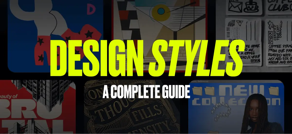
This is your guide to graphic design styles.
Some styles are easy to recognize, but hard to name. You know the look when you see it. You just do not know what to search for.
We know the problem well. Our content and production teams talk about visual trends all the time, and naming a style is often harder than spotting it.
So we made this guide to help.
It covers graphic design styles that are tough to pin down with a simple Google search. By giving these looks clear names, you can find better references, use better keywords, and get to the right inspiration faster on Pinterest, Dribbble, and beyond.
Save this list. Use it whenever you need clarity, direction, or a quicker way to identify the style you have in mind.
Let’s get into it.
Where do different graphic design styles come from?
Graphic design styles sit at the core of visual communication. Each one carries its own mood, message, and way of shaping how people feel about what they see. From clean, modern layouts to timeless classic looks, every style is built through deliberate choices around color, composition, typography, and imagery. The question is. Where do these choices come from?
Most graphic design styles are shaped by three key forces. History, culture, and technology.
Cultural influences play a major role. Regional trends, social values, and traditions shape how design looks and feels. Colors, symbols, and visual language shift across cultures, allowing design to reflect local identities and respond to social moments in meaningful ways.
Technological progress pushes design forward. From the invention of the printing press to modern design software, new tools unlock new possibilities. Today, AI represents the latest shift, expanding how quickly ideas can be explored a
Historical movements continue to leave a strong imprint. Designers still draw inspiration from past styles like the geometric clarity of Bauhaus or the richness of Baroque, while blending them with contemporary approaches such as minimalism, pixel art, and 3D design.
By understanding how graphic design styles are formed, designers can build on proven principles while pushing their work in new, original directions.
Graphic design styles list
Acanthus


Acanthus is a classic decorative design style built around flowing, stylized leaves and curling floral forms. Named after the acanthus plant, its deeply cut leaf motif became iconic in ancient Greek and Roman ornament, especially in Corinthian and Composite column capitals, where it signaled craftsmanship, elegance, and refinement. Today, acanthus details still show up as premium decoration in typography, borders, stationery, wallpaper, invitations, and print, adding a timeless classical richness to modern work.
Characteristic of this design style:
- Accent-first usage: works best as detailing around a clean core, not as visual clutter.
- Sculptural leaf forms: bold, curled acanthus leaves with deep cuts and layered lobes.
- Classical symmetry: balanced compositions, mirrored flourishes, and structured ornament.
- Architectural influence: column-capital shapes, scrollwork, and carved-stone-inspired rhythm.
- Ornamental borders and frames: acanthus used as corner flourishes, dividers, and crest-like trims.
- Engraved linework feel: etched shading, fine strokes, and vintage print texture cues.
- Heritage typography pairing: high-contrast serifs, roman capitals, and formal lettering styles.
- Premium, traditional mood: signals tradition, luxury, ceremony, and “old world” craft.
Anthropomorphic


Anthropomorphic design turns animals, objects, or creatures into human-like characters.
It has roots in ancient mythology, where non-human figures were often given human emotions, motives, and roles. But the style became widely popular through cartoons, animation, and brand mascots in the 20th century.
Why did it stick? Because it works. Humanized characters feel expressive, relatable, and easy to remember.
Today, anthropomorphic design appears in playful branding, children’s publishing, poster design, and nostalgic packaging. It helps brands add personality, build emotional connection, and communicate ideas in a way that feels simple and visual.
Characteristics of anthropomorphic design
- Human-like traits
Animals, objects, or fantasy creatures are given human emotions, expressions, posture, or behavior. - Expressive faces and gestures
Characters often smile, frown, pose, or react in ways people instantly recognize. - Strong personality
The design usually feels playful, friendly, mischievous, confident, or charming. - Story-driven visuals
These characters often suggest a role, mood, or mini narrative, even in a single image. - High memorability
Humanized characters are easier to remember than generic icons or static illustrations. - Emotional appeal
The style helps viewers relate to a brand or message faster. - Accessible communication
Complex ideas can feel simpler and more approachable when expressed through character design. - Common in branding and entertainment
You’ll often see it in mascots, packaging, editorial illustration, animation, and children’s media
Art Deco

Decopolis Cocktail Lounge – Art Deco. Use Template

Save the Date – Gatsby Style. Use Template
Art Deco is a bold, geometric design style defined by symmetry, clean lines, and polished glamour. Rising in the 1920s and 1930s, it reflected an era obsessed with progress, modernity, and luxury, often expressed through strong shapes, stepped forms, and metallic accents. Today, Art Deco still shows up in modern work through dramatic typography, architectural patterns, and refined details, making it a go-to style for upscale packaging, premium event branding, and elegant visual systems with a “Gatsby-era” confidence.
Characteristic of Art deco design style:
- Cinematic opulence: communicates premium, dramatic, and polished brand energy.
- Geometric structure: sharp angles, circles, chevrons, and clean, engineered shapes.
- Symmetry and balance: centered layouts, mirrored motifs, and orderly composition.
- Stepped and tiered forms: sunbursts, zigzags, and “skyscraper” silhouettes.
- Luxurious finishes: gold, brass, chrome, and high-contrast metallic accents.
- High-contrast typography: tall caps, strong verticals, and stylized display letterforms.
- Decorative patterning: fan motifs, arches, fluting lines, and repeating geometric borders.
- Minimal ornament, maximum impact: detail is intentional, crisp, and never overly delicate.
Art Nouveau

Art Nouveau Poster Design.
Use Template

Vintage Floral Vibe Tarot Deck.
Use Template
Art Nouveau design style combines flowing lines, organic forms, floral ornament, and refined typography.
The movement began in the late 19th century and took much of its inspiration from nature. It treated design as an art form, blending illustration, decoration, and type into one expressive style.
Part of its appeal came from contrast. As industrial production expanded, Art Nouveau offered something more detailed, handcrafted, and human.
Its influence still shows up today. You’ll see it in type design, posters, book covers, and branding that leans romantic, decorative, or vintage-inspired.
Characteristics of Art Nouveau design style
- Flowing lines
Curves, swirls, and whiplash shapes create a sense of movement. - Organic forms
Shapes often echo plants, vines, flowers, insects, and the natural world. - Decorative detail
Ornament plays a central role, rather than acting as a small accent. - Elegant typography
Type often feels refined, stylized, and integrated into the composition. - Nature-inspired motifs
Floral patterns, leaves, stems, and feminine silhouettes appear often. - Illustration and design blended together
Images, borders, and text usually feel unified rather than separate. - Handcrafted feel
The style often feels artistic, intimate, and less industrial. - Romantic and ornamental mood
Art Nouveau usually feels graceful, expressive, and visually rich.
Alphonse Mucha was one of its most influential artists of the Art Nouveau era.
Aurora

Aurora is a gradient style inspired by the luminous colors and soft glow of the Northern Lights, or aurora borealis. It became a defining modern aesthetic in the late 2010s, as digital artists increasingly embraced bold, radiant color transitions.
Characteristics of Aurora design style:
- Often enhanced with subtle grain or blur for a softer, more ethereal finish
- Smooth transitions between purples, pinks, blues, and greens
- Soft, glowing appearance with a dreamy or atmospheric feel
- Luminous color blends that feel modern and immersive
- Frequent use in branding, UI and UX backgrounds, and digital art
- Strong association with cosmic, futuristic, or magical visual themes
Baroque

Gold Angle Design. Use Template

Hermano Bar & Motor Repaire Design. Use Template
When it comes to Baroque style think dramatic details, swirling ornamentation, and intense contrasts that make everything feel lavish and theatrical. This style flourished in Europe from the early 17th century up to the mid-18th century, dominating architecture and art of the period.
But here’s an interesting backstory — Baroque wasn’t just about looking fancy. It was a power move by the Catholic Church during the Counter-Reformation (the Catholic response to the Protestant Reformation), designed to bring emotion and drama back into religious art.
The idea? To create awe-inspiring, reactions that would draw people back to Catholicism after the Protestant Reformation had stripped things down to the basics.
Bauhaus

Bauhaus Graphic Design Poster. Use Template

Martini Galerie Design. Use Template
Bauhaus strips design down to its functional essentials, focusing on bold geometric shapes, primary colors, and minimal ornamentation. Its primary ideals are form over function and clarity. Born from the German art school active between 1919 and 1933, Bauhaus set the stage for modernist design worldwide, influencing key design styles such Japandi design which we explored earlier.
Bento grid

Beauty Product IG Post Bundle. Use Template

Bento Grid Design – IG Post Bundle. Use Template
The Bento Grid, inspired by compartmentalized Japanese bento boxes, is a clean, orderly layout style that organizes content into distinct sections with clear separation. It gained traction in the late 2010s, especially in UI/UX and web design, as minimalism and functional layouts became more popular.
Biomorphic

Biomorphic GardeningTemplate. Use Template

Biomorphic Treasure Template. Use Template
Biomorphic design replaces hard geometry with soft, organic form.
It draws from nature, cells, anatomy, water, and growth patterns to create visuals that feel fluid, calm, and futuristic. You’ll often see it in branding, posters, product imagery, and digital design that wants motion and warmth without looking playful.
Its strength lies in balance. The shapes can be expressive, but the layout should stay clean, spacious, and controlled.
Characteristics of biomorphic design
- Organic shapes
Forms feel soft, fluid, rounded, and inspired by nature rather than strict geometry. - Nature-based references
Visual cues often echo cells, bodies, water, waves, growth patterns, or microscopic structures. - Flow and movement
Shapes often suggest motion, expansion, or transformation. - Soft contours
Edges are usually curved and smooth instead of sharp or mechanical. - Minimal typography
Type is often simple and restrained to let the forms take the lead. - Generous white space
Layouts usually feel open, breathable, and uncluttered. - Controlled color palette
Colors are often limited, soft, or gradient-based to keep the composition cohesive. - Abstract but approachable
The style feels modern and experimental, but still warm and accessible. - Clean structure
Even with expressive shapes, the overall layout stays organized and intentional. - Quietly futuristic mood
Biomorphic design often feels contemporary and forward-looking without becoming cold or overly tech-driven.
Bohemian (boho)


Bohemian, or boho, design design styles are a blend of global influences, layered textures, and earthy yet vibrant color palettes. This style radiates a laid-back, free-spirited energy, evoking a sense of wanderlust and artistic adventure. While its origins trace back to 19th-century artist communities, Boho design gained mainstream popularity during the hippie movement in the 1960s and 1970s, leaning heavily on bright and colorful palettes.
There’s a ton of bohemian-style design assets in Kittl — from fonts to illustrations to color palettes. Check out some of the assets from the Bohemian logo design bundle in Kittl below:


Brutalism

Beauty of Brutalism Design.
Use Template

Neo Brutalist/Brutalism Pizza Flyer Use Template

Babylon Brutalism Design.
Use Template
Applied to graphic design, Brutalism is nearly the opposite of polished minimalism, favoring stark layouts, bold monochrome palettes, and unrefined typography design styles. It’s intentionally raw, breaking away from conventional aesthetics to make a bold statement. Stemming directly from mid-20th-century architectural Brutalism, this art style had a digital resurgence in the 2010s.
Today, we’re spotting it used in edgy portfolio sites, streetwear, poster design, and brand identities that want to stand out because this style attracts people efficiently. If you’re searching for styles similar to Brutalist Art, you can check “Maximalism” or Maximalist style art for another bold design direction.
Chinoiserie

Chinoiserie Blue Template. Use Template

Chinoiserie Bird Template. Use Template
Chinoiserie is a decorative design style that borrows from Chinese and broader East Asian art motifs through a Western, ornamental lens. It’s defined by intricate pattern work and storybook detail, like cranes, peonies, bamboo, pagodas, cloud forms, and lattice frames, often arranged in scenic vignettes or dense borders.
You’ll see this design style most in wallpaper, textiles, ceramics-inspired graphics, and premium packaging, where it signals craft, heritage, and a “collected” sense of luxury. The key is restraint: keep the core logo simple, then apply the design style through patterns, frames, and accent illustrations, so it reads intentional rather than costume-like.
Characteristic of Chinoiserie design style:
- System-first usage: strongest as a supporting layer around a clean core mark.
- Ornamental motifs: cranes, peonies, bamboo, pagodas, dragons, clouds, and garden scenes.
- Scenic vignettes: story-like compositions with layered foreground and background elements.
- Decorative borders and frames: lattice trims, corner flourishes, and patterned edging.
- Pattern richness: dense repeats that feel textile or wallpaper-inspired, not minimal.
- Porcelain-inspired cues: blue-and-white effects, fine linework, and ceramic-style detailing.
- Elegant, curated palettes: porcelain blues, jade greens, inky blacks, reds, and soft neutrals.
- Craft-forward texture: engraved linework, ink illustration feel, and “hand-finished” detail.
Conceptual sketch (doodle art)


One of the most fun design styles in recent years is conceptual sketch art, also known as doodle art. This style is characterized by spontaneous lines, childlike or naive drawings, and freeform shapes. While sketching has always been a part of artistic expression, doodle-centric art gained significant popularity in the 2000s, particularly online. Today, it’s been picked up in more professional environments and used for designs that aim to convey a fun, unpolished energy, including branding for creative agencies, youth-oriented products, and editorial designs.
This design style offers creative freedom, allowing designers to easily transform hand-drawn sketches into digital assets. We do a deeper dive on this doodle art trend in another article and share exactly how to upload a simple doodle to Kittl, vectorize it, and instantly create a digital version of your image for your graphic design projects.
Learn more about doodle art with our in-depth guide that explores the trend, plus how to create digital doodle art with physical, hand-drawn doodles—no tablet or drawing pad needed.
Coquette

Coquette is a romantic design style that chooses softness over polish. It leans into intimacy, nostalgia, and delicate decoration, using pastel palettes, vintage-inspired typography, and personal, diary-like imagery to create visuals that feel emotionally grounded. This design style often shows up in beauty branding, fashion edits, social posts, and packaging where the goal is to feel sweet, curated, and human, not sleek or overly perfected.
Characteristic of Coquette style:
- Sweet emotional tone: flirty, tender, and personal, never loud or aggressive.
- Pastel palette: blush pinks, creams, powder blues, and soft, milky neutrals.
- Bows and lace details: ribbon motifs, lace trims, scalloped edges, and frilly accents.
- Vintage or handwritten typography: scripts, retro serifs, dainty caps, and “love letter” letterforms.
- Nostalgic imagery: film photos, dolls, florals, heart motifs, and romantic ephemera.
- Light imperfect textures: paper grain, soft blur, subtle noise, and worn print cues.
- Delicate decoration: tiny icons, ornamental dividers, and minimal sparkle or charm elements.
- Soft composition: gentle spacing, centered layouts, and intimate scale choices.
Cybercore


Cybercore is all about neon-lit visuals, circuit board motifs, and the feeling of living inside a high-tech world. Think metallic finishes, harsh drop shadow, pop-up windows, and a sense of digital speed. Rooted in 1980s cyberpunk culture, it gained traction in the 21st century with the internet boom. It was influential everywhere from fashion (think popular 90s pop stars, Brittney Spears, NSync, and more). This style has recently been revived, but via the keyword IOS core.
Lately, you’ll find Cybercore design style in gaming brands, festival posters, marketing campaigns, vision boards, social posts, and more edgy branding. Watch the video below to learn more about this design style trend.
Ethereal

The Ethereal style focuses on soft hues, delicate layering, and a generally airy, otherworldly atmosphere with distorted, blurry imagery and photos — like you’re stepping into a dream. While airy aesthetics have shown up throughout art history, this particular style became extra trendy in the 2010s, especially in photography and web design.
We’re seeing Ethereal design in high-end fashion lookbooks, website hero images, and conceptual art pieces that aim for a soft, refined feel. It’s somewhat similar to Surreal design, but more grounded in reality. Instead of creating completely dreamlike or otherworldly scenes, Ethereal design takes realistic images and gives them a gentle, otherworldly glow — almost like viewing them through a dreamy, hallucinatory lens.
Ethereal style works excellent for design projects that need a nostalgic vibe.
Farmhouse or cottage-core

Farmers Market – Vegetables & Fruits. Use Template

Wildflowers Shop – Garden. Use Template
Farmhouse and cottage-core are closely related styles that emphasize rustic simplicity, natural fabrics, and countryside aesthetics. Rooted in rural settings, these styles became widely recognized through social media in the 2010s in interior design and fashion and continue to thrive today.
Today, farmhouse and cottage-core design often appear in home décor branding, boutique fashion labels, nature-inspired book covers, and any project seeking a warm, cozy feel that pulls us into the simple life.
Find more cottage-core design assets with the cottage-core YouTube design bundle below:

Filigree

Filigree is all about intricate, lacy patterns inspired by the delicate metalwork, marble, and wood designs seen in vintage jewelry and historical architecture. It’s rooted in centuries-old European craftsmanship, particularly from the 17th and 18th centuries. The name filigree name comes from the Latin words filum (thread) and granum (grain), referencing the tiny metal threads used in jewelry-making.
In graphic design, Filigree design style often manifests as lavish swirls, flourishes, and fine details that instantly convey elegance and sophistication.
You’ll often spot filigree in premium packaging, wedding invitations, and anywhere a touch of ornate luxury is needed.

Future Medieval

Future Medieval design style blends ancient symbolism with speculative, digital aesthetics. It pulls from medieval manuscripts, heraldry, armor, and religious iconography, then reimagines them through modern tools, sharp contrast, and futuristic composition. The result feels both historical and forward-looking, familiar yet strange.
This style often features gothic typography, ornate borders, shields, sigils, and mythical motifs, paired with digital textures, metallic finishes, and stark color palettes. Gold accents meet dark backgrounds. Calligraphy collides with modern layout systems. It feels ceremonial, powerful, and intentionally dramatic.
Characteristic of this design style:
- Modern layout systems: grid structure, clean spacing, and contemporary composition that keeps it readable.
- Gothic typography: blackletter influences, sharp serifs, and dramatic, high-contrast letterforms.
- Heraldic symbols: shields, crests, sigils, monograms, and emblem-style lockups.
- Manuscript ornament: ornate borders, illuminated-style flourishes, and marginalia-inspired details.
- Mythic motifs: swords, beasts, saints, moons, stars, and coded symbolic imagery.
- Stark contrast palettes: dark grounds with bright highlights for intensity and focus.
- Gold and metallic accents: gilded details, foil-like cues, and “relic” luxury finishes.
- Digital texture overlays: scan noise, glitch hints, grain, and modern surface treatments.
Gothic

Demon Sinister Design. Use Template

Haunting Presence Design. Use Template
Gothic is a classic design style known for its dramatic contrast between darkness and grandeur. Its aesthetics and typography often balance eerie, mysterious elements with ornate, decorative details, depending on how the style is applied. Gothic design styles originated in twelfth century European architecture and have gone through multiple revivals, influencing everything from typography and illustration to fashion and visual branding.
Today, Gothic design styles appear across band merchandise, logo design, vintage inspired branding, and fashion collections. What makes this style especially compelling is its versatility. Designers can create vastly different visuals that still follow Gothic principles, ranging from dark and minimal to highly ornate and expressive.
Graffiti

Canvas Street Art Design. Use Template

Urban Canvas Logo Design. Use Template
Graffiti is a bold design style rooted in urban street art, known for spray painted lettering, vivid colors, and gritty textures. It feels energetic, rebellious, and unapologetically expressive. Modern graffiti design styles emerged in the 1960s and 1970s alongside the rise of hip hop culture, where walls, trains, and public spaces became canvases for identity and protest.
Today, graffiti design styles continue to influence graphic design through edgy brand campaigns, music festival posters, and streetwear collections. Designers use these elements to capture an underground attitude and raw visual energy that stands out against more polished, commercial aesthetics.
Japandi


Japandi is the beautiful and calming combination of Japanese minimalism and Scandinavian warmth. Think neutral, muted color palettes, organic materials and textures, and a touch of inspiration from traditional Bauhaus layouts (more on this later).
Japandi style gained popularity in the late 2010s into the 2020s, at the same time the wave of minimalistic interior design trends. You’ll find Japandi style influences in sleek websites, lifestyle product branding, and very often in calming and minimalist poster design.
We did a deep dive into this style as its currently growing at a rapid pace in popularity. In fact, it made it onto our 2025 graphic design trends list.
Kawaii

Cute Girl Kawaii Design. Use Template

Pink Kawaii Y2K Logo Design. Use Template
Kawaii is the Japanese concept of cute and features rounded shapes, pastel colors, and cartoon-like characters. While it emerged in Japanese pop culture in the 70s and 80s, it has since swept across global fashion, stationery, and media. You’ll see Kawaii style in product design, character branding, toy packaging, apparel brands, and social media graphics that are built on or inspired by the cute Japanese aesthetic.
Kawaii characters and images can be generated easily with Kittl AI. In fact, there’s a specific style option that you can select in the image generator to achieve the perfect kawaii AI image.
Kidcore

Kid CoreTemplate. Use Template

Kid Core Template. Use Template
Kid core design draws directly from childhood visuals. Crayons, stickers, bold colors, simple shapes, and naive drawings all play a role. The style feels playful, emotional, and intentionally imperfect, with a focus on expression rather than polish.
In recent trends, kid core reflects a wider shift away from strict minimalism. As visual sameness increases across brands and platforms, expressive styles regain attention. Audiences are responding more strongly to work that feels personal, emotional, and human.
Kitsch

A Friend in Need (1903)
by Cassius Marcellus Coolidge

Vogue Portugal Fevereiro 2024
The Kitsch Issue Magazine Cover
Kitsch is a design style name that’s not incredibly well-known. It embraces bright colors, exaggerated imagery, and playful pop culture references, turning tackiness into an art form. This style is rooted in nostalgia and irony, often incorporating retro graphics and humorous elements. While the concept of kitsch dates back to the late 19th century, being largely used in interior design, it experienced a major revival in mid-20th-century pop art.
Today, kitsch design is commonly seen in novelty products, sticker designs, satirical branding, and marketing campaigns that lean into over-the-top humor. In interior design, kitsch embraces the principles of DIY and upcycling.
Kitsch is the German word for ‘trash’ highlighting the controversial aspect of this design style.
Luxury Typography

Luxury Typography is one of the most influential design styles in contemporary graphic design. It centers on refined, often custom typefaces, elegant scripts, and carefully crafted ligatures that signal sophistication and control. While the style gained strong visibility through high-end fashion branding in the twentieth century, its roots trace back to classical calligraphy and typographic craftsmanship.
Today, Luxury Typography design styles remain a staple across premium packaging, luxury streetwear branding, upscale event invitations, and high-end magazine covers. Their continued relevance reflects a desire for timeless elegance and visual authority.
The popularity of this style is easy to spot. Platforms like Pinterest feature thousands of examples exploring luxury typography, highlighting its lasting appeal and versatility across modern design contexts.
Memphis


Now for the classic and energetic Memphis style. With loud geometric shapes, bold colors, and playful patterns, it’s all about postmodern vibes. This style first stepped into fame in the early 1980s, thanks to the Memphis Group, it quickly became iconic of that era’s experimental design scene. If you’re back to watch 80s shows such as Saved by the Bell, Seinfeld, and Full House, you’ll see this pattern very frequently, whether in decor or on clothes.
You’ll see Memphis patterns today in retro branding, editorial pieces looking for a splash of fun, and funky product packaging. Kittl has a wide collection of design elements and templates (from social media posts to marketing materials) you can access with a free account.
Mixed Media

Source: www.pinterest.com

Source: www.pinterest.com
Mixed Media is exactly how it sounds, mixing different mediums or media forms in one cohesive image. From painting, photography, scrap materials, and more. The mixed media design style typically leans heavily into layering and unexpected juxtapositions, creating eclectic visuals. While artists have used mixed media for centuries, it saw a surge in use in the late 20th century.
Today, you’ll find mixed media in magazine spreads, album covers, and advertising campaigns.
Mystical Western


Mystical Western, is a term we’ve keyed ourselves to describe a specific design style we’ve been seeing frequently. Mystical Western is a fusion of classic cowboy aesthetics with celestial and spiritual imagery. This style features desert landscapes, moonlit nights, and cosmic symbols, blending rugged Americana with a dreamy, otherworldly feel.
Western art has historical roots dating back to the 19th century, but the mystical twist emerged in alternative and Boho design circles in the 2010s. It is a perfect fit for music festival posters, indie apparel, and branding that aims to capture a magical frontier aesthetic.
Naive

Naive Cat Template. Use Template
One of the most favored design trends right now, Naive leans into childlike expression and visible imperfection. It feels openly human. Uneven shapes, jittery outlines, messy fills, and smiley faces drawn mid phone call, not carefully aligned to a grid. This is not design done poorly. It is design done honestly, where personality matters more than polish.
Neoclassical

“Napoleon Crossing the Alps” by Jacques-Louis David, 1801. Source: www.britannica.com

Duelist Design. Use Template
After the ornate drama of Baroque and the playful excess of Rococo, Neoclassical design styles emerged as a return to structure and restraint. If you are drawn to the balanced proportions of Greek and Roman architecture or the calm authority of classical portraits, Neoclassical design is the style to know.
This design style developed in the late eighteenth to early nineteenth century, shaped by the Enlightenment’s renewed fascination with classical antiquity. Neoclassical art emphasized simplicity, symmetry, and controlled grandeur, reflecting a cultural shift toward reason and order after the visual richness of earlier movements.
Today, Neoclassical design styles continue to influence formal print layouts, editorial design, and interior spaces that aim for a timeless, dignified presence. Its lasting appeal lies in clarity, proportion, and a sense of quiet confidence that never feels overstated.
A key way distinct Neoclassical art from other classic art forms is the use of red with earthy color palettes. Red is often strategically used in Neoclassical art to create contrast and highlight focal points, adding richness to the otherwise muted, classical color schemes.
Pixel art (8-bit, bitmap)
Now for something totally different — Pixel Art! If you grew up playing video games in the 70s or 80s, you’ll remember the blocky, low-resolution graphics that defined that era. Pixel Art, also known as 8-bit or bitmap art, is made up of tiny squares of color, often limited in palette, but full of nostalgic charm.
Popularized during the golden age of gaming, this style made a massive comeback with indie game developers in the 2010s. It’s everywhere now, from retro-inspired marketing (most often used in casual, eye-catching social media posts) to the design aesthetics of hit games like Minecraft.
Early game designers had to work with severe technical limitations, which led to the birth of Pixel Art. Today, those same limitations have become the style’s defining feature and appeal!
Explore pixel art ideas and learn how to create cute pixel art (in just minutes) in Kittl with our tutorial guide.
Pointillism

Pointillism is a distinctive design style built entirely from tiny dots, relying on the viewer’s eye to blend them into a complete image. Developed in the late nineteenth century, this technique creates a recognizable stippled texture that feels intricate and almost hypnotic up close.
Because pointillism is time intensive, it is less common in everyday design work today. However, pointillism design styles still appear in book illustrations, specialty branding, and select packaging where craftsmanship and detail matter. The dense dot work adds a tactile, hand crafted quality that helps designs stand out in a landscape dominated by flat, minimal visuals.
French artists Georges-Pierre Seurat and Paul Signac are credited with developing the technique of Pointillism.
Pop Art

Pop Art is a classic design style from the Pop Art movement that emerged in the United States and Britain in the mid-to late-1950s, led by artist Andy Warhol. It takes imagery from popular culture (pop culture), such as consumer products, comic strip images, and famous icons, and represents them through bold colors and repetition to make a statement. The style emerged as a playful and eye-catching commentary on consumerism and celebrity culture.
Today, Pop Art remains as popular as ever for eye-catching visuals. It’s used frequently lately in everything from branding and packaging to apparel design and even web design.
Punk Grunge

Punk grunge design is not about rejecting technology. It is about bringing the human hand back into the process. Now, the most compelling creative work is not frictionless or overly automated. It shows fingerprints, texture, and a touch of chaos. Every smudge, tear, and crooked letter signals that a real person made it. Creativity is not meant to look perfect. It is meant to feel alive.
And if you want to create that energy without fighting your tools, Kittl is built for it. Punk fonts, rough textures, collage elements, and a palette generator that pulls colors from real gig posters give you everything you need to design work that feels raw, expressive, and unmistakably human.
Risograph
Risograph is a print-inspired design style that recreates the look of riso output, using layered spot colors, visible grain, and slight misregistration for character. It typically features flat shapes with tactile texture, ink noise, and imperfect overlaps that make the work feel handmade and editorial, not overly polished.

Risograph Colorful Template. Use Template

Risograph Animal Template. Use Template
This design style shines in posters, zines, album art, event flyers, editorial illustration, and artsy brand collateral when you want warmth and “printed” personality.
Romantasy

Romance Fantasy Template. Use Template
Romantic fantasy design style is not just pretty. It is narrative. It leans into ornate type, medieval symbols, florals, moons, swords, and dramatic lighting. It makes a brand feel like a story you can step into. If your project needs emotion and atmosphere, this style signals it fast.
Rocketpunk
Rocketpunk (also called atomic age retrofuturism) is a retro-futuristic design style that imagines the future the way the 1950s did: optimistic, sleek, and proudly science-forward.
It’s defined by rockets, ray guns, atomic symbols, mid-century curves, bold signage typography, and bright “space-age” contrast that feels energetic and playful. Rocketpunk works especially well for posters, merch, playful sci-fi branding, retro illustrations, and event graphics that want nostalgia with punch.
Rubberhose
Rubber hose is a 1920s–30s animation-inspired illustration design style defined by bendy, noodle-like limbs, simple facial features, and big, exaggerated motion. It’s instantly recognizable for vintage cartoon mascots, oversized gloves, thick outlines, and rubbery poses that feel playful, charming, and slightly surreal.

Rubberhose Mascot Template. Use Template
This design style is a strong fit for retro mascots, café or bar branding, sticker packs, character logos, and cartoon-inspired merch where you want personality to hit fast.
Shabby Chic

Jasmine Perfume Design. Use Template

Luxury Aesthetic Wedding Invitation. Use Template
For those drawn to distressed finishes, pastel tones, and vintage romance, Shabby Chic is one of the most recognizable design styles. This aesthetic is defined by faded florals, repurposed furniture, soft textures, and nostalgic details that create a sense of comfort and lived-in charm.
Shabby Chic design styles rose to prominence in the late 1980s and 1990s, particularly within interior design. Today, the style remains popular across wedding invitations, cozy product packaging, and brand identities that aim to feel warm, sentimental, and inviting.
Steampunk

Steampunk Gears – Gold Ornate. Use Template

2938 Deliverance – Scifi Ebook Cover. Use Template
Steampunk is one of the most distinctive design styles, blending Victorian-era aesthetics with imagined mechanical, steam-powered technology. The result feels both vintage and futuristic, combining historical detail with speculative creativity.
Common elements in steampunk design styles include gears, cogs, brass machinery, leather straps, and exposed mechanisms. These visuals reference the steam engines, coal-powered machines, and industrial environments of the Victorian era, reimagined through a fantasy lens.
Steampunk originated as a literary subgenre in the 1980s before expanding into broader pop culture and visual design. Today, steampunk design styles often appear in book covers, fantasy branding, posters, and merchandise that merge historical influence with science fiction storytelling.
The steampunk style can be generated easily with the Kittl AI image generator.
Synthwave

Synthwave Sunsets. Use Template

Retro 80s Synthwave Music Festival. Use Template
Another retro design style is Synthwave. Synthwave brings us back into the 80s with neon grids, palm trees, and dramatic sunset gradients. Its retro-futuristic themes are heavily influenced by electronic music and old-school 80s arcade aesthetics. In the late 2000s there was a revival of 80s synth music that brought the style back to life and it became a widespread design trend in the 2010s.
Today, Synthwave frequently appears in album artwork, film, television, and digital media where neon-infused, high-contrast and energetic visuals are needed. It has also found a place in branding and marketing campaigns, leveraging its bold aesthetic for eye-catching materials.
To get started with the Synthwave style, use the design bundle below for easy access to all the Synthwave design elements you’ll need.


Tenebrism


Tenebrism is a lesser-known design style defined by extreme contrast between light and dark, creating a dramatic, spotlight effect. This approach comes from the Baroque painting movement and is most closely associated with artists like the Italian painter Caravaggio, who worked between 1571 and 1610. As one of the more expressive design styles rooted in fine art, Tenebrism uses intense lighting and deep shadow to direct attention and heighten emotion.
Today, Tenebrism-influenced design styles appear in atmospheric posters, event flyers, editorial layouts, and packaging that aims to create strong visual tension. By embracing darkness as an active design element, this style delivers mood, focus, and a sense of theatrical impact.
Three by three (3×3) grid design


The 3×3 grid design is a term we’ve coined to describe a structured nine-box layout that organizes visuals into a clean, easily digestible format. While grid systems have long been a fundamental part of design, this particular layout gained popularity in the 2010s with the rise of social media aesthetics and mood boards.
Commonly seen in Instagram feeds, portfolio showcases, boutique branding, and apparel design, the 3×3 grid is valued for its visually striking yet orderly composition. It’s the perfect choice for creating a cohesive design that seamlessly incorporates multiple themes or concepts while giving each element equal prominence.
Trinket

Trinket Design is a visual style built on a simple human instinct: collecting. It takes the language of archives, specimen sheets, and catalog pages, then remixes it into something personal and nostalgic, turning everyday objects into curated grids that feel like memory made visible. What used to be documentation now becomes identity, blending museum-like order with the warmth of digital culture and “these little things mean something” storytelling.
Characteristic of this design style:
- Quiet narrative tone: the layout feels intimate, like a personal archive, not decoration.
- Catalog-style layouts: objects arranged like a sheet, board, or collection page.
- Flat-lay composition: top-down, orderly placement with clear spacing and structure.
- Neutral or minimal backgrounds: clean backdrops that let objects read instantly.
- Clear silhouettes: strong outlines and recognizable shapes, often cutout-like.
- Small labels and captions: tiny names, numbers, tags, or “specimen” notes.
- Curated clustering: grouped items that feel themed, collectible, and intentional.
- Nostalgic object choices: charms, toys, pins, trinkets, stationery, and keepsakes.
Type-collage

Type Collage is a typography-first design style where letterforms become the composition. Instead of using type as a supporting element, it treats type as the main visual material, mixing fonts, weights, sizes, and layout moves to create mood, hierarchy, and energy in one frame. It’s common in posters, editorials, and brand graphics where you want the design to feel expressive, authored, and instantly attention-grabbing.
Characteristic of this design style:
- Texture treatments (grain, distress, halftone, stamped effects).
- Strong font contrast (serif vs sans, condensed vs wide, modern vs vintage).
- Big scale shifts (oversized hero words with small supporting text).
- Layering, overlap, and cropping of type.
- Intentional grid breaks (structured, but not rigid).
- Mixed weights, cases, and styles (bold, italic, outline, uppercase).
- Rhythm through repetition (repeated words, letters, or blocks).
- Bold alignment choices (hard-left, centered stacks, offsets, diagonals).
Vaporwave

Technowave Retrowave Chrome. Use Template

Infinite Illusions Vaporwave Album. Use Template
Vaporwave is an interesting internet-born aesthetic that mashes up old-school computer graphics, neon hues, glitchy effects, and most surprisingly of all: Greek busts. It emerged in the early 2010s from online communities and leans heavily on nostalgia and satirical design, incorporating elements from the 80s and 90s.
You may see it on album covers, digital collages, and experimental ad campaigns.
Victorian design

Goldminer Barber – Monogram Design.
Use Template

Birmingham Distillery – Elegant Victorian Design.
Use Template
Victorian design is one of the most ornate styles, known for rich color palettes, intricate details, and elaborate floral motifs. Popularized during Queen Victoria’s reign (1837–1901), it still shows up today in calligraphy-heavy layouts, vintage-inspired branding, event invitations, and steampunk aesthetics, proving the style can feel modern when used with intention.
Characteristic of this design style:
- Ornament-first layouts: borders, frames, flourishes, and “filled space” compositions.
- Floral and botanical motifs: roses, vines, leaves, and bouquet-like arrangements.
- Decorative typography: calligraphy, engraved-style lettering, and high-contrast serif type.
- Rich, layered palettes: deep jewel tones, warm neutrals, and antique metallic accents.
- Pattern density: damask, wallpaper repeats, filigree, and lace-like detailing.
- Vintage texture cues: etched linework, paper grain, letterpress feel, and subtle aging.
- Symbolic details: crests, cameos, monograms, and storytelling ornaments.
- Maximal, crafted energy: it looks intentional, detailed, and handmade rather than minimal.

Ornament Vintage Notebook Design.
Use Template

Playing Cards – Ornate Design. Use Template
Y2K design

Vagabond Heart Y2K Album Cover. Use Template

Synthetic Serenade Y2K Album Cover. Use Template
Y2K design is one of the most recognizable design styles to emerge from the turn of the millennium. It captures a vintage-futuristic energy by mixing cyber-inspired visuals with playful, high-impact aesthetics. Grungy textures, neon gradients, metallic finishes, and bubbly futuristic typography sit at the core of the look. While it originally peaked around 1999–2000, Y2K design styles have seen a strong nostalgic revival since around 2020, and it keeps showing up in modern culture with new polish.
Characteristic of this design style:
- Chrome and metallic finishes: shiny bevels, reflective surfaces, and “liquid metal” highlights.
- Neon gradients: bright blends like pink-to-purple, cyan-to-lime, and other high-glow transitions.
- Tech UI overlays: HUD elements, scan lines, interface frames, and futuristic iconography.
- Bubble and cyber typography: rounded, inflated letterforms mixed with sharp techno fonts and wide tracking.
- Grunge meets gloss: dirty textures layered over clean digital shapes for contrast and attitude.
- Sticker and collage energy: cutouts, layering, random scale shifts, and playful composition chaos.
- Iridescent and holographic accents: prism-like sheen, pearlescent highlights, and glossy flare details.
- Futuristic shapes: swooshes, blobs, orbs, rings, and starbursts that feel fast and synthetic.
Find the Y2K Shopify banner below and more Y2K designs in Kittl’s template library!
Key Takeaways:
Design styles are not just categories or aesthetics. They are cultural signals. Each one captures a moment in time. What people feel. What they resist. What they want to move toward.
Tracking design styles means tracking shifts in taste, technology, and human behavior. From nostalgic revivals to AI-driven experimentation, from static to motion, styles evolve as creators respond to the world around them. Some fade quickly. Others resurface, reworked by new generations with new tools and perspectives.
This is why understanding design styles matters. Not to label work, but to see patterns early. To recognize when a visual language is emerging, mutating, or about to cross into the mainstream. The designers who stay relevant are not the ones chasing trends. They are the ones who understand where those trends come from and how to use them with intention.
Design styles are living systems. And learning to read them is how you design with context, confidence, and a point of view.

Kezia Sabrina is a biotechnologist turned Product Manager, blending deep user insight with out-of-the-box product strategy. With experience across healthcare, e-commerce, and now the graphic design space, she focuses on building lovable tools and thoughtful pages for her users. At Kittl, she’s shaped the blog into a more seamless experience and occasionally contributes as a writer, combining her product thinking, SEO experimentation for e-commerce sellers, and just enough creative weirdness to stay memorable.