Reed diffusers are an understandable product to build a brand around. The market was valued at around $839 million in 2024 and is on track to hit $1.53 billion by 2034. It runs perfectly alongside the self-care boom, and the demand doesn’t have an off-season.
A well-made reed diffuser sells itself… in theory.
In practice, you still have to get someone to pick it up first.
Because before anyone smells your bergamot and reach the bottle, they see the box. And in that half-second, before a single word is read, they’ve already decided whether your price makes sense.
That’s the real job of good reed diffuser packaging ideas. Premium reed diffuser packaging has four working parts:
- The rigid box: The exterior structure, the first thing touched and seen.
- The internal insert: The foam, paper, or molded tray that holds the bottle in place and communicates care.
- The label hierarchy: The visual system that presents brand name, scent identity, and product information in the correct order of importance.
- The unboxing experience: The moment of reveal. The tissue, ribbon, printed interior messaging, that creates a memory.
Most indie fragrance brands get all four wrong with slapdash packaging. And all because they don’t work the whole design out with a system.
Also see what other product ideas are in high-demand in 2026 with this article: Top 30 high demand products to sell in 2026 (backed by Kittl search data).
The luxury reed diffuser packaging gap: Why most brands look generic
Here’s a brutal test. Put your current packaging next to something from Aesop, Diptyque, or the in-room fragrance line of any boutique hotel you’d actually want to stay in.
If yours looks like it was designed for a different price point and a different customer, well, that’s a valid gap. This means you cannot charge the same premium price as the rest.
We call it The Boutique Shelf Test, and it’s the most honest diagnostic a fragrance founder can run before spending another dollar on anything else.
The failure patterns aren’t random. They’re almost always the same four mistakes, in the same four combinations.
- Three competing fonts on a label that should have one
- Color chosen by personal preference instead of brand logic
- Stock illustrations indistinguishable from every other diffuser on the same shelf
- Scent names buried in 8pt type or is unclear
None of these are expensive mistakes. That’s what makes them so damaging. They’re symptoms of a design system that either doesn’t exist, or was never built with conviction. And conviction, it turns out, is exactly what the luxury category is selling.

So what actually separates the brand charging $45 from the one charging $120? Not necessarily better scent, better wax, or glass. It’s that the $120 brand made the price feel inevitable before the lid came off.
The box isn’t packaging. It’s the opening argument. If yours doesn’t make that argument clearly, nothing inside it can save you.
15 premium reed diffuser packaging ideas for scent brands
1. The monochromatic minimalist system
The monochromatic minimalist system uses one solid color across the rigid box, label, and sometimes even the bottle or cap detail, leaving typography to do most of the contrast work. It is clean, controlled, and very easy to underestimate.

Because there are no busy illustrations or decorative distractions, every detail has to be right: the negative space, the font choice, the hierarchy, the paper finish, and the exact shade of color that represents your scents nicely. Done well, this approach fits the modern luxury and proves high-perceived value.
For reed diffuser brands, this is one of the most scalable packaging styles because each scent can own a single color while the overall system stays consistent.
- You can use a soft tone for scents like linen or cotton
- Deep green is amazing for fig leaf or herbal scents
- Warm amber is iconic for woods, resin, and any other spice
A soft stone shade might signal linen or cotton, deep green can suggest fig leaf or herbs, and warm amber can hint at woods, resin, or spice. It also fits naturally into the modern Scandinavian interior design trends where packaging needs to look good on a bathroom shelf, bedside table, or living room console long after purchase.
You can also check out our article about the best color combinations for professional designs to learn more about which color is best for your brand.
2. The vintage apothecary aesthetic
Borrowing from old-world pharmacies, herbal remedies, tincture bottles, and small-batch craftsmanship, this vintage apothecary aesthetic is usually identifiable with its amber glass, kraft paper boxes, dense labels, and batch-number callouts.
It’s topped off with a mix of serif, script, or typewriter-inspired typography to give a sense of history before the customer knows anything about the brand. You can also check out our favorite vintage fonts here: Never miss 75 Retro Fonts: From ’50s to ’90s.

This style works especially well for wellness-led diffuser brands that want to emphasize essential oils, natural ingredients, hand-blended formulas, or a more grounded ritual around home fragrance.
The style alone is already 180° from common labels since it looks very handmade. But you can completely prevent creating amateur labels with Kittl’s pre-built templates to look instantly authentic.


Topped off with Kittl Exclusive vintage fonts, you cannot find any other label that can do it like yours does.
Just see some of our best ones here:
3. The eco-luxury Kraft tube

Remember how positive unboxing experiences can drive reorders? This design is built just for that. This eco-luxury Kraft tube design replaces the expected square box with a cylindrical paper tube which creates a more distinctive shape and a more memorable unboxing moment. The best middle ground between high-end design and sustainability.
The raw texture of kraft paper immediately communicates “natural” and sustainability. This tube structure gives the packaging a premium feel that makes it extra giftable and keep-worthy. Not to mention, the tube still gives the cushion for safety of the glass but also gives the product strong shelf presence because it breaks away from the sea of rectangular boxes.
If you want your brand to communicate 100% eco-friendliness, you can even make the label as stamps. The analogy of it all makes it extra personal, plus it’s cutting costs for prints.
But if you want to cut the messiness of it all and your label’s design looks better in print, then you can use recycled paper or fabric clothing tags. High-contrast black ink, white foil, simple labels, or linework tend to sit beautifully against raw, textured cardboard.
4. The editorial botanical approach
The best way to lead future-customers to know your reed diffuser’s scent is common marketing mind-games: visualizing the ingredients around it.
Utilize fine-art botanical illustrations to represent your notes for a fine visual storytelling on the box. Etch the packaging with herbs, floral watercolors, leaves, fruit stems, or any other ingredient detail from your diffuser’s “recipe” and give the customer something to read visually before they read the scent name.
This direction is especially strong for reed diffusers because fragrance is invisible. A botanical illustration gives the scent a shape, a texture, and how it can fit in the lives of the customer.
The style also speaks to traditional luxury buyers and boutique gifters.

For founders, you can even create custom botanical artwork with Kittls’ AI Image Generator to avoid the common problem of using the same stock vectors as every other wellness brand. All licensing fees included in your Kittl subscription.
Or follow our tutorial to create beautiful 3D glass botanical designs here:
5. The boutique hotel aesthetic
The boutique hotel aesthetic is ultra-clean, grid-based, and quietly expensive. It often uses scent numbers, rigid alignment, refined sans-serif typography, and generous spacing. The design feels like it belongs in a five-star hotel lobby, spa suite, or high-end concept store. Nothing is loud, but everything feels measured.

This style works because it’s highly structured and borrows from hospitality, where atmosphere is everything. A diffuser using “Scent No. 04” or “Room Ritual 02” with premium sans-serif fonts immediately feels more curated than one with a cluttered descriptive label.
The key is label hierarchy. The brand name, scent number, fragrance family, and product details need to sit in a clear order controlled through kerning and layout grids.
When done well, this kind of packaging makes the customer feel like they are buying into an experience.
6. The textured embossed experience
The textured embossed experience uses touch as part of the branding. Instead of relying on ink-heavy graphics, the design is created through blind embossing, debossing, raised logos, thick cardstock, and shadow. The result is subtle, but that is exactly why it feels luxurious. The customer has to hold it, tilt it, and notice it. Basically, it’s a multi-sensory unboxing experience.

For reed diffuser packaging ideas, embossing is powerful because the product itself is already sensory. Before the customer smells the fragrance, they feel the care in the box. A blind-embossed logo on a thick rigid lid, a debossed pattern on the sleeve, or a raised scent mark can make the entire unboxing experience feel more deliberate. It also instantly communicates a luxury price point.
From a design perspective, this approach also forces clarity. If a mark cannot work as a clean black-and-white vector, it probably is not strong enough to emboss beautifully.
So try some stuff up in the Kittl Editor to see what works.
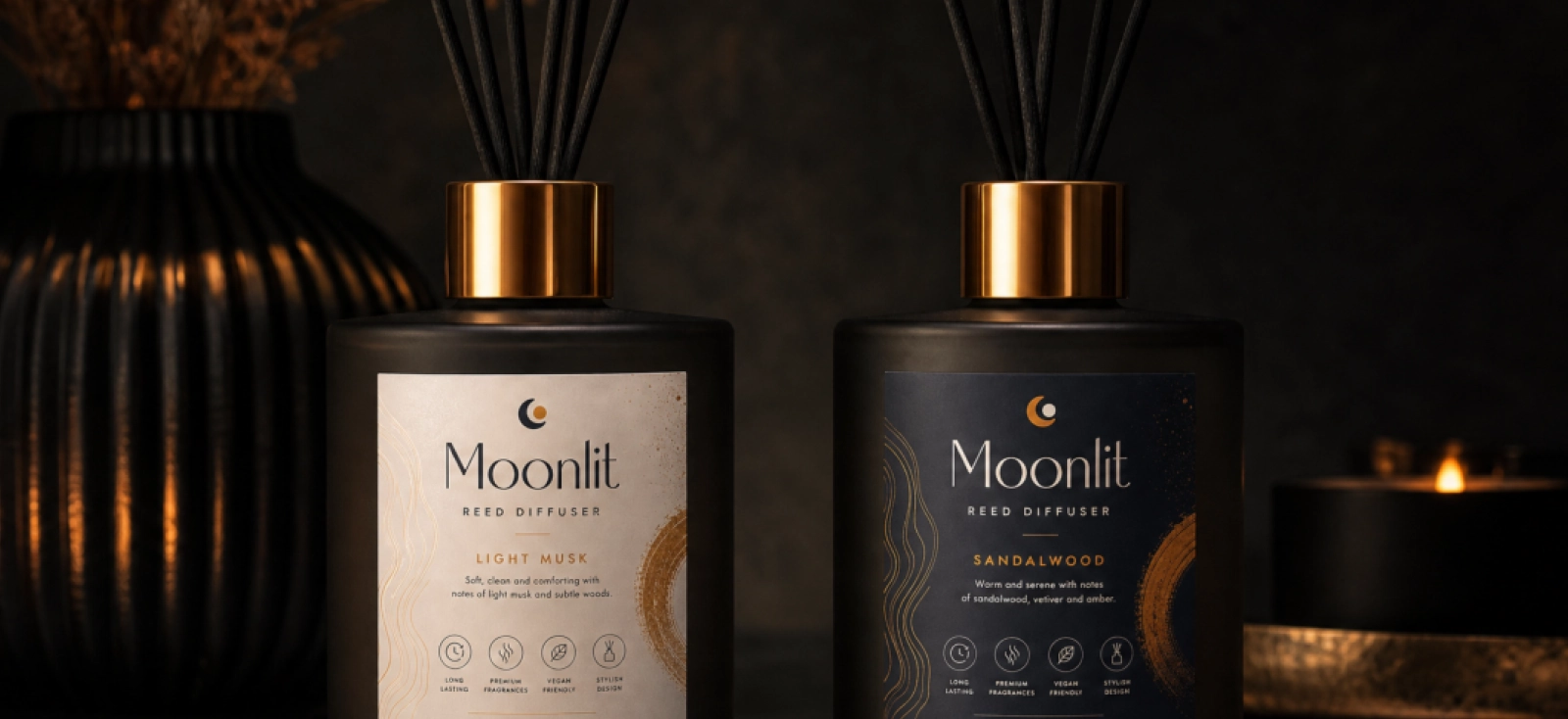
7. The dark moody aesthetic (noir packaging)
The dark moody aesthetic uses matte black, deep charcoal, espresso brown, ink blue, or forest green to create a more intense fragrance world. These boxes are often paired with black reeds, smoked glass, metallic foil, or spot UV details. The result feels evening-focused, sensual, and more dramatic than the usual soft wellness packaging.

This style is especially relevant for diffuser brands selling wood, oud, leather, amber, tobacco, incense, or smoky floral scents. It dominates the men’s grooming and luxury evening home fragrance market due to its edgy and masculine nature.
It can also help a brand speak to customers who do not connect with pastel self-care aesthetics.
The challenge is keeping the design legible. Dark packaging relies on strong contrast, clear typography, and a balanced use of decorative finishes. Careful execution helps maintain a premium appearance and keeps key information easy to read.
Before sending your design to print, preview it in Kittl’s realistic mockups. This helps you evaluate typography, contrast, spacing, and overall packaging presentation in a realistic setting.


You can also top it off with our favorite gothic fonts to truly embody the noir vibe here: The ultimate gothic font lists 2026: 38 typefaces worth your time.
8. The color-blocked multi-scent system
The color-blocked multi-scent system is built for brands that plan to grow. The layout stays the same across every product, while one bold color block changes from scent to scent. This gives the collection instant visual consistency while still making each fragrance easy to identify. It is practical, scalable, and very effective on retail shelves.

For reed diffuser brands, color blocking solves a real operational problem. Founders often start with three scents, then add seasonal scents, limited editions, refills, gift sets, and new fragrance families. Without a system, every new launch becomes a full redesign.
With a strong color-blocked structure, the brand can expand without losing cohesion. It looks incredible when merchandised together on a shelf or a Shopify collection page.
You can make it twice as easy with Kittl’s Brand Kit to lock your layout and swap your brand color effortlessly every time.

9. The custom illustrated sleeve
The custom illustrated sleeve is a smart way to make simple packaging feel special. Instead of printing a different rigid box for every scent, a brand can buy plain base boxes in bulk and wrap it in a decorative (usually cheaper) printed paper sleeve. The sleeve becomes the storytelling layer with a very luxurious feel, while the base packaging stays cost-effective and consistent. A win-win.

This approach is especially useful for small fragrance founders because it allows for flexibility without requiring huge production runs. A winter scent can have one sleeve, a collaboration can have another, and a limited-edition drop can feel visually distinct without changing the entire packaging structure.
The sleeve can carry vibrant artwork, seasonal illustrations, scent notes, patterns, or campaign-specific messaging. It is one of the easiest ways to make practical packaging feel layered and premium.
In Kittl, founders like you can learn how to design custom dimension sleeves with proper rulers and design tools before finally exporting them with CMYK print-ready settings.
Learn more about it here: Design for print with confidence: CMYK export is now in Kittl or here: 7 differences between RGB vs CMYK vs Pantone.
10. The architectural geometric box
The architectural geometric box uses rigid lines, asymmetrical color splits, bold shapes, and structured patterns to create a more modernist visual identity. It can pull from Bauhaus, Art Deco, gallery posters, or interior architecture, depending on the brand direction. The result feels design-conscious, urban, and art-gallery-inspired aesthetic without relying on obvious luxury cues.

This style is specifically appealing as a reed diffuser packaging ideas aimed at a younger and more highly design-conscious urban demographic. It’s fit for concept stores, interior lovers, or design-led gifting.
A strong geometric system can also make a brand instantly recognizable from a distance. The important thing is precision. If the lines, spacing, and color relationships feel slightly off, the whole design loses its architectural confidence.
Leverage Kittl’s vector suite, complete with pen tools, shape builders, and other tools to create precision geometric patterns to your liking.
Since Bauhaus works particularly well in this design style, check out our article about it here: Bauhaus art in graphic design: Big shapes, bold colors, and surprisingly many decisions.
11. The refill-ready brand system
The refill-ready brand system treats the original diffuser and the refill as two parts of the same visual world. The main product may have a decorative rigid box, a beautiful vessel, and a more luxurious label, while the refill packaging can be simpler, lighter, and more utilitarian. Together, they communicate both indulgence and responsibility.

It actually adopts from another familiar design system, which is shampoo and conditioner. We automatically understand that it’s a part of a package (but entirely up to us to decide). Which feels familiar, safe, and easy on the eyes.
This is a strong direction for brands that want to build repeat purchases and eco-conscious loyalty. The customer invests in the first beautiful vessel, then returns for refills that feel practical but still branded.
Visually, the trick is creating a two-tier hierarchy. The primary product should feel giftable and elevated, while the refill should feel clear, efficient, and trustworthy. Both need to belong to the same brand, even if they serve different moments in the customer journey.
Use the Infinite Canvas to see how each of your SKU can pair side-by-side with their respective refills.

12. The window cut-out reveal
The window cut-out reveal uses a die-cut opening in the outer box to show part of the bottle, label, or fragrance oil inside. It connects the exterior packaging with the actual product, which can be especially useful in retail environments where customers want to see what they are buying without opening the box.

For reed diffusers, a window can create a beautiful moment when the bottle label is perfectly framed inside the box. It can reveal the glass color, the liquid shade, the cap, or a key part of the label design. But this style only works when the measurements are precise. A window that almost aligns looks accidental. A window that frames the product perfectly feels considered, premium, and satisfying.
13. The premium giftability layer (magnetic closure)
The luxury giftability layer is all about making the diffuser feel ready to give. Magnetic-closure boxes, book-style rigid packaging, ribbon pulls, printed inserts, tissue, and interior messages can make the product feel closer to jewelry or a luxury keepsake than a basic home fragrance item. This is packaging designed for the moment of presentation.

This direction is commercially powerful because reed diffusers are often bought as housewarming gifts, holiday gifts, thank-you gifts, and self-care treats. If the packaging already feels giftable, the customer has one less thing to do. The inside of the box becomes just as important as the outside. A short brand message, scent ritual, care instruction, or poetic line printed inside the lid can make the unboxing feel personal rather than purely transactional.

This part is beautifully paired with elegant sans-script typography that you can easily find in Kittl.
14. The scent storytelling label
The scent storytelling label puts narrative at the center of the design. Instead of only listing fragrance notes, it uses poetic copy, origin details, ritual language, or a short scene to help the customer imagine the scent. The layout often feels editorial, almost like a magazine page placed onto a bottle or box.

This is especially useful for online fragrance brands, where customers cannot smell the product before buying. Good scent copy can bridge that gap. A label that says “bergamot, cedar, musk” gives information. A label that describes late afternoon light, open windows, clean linen, and warm wood gives the customer a reason to care. The design challenge is making long-form text feel elegant, not crowded. Columns, line breaks, font pairing, and spacing become essential.
15. The soft-touch pastel collection
The soft-touch pastel collection uses muted color, matte finishes, and low-contrast details to create a calm wellness-led identity. Think sage green, dusty rose, oat, mist blue, clay, buttercream, or pale lavender, often paired with tone-on-tone typography or delicate white foil. It feels quiet, soft, and easy to place in a home.
This style dominates modern self-care packaging because it immediately communicates calm. Basic color psychology.

For reed diffusers, that matters. The product is not just scenting a room. It is helping define how a space feels. Soft-touch lamination adds another sensory layer, making the box feel smooth and comforting in the hand.
The risk is sameness, since many wellness brands now live in the same muted palette. To stand out, the brand needs one distinct element, whether that is a sharper type system, an unusual color pairing, a memorable scent naming structure, or a more refined label hierarchy.
You can apply the same style to your reed diffuser packaging box with these pastel-colored candle template to start:


If you want to learn more about color psychology and what colors communicate what message, check out our article here: The psychology of color: Designing with emotion in mind.
The fake-AI packaging problem, and how to fix it
Yes, you can create a beautiful reed diffuser packaging in seconds now. But you still have to be careful with what you create, because not every beautiful packaging image is something you can actually print, sell, or build a brand around.
Here are the main problems founders like you might run into, and how to solve them before they become expensive.
Beautiful packaging design vs. actual working file
AI can generate a beautiful reed diffuser packaging in seconds, but a beautiful image is not the same thing as usable reed diffuser packaging. It will not give you a dieline, proper label placement hierarchy, CMYK print settings, or a file your manufacturer can actually use.
So the better approach is to create the actual packaging design in Kittl first. You can start with a template, customize an existing layout, or build the whole design from scratch with your logo, scent name, fragrance notes, volume, color palette, and artwork in place.
That way, you are not just creating a nice-looking concept. You are creating an editable design that can later be exported as a print-ready CMYK file and sent to your manufacturer with the right visual direction already locked in.
You can still use AI in the process, just in a smarter order. In Kittl, you can use your original design as a reference for your next AI Image Generator canvas, then place that packaging direction into a more realistic setting.
You can explore how the diffuser might look on a bathroom counter, in a boutique display, or inside a gift-ready scene, all without losing the original design system you started with.
Packaging realism and trust
You should also be careful about how realistic your packaging looks like. If the mockup looks too synthetic, with warped text, impossible shadows, or packaging that feels physically unreal, it can actually damage trust before the customer even reads the scent description.
And online fragrance is already hard to sell. Customers cannot smell the diffuser through your shop, so they judge the product through the packaging, photography, and overall visual confidence. If the image looks fake, the product starts to feel untested. If the packaging looks real, considered, and properly photographed, the price feels safer.
The better workflow is to design the flat packaging first, then use AI and mockups to support the system. Create the logo placement, scent name, notes, volume, color palette, and artwork as an editable 2D design.
If you need custom visuals, Kittl’s AI Image Generator can help create elements like vintage botanical etchings or scent-inspired illustrations, which then could be placed into a real layout with proper typography and spacing.
From there, apply the design to realistic bottle mockups in Kittl or you can also generate another image with your design on a reed diffuser packaging. This lets you test whether the label still reads at an angle, whether the color feels premium, whether the scent range looks cohesive, and whether the packaging looks believable enough for ecommerce or wholesale decks.
The goal is not to make AI packaging look impressive. Impressive is easy now. The goal is to make reed diffuser packaging look real enough to buy, good enough to pitch, and clean enough to send to print.
From concept to print: The small business owner workflow
Once your reed diffuser packaging idea looks good, the next question is less glamorous but far more important: can this actually become a physical product?
A founder does not have the luxury of rebuilding the brand every time a new scent is added, or paying for a full product shoot before knowing whether the packaging direction can sell.
The workflow needs to be lean, but still disciplined enough to create shelf differentiation, Shopify trust, and manufacturer-ready files.
1. Establish the multi-scent color system
Start with the collection, not the individual scent. Lavender, sandalwood, and citrus can each have their own color or artwork, but they should still look like they belong to the same brand.
Keep the same logo placement, label proportions, typography rules, and information hierarchy across every product. Then change one controlled detail per scent, such as color, scent number, illustration, or pattern.

This is where Kittl Brand Kits help. You can lock in your fonts, colors, and brand assets, then adapt the same reed diffuser box packaging layout across multiple scents without redesigning everything from scratch.
2. Finalize the label hierarchy
Before adding foil, botanical artwork, or texture, decide what the customer should understand first. Usually, the order should be brand name, scent name, fragrance notes, product type, and volume.

The front label should not carry every detail. Safety information, instructions, ingredients, and longer scent copy can move to the back label, side panel, insert, or box interior.
That is what makes luxury reed diffuser packaging feel calm. It is not empty. It is controlled.
3. Generate realistic mockups for pre-selling or wholesale decks
A flat design can look perfect on screen and still fail once it wraps around a bottle or sits on a box. The scent name might become too small. The color might look dull. The artwork might feel too busy across the full collection.

In Kittl, you can place your 2D reed diffuser packaging design onto realistic boxes and bottles before paying for samples or photography. That gives you a better sense of how the product will look on Shopify, in launch materials, or inside a wholesale deck.
For ecommerce, strong mockups make the product feel more trustworthy. For wholesale, they help boutiques, spas, gift shops, or hotels imagine your reed diffuser packaging boxes on their shelves before you commit to a full production run.
4. Export print-ready files for manufacturers
The final step is where many AI-led packaging ideas fall apart. A beautiful packaging image is not a production file. Manufacturers need clean artwork, accurate sizing, bleed, CMYK color settings, high-resolution assets, and vector elements that can be used for labels, boxes, sleeves, inserts, or foil-ready details.

This is why the workflow has to come back to editable design files. If the founder used AI to create custom artwork, such as a vintage botanical etching for an editorial scent concept, that artwork still needs to sit inside a proper layout. If the brand uses embossing or foil, the mark needs to be clean enough to reproduce. If the collection uses multiple scent colors, those colors need to be consistent across every reed diffuser packaging box, not guessed by eye each time.
Kittl helps close the gap between inspiration and production by giving founders a place to create the visual system, test it through mockups, and export commercial-grade files with CMYK and high-resolution vector support. That does not replace the printer or manufacturer, but it gives small brands more control before they speak to one. They can brief suppliers clearly, evaluate samples more intelligently, and avoid paying someone else to rebuild a concept that was never production-ready in the first place.
Reed diffuser packaging FAQ
How can I make my reed diffuser packaging look luxury?
Luxury reed diffuser packaging starts with structure, not decoration. Use a rigid box or well-finished tube, create a clear label hierarchy, choose a controlled color palette, and leave enough negative space for the design to breathe. Details like embossing, foil, soft-touch lamination, textured paper, or a printed insert can raise the perceived value, but only when the core design is already disciplined. If the typography is messy or the scent name is hard to read, no finish will save it.
What are the best materials for reed diffuser boxes?
The best materials depend on the brand position. Rigid boxes work well for premium gifting because they feel substantial and protect fragile glass vessels. Kraft tubes are strong for eco-luxury brands because they combine tactile sustainability with distinctive shelf presence. Paperboard sleeves can be useful for smaller brands that need flexibility across scents or seasonal collections. For higher-end reed diffuser packaging boxes, textured paper, soft-touch lamination, magnetic closures, molded inserts, and foil-ready stocks can all help communicate a more premium price point.
How do you design cohesive packaging across multiple scents?
Start with one fixed layout system before designing individual scents. Keep the logo placement, label structure, typography, product information, and box proportions consistent, then change controlled variables such as color, scent illustration, pattern, or fragrance number. This is where color-blocking works especially well. A lavender scent, sandalwood scent, and citrus scent can each have a distinct mood while still looking like one collection. In Kittl, Brand Kits can help founders lock in fonts, colors, and brand assets so every new scent builds from the same system instead of starting from scratch.
How can I create professional packaging mockups without a photographer?
Start with a real 2D packaging design, then apply it to realistic 3D mockups instead of relying on fake AI-generated boxes. In Kittl, founders can design the label, box, sleeve, or insert flat first, then map that design onto product mockups for ecommerce, launch pages, or wholesale decks. This gives the brand polished visuals before investing in samples, a studio shoot, or a full production run. The key is realism: accurate proportions, believable lighting, readable typography, and packaging that looks physically possible.
What information needs to be on a reed diffuser label?
A reed diffuser label usually needs the brand name, scent name, fragrance notes, product type, volume, usage or safety information, and any required ingredient or warning details depending on the market. The front label should prioritize the brand and scent identity, while secondary information can move to the back label, side panel, insert, or outer box. Always check local labeling requirements for home fragrance products, especially if the diffuser contains allergens, essential oils, or flammable components.
How do boutique hotel fragrance brands design their packaging?
Boutique hotel fragrance brands usually design packaging around atmosphere and restraint. They often use scent numbers, grid-based typography, muted palettes, architectural spacing, and minimal copy to make the diffuser feel part of a larger hospitality experience. The packaging rarely tries to explain everything at once. Instead, it signals taste through hierarchy, material, and consistency. The best versions feel like something that belongs in a lobby, spa, suite, or carefully designed bathroom.
How can I make AI packaging mockups look realistic?
The most realistic AI-assisted packaging starts with an actual design file. Do not ask AI to invent the entire box, label, logo, and lighting in one image. That often leads to warped text, impossible structures, fake foil, and packaging that cannot be printed. Create the label or box design first, use AI for supporting artwork or lifestyle direction, then apply the design to a realistic mockup. Check the basics carefully: straight edges, readable type, correct shadows, believable scale, and no distorted logos. If the image looks too perfect to exist, customers will feel that too.

Shafira is a content writer who turns boring business talk into reads people actually enjoy. She grew up hoarding $1 novels in Singapore and writing hilariously bad fiction, but now she tackles content marketing with all that creative chaos since 2019. From blogs and newsletters to UX and SEO, she writes how she thinks: nerdy, honest, and a bit offbeat. She believes the best content is human-designed, not just plain text.