Minimalism has dominated digital design for years. Clean grids, neutral palettes, and polished visuals became the default look across websites, branding, and social media.
But design trends never stay still for long.
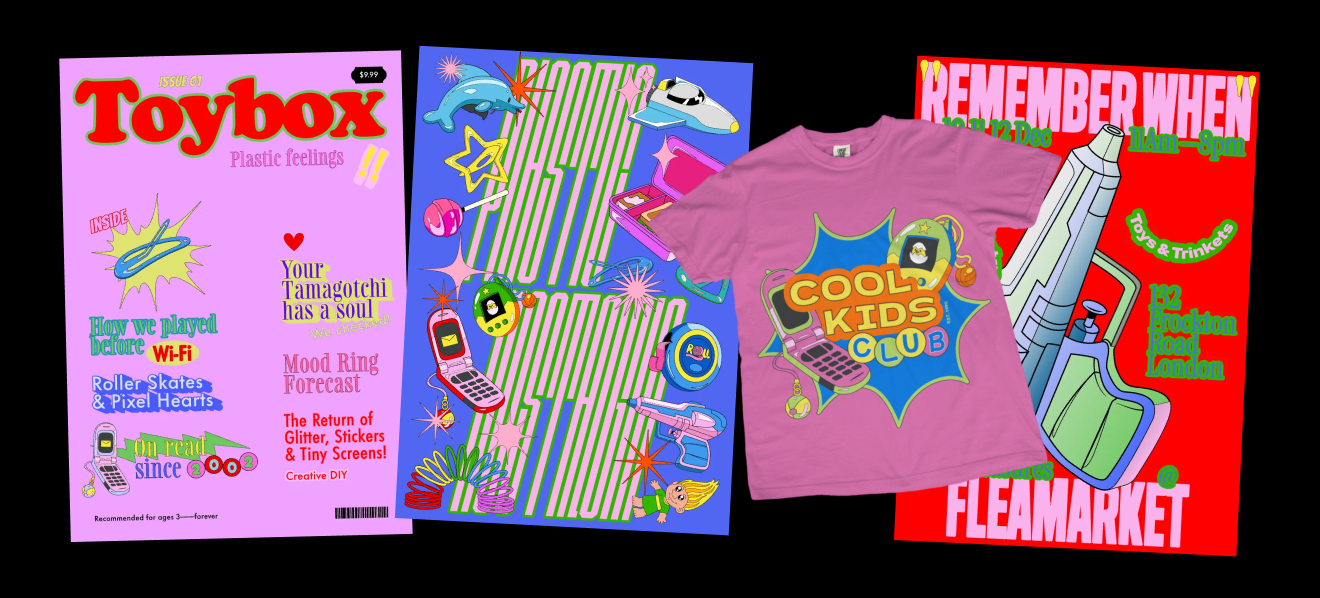
Kid core design is emerging as one of the most playful graphic design trends in 2026, bringing back the colorful, chaotic energy of childhood creativity. Instead of perfect symmetry and muted tones, this style celebrates bold colors, hand-drawn elements, stickers, and intentionally naive shapes.
The result feels expressive, nostalgic, and full of personality.
Designers are rediscovering the visual language of childhood — from toy packaging and school notebooks to early cartoon graphics — and translating it into modern creative work.
What is kid core design?

Kid core design is a graphic design style inspired by childhood visuals and toy culture.
It pulls from the visual world many people grew up with:
- sticker sheets
- crayon drawings
- toy packaging
- cartoon graphics
- bright plastic colors
- playful doodles
The style intentionally embraces imperfection. Instead of smooth vector shapes and perfect alignment, kid core design often includes uneven lines, quirky characters, and exaggerated proportions.
It’s not about looking childish — it’s about capturing the joy, creativity, and emotional energy of childhood visuals.
This trend also connects with other expressive design movements emerging in 2026. For example:
- Naive Design, which celebrates imperfect hand-drawn aesthetics
- Type Collage, which embraces chaotic and expressive layouts
- Grainy Blur, which explores emotional and nostalgic visuals
Together, these trends show a growing shift toward expressive, personality-driven design.
Pro Tip
Kid core isn’t about making something look childish — it’s about recreating the freedom and creativity of childhood visuals. The best designs still balance playfulness with thoughtful composition.
The origins of Kid Core design
Kid core design didn’t appear out of nowhere. Its visual language is rooted in the colorful world of childhood media and product design from the late 1990s and early 2000s.
During that time, toys, cartoons, and children’s brands embraced bright palettes, playful characters, and energetic graphic systems. Packaging for toys, school supplies, and candy often featured bold typography, sticker-like graphics, and exaggerated illustrations meant to capture attention instantly.
Television networks like Nickelodeon and Cartoon Network also helped shape this visual culture. Their branding leaned heavily into vibrant colors, slime textures, doodles, and playful typography — visuals that felt expressive and slightly chaotic compared to traditional design rules.
Early internet culture added another layer to this aesthetic. Websites and games often used colorful icons, animated characters, and playful graphics that prioritized personality over polish.
Today, designers are revisiting those visual memories and translating them into modern compositions. Kid core design captures that same sense of spontaneity and imagination while combining it with contemporary tools and workflows.
Pro Tip
When referencing kid core visuals, look beyond design platforms. Toy packaging, cartoon branding, and even childhood sticker books can be great sources of inspiration.
Key characteristics of Kid Core design
Kid core designs are easy to recognize once you know what to look for. The style pulls from childhood visuals — toy packaging, stickers, doodles, and cartoon graphics — and translates them into expressive modern layouts.
Here are the visual traits that usually define the style.
Bright, playful color palettes
Kid core color palettes resemble the colors you’d find in toy aisles or cartoon branding. Think vibrant reds, bubblegum pinks, sky blues, and sunny yellows.
These palettes are intentionally energetic and emotional, helping designs feel playful and nostalgic.
Pro Tip
If your palette starts feeling muted or neutral, push the colors further. Kid core visuals often work best when they feel slightly exaggerated.
Naive illustrations and doodles
Simple drawings are a defining part of kid core aesthetics.
Rather than polished illustrations, designers often use doodles that feel spontaneous — almost like they were sketched during a creative moment.
These visuals help the design feel playful and authentic.
Check out our collections at Kittl’s Content Library, full of elements like these:

Sticker-style graphics

Sticker culture is another major influence.
Layered icons, sparkles, cartoon characters, and playful symbols all mimic the look of sticker sheets and toy packaging.
These elements add personality and movement to the design.
Pro Tip
Let some elements overlap slightly. The layered look mimics real sticker placement and makes the design feel more organic.
Bold, expressive typography
Typography in kid core design often behaves like an illustration.
Chunky display fonts, bubble lettering, and playful handwritten typefaces help reinforce the energetic aesthetic.
Short phrases usually work best — something punchy that complements the playful visuals.
How to create Kid Core designs in Kittl
Kid core might look chaotic and spontaneous, but strong designs still rely on a few intentional choices. Once you understand the basic ingredients — color, shapes, typography, and playful elements — it becomes easy to experiment with the style.
Here’s a practical way to build your first kid core design.
Step 1: Start a new canvas and choose a bold background

Open the Kittl Editor and create a new project.
You can choose a format like:
- Poster
- Instagram Post
- Square canvas
Once your canvas is open, click on the background and change the color in the right-side color panel.
Kid core works best with vibrant colors, so try starting with something bright like:
- yellow
- sky blue
- bubblegum pink
- lime green
This immediately sets the playful tone of the design.
You can also just start quick with these templates we have on our Template Library:
/////TEMPLATE//////////
Pro Tip
Kid core palettes usually feel energetic rather than balanced. If the background feels too calm, try increasing the color contrast later with shapes and icons.
Step 2: Add playful doodles and simple shapes

Kid core visuals often feel like they were drawn during a creative moment — not carefully engineered.
That means adding simple graphics such as:
- stars
- hearts
- clouds
- smiley faces
- arrows
- lightning bolts
You can find many of these elements in Kittl’s Content Library, or create your own using the pen tool and shape tools.
Drag a few elements onto the canvas and resize them using the corner handles.
Try placing them around the canvas rather than perfectly aligning them — kid core layouts often feel slightly spontaneous.
Pro Tip
Rotate a few shapes slightly using the rotation handle. Perfect alignment can make the design feel too polished for this style.
Step 3: Add expressive typography

Next, place your main text element. Kid core typography usually feels bold and playful, so look for chunky display fonts or handwritten styles.
Short phrases work best — something punchy that supports the visual energy of the design.
Click Text → Add Text in the left panel.
Type a short phrase or title that fits the playful tone of the design.
Then open the Font panel and try searching for fonts like:
- bubble
- cartoon
- playful
- handwritten
Increase the font size so the text becomes a focal point of the layout.
Kid core typography often feels oversized and expressive.
Pro Tip
Try using two fonts: one chunky display font for the main words and one handwritten style for smaller text.
Step 4: Layer sticker-style icons

To give the design that “sticker collage” feeling, add more icons around the text.
Go back to the Elements panel and search for:
- sparkles
- stickers
- doodles
- stars
Place these graphics around your typography and let some overlap slightly.You can also adjust the color of each icon using the color picker in the right panel to match your palette.
Pro Tip
Group smaller icons near your main text instead of scattering them evenly. This creates stronger visual rhythm.
Step 5: Generate playful characters using AI

If you want a unique illustration, open Kittl’s AI Image Generator.
Enter a prompt like this:
cute cartoon sticker characters, bright toy colors, playful shapes, toy packaging style, simple illustration, no text
Once the image generates:
- Click Remove Background
- Resize the graphic
- Place it into your layout
This gives you a custom element that matches the playful kid core aesthetic.
Pro Tip
If the AI output looks too detailed, try adding phrases like “simple shapes” or “flat cartoon style” to the prompt.
Step 6: Add finishing touches with colors and effects

Finally, refine the design by adjusting colors and spacing.
Try:
- changing icon colors to match your palette
- resizing shapes to balance the layout
- adding a subtle shadow or glow effect to typography
Small adjustments can help the composition feel more cohesive.Once you’re happy with the design, click Export to download your graphic.
Common mistakes when designing Kid Core graphics
Kid core may feel chaotic and playful, but strong designs still rely on a few creative decisions. Avoiding these common pitfalls will help your designs feel more intentional.
Making the design too polished
If everything looks perfectly aligned and perfectly drawn, the design may lose the charm that makes kid core appealing.
Allow for a little imperfection in the shapes and composition.
Using muted colors
Kid core thrives on bright palettes. If your colors feel too neutral, the design might start drifting toward minimalism instead of playful energy.
Overcrowding the canvas
It’s tempting to add dozens of elements, but too many icons can overwhelm the composition.
A few strong visuals usually create a more memorable design.
Explore more 2026 design trends

Kid core is just one of the expressive visual styles shaping design in 2026.
This year’s trends reveal a growing interest in experimentation, nostalgia, and emotionally engaging visuals.
Other trends in the Kittl 2026 Design Trend Report include:
- Trinket Design, which arranges objects into curated visual collections
- Type Collage, where typography becomes the central visual element
- Grainy Blur, which creates dreamy gradients and atmospheric visuals
- Future Medieval, blending historical symbolism with futuristic design
Each trend explores a different way designers are pushing visual language forward.
Key takeaways: Why designers are embracing Kid Core
Kid core design reminds us that creativity doesn’t always need to follow strict rules.
By combining playful colors, simple shapes, expressive typography, and nostalgic visuals, designers can create graphics that feel energetic and emotionally engaging.
In a digital landscape full of polished visuals, kid core offers something refreshing: design that feels joyful, experimental, and human.
FAQ: Kid Core design
What is kid core design?
Kid core design is a graphic design style inspired by childhood visuals such as stickers, toy packaging, doodles, and bright cartoon-like colors. The style embraces playful shapes, expressive typography, and intentionally imperfect illustrations to create graphics that feel nostalgic and energetic.
Why is kid core design trending in 2026?
Kid core design is gaining popularity as designers explore nostalgic aesthetics and more expressive visual styles. Many creatives are revisiting childhood-inspired visuals as a way to create designs that feel playful, emotional, and distinct from minimalist trends.
Modern tools also make it easier to generate playful illustrations and colorful graphics quickly, allowing designers to experiment with kid core aesthetics more freely.
What colors work best for kid core design?
Kid core designs typically use bright, high-energy color palettes similar to those found in toy packaging and cartoon graphics.
Common color combinations include:
- pink and yellow
- blue and orange
- lime green and red
- purple and neon blue
These bold palettes help the design feel playful and visually engaging.
What fonts work well for kid core graphics?
Playful display fonts tend to work best for kid core designs. Bubble lettering, cartoon-style fonts, chunky display typefaces, and handwritten styles all help reinforce the energetic aesthetic.
Short, bold phrases often work better than long paragraphs.
Where can kid core design be used?
Kid core design works especially well for projects that benefit from playful visuals, including:
- social media graphics
- brand campaigns
- packaging design
- posters and digital illustrations
- merchandise and apparel graphics
The bright colors and expressive visuals help designs stand out in fast-scrolling digital environments.
Do you need illustration skills to create kid core designs?
Not necessarily. While drawing skills can help, many kid core visuals rely on simple shapes, icons, and playful typography. Tools like Kittl’s Content Library and AI Image Generator can help designers create sticker-style graphics and playful elements quickly.

Shafira is a content writer who turns boring business talk into reads people actually enjoy. She grew up hoarding $1 novels in Singapore and writing hilariously bad fiction, but now she tackles content marketing with all that creative chaos since 2019. From blogs and newsletters to UX and SEO, she writes how she thinks: nerdy, honest, and a bit offbeat. She believes the best content is human-designed, not just plain text.