Light blue does a lot more than people give it credit for. Sure, it often shows up in interior design or baby branding, but in graphic design, it can feel clean, modern, calm, and surprisingly flexible. That’s why it works so well across UI, social media graphics, packaging, and print layouts.
Part of its strength comes from color theory. Light blue has a soft, calming feel, so it can hold a design together without fighting for attention. That makes it a great base color when you want brighter shades like mustard, coral, or orange to stand out.
You can see this kind of balance everywhere — from airy interior palettes that use pale blue to create a sense of openness, to famous artworks like Van Gogh’s blue-and-yellow compositions, where blue helps the warmer tones pop. In design, light blue does the same thing: it gives your layout room to breathe while making accent colors work harder.
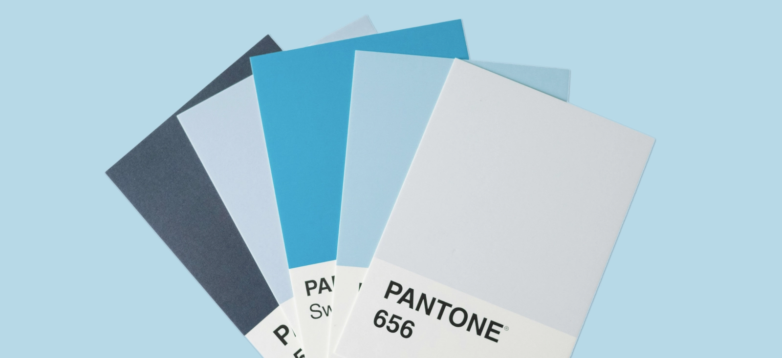
Light blue hex codes, names, and digital variations

Say you’re trying to build a palette around that airy, calming kind of blue you’d save from Saatchi Art or Unsplash for layout and color inspiration. The tricky part is that “light blue” is not just one exact shade — it can lean brighter, softer, cooler, or slightly more muted depending on the vibe you want.
- Light blue — #ADD8E6
- Sky blue — #87CEEB
- Powder blue — #B0E0E6
- Baby blue — #89CFF0
- Ice blue — #99FFFF
- Robin’s egg blue — #00CCCC
These light blue color codes give designers a solid starting point for building cleaner palettes, testing contrast, and finding the right visual tone for digital graphics.
Light blue, sky blue, and powder blue are standardized web color names, while baby blue, ice blue, and robin’s egg blue are more flexible naming conventions, so their hex values can vary slightly depending on the source.
15 colors that go with light blue in graphic design
Light blue is one of those colors that can shift in a lot of different directions depending on what you pair it with. It can feel bold, playful, polished, soft, or high-contrast, which makes it especially useful in branding, social graphics, typography, and digital layouts.
To make things easier, these color pairings are grouped by mood and design function — starting with the combinations that create the strongest visual impact.
Category 1: High-contrast and bold combinations
1. Mustard yellow

Blue Yellow Bold Typography T-Shirt Design. Use this template
Color palette in hex codes: #F1C938 (saffron), #30A8FF (cool sky), #171717 (carbon black), #F972E4 (violet), #FD6B00 (pumpkin spice)
Need an especially strong combo when you want your design to feel loud and full of personality?
Mustard yellow gives light blue a punchy, high-contrast backdrop, and this design shows how effective that can be in bold typography. The yellow background makes the blue lettering feel brighter and more energetic, while the black shadow adds weight and pushes the whole look into retro pop graphics, dopamine design, and a slightly comic-book-inspired direction.
2. Terracotta

Orange Blue Educational IG Post Abstract Minimalism Design. Use this template
Color palette in hex codes: #DE5D46 (terracotta), #6CCFBE (mint blue), #F2F2F2 (soft white), #062934 (deep teal)
Terracotta brings warmth and grounded energy, but this palette gives it a more lived-in, outdoorsy feel than the cleaner example from before. Paired with light blue and teal like this, it leans into earth-tone branding, rustic editorial design, and that soft artisan market aesthetic you often see in lifestyle packaging and seasonal campaign visuals. It feels warm and organic without losing that fresh contrast light blue brings. We love this combination for organic skincare branding, boho-inspired apparel, and soft lifestyle campaigns.
3. Bright tangerine

Fresh Summer Color Palette Design. Use this template
Color palette in hex codes: #FFA60B (bright tangerine), #FBD862 (sunny yellow), #5AC4E5 (light aqua blue), #0387C4 (deep azure), #66A50A (leaf green)
Super strong choice for CTA buttons, event posters, and promo graphics that need attention right away: Bright tangerine has that instant hit of energy that makes a palette feel sunny, bold, and hard to scroll past.
Paired with blue like this, it taps into Mediterranean summer editorial, dopamine design, and that glossy vacation-core look you see in travel graphics, seasonal campaigns, and food-forward branding. It feels fresh and high-contrast, but still clean enough to use in digital layouts without looking messy.
4. Fuchsia / magenta

Colorful Moodboard – Color Palette Design. Use this template
Color palette in hex codes: #AFE4A2 (light green), #41D9FC (bright sky blue), #E1AC7C (warm tan), #F96DA8 (fuchsia pink)
Fuchsia brings the palette straight into dopamine design territory — bright, playful, and impossible to ignore. This kind of pink-and-blue pairing also shows up in Y2K pop graphics, Memphis-inspired design, and other maximalist visuals that want to feel loud, glossy, and full of personality. In this moodboard, the light blue gives the fuchsia room to stand out without letting the whole palette feel too chaotic.
This pairing works especially well for creator brands, statement merch, beauty launches, and campaign graphics that want to feel bold and image-first.
5. Brick red

Fragments of Calm Color Palette Design. Use this template
Color palette in hex codes: #780000 (maroon red), #669BBC (sky blue), #FDF0D5 (beige), #003049 (aquamarine dark), #C1121F (royal red)
Brick red brings a richer, more grounded feel than a bright primary red, which makes it easier to use in polished design work. In this palette, it adds depth and character while the light blue keeps everything feeling balanced and fresh.
The result feels classic and slightly vintage, especially when paired with beige and a dark navy-toned accent. You’ll see this combo work really well in things like vintage logo badges, heritage-inspired packaging, and editorial branding that wants a little character without feeling old-fashioned.
Category 2: Soft, analogous, & pastel palettes
6. Mint green

Mintmingle Mint-Infused Beverages Design. Use this template
Color palette in hex codes: #48DED6 (turqoise), #ABEEE1 (icy aqua), #EEFCBD (mint green), #F6FEE6 (soft ivory)
Mint green and light blue sit close enough on the color wheel to feel easy together, but this palette still has enough contrast to look clear and intentional. It leans into wellness branding, clean botanical packaging, and that soft functional minimalism you see in modern beverage, skincare, and eco-conscious product design.
If your visuals lean more plant-forward, this kind of pairing can also move naturally into a biophilic aesthetic. It feels calm and natural, but still polished enough for logos, labels, and visual identity systems.
7. Light Lilac/lavender
Minimalist Pastel Colors Weekly Schedule Design. Use this template
Color palette in hex codes: #D6C8EE (soft lilac), #F2DED7 (blush pink), #F7ECCC (buttercream), #EBCFEA (lavender pink), #CEE5F4 (powder blue), #D3E7E0 (pale sage)
Lilac and light blue create the kind of pastel palette that instantly feels soft, dreamy, and visually calm. In this layout, the pairing leans into ethereal editorial design, coquette-inspired stationery, and the kind of gentle celestial aesthetic that works beautifully for soft visual branding. It feels romantic and polished without looking overly sweet.
A palette like this fits beautifully in podcast covers, mystical graphics, astrology-themed visuals, and elegant wedding invitations where you want the design to feel soft, polished, and a little otherworldly.
8. Deep navy

Noir Nautical Blue Soft Minimalism Moodboard Design. Use this template
Color palette in hex codes: #14293D (deep navy), #668092 (slate blue), #D8DDDB (mist gray), #E9DFD3 (warm beige), #B3D0E2 (powder blue)
Deep navy gives powder blue a darker, more grounded counterpart, so the palette feels calm but still structured. In this moodboard, the pairing leans into soft minimalism, quiet luxury editorial, and even a slightly nautical noir aesthetic that feels clean, moody, and refined.
It has the kind of polish you’d expect in a premium skincare label, a boutique hotel brand, or a fashion lookbook that wants to feel understated but expensive.
9. Coral pink

Summer Vibes Design. Use this template
Color palette in hex codes: #F9D9A0 (warm sand), #AACBC8 (seafoam blue), #F8976E (coral pink), #73B4AE (lagoon teal), #F9C9ED (pastel lilac), #54224D (deep plum)
Coral pink gives light blue a warmer, more playful shift without losing that soft, easygoing feel. In this design, the pairing leans into vacation-core, retro summer poster design, and that glossy dopamine design energy you see in social graphics made to feel bright, fun, and instantly likable. It feels friendly and image-first, which makes it a strong fit for lifestyle branding, Instagram carousel templates, and seasonal campaign visuals.
10. Soft gold

Blue Beauty Design. Use this template
Soft gold-light blue palette like this works beautifully for high-end cosmetic packaging, luxury real estate branding, and editorial designs that want a refined, romantic finish. It has the kind of polish that would feel right at home on a perfume box, a premium candle label, or an elegant event invite. Here is why:
The palette gives light blue a more elevated, decorative feel without making the palette look too formal. In this design, the pairing leans into chinoiserie-inspired florals, grandmillennial style, and that soft quiet luxury look.
Category 3: Modern neutrals & grounding tones
11. Charcoal gray

Overthinking Design. Use this template
Color palette in hex codes: #97A9AE (dusty light blue), #0C1521 (dark charcoal), #F4F4EF (soft off-white), #545C65 (slate gray), #758492 (muted steel blue)
A dusty light blue and dark gray combo like this gives the design a tougher, more graphic edge. In this layout, the pairing leans into retro comic art, industrial poster design, and a slightly retro-futurist aesthetic that feels smart, mechanical, and full of attitude. It is a strong direction for tech merch, gaming graphics, statement typography, or brand visuals that want to feel playful but not too soft.
12. Crisp white

Beige Minimalism Tactile Mood Moodboard Design. Use this template
Color palette in hex codes: #FFFFFF (crisp white), #DCDDDB (soft pearl gray), #DDCFBA (warm sand), #95B6C2 (powder blue), #949393 (cool gray)
Crisp white gives light blue the kind of clean space that makes everything else feel softer and more refined. In this moodboard, the pairing leans into tactile minimalism, Scandinavian softness, and that calm quiet luxury direction you see in lifestyle branding, elevated stationery, and wellness-led content. It feels airy and understated, but still warm enough to avoid looking too clinical. A palette like this works beautifully for minimalist poster design, airy website headers, and brand systems that want to feel gentle, polished, and easy to trust.
13. Warm beige/oatmeal

Cosmetics Label Design. Use this template
Color palette in hex codes: #D8CFC1 (warm beige), #BFD4DF (powder blue), #000000 (black), #B7AA9A (taupe beige)
Warm beige and light blue are one of those pairings that just feel easy. In this label design, the combo leans into clean beauty branding, quiet luxury packaging, and that soft apothecary-inspired look that feels calm, elevated, and easy to trust. It gives light blue a warmer, more grounded setting, which is why it works so well for skincare, boutique products, and editorial-style brand systems.
14. Forest green

Effortless Calm Moodboard – Soft Minimalism Design. Use this template
Color palette in hex codes: #18361F (forest green), #A6C6D6 (dusty light blue), #D3E440 (lime green), #D9D4D6 (soft pearl gray), #7F9561 (moss green)
Forest green gives light blue a calmer, more grounded edge without making the palette feel heavy. In this moodboard, the pairing leans into biophilic design, plant-forward branding, and that soft eco-editorial look that feels fresh, modern, and quietly premium. It is the kind of color direction that works really well when you want nature-coded visuals without falling into rustic clichés.
15. Plum purple/periwinkle

Mouse Pads Design. Use this template
Color palette in hex codes: #5C22A7 (plum purple), #9D62D8 (electric violet), #B58FF2 (soft lavender), #B3CDF0 (soft periwinkle), #E0ABE1 (blush pink), #EBE3F7 (pastel lilac)
Plum purple gives light blue a moodier, more expressive edge without losing that dreamy softness. In this design, the pairing leans into pastel anime aesthetics, kawaii UI, and that glossy cyberpop look that feels playful, emotional, and a little futuristic.
It also shows how light blue can move into the wider blue-purple spectrum, where shades like periwinkle, lilac, and soft violet help a palette feel more artistic and trend-forward. That makes it a strong choice for digital art, music visuals, fan merch, or event graphics that want to feel cute on the surface but still visually rich.
What light blue symbolizes and how to choose the right shade for your brand
Light blue has a way of making a design feel instantly calmer, cleaner, and easier to trust. That is why it shows up so often in branding, UI, social graphics, and marketing visuals that want to feel modern without coming across as cold. From a color psychology point of view, it is often tied to trust, clarity, openness, softness, and a kind of quiet confidence.
Not every light blue gives off the same vibe, though. The exact shade you choose can change how the whole design feels:
- Pastel light blue feels soft, friendly, and a little sweeter.
- Muted light blue feels grounded, subtle, and more refined.
- Icy light blue feels crisp, polished, and modern.
- Purple-tinted light blue feels dreamy, artistic, and more trend-aware.
It can also shift depending on what you pair it with. Next to white or gray, it feels crisp and minimal. Next to lilac or periwinkle, it feels dreamy and artistic. Next to navy or charcoal, it starts to feel more structured and professional, which is why light blue is such a useful color for designers building flexible visual systems.
So when you pick a light blue for your brand or layout, think about the audience, the amount of contrast you need, and the overall mood you want the design to carry.
How to build and manage light blue palettes in Kittl
Once you land on a light blue palette you actually love, the goal is to stop rebuilding it from scratch every time.
- Start with the Document Palette. As you build on canvas, Kittl keeps track of the colors already used in that design, so your light blue, navy, neutral, and accent colors are easy to grab again without retyping anything. That makes palette testing feel a lot less messy, especially when you are comparing a few similar blues and trying to decide which one feels right.
- Use the Color Picker when you want precision. If you already know the exact shade you want, just click the color swatch and paste in the HEX code, like #90D5FF. From there, you can nudge the color until it feels softer, icier, brighter, or more muted, and use the eyedropper if you want to sample a blue from another element in your design.
- Use the “Eyedropper” tool to copy and apply colors to your selection. This is especially helpful when you already have a blue somewhere in your design and want to match it quickly without guessing or entering the code manually.
- Use Project Colors when your blue appears in multiple places. This is the easiest way to keep things consistent across one design. If the same light blue is used in backgrounds, shapes, icons, and text accents, updating that shared color is much faster than changing every element one by one.
- Save the final palette into your Brand Kit. Once the colors feel locked in, move them into Brand Kits so they are not stuck in one project. Kittl lets you save reusable color, text, and shadow styles, which means your light blue palette can follow you into future social posts, templates, brand boards, and campaign graphics without any extra setup.
Frequently asked questions about colors that go with light blue
What color sits opposite light blue on the color wheel?
The closest opposite to light blue is a warm orange tone. That is why shades like tangerine, terracotta, mustard, and coral tend to work so well with it—they create contrast without making the palette feel too harsh.
Does light blue go well with warm or cool tones in logo design?
Yes, both can work. Warm tones like coral, mustard, or soft gold make light blue feel more energetic and eye-catching, while cool tones like navy, mint, lilac, or charcoal keep it calm, polished, and more brand-system friendly.
How do you make light blue text readable on digital screens?
The easiest fix is contrast. Use light blue text on dark backgrounds, or pair it with navy, charcoal, or deep gray instead of white. If the text still feels too faint, make the blue darker, bolder, or larger so it holds up better on screen.
What is the best hex code for a neutral light blue?
A strong starting point is #ADD8E6, which is the standard web color for light blue. If you want something a little softer or more modern, #B3CDF0 or #90D5FF can also work really well depending on the palette.
Which colors clash with light blue in graphic design?
Colors usually clash with light blue when they fight for the same amount of visual attention without enough contrast or harmony. Very saturated neons, muddy mid-tones, or certain bright greens can feel off unless the rest of the palette is styled very intentionally.
Can you pair light blue with other pastel colors without washing out a design?
Yes, but you need at least one anchor. A darker accent, stronger outline, clear typography, or a bit more contrast in one of the pastel shades will stop the design from looking faded. That is why pastel palettes often work best when they include one grounded color like navy, plum, or charcoal.
What is a good 3-color palette starting with light blue?
A simple one is light blue + mustard yellow + charcoal gray. It gives you one soft base, one warm contrast color, and one strong grounding tone, which makes it easy to use across branding, social graphics, and layout design.