Starting a small business usually means building as you go. You create a logo, open social accounts, design a few posts, maybe launch a simple website.
Individually, everything looks fine. Together, it doesn’t always feel like the same business.
That gap slows growth. Not because customers analyze your branding in detail — but because early impressions shape trust quickly. When your visuals and messaging feel slightly disconnected, the brand feels unfinished.
Brand assets exist to prevent that.
Most small businesses don’t need more design. They need a small set of foundational brand assets built well — assets that are usable, repeatable, and strong enough to grow with the business.
In this article, we’ll break down the five essential brand assets for small business, what makes each one effective, and how to create them in a way you’ll actually reuse.
Why these five brand assets for small business matter more than “good design”

When small businesses talk about branding, they often talk about aesthetics: does it look modern, clean, premium, fun?
But customers don’t interact with brands as single designs. They experience a series of touchpoints — your Instagram profile, website, product photos, packaging, emails, listings, reviews, and ads — and they form impressions based on how consistent and recognizable those touchpoints feel.
That consistency matters.
Research shows that maintaining a consistent visual and messaging identity across platforms can increase revenue by up to 23–33%, because customers recognize and trust brands they’ve seen before.
Consistent branding also makes a brand more memorable. Studies find that brands with consistent visual identity enjoy about 33% higher recall than inconsistent ones, and a consistent color palette alone can boost brand recognition by as much as 80%.
Those numbers matter for small businesses because trust and recognition directly influence conversion: a familiar, stable brand feels less risky to buy from — meaning customers decide faster, with less hesitation.
That’s why brand assets are less about style and more about systems. A brand asset isn’t just a graphic you like — it’s something you can reuse, apply, and repeat so your brand becomes recognizable even when you’re busy.
The five assets below are the simplest version of that system.
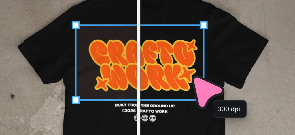
1. A logo system (not just one logo)

A logo doesn’t need to be complex to be effective. But it does need to be usable in the places your business will actually show up.
Before you consider it finished, it’s worth checking a few practical things:
- Does it stay readable at small sizes, like a social profile image?
- Does it work on both light and dark backgrounds?
- Does it still look clear in black and white?
- Do you have a simplified version for tighter spaces?
Thinking through these details early saves time later — especially when you start printing packaging, running ads, or sending files to partners.
A strong small-business logo usually includes:
- A primary version
- A secondary layout (stacked or horizontal)
- An icon-only mark
- Properly exported files for web and print
The goal isn’t perfection. It’s flexibility.
If you’re building in Kittl, our Infinite Canvas can help you create multiple versions side-by-side, which makes it simpler to create variations without rebuilding from scratch. Want to know what other designers and small business owners use our Infinite Canvas for? Check out our article about it here.
Before sending your logo to a printer or collaborator, open the file at 100% zoom and at thumbnail size. If it only looks good in one of those, refine it before exporting. Small distortions become expensive fast.
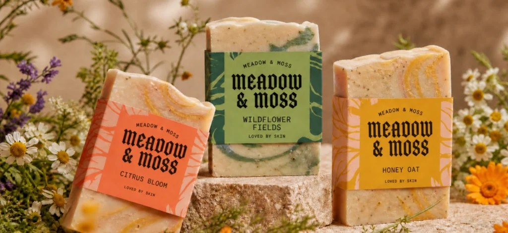
2. A defined color palette (with clear roles)

Choosing brand colors is usually one of the most enjoyable parts of building a business. The important part isn’t picking the “perfect” colors — it’s deciding how they’ll be used.
A strong color palette is small and intentional. Before locking yours in, check a few practical things:
- Does your primary color stand out clearly against both white and dark backgrounds?
- Does it pass basic contrast checks for readability?
- Do your secondary colors support the primary, rather than compete with it?
- Do you know which color is used for calls-to-action, backgrounds, and accents?
Defining roles early makes every future design decision easier. Instead of asking, “What looks good here?” you’re simply applying the system you’ve already chosen.
A reliable small-business color system usually includes:
- One primary brand color
- One or two supporting colors
- One or two neutral colors
- Saved hex codes (and CMYK values if you print)
The goal isn’t variety. It’s clarity.
You can store your brand colors directly inside Kittl’s Brand Kit, so every new design starts with the same palette by default.
Before finalizing your primary color, test it on a real layout — like a mock landing page section or product label. Colors behave differently in isolation than they do in context.
3. Typography that creates structure, not noise

Fonts shape personality, but their real job is structure.
Strong typography doesn’t draw attention to itself — it quietly organizes your content so people can read and scan without effort.
Before choosing your fonts, consider:
- Does your headline font remain readable at different sizes?
- Does your body font feel comfortable in longer paragraphs?
- Do the two fonts feel related, not competing?
- Have you defined how headlines, subheadings, and body text differ?
Most small businesses only need:
- One headline font
- One body font
- A simple hierarchy (H1, H2, body, caption)
That’s enough to create rhythm across your website, posts, and marketing materials.
The goal isn’t visual excitement. It’s consistency and readability.
You can find a bunch of fonts you’d like for your logo at Kittl’s Font Library too!
Choose a headline font that still feels strong in sentence case — not just all caps. That flexibility gives you more range without changing fonts later.
4. A clear brand message you can reuse
Design gets attention. Messaging explains why someone should stay.
A clear brand message doesn’t need to be long. It needs to be specific and repeatable.
Before finalizing yours, ask:
- Can someone understand who this is for within one paragraph?
- Does it describe the outcome you create, not just the features you offer?
- Is it distinct enough that it wouldn’t apply to three competitors?
- Could you reuse this paragraph in your bio, website, and product listings?
A strong small-business brand message usually includes:
- Who you serve
- What you help them achieve
- What makes your approach different
If you hesitate when describing your business out loud, refine the message before refining the design. Clarity in words strengthens everything around it.
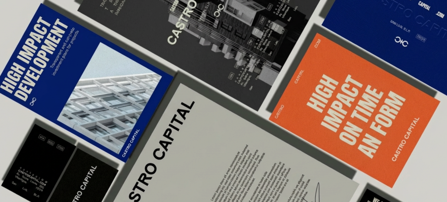
5. Reusable templates built for real life

Templates aren’t about limiting creativity. They’re about making consistency sustainable.
Before building your first template, think about how you actually work:
- What type of content do you create most often?
- What layout do you find yourself repeating?
- Would this design still feel usable during a busy week?
- Is there space for variation without changing the entire structure?
A practical template system for small businesses might include:
- Two or three core social post layouts
- One announcement or promotional design
- One story format
- Optional product listing or packaging layout
The goal isn’t a large library. It’s a small set of layouts you can reuse confidently.
In Kittl, you can connect your templates to your Brand Kit so fonts, colors, and logos stay aligned automatically. You can also preview your designs in mockups to make sure they hold up in real-world contexts.
Design your first template during a calm week — but test it during a busy one. If it’s easy to update under pressure, it’s built well.
How to know your brand assets are strong enough
You don’t need external validation to know your foundation is working. A few practical checks help:
- Can you create a new social post in minutes without rethinking colors and fonts?
- Can you send your logo files confidently to a printer or collaborator?
- Does your website feel visually aligned with your social content?
- Do your visuals and messaging feel like they belong to the same business?
If the answer is yes, your fundamentals are doing their job. If not, it’s usually not about creativity. It’s about tightening the core pieces.
Build once. Refine as you grow.
Strong brand assets aren’t about looking bigger than you are. They’re about building a foundation that supports growth without constant redesign.
When your logo works everywhere, your colors have clear roles, your typography creates structure, your message is repeatable, and your templates are reusable — branding becomes easier.
Not louder. Not trendier. Just more intentional.
Kittl helps you bring those pieces together in one workspace — from logo variations and color systems to saved fonts, reusable templates, and real-world mockups — so your brand assets stay connected as your business evolves.

Shafira is a content writer who turns boring business talk into reads people actually enjoy. She grew up hoarding $1 novels in Singapore and writing hilariously bad fiction, but now she tackles content marketing with all that creative chaos since 2019. From blogs and newsletters to UX and SEO, she writes how she thinks: nerdy, honest, and a bit offbeat. She believes the best content is human-designed, not just plain text.