Nothing goes viral by accident.
Every post that explodes across feeds looks effortless, but behind it is obsession. It’s about timing, framing, typography, restraint. Someone decided exactly where the eye should land and what emotion should follow.
That’s the real job of designers and social media specialists alike. Not just to make something beautiful, but to make something move.
AI doesn’t replace that instinct — it just removes the waiting. It helps you test faster, fail faster, and get to the thing that feels alive before the trend dies.
Because when everyone’s fighting the algorithm, the real edge isn’t more content. It’s precision.
Why visuals go viral
When something “goes viral,” it’s rarely random — it’s behavioral math.
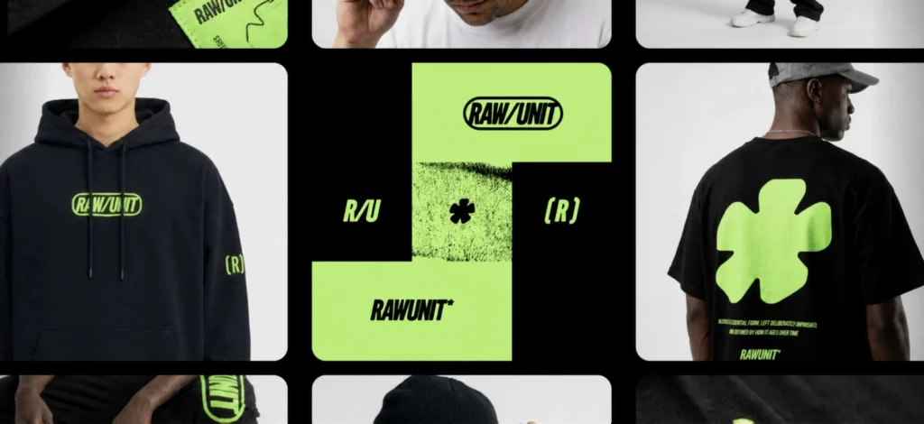
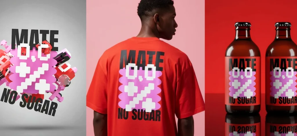
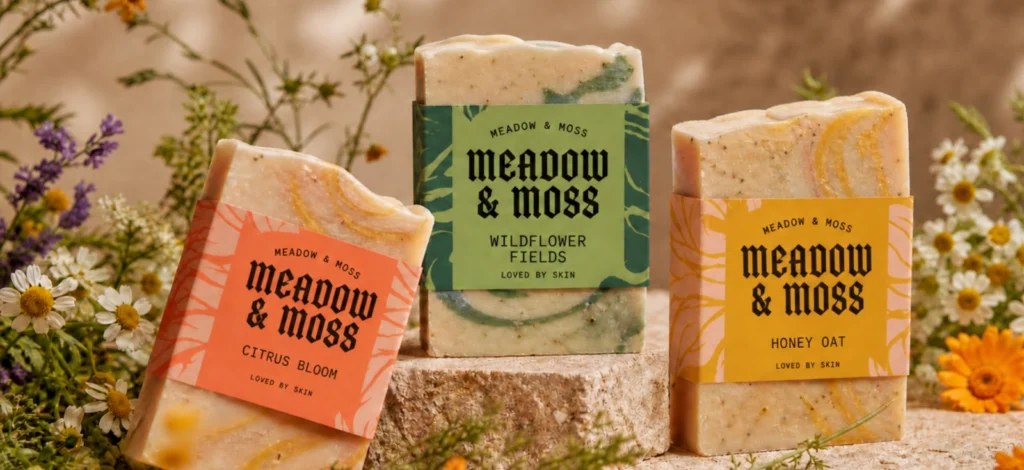
A viral social media graphic is one that triggers enough emotional and cognitive response to move from one social circle to another. It spreads because it demands a reaction.
And for visuals, that reaction happens in milliseconds. MIT researchers found people can interpret the meaning of an image in as little as 13 milliseconds. That’s long before they process the text that comes with it.
That’s why design is often the real engine behind virality: it’s what decides whether someone even pauses long enough to care.
The psychology behind virality
Virality isn’t luck — it’s human behavior.
When someone shares a post, they’re reacting to one of three things:
1. It made them feel something.
2. It made them look good.
3. It helped them help someone else.
That’s it. And every viral social media graphic expresses at least one of those buttons.
Think of virality as a chain reaction built on three design cues:
- Emotion → What’s the feeling your viewer gets in the first second?
- Identity → What does sharing this say about them?
- Utility → Does this give them something worth passing on?
That’s the foundation. The next step is how to design for it. You can also check out
Anatomy of a viral post
Every viral social media graphic shares one thing before it spreads: it’s instantly legible.
In less than two seconds, people know what it is, how it makes them feel, and whether it’s worth sharing.
Let’s break that down into what actually matters when you’re designing for share velocity.
Visual comprehension: The 2 second rule
According to Meta’s own internal UX research, users decide whether to stop or keep scrolling in under 1.7 seconds. That window is your entire chance to communicate value.
That means your visual has less than two seconds to do three jobs: Get noticed. Communicate meaning. Spark emotion. Here’s how to translate that into design:
- One dominant focal point (no competition for attention).
- High contrast between subject and background.
- Composition that reads from top-left to bottom-right in one glance.

If someone needs to “decode” your visual, you’ve already lost.
Emotional framing
People don’t share content because it’s beautiful; they share it because it moves them or represents them.
That’s where emotional framing in design comes in — translating feeling into form.
| Emotion | Visual cues that drive sharing | Example use |
| Awe / Inspiration | Expansive space, upward motion, cool hues | “Before / After” transformations |
| Amusement | Exaggerated proportion, bright contrast | Memes or playful motion graphics |
| Anger / Frustration | Harsh contrast, asymmetry, tight framing | Opinionated statements |
| Hope / Relief | Soft gradients, warm light | Announcement or comeback visuals |
When testing your concept in AI, prompt for different moods rather than different objects. Compare how each emotional tone changes your audience’s reaction.
Built-in shareability
A viral social media graphic doesn’t end with the viewer — it gives them a reason to pass it on.
Design shareability into the post itself:
- Leave white space for commentary screenshots or user reactions.
- Include a saveable takeaway (a quote, a quick step, or a small truth).
- Prompt a tag-action: “You know someone like this.”
AI tools and AI agents help you batch-produce these variants in minutes, turning one design idea into a set of platform-tailored assets (carousel, story, vertical reel cover, and static post) without diluting the concept. Once those variants are ready, an AI social media assistant can help turn them into a more consistent publishing workflow across channels.
Timing and momentum
Finally, virality depends on timing more than volume. BuzzSumo found that 73% of viral social media graphics peak within the first 24 hours. This means iteration speed is everything.
AI shortens the distance between concept and upload. You can move from idea to visual in under an hour, test versions, and ride cultural waves while they’re still breaking.
How to create viral social media graphics with AI
Once you understand how emotion, timing, and clarity drive sharing, AI becomes the fastest way to test those ingredients — without diluting your creativity.
Here’s how to build your workflow around that.
Step 1: Start with your message

Most posts fail before they’re designed because the idea is fuzzy, and a solid social media strategy helps set a clearer direction from the start. Write one sentence that captures what you want people to feel and remember.
Example:
- “Good design takes time.”
- “Trends fade. Taste doesn’t.”
This becomes your core text layer. The hook your viewer reads in 2 seconds. That’s your starting point. Everything else serves that sentence.
Pro Tip
Need inspiration for the killer quote on your design? Converse with our free AI Quote generator!
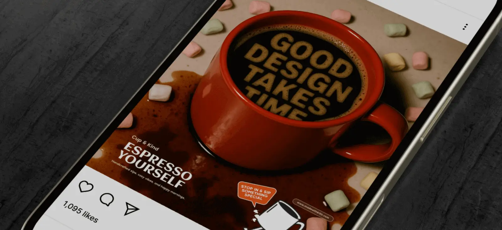
Step 2: Turn that message into a visual brief

AI image generators work best when you speak their language: visual clarity.
So you’re not prompting for emotion — you’re describing how that emotion looks.
In this example, I tried prompting: “Turn the design as bubbles and foam in a coffee cup. Make the image look like it was shot with a hard flash, and make the mug red”
Here, I’ve broken down abstract emotion into something more tangible — things the model can visualize accurately.
Step 3: Generate wide, narrow fast
Don’t fall in love with the first version.
The best viral social media graphics usually start as a wall of maybes with slightly different tones, layouts, and energy levels that you can compare side by side.
With Kittl Flows, you can do this without juggling tabs or losing track of versions.

Design multiple iterations in one visual thread — your original concept, your bold color test, your calm version, your typographic experiment — all visible together in a single workspace. Then check these 3 things:
1. Thumbnail check: Can you still read the message at 10% size?
2. Emotion check: Does the tone match what you intended?
3. Scroll test: Which image catches your eye first in a 9-grid view
Keep only 3–4. Edit manually afterward. Tighten spacing, fix kerning, and unify your tone.
Add structure for shareability
Now turn your design into something people want to pass on. That means:
- Clean, centered headline (so it crops well).
- Visual breathing room for screenshots.
- Optional footer line: your handle, logo, or a subtle CTA.

Use that flexibility to test visual rhythm — how your post feels when swiped or replayed, not just when seen once.
Step 5: Test tone through variants
Virality often comes down to emotional fit, not visual detail. Take your best concept and render it in two or three tones:
| Variant | Visual Style | Use When |
| Bold | high contrast, sharp edges, tight type | motivational, opinion, callout posts |
| Soft | pastel tones, open space, gentle light | reflective, personal insights |
| Playful | asymmetry, bright contrast, fun typography | humor, trends, culture commentary |

Compare reactions. You’ll start to see patterns — your audience doesn’t just respond to the message, they respond to how it feels visually.
Key takeaway
Virality isn’t an accident, it’s the result of clarity meeting momentum.
The posts that spread aren’t the prettiest or the most polished. They’re the ones that feel inevitable: the right message, framed the right way, at exactly the right moment.
Now AI doesn’t make viral social media graphics, it makes you faster at finding what deserves to be. It lets you test emotion before posting, sharpen your message before the scroll, and design with the same precision that algorithms use to decide what stays visible.
And with AI, that window — between inspiration and impact — has never been shorter.

Shafira is a content writer who turns boring business talk into reads people actually enjoy. She grew up hoarding $1 novels in Singapore and writing hilariously bad fiction, but now she tackles content marketing with all that creative chaos since 2019. From blogs and newsletters to UX and SEO, she writes how she thinks: nerdy, honest, and a bit offbeat. She believes the best content is human-designed, not just plain text.