There’s a certain magic in old postcards. The kind with giant block letters spelling out New York or Miami, each filled with tiny snapshots of the city.
That same retro charm is what inspires today’s letter mask designs, only now you can make them in minutes instead of hunting for vintage prints.
Think about it: a coffee shop owner spelling BREW with beans and mugs tucked into every letter, or a design student turning DREAM into a collage of sketchbook pages. It’s bold, personal, and just a little unexpected — exactly the kind of design people stop scrolling for.
In this guide, we’ll walk through the hidden trick to creating stunning letter mask effects in Kittl.
It’s simple to learn, but the results feel like a secret design move that’s been waiting for you to try it.
Where the letter mask design came from
The roots of the letter mask style go back nearly a century, to the bold “large-letter” postcards that swept across the United States in the 1930s and 1940s.
These oversized greetings featured city names spelled in block letters, each one filled with photos of landmarks, beaches, or local life. They were colorful, eye-catching, and instantly became keepsakes for travelers.
That postcard tradition gave birth to the modern letter mask effect we know today. Designers still borrow the same idea: Images living inside letters.
But here’s the funny thing: maybe this topic doesn’t make it to the top 10 most popular text effects, yet it has quietly shaped some of the most recognizable designs in history. From souvenir T-shirts to posters and digital ads, the letter mask is everywhere once you start noticing it.
And if you’ve ever tried fitting text inside shapes, you’ve already played with the same idea — only now Kittl makes it far simpler than the old postcard printers ever dreamed.
How to create a letter mask in Kittl (step by step)
1. Open the design menu

Start a new project or open an existing one in Kittl. In the left sidebar, open the Illustration menu.
2. Find the Letter Masks

Scroll to the bottom of the Design menu until you see Letter Masks. These are prebuilt letter shapes designed to hold images perfectly, so you don’t have to fuss with clipping paths.
3. Choose the letters for your word

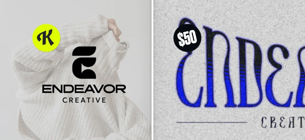
Add each letter you need to the canvas and arrange them in order. For the strongest letter mask effect, all the letters are premade as all ALL CAPS. So you might want to keep the word short (4–7 letters).
Your masked word is the star of the show, so pair it with something simple that supports it instead of competing. For example, try Montserrat for clean taglines, Lora for a touch of elegance, or Archivo Narrow for compact details like dates or slogans. These lighter, easy-to-read fonts balance out the heavy, image-filled letters and give your design a polished hierarchy.
4. Place the same image inside every letter

Upload or select your image, then drop that same image into each letter. Using one image across all letters ties the composition together and creates that seamless panoramic feel inside the word.
5. Enlarge and align the image across letters

Within each letter, scale and position the image so key details line up from one letter to the next. Aim to align horizons, edges, or your main subject across the letter sequence.
6. Bonus tip 1: Add the image again and remove the background

Bring the same image onto the canvas as a separate layer. Use Background Remover to isolate the main subject (person, product, landmark).
You’re preparing the “pop-out” highlight that will sit above the word.
7. Bonus tip 2: Overlay the subject to create the pop-out moment

Place the cut-out subject on top of the masked word so it looks like it’s breaking out of the letters. Nudge until the edges feel natural and connected to the imagery inside the letters.
Key takeaways
- The letter mask effect comes from vintage postcards but remains a fresh, eye-catching design style today.
- Entrepreneurs, students, and hobbyists can all use letter masks for posters, merch, social posts, or branding.
- Kittl makes the process simple: drop letters onto the canvas, mask your image, align across letters, and pop out the subject.
- If you get to pick your own font, bold, wide typefaces (like Montserrat Black or Alfa Slab One) work best, and pairing with lighter fonts adds balance.
Why the letter mask is worth trying
The letter mask has this mix of retro postcard charm and modern punch that instantly grabs attention without trying too hard.
Whether you’re building something for your brand, putting together a project, or just experimenting for fun, the letter mask has that “Whoa, how did you do that?” factor built in.
At the end of the day, the letter mask is flexible and surprisingly easy to pull off in Kittl. It turns a single word into something memorable.
And that’s a design move anyone can use.
If you want to take it even further, Kittl’s Pro and Business plans unlock the full set of advanced text effects, giving you even more ways to push your letter mask designs to the next level.