In 2017, Nielsen Norman Group found something surprising: websites that broke all the design rules—ugly layouts, default fonts, no visual polish — often performed better than their “perfect” counterparts.
They loaded faster, got straight to the point, and refused to distract users with fluff. These weren’t accidents—they were acts of intentional rebellion. And that rebellion has a name: Brutalism.
For advanced designers who’ve spent years mastering grids, kerning, and pristine UX flows, Brutalist art offers something rare—a chance to unlearn.
To challenge muscle memory. To strip design down to its rawest components and ask: What happens if I stop trying to please? In a sea of glossy sameness, Brutalism is sharp edges, broken symmetry, oversized type, and unapologetic function.
It’s less about chaos and more about clarity through discomfort. If you’re exploring where this style fits in the bigger picture, it’s helpful to explore various graphic design styles, including Brutalism, to see how it contrasts with — and reacts to — more conventional aesthetics.
In this article, we’ll explore the roots, rules, and raw power of Brutalist art in the digital space. You’ll get a closer look at its key traits, see how top designers are applying it today, and learn how to bring that brutal edge into your own work—strategically, intentionally, and without losing the plot.
What is the Brutalist Art style?
In graphic and digital media, Brutalist art refers to a style that intentionally looks raw, unpolished, and even “ugly” by conventional standards.
It draws inspiration from the Brutalist architecture of the mid-20th century, which was characterized by exposed materials (often raw concrete) and an unapologetically utilitarian look.
In the digital realm, Brutalist design means embracing the basic building blocks of content (text, images, simple shapes) with minimal stylistic embellishment. The Nielsen Norman Group describes Brutalism in digital design as a style that looks “raw, haphazard, or unadorned,” echoing early 1990s websites like Craigslist.
In other words, a Brutalist graphic or interface presents itself “as-is” – often using default HTML or bare-bones layouts – rather than hiding behind glossy UI elements.
Brutalist art in this context is a reaction against the sleek, “pixel-perfect” design trends of today. “In its ruggedness and lack of concern to look comfortable or easy, Brutalism can be seen as a reaction by a younger generation to the lightness, optimism, and frivolity of today’s web design,” explains Pascal Deville, founder of the Brutalist Websites gallery.
While originally an architectural term, designers have adopted “Digital Brutalism” (or Neo-Brutalism) to describe work that rejects modern web standards and aesthetics in favor of a more honest, almost DIY presentation.
To better appreciate what this style pushes against, it helps to review foundational design principles to understand how Brutalism challenges them. The result is often jarring at first glance – bold text, simple backgrounds, clashing elements – but deliberately so.
What are the roots of Brutalism in art and design?

Brutalism began not as a design aesthetic, but as an architectural movement. The name comes from béton brut, French for “raw concrete”—a material celebrated by postwar architects like Le Corbusier and the Smithsons.
These architects embraced unpolished, geometric forms and believed that buildings should wear their structure openly, with no decorative disguise. The goal was function over form, integrity over aesthetics.
But Brutalism was never just about concrete. From the start, it had one foot in the art world. Critics linked its raw, no-frills look to “Art Brut,” a rebellious art movement led by Jean Dubuffet that praised rough, outsider expression. In 1953, Brutalist architects even collaborated with avant-garde artists, blurring the line between structural and visual design.
By the 1960s and 70s, brutalist ideas found their way into graphic design, especially through modernist movements like Swiss Style and Constructivism. Think heavy grids, stark contrasts, oversized typography, and function-led layouts. If you’re curious how these early movements continue to shape visual culture today, it’s worth understanding how classic art movements influence contemporary design trends.
Then came the digital era. Around 2014, Brutalism had a second life online. Designers, tired of glossy templates and UX sameness, started building sites that looked intentionally “broken”—HTML-first, default fonts, and no-frills visuals. BrutalistWebsites.com helped give this raw digital aesthetic a name and a global audience.
Even major brands joined in, from Bloomberg’s oversized layouts to Adult Swim’s chaotic site redesigns. This digital shift also embraced distortion and imperfection as design tools, with many creators experimenting with glitch text effects that complement Brutalist aesthetics to push that sense of disruption even further.
Brutalism today sits at an intersection: part nod to modernist purity, part rebellion against overdesigned digital norms. Its roots stretch from concrete buildings to punk zines to glitchy websites — always challenging convention, always prioritizing authenticity over polish.
Key traits of the Brutalist art style
Brutalist graphic and UI design is distinctive for its bold and unrefined visual language. Despite the seeming chaos, many Brutalist works share common traits.
Here are some key characteristics (in terms of typography, layout, UX, etc.) that advanced designers will recognize:
01. Rugged, unstyled typography

Text in Brutalist design is often set in simple, heavy fonts – frequently sans-serif and all caps – or even default monospace or system fonts.
This means no fancy kerning or elegant webfonts; instead, you might see big black Helvetica or blunt bitmapped lettering that looks “off the shelf.” Using typography as a structural element is common, such as oversized type that dominates the page or text that serves as the grid itself.
For example, brutalist websites often feature “blue hyperlink” default text and monochromatic monospace fonts, deliberately evoking the raw HTML look of 1990s sites. The overall effect is text that shouts rather than pleases – unapologetically bold and legible, albeit in a blunt way.
Still, even within these limitations, understanding font pairing to enhance Brutalist typography can help designers strike the right balance between visual aggression and structural clarity.
02. Minimal layouts that break convention

A Brutalist layout usually rejects the polished grids and symmetry of corporate design. Many brutalist works have a bare-bones, boxy structure – or conversely, a jarringly asymmetrical one.
It’s common to see content simply stacked in a single column or scattered in unconventional arrangements that ignore “proper” alignment.
Standard navigation menus or UI components may be omitted or hidden. In web UI, “brutalist websites use very little CSS, giving off a much boxier HTML effect,” resulting in a text-focused, grid-like layout by default.
This means lots of blocky sections and plain hyperlinks. In print layouts, designers might use an obvious grid but then violate it by, say, bleeding text off the edge or rotating an element unexpectedly.
The goal is to appear “unfinished” or improvised, as if the design is a first draft. This roughness forces the audience to actively navigate the content (since nothing is hand-held by slick UI cues).
03. High contrast and limited color

Brutalist designs tend to favor either monochrome schemes or extremely high-contrast color usage.
Often, the palette is limited and striking – for example, plain black text on a stark white background with perhaps one accent color. Bold primary colors might be used not for harmony but for shock value.
According to one design analysis, “the strategic use of white space and bold colors” is a hallmark of brutalist graphics. In practice, this could mean a page that is mostly white (or a neutral gray, reminiscent of concrete) with brutally black text and maybe one element in a loud color like neon green or fire-engine red.
The emphasis is on contrast: light vs. dark, saturated vs. neutral. (We will detail specific color palettes in a later section.)
04. “Truth to Materials”

Borrowing a concept from architecture, Brutalist design often shows an honest use of materials. In architecture, this meant showing raw concrete and structural elements; in graphic/web design, it means exposing the basic building blocks.
This can translate to using default HTML elements (buttons, forms) with no styling, showing pixelation or grain in images, or using textures that mimic raw materials.
For instance, a brutalist web page might display the actual code-like appearance of a form or a browser’s default blue links – effectively saying, “this is made of HTML, and we’re not hiding it.”
One web design blog notes that brutalist sites “foreground information and eschew decoration,” essentially using only the web’s “raw materials” of text and hyperlink blue.
Even in printed graphic design, you may see visible guidelines or rough paper: e.g,. Leaving crop marks in a poster or printing on kraft paper to highlight the texture. This raw tactility is very much on purpose.
05. Use of brutal simplicity (or deliberate complexity)
Interestingly, Brutalist design oscillates between extreme simplicity and deliberate complexity.
On one hand, many brutalist works are ultra-minimal – only the absolutely necessary content is presented, with an almost stubborn refusal to add frills. (The mantra “form follows function” is taken to heart).
On the other hand, some brutalist designers embrace chaos – clashing elements, overlapping images, scrolling marquees – to create a hectic, anti-user-friendly vibe.
Both approaches break the rules: one by stark simplicity, the other by anarchic composition. What they share is a rejection of balanced, middle-of-the-road design.
06. Textures and imagery

While many brutalist compositions rely heavily on text and flat color, imagery is not off-limits. When images are used, they might be black-and-white photos or low-resolution graphics, often with their edges or backgrounds left unedited (again, an “honest” presentation).
Collage techniques are common as well – e.g., layering clip art or emoji with harsh contrast, as noted in recent poster designs influenced by digital brutalism.
In print, designers may incorporate scans of concrete textures, photocopier noise, or deliberately poor-quality prints to give a rough feel.
The overall textural vibe is raw: think grainy photos, bitmap icons, or flat illustrations with no gloss. If Swiss Modernism loved clean white and perfect line art, Brutalism embraces the grit (or at least the appearance of it).
For designers interested in experimenting with these effects, you can discover methods to incorporate grunge textures that align with the Brutalist style using practical techniques in Kittl.
4 artists and studios to watch for Brutalist art style inspiration
If you’re looking to immerse yourself in Brutalist design and learn from the best, there are several contemporary designers, artists, and studios known for mastering this aesthetic.
Below is a list of notable figures and groups whose work exemplifies Brutalist principles (each with a note on what they’re known for):
01. Pascal Deville – Founder of Brutalist Websites
Pascal Deville is a Swiss creative director often credited with coining and catalyzing the Brutalist web design movement in the 2010s. In 2014, he launched BrutalistWebsites.com, a curated directory of Brutalist-style sites that became a hub for inspiration.
According to Smashing Magazine, after vetting hundreds of submissions, Deville observed a three-way split in Brutalist web approaches (from purist to radical).
02. Studio HAWRAF – Experimental interaction design
If you’re looking to design a Brutalist-style website interface, we’ve got good news: there’s a whole world of reference sites that embrace this raw, rule-breaking approach.
From minimalist layouts that ignore modern UX conventions to chaotic, all-text navigation systems, these digital spaces offer endless inspiration.
One standout example is HAWRAF, a New York-based design studio (active circa 2016–2018) that made waves with its anti-design ethos. Their own website invited users to “check every link” by listing out every single element in one long, scrollable page—a tongue-in-cheek move that turned UX hierarchy on its head.
HAWRAF’s work often featured chaotic layouts, interactive oddities, and graphic rawness that felt both disruptive and intentional. It’s a perfect case study for anyone aiming to challenge the norms of digital design with a Brutalist mindset.
03. Wunder Werkz – Branding with Brutalism (Denver)
Wunder Werkz is a Denver-based design studio known for using Brutalist principles to build bold, immersive brand identities. Their work often features stripped-down layouts, raw typography, and jarring interactions that disrupt traditional user flows.
A great example is their own website—move your cursor, and photos flash across the screen in scattered, unpredictable spots. It’s chaotic by design, reflecting the Brutalist rejection of polished, overly guided interfaces.
They’ve also brought this aesthetic into the real world, like with the identity for Brutø, a minimalist restaurant that uses industrial typography and stark visual elements across both print and space.
04. Craig Oldham – Graphic designer & author
Craig Oldham is a British graphic designer known for his outspoken, punk-influenced design work and writings. Oldham has produced projects that embrace a kind of “beautiful ugliness.”
For instance, he’s worked on protest art and books that employ deliberately rough typography and layouts. He’s cited as one of the designers who “pushed the anti-aesthetic forward by using asymmetrical grids, harsh color contrasts, and unrefined elements.”
Color palettes commonly used in the Brutalist art style
Color in Brutalist design tends to be stark, either extremely minimal or outrageously bold (and sometimes both!)
The palette you choose will greatly influence the tone of your brutalist project – whether it feels harsh and utilitarian, or loud and punk.
Below are some proven palette approaches frequently seen in Brutalist art style, complete with HEX codes and notes on their psychological/compositional impact:
01. Monochrome with hyperlink blue

Palette: #FFFFFF (White), #000000 (Black), #0000EE (Hyperlink Blue).
This palette is straight from the early web playbook. White and black provide maximum contrast and a neutral canvas, while the standard hyperlink blue (that default bright blue browsers use for links) adds a touch of recognition and emphasis.
Using this trio emulates the look of plain HTML pages and bare OS interfaces, tapping into a sense of utility and nostalgia. Psychologically, black-on-white is the easiest to read (hence feeling functional), and the blue triggers the user’s impulse to identify clickable text (as learned from decades of web use).
Designers favor this palette in Brutalist sites because it “evokes the early days of the web, and uses one of the web’s raw materials” – the blue link.
For example, a brutally designed wiki or blog might be almost entirely black text on white, with blue for links and highlights. The effect is unpretentious and content-forward. It can also feel stark and serious (black/white being the absence of color play), which aligns with Brutalism’s no-frills ethos.
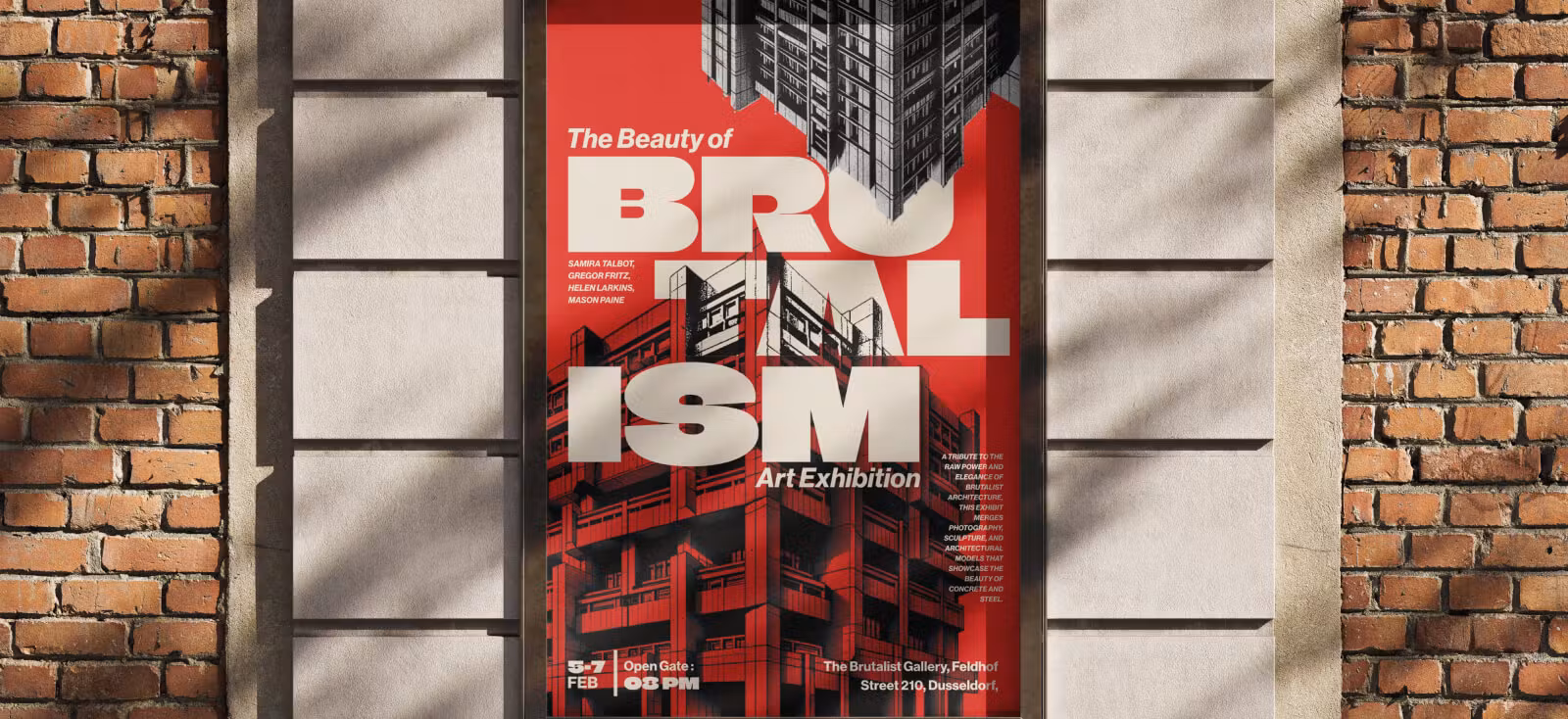
02. High-contrast black, white & red

Palette: #000000 (Black), #FFFFFF (White), #FF0000 (Red).
Black, white, and red is a classic combination in graphic design with a lot of historical weight – from Constructivist propaganda posters to underground zines.
In a Brutalist context, this palette screams for attention and carries a slightly aggressive or urgent tone. Red is the most emotionally intense color; as an accent against black and white, it can signify warning, revolution, or importance.
For instance, the Brutø restaurant’s website used a strong red background with black text, creating a visceral punch and a modern-yet-brutal look. Red on white or red on black has extremely high contrast, which is visually arresting (think of STOP signs or error messages).
Compositionally, using red sparingly (for backgrounds or key text) against a black/white layout will draw focus exactly where you want it – you can lead the eye to, say, a logo or a call-to-action by making it red.
Psychologically, black and white provide the straightforward, honest backdrop, while red adds an element of rebellion or urgency.
03. Industrial gray tones with neon accent

Palette: #F0F0F0 (Concrete Gray), #606060 (Dark Gray), #39FF14 (Neon Green) – plus black or white as needed.
This palette mirrors the concrete textures of Brutalist architecture with a futuristic twist. The grays (#F0F0F0 is a light gray, like weathered cement; #606060 is a mid-to-dark gray for text or background elements) establish a utilitarian, subdued base.
By itself, a gray palette can feel cold, which is actually on-brand: it channels the “raw concrete” vibe and a neutral, objective mood.
Now, adding a neon green (a very bright, almost fluorescent green) as an accent introduces a jolt of modern digital energy. Neon green (or you could substitute neon pink #FF0AFF, or electric blue #00FFFF, depending on preference) contrasts sharply with gray, creating a focal point that feels a bit glitchy or high-tech.
This sharp contrast is exactly why neon color palettes have become a go-to choice for designers aiming to break visual conventions—especially in bold, boundary-pushing styles like Neo-Brutalism.
04. “Pretty-Ugly” clashing pastels

Palette: #FFB7DD (Bubblegum Pink), #A0E7E5 (Cyan Teal), #FBE7C6 (Beige Yellow), #343434 (Charcoal for text).
Pastels in general aren’t typical for Brutalism, but neo-brutalism has expanded to include “so bad it’s good” combinations. The psychological effect here is subversion: using cheerful colors in a way that feels chaotic rather than comforting. It can create visual tension that draws viewers in.
For example, a poster with a pink background and cyan headline text, plus random beige elements, would certainly get a double-take for its odd combo. The charcoal dark gray is included as a text color because pure black might be too harsh with these lighter tones; charcoal softens just a bit while still providing contrast.
Compositionally, this palette works when you assign each color to a distinct role (e.g., one color for background, another for headlines, another for accents) so they deliberately don’t “match.”
Designers who want to channel the “ugly design” trend might use this – it’s a more eccentric flavor of Brutalism that overlaps with retro and vaporwave influences.
Keep in mind that pastels will reduce contrast, so if legibility suffers, adjust the tone (e.g., deeper pink or adding a white outline to teal text). The goal is a bubblegum meets brutal statement, which conveys creativity and nonconformity with a tongue-in-cheek tone.
Why does the Brutalist Art style still matter in modern design?
The Brutalist art style reminds designers that function can be raw, structure can be visible, and beauty isn’t always the end goal. For advanced creatives, Brutalism is a way to reset the design instinct, question default choices, and reconnect with the core of visual communication.
By stripping away polish and embracing tension, the Brutalist art style offers a creative space where typography speaks louder, grids break with purpose, and every element has to earn its place.
It’s not about being contrarian for the sake of it—it’s about creating work that feels real, honest, and unforgettable.
So if you’re feeling stuck in safe layouts or overly refined systems, let Brutalism be your sharp edge. Explore it, break it, own it—and let it remind you that sometimes, the most powerful designs are the ones that refuse to play nice.
And if you’re ready to experiment with bold typography, raw layout tools, and expressive visual features, Kittl’s design platform makes it easy to get started—with flexible plans for every creative workflow.