And technically, yes. But if you’ve ever actually tried to create abstract work that doesn’t look like a hasty placeholder, you already know: freedom’s only fun when you know how to handle it.
Abstract art isn’t about getting away with less. Its about doing more with less. Less literal structure, more intention. Less visual explanation, more emotional weight. And that makes it one of the trickiest styles to pull off.
Because when there’s nothing recognizable on the canvas, the only thing left to hold it together is you: your instincts, your composition choices, your color judgment, your sense of rhythm. Abstract art doesn’t let you hide behind aesthetics. It demands that you own them.
Were going to break down what abstract art actually is, what makes it good, and how you can start making work that’s bold, considered, and completely your own. Whether you’re working from scratch or remixing templates inside Kittl.
Let’s start!
What really is abstract art?

Before we go any further and make your very own, it’s important to truly understand what abstract art really is.
Definition of abstract art
If you want the dictionary definition, abstract art is described as: Art that doesn’t attempt to represent external reality. Instead, it uses shapes, colors, forms, and gestural marks to achieve its effect.
But what does it actually mean for us designers?
To put it simply, its like the difference between drawing a bird and drawing the idea of freedom. You’re not describing a thing, you’re setting a mood.
At its core, abstract art is visual work that doesn’t aim to represent the external world. It doesn’t care about accurate proportions, recognizable objects, or mimicking real life. What it does care about is energy. Flow. Tension. Contrast. Space.
And just because it doesn’t “look like anything”, doesn’t mean it doesn’t say something. Good abstract work has rhythm, harmony, imbalance, and restraint. It communicates through color, line, texture, and scale.
History of abstract art

Abstract art didn’t start as a trend. It started as a rebellion. Around 1910, Wassily Kandinsky decided he was done painting things the way they looked. Instead, he painted how they felt — with color, shape, and rhythm doing the heavy lifting. But Kandinsky wasn’t the first.
Hilma af Klint had already been quietly creating otherworldly, non-objective works years earlier—big, spiritual pieces made long before the art world was ready to give her credit.
At the same time, movements like Cubism and Futurism were shaking things up. Picasso and Braque broke subjects into shards. Italian Futurists tried to capture speed and energy in a single image. The whole idea of what art should look like started falling apart — in the best way.
By the 1940s, abstract art had crossed the ocean and exploded. The Abstract Expressionists in New York — Pollock, Rothko, all of them — ditched subjects entirely and made paint itself the story.
And from there, abstraction spread everywhere. Artists around the world took the idea and made it local, mixing it with their own traditions, symbols, and styles. Because once you break the rules, everyone gets to rewrite them.
The 7 characteristics of abstract art
Abstract art might not follow the usual rules, but that doesn’t mean it’s lawless. When there’s no subject to guide the eye, these are the things holding everything together.
1. Form comes first.
You’re not trying to make something look like something. You’re building it from the ground up with shapes, spaces, movement. It doesn’t have to resemble anything at all. It just has to hold together.
And if it falls apart? You’ll feel it. Even if you can’t quite explain why.
2. Color does the talking
Abstract art doesn’t use color to stay realistic, it uses it to set the tone. Color becomes the emotion. That sickly green? Unsettling. That heavy red? Loud and proud. That off-white next to pale pink? Way more thoughtful than it lets on.
There’s even black and white abstract art that just hits right. Create whatever feels right for you. Check out these two contrasting abstract art templates below and see how it can flourish in both ends:

Illusion Design. Use Template

Hard Work Will Pay Off Design. Use Template
3. Texture adds flavour
A flat color is fine. But a bit of grain? A soft blur? Some unexpected roughness? That’s what gives your work some bite. Even if it’s digital, texture makes it feel less… flat.
4. There’s no main character
You’re not illustrating a thing. There’s no tree, no face, no product. And that’s the whole point. The design is the thing. How it feels matters more than what it’s supposed to be.
3. Lines aren’t just lines
Lines don’t need to outline anything here. They can be soft or sharp, loose or tight. Use them to break things up, lead the eye, or just because they look cool.
Here’s a great example of abstract line art that might just inspire you:

Abstract Zoom Background Design. Use Template

Gradient Line Zoom Background Design. Use Template
4. Layout still matters
Even if everything’s abstract, where you put things still makes or breaks it. Big shapes, small ones, breathing room, tension…it all counts. If something feels off, trust that instinct.
5. People will read into it
And that’s kind of the fun of it. One person sees movement, another sees melancholy, someone else just likes the colors. You don’t have to spell anything out. Let people bring their own meaning.
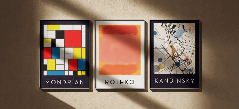
Famous classic abstract art examples

You’ve probably seen the classics: Kandinsky’s colorful explosions, Mondrian’s tidy little color blocks, Rothko’s giant color fields that look like mood swings in rectangle form.
These pieces are technically “famous abstract art,” but they’re also just… good design. They play with balance, contrast, and emotion in ways that still feel fresh (even if they were painted 100 years ago).
And then there’s Hilma af Klint who quietly made large-scale, layered geometric abstractions before it was cool. Her work feels oddly modern, with clean lines, grids, and color palettes that wouldn’t look out of place in a 2025 rebrand.
Abstract art today (a.k.a, it never left)
Modern abstract art is everywhere. You’ll see it in mural projects, Instagram feeds, poster design, brand illustrations, and even UI backgrounds. Designers today remix it constantly — sometimes as a style choice, sometimes to say something without spelling it out.
It’s not about copying the old stuff. It’s about borrowing the tools (texture, mood, color, space) and making something that feels like now.

Trendy Abstract Shape Poster. Use Template

Abstract Design. Use Template
Abstract wall art
This is where abstract art gets to show off. Big canvases. Huge color fields. Dramatic shapes. Whether it’s digital or physical, abstract wall art is designed to hold space — and attention. It works in living rooms, waiting rooms, and yes, your next interior-style product mockup.

Circle Shape Art Design. Use Template

Every Artist Design. Use Template
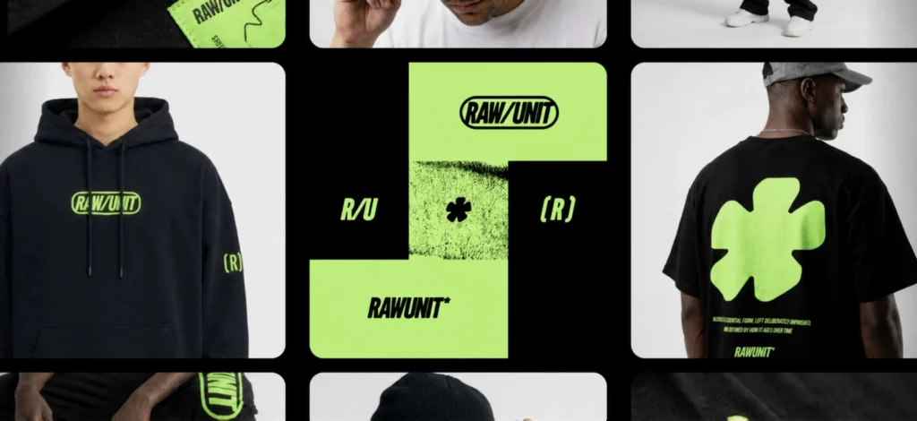
Abstract art on merch (T-shirts, tote bags, etc)
Abstract art + merch = match made in branding heaven. It works because it doesn’t have to say much to say a lot.
One interesting shape and suddenly the shirt feels intentional. A wavy color block and now the tote looks like it belongs in a concept store. You don’t need slogans or symbols. Just good composition and a bit of guts.
Great for limited drops, community merch, or when you just want to print something cool without overthinking it.

Not sure if your blob belongs on a hoodie or a tote? Just throw it into a Kittl mockup. You’ll see exactly how it wraps around fabric, folds, tags or whatever you’re working with. It’s faster than exporting to multiple tools, and way less of a pain.
Abstract art wallpaper
Not the floral kind. Think bold, blurry shapes, painterly strokes, gradients, and line textures. Abstract wallpapers are perfect for digital backdrops, brand templates, or just your own device. They set the vibe without being distracting. Useful when you want emotion without too much detail.

Lilac Kinetic Art – Abstract Event Design. Use Template

Romance Of Many Dimensions Design. Use Template
Like seeing your designs in the wild on T-shirts, tote bags, sweatpants, and more? Use them on our mockup tool!
Abstract art even looks good on Zoom backgrounds:

Gradient Textured Zoom Background Design. Use Template

AlphaWave – Gradient Zoom Background Design. Use Template
Abstract art on brands logos
Some abstract logos are pure chaos. Others are just a curve and a dot…but they work. The best ones don’t try to explain themselves. They just feel balanced, fresh, and a little hard to forget. That’s the sweet spot. Natural wrapping physics that show all the realistic creases, folds and textures you’d see on real products.

Noir Logo Design. Use Template

On My Own Logo Design. Use Template
Kittl’s AI logo tool is great for getting weird ideas out of your head and onto the canvas. Start messy, tweak what feels right, then shape it into something that looks like it came from a branding studio (without actually hiring one).
Even better, abstract art totally holds its own on a business card. It gives you just enough personality without crowding the space. Like this one. Clean layout, bold shape, nothing trying too hard:

Abstract art on social media bundles
Abstract art gives social posts a bit of an edge without needing to explain anything. It works great for brands that want to feel modern without spelling out every detail. A few strong shapes, a nice contrast, and suddenly the whole feed feels more designed.
Afraid to start from scratch? No worries! Pick these social media bundles from Kittl’s templates to help you start off:

TechVibe Brand Social Media Bundle. Use Template

Tech Brand Social Media Bundle. Use Template
And honestly? Anything goes.
Some abstract art is wild. Some is peaceful. Some is just kind of funny and weird. That’s the beauty of it. It doesn’t have to follow one style. Play with gradients, stack random shapes, use texture just because it feels good. Make something that doesn’t need a caption to feel finished.
As a designer, abstract work can be a palette cleanser, a playground, a place to experiment without a brief breathing down your neck. Or it can be the brief.
If you’re playing with abstract shapes, Kittl’s vector editing tools make it ridiculously easy to push things around until they just feel right. Draw custom paths, round off corners, merge or subtract shapes, and tweak every little anchor point without bouncing between tools.
How to create your own abstract art in Kittl
Making abstract art from scratch is either deeply meditative or mildly chaotic. Sometimes both. But that’s kind of the fun, right? You’re not following a style guide, you’re moving shapes around until something clicks.
But with Kittl, it’s a little smoother — and a lot faster. And the best part? You can start wherever your brain is.
Here’s what you’ve got to work with:
Vector tools for shaping stuff your way
Draw your own forms with the Pen Tool, then bend and tweak every little curve using Vector Path Editing. It’s perfect when you don’t want to use someone else assets you want that blob to be your blob.
And with the Shape Builder, you can cut shapes out of each other, overlap them, or build something wild from scratch.

AI tools to kickstart something weird
Not sure where to begin? Try the Text-to-Vector or Text-to-Image generator. Type in a weird prompt like “melting cubes” or “sunset but geometric” and you’ll get instant visuals to play with. You can edit them, remix them, or use them as a jumping-off point when the blank canvas is making you spiral.
Type tools that don’t just sit there
Abstract art doesn’t always need type, but when it does, it shouldn’t feel static. You can curve, warp, stretch, and distort type directly in Kittl.
Want letters that follow a spiral path or wrap around a shape? Done. Want to use type as a design element instead of just a label? You’re in the right place.
Mockups that actually look good
Once your piece feels ready, drop it into one of Kittl’s high-res mockups. Whether it’s a poster, tote bag, T-shirt, or even a phone background, you’ll see how your abstract art lives off the canvas.
And because the mockups support realistic wrapping and layering, your shapes don’t just float. They fold, crease, and stretch like they’re meant to be there.
TL;DR: You can build your weird, wonderful abstract piece start to finish without exporting to a single other tool. Everything’s here and actually fun to use.
Check out our other article about it here.
Ready to abstractify?
At the end of the day, abstract art is about trusting your eye. You’re not following rules, you’re following rhythm, shape, and instinct. And that’s exactly why it pairs so well with tools that don’t get in your way.
Kittl is built for designers who want to explore, tweak, remix, and move fast without jumping between a dozen different platforms.
Whether you’re layering textures, editing vector paths, generating AI starting points, or just making something for fun, it all happens in the same place.
So go abstract. Go bold. Go off-script. You’ve got the tools for it.

Shafira is a content writer who turns boring business talk into reads people actually enjoy. She grew up hoarding $1 novels in Singapore and writing hilariously bad fiction, but now she tackles content marketing with all that creative chaos since 2019. From blogs and newsletters to UX and SEO, she writes how she thinks: nerdy, honest, and a bit offbeat. She believes the best content is human-designed, not just plain text.