If 2026 design trends share one mood, it’s this: the future feels shaky, so designers look backward for meaning.
That helps explain the rise of Future Medieval.
This style mixes medieval cues like blackletter typography, illuminated borders, sacred ornament, and mythical creatures with modern layouts, digital textures, and AI-made patterns.
The result feels old and next-gen at once. Think prophecy poster, reimagined for the internet.
And the best part? This trend doesn’t feel like cosplay. It feels surprisingly relevant.In this breakdown, we’ll explore where Future Medieval comes from, why it’s trending in 2026 among the 10 other graphic design trends in 2026, what visual traits define it, and how to recreate the look using Kittl templates, typography, textures, and AI tools.
What is Future Medieval design?

Future Medieval design is exactly what it sounds like: medieval aesthetics reimagined through modern design tools.
Think:
- gothic blackletter type… but laid out like a fashion campaign
- illuminated manuscript borders… but with grainy blur textures
- medieval beasts and relics… but turned into poster graphics and merch
- sacred symmetry… but used in social posts, album covers, and branding
It’s not purely historical. It’s more like a remix — medieval references filtered through digital culture.
What makes Future Medieval especially interesting is how it overlaps with other 2026 trends. It shares Punk Grunge’s love of texture and imperfection, Type Collage’s type-first attitude, and even AI Abstract Art’s embrace of strange machine-made patterns.
It’s not a standalone aesthetic — it’s part of a bigger shift toward design that feels more symbolic, more physical, and less polished.
Pro Tip
If you’re not sure whether something counts as Future Medieval, ask yourself: Would this design work on a medieval scroll and on a modern streetwear poster? If yes, you’re in the right zone.
The origins: why medieval aesthetics keep coming back
Medieval aesthetics have been cycling through design for decades — but Future Medieval feels different.
Historically, medieval visuals were tied to:
- religion and ritual
- status and hierarchy
- myth, folklore, and symbolic storytelling
So when designers reuse these motifs, it’s rarely random. Medieval design language carries weight. It instantly signals:
- tradition
- mystery
- authority
But in 2026, the medieval revival isn’t technically about history accuracy. It’s about vibe. It’s medieval symbolism used to give modern messages more gravity.
That’s why you’ll see it in:
- editorial posters
- music merch
- fashion branding
- conceptual campaigns
- fantasy-inspired creator content
Pro Tip
Future Medieval works best when your message has drama. Even simple copy like “DROP 01” feels more important in this style.
Why Future Medieval is trending in 2026
So why now?
Because design right now is split between two extremes:
- hyper-modern, clean, AI-assisted visuals
- nostalgic, symbolic, human-feeling work
Future Medieval sits right in the middle.
It uses modern tools — AI textures, vector overlays, digital composition — but it doesn’t feel modern. It feels mythic. And that’s what makes it powerful in a year where audiences are tired of “perfect” design.
Future Medieval gives designers a way to make work feel:
- more meaningful
- more crafted
- more intentional
- more cinematic
It’s like visual worldbuilding — even when the project is just a poster.
Pro Tip
This trend thrives when you treat the design like a “relic.” Add age, texture, symbolism, and structure — even if the content is modern.
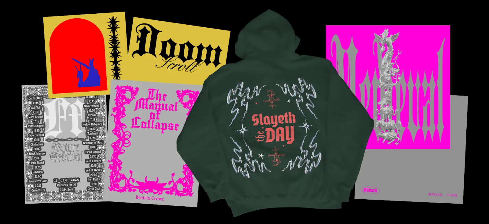
The anatomy of Future Medieval design (what defines it)
Future Medieval design looks rich, but it’s built from a handful of repeatable choices. If you understand these, you can recreate the look consistently (instead of accidentally making “fantasy poster”).
Blackletter type + medieval calligraphy

Blackletter is the heartbeat of this trend.
You’ll see:
- gothic blackletter headlines
- distorted calligraphy
- rune-inspired letterforms
- stamped medieval typography
It instantly brings medieval energy — even in a modern layout.
If you want to learn more about blackletter fonts or gothic fonts, you should check out our whole guide + recommended fonts on this article here. Want to explore all of Kittl’s fonts yourself? Check out our Font Library here.
Pro Tip
Pair blackletter with one clean modern font (grotesk or serif). That contrast is what makes it feel “future medieval,” not purely historical.
Medieval iconography (relics, beasts, symbols)

This is where the style becomes unmistakable.
Common motifs:
- dragons, knights, castles
- swords, shields, chalices
- religious ornamentation / sacred halos
- medieval borders, seals, emblems
But they’re rarely used as literal illustrations. They’re treated like graphic symbols — layered, cropped, textured.
You can check out many elements that fit this right vibe with Kittl’s Content Library. You can also bring your specific ideas to life with Kittl’s AI Image Generator.
To know more about which generator is best for you, learn more about the 12 built-in AI image generators like Nano Banana or Idea in this full guide here.
Pro Tip
Don’t overload the design with medieval objects. Pick 1–2 “relic” motifs and build the composition around them.
Ornate symmetry and illuminated composition
Medieval manuscripts were structured. So Future Medieval design often uses:
- centered layouts
- symmetrical frames
- border systems
- crest-like compositions
Even if the texture is chaotic, the structure usually isn’t.
Pro Tip
Start with symmetry first. Then distress it. If you do it in reverse, it becomes messy instead of ceremonial.
Distressed parchment + halftone texture

Texture is what makes this trend feel physical.
You’ll see:
- parchment paper grain
- ink bleed
- halftone shadows
- photocopy roughness
- “aged relic” overlays
Want to learn how to make halftone textures? Check out our Youtube video about it here:
Pro Tip
Use texture like seasoning. If the texture is louder than the typography, the design loses its hierarchy.
AI patterns that feel organic (not sci-fi)
AI shows up in this trend — but not in the shiny, futuristic way.
Instead, you can use Kittl AI is used to generate:
- strange organic pattern fields
- ritual-looking symbols
- surreal medieval textures
- tapestry-like backdrops
It adds that “visionary manuscript from the future” vibe. Before you generate on Kittl’s AI image generator, check out which of the 12 built-in AI image generators is best for your needs here.
Pro Tip
Future Medieval AI outputs work best when they look imperfect or mysterious.
Where Future Medieval works best (real-world use cases)

This trend isn’t just aesthetic — it’s functional. It works especially well for:
- Music + merch
album covers, tour posters, band merch with mythic energy - Streetwear and fashion branding
drop posters, crest logos, capsule collection visuals - Gaming + fandom creator content
lore cards, character posters, “house” banners, fantasy edits - Editorial and event posters
anything dramatic, cultural, or cinematic
Future Medieval is perfect when you want to sell a “world,” not just a product. You can also check out other graphic design trends in 2026 to see which one is best for your brand or products!
How to create Future Medieval designs in Kittl
You don’t need to be a medieval illustrator to pull this off. You just need strong typography, good framing, and the right texture stack.
Here’s a clean way to build it.
1. Start with a Future Medieval template

Templates help because this trend is structure-heavy. You want a strong base:
- symmetrical layout
- border framing
- crest placement
- type hierarchy
In Kittl:
- Go to Templates
- Search keywords like: “medieval”, “gothic”, “blackletter”, “ornate”, “crest”
- Choose a layout that already includes:
- centered composition
- border or frame elements
- a strong headline zone
- emblem/crest placement
You’ll find templates like this:


Pro Tip
Pick a template where the frame/border is already doing the heavy lifting. Then swap the symbols and typography.
2. Build your type pairing
Future Medieval typography works when it’s two eras at once: old-world blackletter + modern supporting type.
In Kittl:
- Click the main headline text
- In the Font dropdown, search: blackletter, gothic, medieval
- For your smaller text, switch to a modern support font:
- grotesk / sans serif for contrast
- or a serif for a more “editorial relic” vibe
A reliable combo:
- Font 1 (headline): blackletter / gothic
- Font 2 (support): clean grotesk OR serif
- Optional: a third font for stamped labels
Check out how to pair fonts perfectly in our guide here!
Pro Tip
Keep your blackletter short. 2–5 words max. Long blackletter paragraphs become unreadable fast.
3. Add medieval iconography (then crop it)

This style isn’t about throwing dragons everywhere — it’s about using medieval motifs like graphic symbols.
In Kittl:
- Go to Elements
- Search keywords like:
- dragon, sword, shield, crest
- ornament, border, frame
- angel, halo, sigil, seal
- Drop 1–2 motifs into the design
- Then make it feel designed (not clipart):
- crop the motif off the edge of the frame
- layer it behind type
- lower opacity
- add grain/texture overlay so it blends into the “artifact”
Check the many choices you can find in our Kittl Content Library.
Pro Tip
If the icon is too literal, it looks costume-y. Cropping + layering instantly makes it feel more modern.
4. Texture it until it feels like an artifact

Texture is what makes Future Medieval believable. You want it to feel like it exists on paper — even if it’s digital.
In Kittl:
- Go to Elements (or Backgrounds depending on your workflow)
- Search texture keywords like:
- parchment
- paper grain
- halftone
- ink
- distress
- Place the texture above your design (or as background)
- Adjust
Use:
- parchment overlays
- ink textures
- halftone shadows
- distress/grain
Then reduce opacity until it feels believable.
Pro Tip
One texture for paper + one texture for ink is usually enough. More than that can muddy the design.
5. Use AI to generate patterns, borders, or “ritual relics”

This is where Kittl can really speed up the process. Instead of hunting for the perfect relic texture or symbol, you can generate it — then treat it like a design asset.
In Kittl:
- Open AI Image Generator
- Choose a style that fits the look (illustration/engraving works well)
- Generate your asset
- Then:
- Remove Background (if needed)
- Vectorize (optional, especially for sigils/stamps)
- drop it into your layout like any other element
Here are prompt recommendations you can drop straight into Kittl AI Image Generators:
Prompt 1: medieval tapestry background
Prompt:
“Medieval tapestry texture background, ornate woven pattern, faded parchment tones, high detail, flat lay, no text, no people”
Prompt 2: illuminated manuscript border
Prompt:
“Illuminated manuscript border frame, medieval ornament, gold ink and black ink style, symmetrical, high detail, no text, transparent background”
Prompt 3: futuristic medieval sigil
Prompt:
“Sacred medieval sigil symbol, occult geometry, ink stamp style, symmetrical, distressed texture, black ink on parchment, no text”
Prompt 4: dragon emblem graphic
Prompt:
“Dragon crest emblem, medieval engraving style, high contrast ink illustration, centered, no background, no text”Want to learn more about prompting to AI? Find everything you need to know about it in our prompting guide here.
Pro Tip
Add “no text” to almost every prompt. It avoids weird AI lettering and keeps your typography clean.
FAQ: Future Medieval design
Is Future Medieval the same as gothic design?
Not exactly. Gothic design is usually purely historical or decorative. Future Medieval mixes gothic/medieval visuals with modern layouts, textures, and digital workflows.
How do I stop it from looking like a fantasy movie poster?
Use modern typography for the supporting text and keep the layout structured. The modern type is what prevents it from becoming pure fantasy.
Does this trend have to be dark?
No. Many Future Medieval designs use parchment tones, muted golds, deep reds, or even bright modern contrasts. It’s about symbolism and structure, not just darkness.
Explore more 2026 design trends
Future Medieval is just one of the styles shaping 2026. This year’s trends are full of contrast — handmade meets digital, nostalgic meets futuristic, structured meets chaotic.Explore the full Kittl 2026 Design Trend Report to see what else is rising — from Punk Grunge and Type Collage to Blueprint layouts, Surveillance Design, and beyond.

Key takeaways: Start experimenting with Type Collage
Future Medieval isn’t just “dragons + blackletter.” The style works when it feels like a modern design system wearing medieval armor.
To make it look real:
- Use blackletter as a headline accent, not your whole layout
- Build symmetry and framing first, then distress it
- Treat medieval symbols like graphic assets, not illustrations
- Keep the palette tight: parchment + ink + one bold accent
In 2026, Future Medieval is less about nostalgia — and more about giving modern design weight, ritual, and story again.

Shafira is a content writer who turns boring business talk into reads people actually enjoy. She grew up hoarding $1 novels in Singapore and writing hilariously bad fiction, but now she tackles content marketing with all that creative chaos since 2019. From blogs and newsletters to UX and SEO, she writes how she thinks: nerdy, honest, and a bit offbeat. She believes the best content is human-designed, not just plain text.