Have you noticed more holiday cards built from modern geometric shapes and Risograph-inspired colors popping up this past year?
If you’re wondering why this style suddenly feels everywhere, you’re not alone (and yes, we’ve got the answers plus templates to inspire you).
Across 2020 and 2025, interest in the modern geometric Risograph aesthetic has been quietly growing. You can see it in niche design blogs, indie printing studios, and even small-batch product listings.
It’s not a mainstream Hallmark trend, but it’s becoming a recognizable design movement. One that’s likely to carry into 2026 as more creators look for alternatives to the usual seasonal imagery.
The appeal makes sense. Affectionately known as “Riso art,” the style embraces intentional imperfections, grainy textures, and bold, simple forms that feel both retro and contemporary.
It’s a refreshing way to make holiday cards feel more artistic, less predictable, and easier to customize for your own creative direction.
Before we begin exploring the rise of this trend, let’s get to know what the Risograph aesthetic actually is.
What the “Risograph” aesthetic actually means
The term Risograph comes from a print process developed by RISO in the 1980s, a method that blends the efficiency of digital duplication with the charm of stencil-based printing. Instead of relying on full-colour CMYK, artists work with a small set of vibrant spot colours layered on top of each other, creating unexpected overlaps and tone.
A few hallmarks define this aesthetic:
- Layered spot colours: The Risograph process produces striking blends where colours overlap, a signature look often highlighted in design write-ups such as this breakdown of ink behaviour.
- Texture and imperfect registration: Part of the appeal lies in slight misalignment, visible grain, and uneven ink distribution — traits embraced by designers, as seen across many Behance Risograph projects showcasing this style.
- Bold, simplified graphics: Riso art-inspired backgrounds often rely on oversized shapes, strong colour blocks, and playful, slightly imperfect forms. The effect leans toward duotone-style palettes with noticeable texture, creating visuals that feel loud, energetic, and intentionally rough around the edges.
Even when recreated digitally, the aesthetic keeps its personality.
Designers mimic the uneven textures, layered hues, and off-registration to retain the hand-made charm without the physical machine.
Why the Risograph-inspired look is shaping modern Christmas card design trend 2020–2026)

A five-year view of Google Trends reveals that searches for Risograph art have grown consistently since 2020, reaching their strongest levels through 2024 and into 2025.
This momentum is set to continue into 2026 as more creators lean toward holiday visuals that feel intentional and distinct from the mass-market aesthetic.
A few cultural and visual shifts explain why riso art is gaining traction in modern Christmas card design trends:
1. A broader retro resurgence.
The bold colours, textured layering, and slightly imperfect forms echo mid-century print styles. As retro design continues to cycle back into relevance across branding and illustration, this aesthetic naturally filters into seasonal work as well.
2. A move toward minimal, cleaner holiday motifs.
Instead of detailed illustrations or overly decorative elements, designers are gravitating toward modern geometric shapes and simplified silhouettes. This shift helps holiday cards feel more contemporary and art-driven.
3. A growing preference for a handmade-feel digital design.
Even in digital formats, the Risograph look brings a tactile quality: grain, uneven colour, and soft misalignment. In a season built on sentiment, this “printed by hand” impression resonates with buyers seeking something more personal.
4. Visible trend growth on Pinterest and independent marketplaces.
The style frequently appears in curated inspiration boards, indie stationery shops, and small-batch card listings. Pinterest boards for “Christmas Risograph” and “modern geometric holiday design” consistently feature Risograph-like compositions, suggesting strong visual appeal.
5. Alignment with eco-conscious values.
The aesthetic’s simplicity: limited palettes, bold shapes, minimal elements, pairs well with brands and makers leaning toward lower-waste, low-ink, or small-run printing.
Common elements of modern geometric, Risograph-inspired holiday cards
[Infographic-ish needed, take one Risograph from the template and label each aspect, like the planet infographic. Example below (or you can create new, or pick something easier that looks great, it’s up to you!)]

Modern geometric, Risograph-inspired holiday cards follow a consistent visual language.
- Geometric, simplified shapes: Most designs rely on circles, blocks, triangles, and abstract silhouettes instead of literal holiday illustrations. The shapes are usually large, clean, and arranged in bold, graphic compositions.
- Limited, punchy colour palettes: Expect small sets of high-contrast colours, often two to four tones, that mimic Risograph spot inks. Overlaps create new shades through layered stencils rather than blended gradients.
- Visible grain and textured overlays: A subtle or sometimes heavy grain effect is applied across shapes and backgrounds to imitate the uneven ink coverage of traditional Risograph prints.
- Slight misalignment or intentional offsetting: Elements may appear slightly shifted or layered with small offsets. This creates soft, imperfect edges that reference manual colour passes from traditional print methods.
- Abstract or minimal holiday cues: Instead of detailed icons, seasonal themes are suggested through simple forms. A circle becomes an ornament, stacked shapes form a tree, or repeated blocks imply wrapping patterns.
- Bold, expressive typography: The type choices are often chunky, retro-leaning, or slightly quirky. Text is usually set large, sometimes overlapping shapes, and occasionally textured to match the overall aesthetic.
- Off-white or muted background tones: Backgrounds typically use warm neutrals like cream, beige, or soft grey to mimic uncoated paper stock. This softens the composition and reinforces the handcrafted look.
- Layered colour interaction: Overlaps are intentionally visible, creating new hues where shapes intersect. This effect adds depth without shadows or gradients while keeping the design flat and graphic.
How to create a digital, modern geometric, Risograph-inspired holiday card look in minutes using Kittl

One advantage of working digitally is that you can recreate the Risograph aesthetic without needing a physical printer, stencils, or layered ink drums.
In Kittl, the tools you already use for posters, cards, and templates can mimic the visual traits of riso-style artwork quickly and consistently. Let’s say we are making the above template from scratch:
1. Build the two-tone tree shape

Start by placing two right-angled triangles on your canvas, one in green and one in red.
Flip the red triangle horizontally so the two shapes meet at the center and form a larger, three-sided tree silhouette.
Lower both triangles to about 70% opacity to create a soft, layered base.
2. Add half-circle ornaments

Bring in two half-doughnut-style circles (rings) from the Illustration tab.
Position one half on each side of the tree so that the straight edge aligns perfectly with the inner edge of each coloured triangle.
Let the curved top peek above the tree to mimic oversized ornaments.
3. Match colours and opacity for consistency

Tint each half-circle to match its corresponding triangle (red with red, green with green).
- The halves that sit outside the tree should stay at 70% opacity.
- The halves tucked inside the tree can go up to around 85% to add depth.
Group the entire tree-and-ornament composition together.
4. Duplicate and anchor the main graphic

Make a copy of the grouped tree and place it toward the lower right area of the canvas. Set this copy to 100% opacity. This will be your main focal graphic.
5. Create simple riso-style stars

Draw a three-pointed star by using the Unite function on three short, rounded lines.
Duplicate it several times, vary the sizes, and scatter them lightly around the canvas to create a playful geometric star pattern.
6. Add small header text

Use the Madering Regular font at size 12 to place the word “Christmas” in the upper left corner and “2025” in the upper right.
Keep this text subtle so it supports, rather than competes with, the main lettering.
7. Design the opening line

Set the word “To a” in a larger Madering style (around size 30).
Adjust its ligatures for a custom, hand-set look, and use a deep green that matches the left side of your tree.
Add a thin underline beneath it using a simple line element.
8. Add the main greeting in layered text

Type “Brighten” using the Recollect font at size 48 with a line height of 42.
Colour it in the same red as the right side of the tree. Apply a block shadow with an offset of 3 to create a retro-style double-layer effect.
Place the word “year” directly beneath it in the same font and size. Use the matching dark green for the lettering and apply a block shadow offset by 3 for consistency.Make sure both words sit above the tree layer so they feel integrated into the foreground.
5 best templates to start your modern geometric, Risograph-inspired holiday cards
If you want to explore the Risograph-inspired, modern geometric look without starting completely from scratch, Kittl’s existing templates give you a strong foundation.
Each one already uses simplified shapes, balanced layouts, and adaptable colour palettes, making them ideal for recreating the layered, textured feel of the aesthetic.
1. Beginner: Simple shapes, clear layouts

This “New Season, New Energy” layout uses a few large geometric shapes: a circle, a triangle, and a square, layered with soft transparency and halftone texture to achieve a Risograph-inspired look.
The composition stays simple and graphic, with a starburst accent and clean corner-set typography.
Because the entire design relies on basic shapes, limited colours, and straightforward layering, it’s an easy style for beginners to recreate by adjusting colours, offsets, and textures inside Kittl.
2. Intermediate: More layering and colour interaction

The Christmas Greeting Card template uses overlapping shapes and a more dynamic layout. This makes it ideal for experimenting with duotone-style palettes or layered textures.
Adjusting colour interactions here gives you a better sense of how Risograph-inspired designs produce depth without gradients.
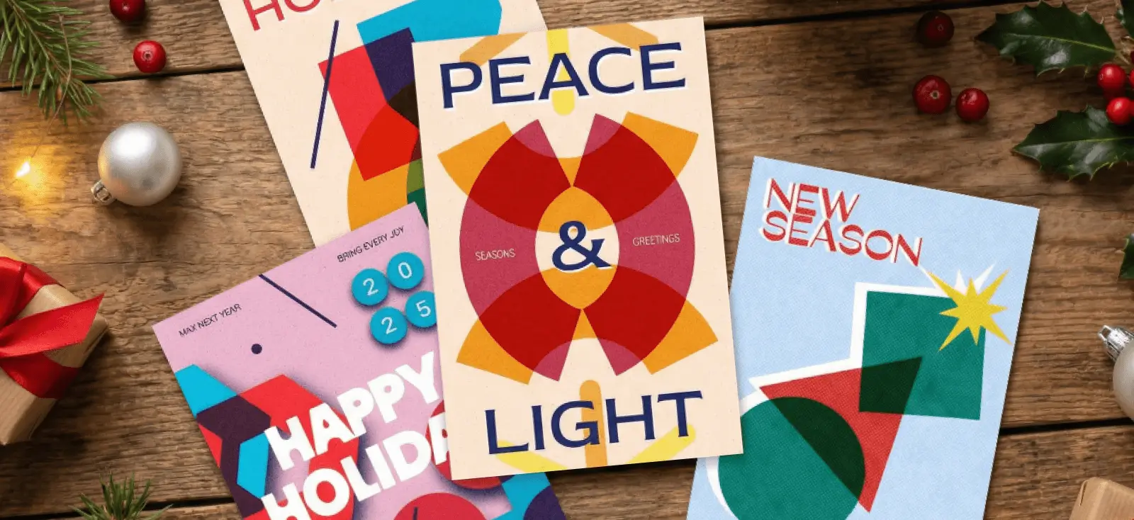
3. Intermediate: Symmetrical overlaps and circular geometry

This “Peace & Light” layout uses repeated circular arcs, bold overlaps, and a halftone grain to create a clear Risograph-inspired look.
The colour blending between red, dark blue, and mustard adds depth without relying on complex tools, and the serif typography anchors the design with strong visual balance.
It’s well-suited for intermediate Kittl users because the structure is simple enough to follow, but still requires comfort with alignment, transparency, and layering.
Small adjustments to rotation, colour, or overlap intensity can completely change the mood, making it a great template for creative experimentation.

The Happy Holiday Season Cards template includes detailed shapes, varied compositions, and more opportunities to combine type with abstract forms.
It’s well-suited for designers who want to create a fully stylized holiday card series with consistent colour, texture, and geometric rhythm across multiple layouts.
5. Advanced: Layered organic geometry with soft halftone texture

This “Season’s Greetings” design uses layered organic shapes, soft pastels, and grainy texture to create a refined, Risograph-inspired holiday look.
The overlapping ovals, semicircles, and star shapes build rich colour blends that feel more complex than basic geometric layouts. Paired with a warm speckled background and clean, oversized typography, the composition feels contemporary and expressive.
Because it relies on subtle transparency, irregular shapes, and carefully balanced layering, this style is best suited for designers comfortable experimenting with colour interactions and composition flow.
Key takeaways on why modern geometric Risograph-inspired Christmas cards aren’t just a trend
Risograph-inspired holiday cards stand out because they offer something the seasonal design market rarely delivers: simplicity with personality, warmth without clutter, and a visual style that feels crafted rather than generic.
The growing interest across 2020 to 2025 shows this isn’t a passing moment but part of a wider shift toward designs that feel intentional, modern, and art-driven.
Key takeaways:
- The Risograph aesthetic aligns with the move toward cleaner, more contemporary holiday visuals.
- Geometric shapes, layered colours, and subtle texture give cards a handcrafted, personal tone.
- The style adapts well to both simple and complex layouts, making it flexible for different skill levels.
- Buyers are increasingly drawn to cards that feel curated rather than mass-produced.
- Designers can recreate the look digitally using a few focused techniques in Kittl.
If you’re looking to create holiday cards that feel distinct from traditional seasonal imagery, this aesthetic offers a strong, modern direction.