After trends of loud gradients, maximalist collages, and hyper-saturated feeds, 2026 is surprising everyone with a design trend that’s quiet, structured, and unbelievably satisfying: blueprint graphic design.
Originally born from engineering schematics and architectural drafts, blueprint graphic design is returning as a modern aesthetic. One that blends minimalism with technical precision. It’s clean, instructional, almost scientific in tone… but also extremely adaptable.
Think deconstructed illustrations, thin-line connectors, monospaced typography, and two-color palettes that feel calm, intentional, and instantly readable.
In this trend breakdown, we’ll explore why blueprint graphic design is rising, what defines its look, and how designers are adapting this utilitarian style beyond engineering.
You’ll also learn how to recreate it in Kittl using vector tools, monochrome palettes, AI deconstruction prompts, and monospaced fonts.
The origins of blueprint graphic design
Blueprint graphic design wasn’t born in a studio. It was born in workshops, labs, and architect offices. Historically, it referred to the cyanotype printing method used to reproduce technical drawings.
These were visuals made for function:
- thin line weights
- stripped-down shapes
- precise labels
- exploded parts and annotations
You weren’t supposed to admire them. You were supposed to build from them.
But like many utilitarian visuals (grid paper, filing labels, barcode art), blueprint graphic design eventually crossed into creative spaces. Designers started borrowing its precision, structure, and calmness — especially as a counterbalance to trends that felt chaotic or oversaturated.
Pro Tip
Search “threshold”, “outline”, or “deconstructed” in Kittl’s Elements panel — these styles closely match the etched, stamped look you see in blueprint-inspired art.
Why blueprint graphic design is trending in 2026
Blueprint graphic design stands out because it feels refreshing in a landscape overloaded with brightness, noise, and complexity.
Three cultural shifts are driving its return:
1. Minimal is making a quiet comeback
After years of maximalist trends, designers are craving something that feels clean, useful, and stable. Blueprint graphic design is the antidote: structured, calm, and textural without being overwhelming.
2. AI workflows make “deconstructed” illustrations easy
Designers are using AI (including Kittl’s image tools) to convert everyday objects into blueprint-ready visuals — outline-only, 2-color, or deconstructed layers. Tools make the process accessible even if you’re not an illustrator.
3. Functional aesthetics feel trustworthy
Blueprints communicate clarity, accuracy, and intention. In a year where information overload is real, audiences gravitate toward visuals that feel organized.
That’s why you’ll see blueprint styles emerging in:
- product explainers
- infographics
- menus
- packaging
- editorial layouts
- science-inspired branding
Pro Tip
Use Kittl’s Vectorizer on any photo, then reduce it to two colors. Turn off one color layer and recolor the remaining one — instant blueprint illustration.
Also, watch our full explainer breakdown here:
The anatomy of Blueprint Graphic Design
Blueprint graphic design is a surprisingly flexible style — but the rules that define it are incredibly clear. Here’s what to look for:
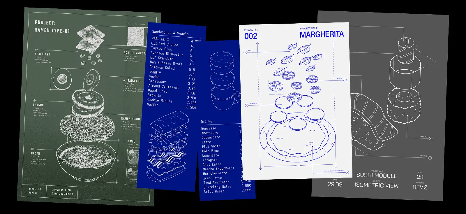
1. Deconstructed illustrations
This is the blueprint signature: objects broken into labeled parts, exploded views, or outline-only diagrams.
You’ll often see:
- threshold-style graphics
- etched or stamped illustrations
- separated layers or components
- dotted connectors and anchor points
Pro Tip
Make a deconstructed illustration of a bicycle in two-color blueprint style.”
Avoid using “blueprint” in prompts — “deconstructed,” “technical,” or “exploded view” yields better results

2. Thin-line connectors and annotation markers
Lines are everything in blueprint graphic design. They guide the viewer’s attention and emphasize structure.
Look for:
- 1–2 px stroke weight
- straight or 45° angled lines
- small anchor circles (nodes) at endpoints
- dotted or dashed connectors for secondary details
Pro Tip
Use the Pen Tool in Kittl + hold Shift for perfect straight lines. Keep stroke weights consistent across the entire design.

3. Monospaced typography
Blueprint graphic design LOVES monospace fonts because they feel mechanical, coded, and functional.
Top choices from Kittl:
- Sliggo Oil Micro
- Roboto Mono
- Space Mono
- Z65009 Monospace variants
They make any layout feel instantly technical.
Pro Tip
Search “monospace” in Kittl’s font panel — the whole category fits the blueprint look perfectly.
4. Two-color (often monochrome) palettes
Blueprints were originally printed using cyan and white — but modern interpretations stretch this slightly.
Common 2026 blueprint palettes:
- blue + white
- navy + cream
- black + white
- forest green + white
- gray + white
Occasionally, you’ll see a third accent color, but rarely.
Pro Tip
Use Kittl’s Palette Generator on a real blueprint image to get instantly authentic color codes.

5. Grid-based layouts
Unlike punk design, blueprint graphic design thrives on structure.
Layouts often include:
- clear margins
- modular sections
- consistent spacing
- perfectly aligned labels
- structural symmetry
It’s minimal but intentional — almost meditative.
Where blueprint graphic design is showing up in 2026

Blueprint graphic design isn’t staying in technical documents. It’s becoming a full-fledged aesthetic in creative industries:
- Food & beverage branding
Deconstructed menus, ingredient posters, coffee brewing diagrams. - Product marketing & packaging
“Exploded view” packaging illustrations for electronics, skincare, candles, or apparel. - Posters & decor
Minimal blueprint-style artwork for rooms, cafes, and boutiques. - Merch
T-shirts featuring technical diagrams of guitars, ramen bowls, sneakers, etc. - Instructional content
Any project that requires clarity, simplicity, and visual breakdowns.
Pro Tip
For printable posters, export your blueprint graphic design from Kittl at 3000×3000 px for crisp line quality.
Creating blueprint graphic designs in Kittl
You don’t need architectural software — just a clear object, a clean outline, and Kittl’s vector tools. Here’s how to start:
1. Pick a blueprint-style template
Kittl has dozens of deconstructed menus, posters, diagrams, and outline templates ready to use.

Sandwich Blueprint. Use Template

Furniture blueprint Kittl Flows x Nano Banana. Use Template

Margherita pizza. Use Template
2. Convert your object into a deconstructed illustration
Use Kittl Flows or Vectorizer to transform photos into 2-color technical illustrations.

3. Use monospaced fonts
Keep your typography functional and consistent.
4. Add connector lines and labels
Use the Pen Tool + circles to create blueprint-style indicators.

5. Stick to a monochrome palette
Blue and white are the classic combo, but any two-color scheme works.
Pro Tip
Keep all strokes the exact same weight across illustrations, borders, and connectors. Even slight variations break the blueprint illusion.
Explore more 2026 design trends
Blueprint graphic design is clean, calm, and functional — but it’s only one part of what 2026 has in store.
This year’s design landscape blends AI workflows, handcrafted textures, editorial minimalism, nostalgic visuals, and experimental layouts in completely new ways.
Dive into the Kittl 2026 Design Trend Report for a full overview of what’s shaping the creative world next.
It’s packed with visual inspiration, templates, and tools to help you stay ahead — whether you design for clients, content, or your own creative world.
Key takeaways: Make your own blueprint graphic design!
Blueprint graphic design is rising because it simplifies the complex. It turns everyday objects into technical art, blends minimalism with clarity, and feels instantly modern.
In 2026, blueprint graphic design proves that utility can be beautiful.

Shafira is a content writer who turns boring business talk into reads people actually enjoy. She grew up hoarding $1 novels in Singapore and writing hilariously bad fiction, but now she tackles content marketing with all that creative chaos since 2019. From blogs and newsletters to UX and SEO, she writes how she thinks: nerdy, honest, and a bit offbeat. She believes the best content is human-designed, not just plain text.