Logos are the heart of a brand’s identity — communicating everything from its offerings, personality, values, and mission. But what makes a logo truly great? Why do some logos become iconic while others are easily forgettable or overlooked?
It has nothing to do with luck or even being just aesthetically pleasing. The designers behind great logos are thoughtful and strategic—they follow core principles that make logos effective, functional, and instantly recognizable.
In this article, we’ll break down what makes a strong logo and look at eight specific examples to create a logo that leaves a lasting impression. Whether you’re designing for a new brand or undergoing a rebrand, these principles will help guide your design process.
What makes a good logo?
A great logo isnt just about looking good its about communicating and functioning well. To achieve this, there are five core factors of a good logo: Memorability, simplicity, timelessness, versatility, and representability. Lets dive deeper into each below:
1. Memorability: Make an instant impression
A great logo sticks with people. It should be clearly legible and distinctive enough to be remembered after a quick glance.
During a study on brand memorability over 150 people were asked to draw logos of 10 iconic logos from memory. Some of the brands included were Apple, Starbucks, and Foot Locker among others.
The results showed that people often forget small details but remember the core elements. This tells us that most brains aren’t processing every intricate part of a logo — only the key features stand out. So, to make your logo memorable, focus on highlighting the most important components, such as the theme, vibe, words, or colors, in a clear and recognizable way.
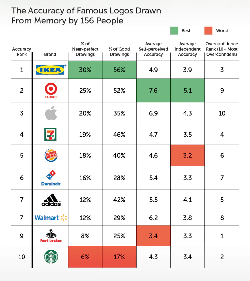
Logos with the worst memorability ratings tend to have intricate details that the brain forgets. To ensure your logo is both accessible and memorable, highlight the most important elements clearly so they don’t get lost. This enhances brand recognition and advocacy, making your brand easier to process and recall than the competition.
2. Simplicity: Less is more
The best logos are straightforward and uncomplicated. You have mere moments for your logo to leave an impression — don’t waste it with excess elements that don’t contribute to the core structure, meaning, or theme of your brand personified through your logo. Keep it simple for maximum impact and to reduce any risk of it being forgotten or ignored.
Additionally, you need to consider your logo’s appearance in different environments. Overly complex logos can lose impact when scaled down or viewed from a distance.
Start with a strong concept and strip away unnecessary details. If a logo still works when reduced to its most basic form, it’s on the right track.
3. Timelessness: Avoid trends for longevity
Trendy logos might look fresh today but they’ll appear outdated in a few years. A well-designed logo should be just as effective decades from now as it is today. Think about how brands like Coca-Cola have made nearly minimal changes to their logo throughout the years. They’ve gone through numerous rebrands and changed their logo, but for the most part, it’s remained the same — turning it into a reliable classic.
See this visually below. Aside from Coca-Cola’s very first logo and a few off-years, the brand retains the same structure, lettering, and colors, just modernized to keep up with the times.

While avoiding trends helps with longevity, occasional refinements and modernization (without losing brand essence) can also keep a logo relevant.
5. Representability: Align with the overall brand identity
A logo should reflect the company it represents. A law firm wouldn’t use playful, cartoonish fonts, just like a children’s toy company wouldn’t use an ultra-serious serif typeface.
So before designing a logo, define the brand’s personality. Whether it’s bold and modern or clean and organic, the logo should communicate this visually.
Learn more about how to define a brands personality with our branding tips guide which shares 20 tips on how to build a personal brand covering every step from development to design to continued growth.
8 examples of great logos we can learn from
We went through and identified eight logos that follow the five principles that we outlined above. Let’s look at each of these examples and what specifically makes them great. This will equip you with insights you can apply to your own logo building.
1. Jell-O

Jell-O’s recently underwent a rebrand after 10 years. The bold, wobbly lettering mimics the product itself — fun, jiggly, and playful. The strong red color and simple, rounded typography isn’t too far off from its original branding, keeping it easily recognizable. But the new flat and bold text, along with the change in tone, modernizes it for new audiences. Just like the study on logo recall showed, people might not remember small details, but they’ll remember Jell-O’s energy and vibrancy.
The key learning from Jell-O’s rebrand is that a logo can evolve while staying true to its core identity — modernizing elements for new audiences without losing the familiar, memorable essence that makes it iconic.
2. DocuSign

DocuSign recently rebranded to reflect its evolution beyond eSignature into intelligent agreement management. The new logo, built from its custom typeface, DocuSign Indigo, maintains a clean, sans-serif look with a signature stroke.
At the core of the redesign is The Nexus, a mark symbolizing agreements. A bold D in bright Poppy overlaps with an agreement shape in Cobalt blue, merging into an Inkwell hue what DocuSign calls The Shape of Agreements. This modernized identity reinforces the companys expanded vision while keeping its signature simplicity.
3. Evri

Evri, the UK-based logistics company, has a unique logo that changes but remains recognizable. Each letter in its name can swap styles, reflecting the brand’s flexibility in delivering parcels across different locations.
Despite this playful variation, the logo remains clear and legible, proving that versatility doesn’t mean sacrificing coherence. Whether it’s on a van, a website, or a shipping label, Evri’s logo works everywhere.
You can read more about the strategic and meticulous thought that Superunion and the Monotype Studio design team put into the Evri logo here.
4. Liquid Death

Liquid Death takes an extreme approach to branding with its gothic-style typography, more reminiscent of a heavy metal band than a bottled water company.
This unexpected design makes it instantly memorable, proving that breaking industry norms can be a powerful strategy. It’s a logo you won’t forget because it looks nothing like what you’d expect from a water brand.
This is why Liquid Death makes it onto the list. Their thoughtful approach to branding, from their logo to packaging, sets them apart from the competition. They identified a niche and expertly filled it, becoming the go-to beverage in hand for festival goers who want to hydrate but feel like they’re drinking something more than just water.
5. Oatly

Oatly’s logo is deliberately imperfect, featuring hand-drawn, slightly irregular typography that gives the brand a bold, natural, and almost rustic image.
This approach works beautifully across packaging, digital media, and advertising, reinforcing its identity as an unconventional, eco-conscious brand that’s disrupting the dairy industry.
6. Mailchimp

Mailchimp’s subtle stroke contrasts in its bold sans-serif lettering, paired with its cheerful mascot, Freddie, reflects the brand’s friendly and creative identity. The loose, informal typography sets it apart from the overly corporate look of its competitors, making it feel more welcoming and approachable.
The combination of Mailchimp’s bright yellow primary brand color and modern, expressive logo, helps the brand capture its fun and positive image.
7. Living Things

Living Things’ logo is a perfect example of a brand using typography to visually reinforce its message. The design cleverly integrates “eyes” within the letters, symbolizing its slogan: “Living Things. For Living Things.” This subtle yet effective touch gives the brand a sense of personality and connection, making it feel alive just like the gut-friendly prebiotic soda it represents.
Beyond the hidden eyes, the rounded, bubbly lettering is a natural extension of the product itself: “Prebiotic soda with belly-loving bubbles.” The soft, playful typography mirrors the fizzy, lighthearted experience of drinking their soda, while also aligning with the brands overall fun, friendly aesthetic.
Every detail in the logo works in harmony, ensuring that it not only looks great but also tells a story about what Living Things stands for — health, playfulness, and, most importantly, life.
8. Nike

We can’t talk about great logo design without mentioning Nike. It may be cliché, but Nike is a brand that truly nails cohesive branding. Rather than diving into hidden messages or conspiracy theories about the logo, let’s focus on how perfectly the Nike swoosh aligns with their slogan: Just Do It.
Nothing is more satisfying than checking something off your to-do list — that little check mark symbolizes the powerful, accomplished feeling of getting things done. The Nike swoosh embodies that same sense of motion and achievement, reinforcing Nike as the brand that helps you take action.
Parts of a logo
A well-designed logo is a combination of elements that work together to create a strong brand identity. While not every logo includes all of these components, understanding the key parts of a logo can help you craft a design that is both effective and memorable.

1. Logomark (symbol or icon)
The logomark is the visual symbol of a brand. It can be an abstract shape, an image, or a recognizable icon that represents the company. For example, the Nike swoosh and Mailchimp’s Freddie the Chimp are iconic logomarks that stand alone without needing text.
Tip: A strong logomark should be simple, scalable, and meaningful to your brand.
2. Wordmark or logotype
A wordmark or logotype is essentially the brand name itself in a distinct typeface. Some logos rely primarily on the wordmark — like Jell-O. In this scenario, brands rely on custom typography to create a recognizable identity without additional symbols.
Choose or design a typeface that reflects your brand’s personality: modern and clean, classic and elegant, or bold and playful.
3. Tagline (optional)
Some logos include a tagline — a short phrase that reinforces the brand’s message. Nike’s “Just Do It” is a famous example. While not necessary, and not always used with the logomark, a well-placed tagline can enhance a logo’s overall impact for merchandise, packaging, and web design, etc.
If including a tagline, keep it brief and ensure it doesn’t overshadow the primary logo elements.
More examples of great logos
For more great logo examples, check out the brand boards below. Each one applies the key principles we mentioned earlier to create logos that are clean, legible, and memorable — all while aligning seamlessly with the overall brand aesthetic.
Pay close attention to how every element — from font choices and colors to icons — works together in a consistent visual style to build a cohesive brand image.
You’ll also notice how the simplicity of each logo makes it easy to create versatile variations. Whether it’s just the logomark or a full combination of logomark, tagline, and wordmark, each version fits naturally within different mockup environments.
Access the brand board templates below and more in Kittl with a free account — customize them to match your brand needs or use them for inspiration
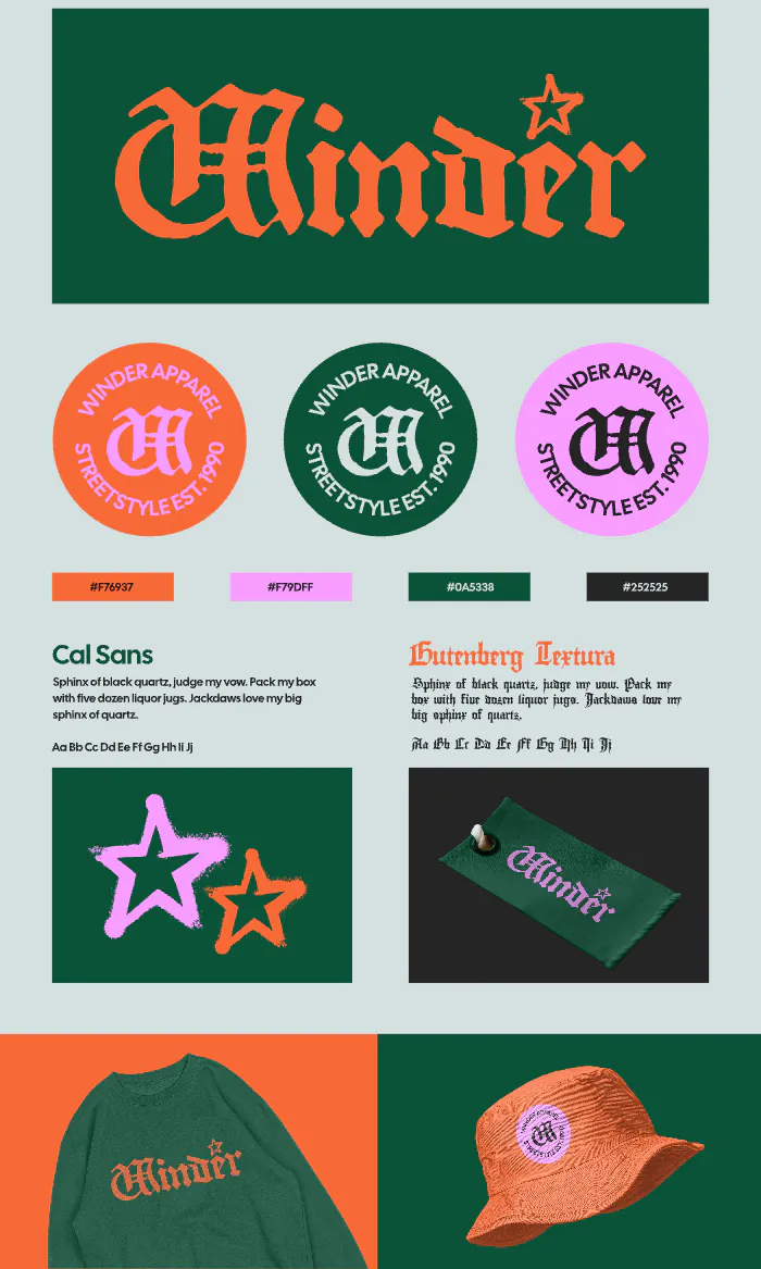
Streetwear Brand Board Design. Use Template

Wellness Massage Studio Brand Board Design. Use Template

Food and Beverage Brand Board Design. Use Template
Key takeaway
A logo is more than just an image — it’s a brand’s first impression. A great logo is simple, memorable, timeless, versatile, and appropriate. Whether you’re designing from scratch or refining an existing logo, these principles will help ensure your design stands the test of time.
Now that you know what makes a good logo, take a look at some of your favorite brands. Which principles do their logos follow? Understanding why certain logos succeed can help you apply the same thinking to your own designs.