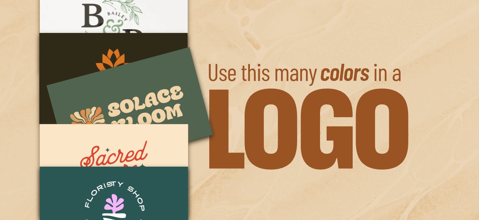
Theres a general agreement among brand strategists and designers alike that a logo should include 13 colors. But this isnt just a random magical number. It comes down to core design principles that make 13 colors ideal for most logos.
In other words, you dont want to choose colors at random or just because they look good together. You want to be intentional and to do this, you need to know why keeping your palette small matters.
So let’s break down why you want to limit your logo to 1–3 colors, plus share tips for crafting a color palette that works.
Why only use 1-3 colors in a logo?
Most iconic logos use one, two, or three colors. Why? Because balance, consistency, and meaning matter more than quantity.
- One-color logos are clean and focused.
- Two or three-color logos allow room for more representation and symbolism without overwhelming the eye.
More than three colors, however, can dilute your message and make your logo less adaptable across different settings/use cases.
Here’s why you want to keep your logo’s color count small:
1. It helps match your brands identity
Your logo’s color palette is one of the most emotionally loaded parts of your brand identity. More than three colors often distract from your core personality, creating confusion about who you are and what you stand for.
Think about your brands values:
- Is the brand minimalist or expressive?
- Serious or playful?
- Luxurious or accessible?
- Organic or electric?
There are some industry “norms” as well when it comes to brand palettes. For example, high-end luxury brands often use a single neutral tone. But these rules aren’t universal — and context is key here.
Example: Luxury brands often use neutral, muted palettes. But a luxury brand targeting a Gen Z audience could choose 23 logo colors with a bold, saturated primary color and muted secondary tones to feel playful yet premium.
The key is to consider your audience, values, and desired personality when choosing your color(s).
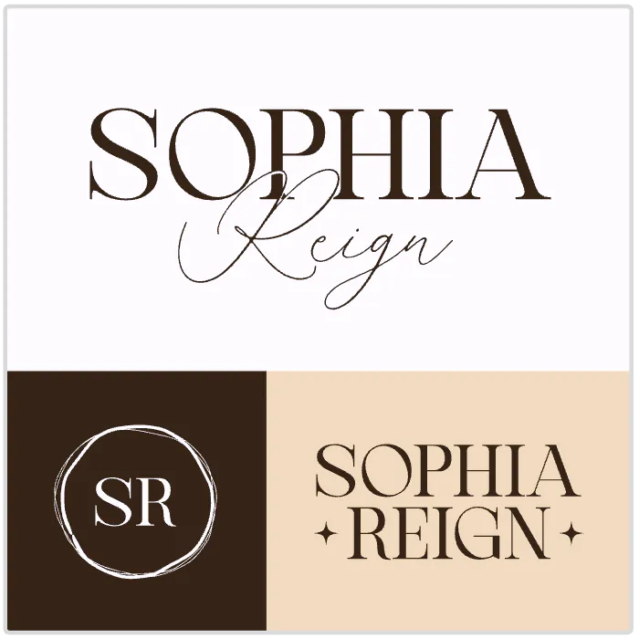
Sophia Reign Beauty Content Logo. Use Template
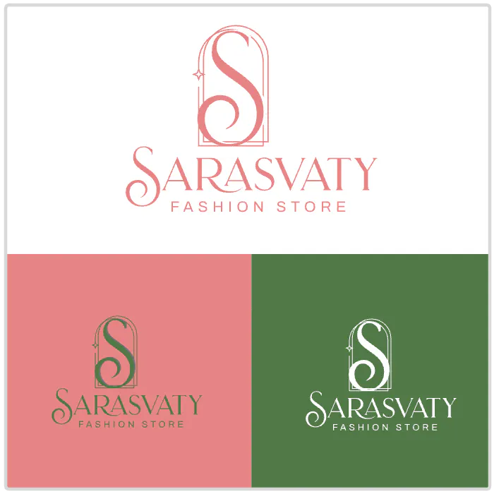
Sarasvaty Fashion Store Logo. Use Template
2. It makes your logo system versatile
As with any brand, your logo isn’t static — it needs to work across dark and light backgrounds, in print and digital, and scaled up or down.
Too many colors can make adaptation harder.
So when planning your logo colors, experiment with your logo system. A strong logo system typically includes:
- A full-color version
- A one-color version
- An inverted version
By limiting your palette, you ensure your logo stays recognizable and effective no matter where it appears.
3. It keeps your design visually appealing
Like we hint at above, more than three colors is often just… too much.
Overloading a logo with color creates clutter and can make it memorable — but not in a good way. Simplicity is more timeless and easier for audiences to associate with your brand.
Keep it simple and keep out the clutter.
Tools and tips for choosing colors for your logo
The goal isn’t to strip your logo of personality its to make every color count. Learn more about the best color combinations.
Tips for creating a strong palette:
- We ultimately recommend choosing one or two core brand colors in your logo. Don’t use more than three.
- Add supporting accent colors for your broader brand identity (but not in the logo itself).
Test in grayscale to check contrast and legibility.
Tip: Tools like Kittls’ color palette generator can help you craft palettes effortlessly and refine to suit your needs. You can upload any image you’d like into Kittl or choose one from the Image Library and generate a palette based on the images colors with a click.
When you’re designing a logo in Kittl
Kittl is one of the best spaces you can use to create and test logo color variations:
- Use the Color Palette generator directly in the editor to pull colors from any image you like that inspires your palette. Learn more tips and tricks about this in our guide to creating the best color combinations.
- Use Brand Kits to save your brand image as you craft and create potential variations.
- Use masks and Kittl’s advanced vector editing tools to refine every detail.
- Preview your design across mockups (business cards, social posts, signage). Do this easily in Kittl with the Mockup generator.
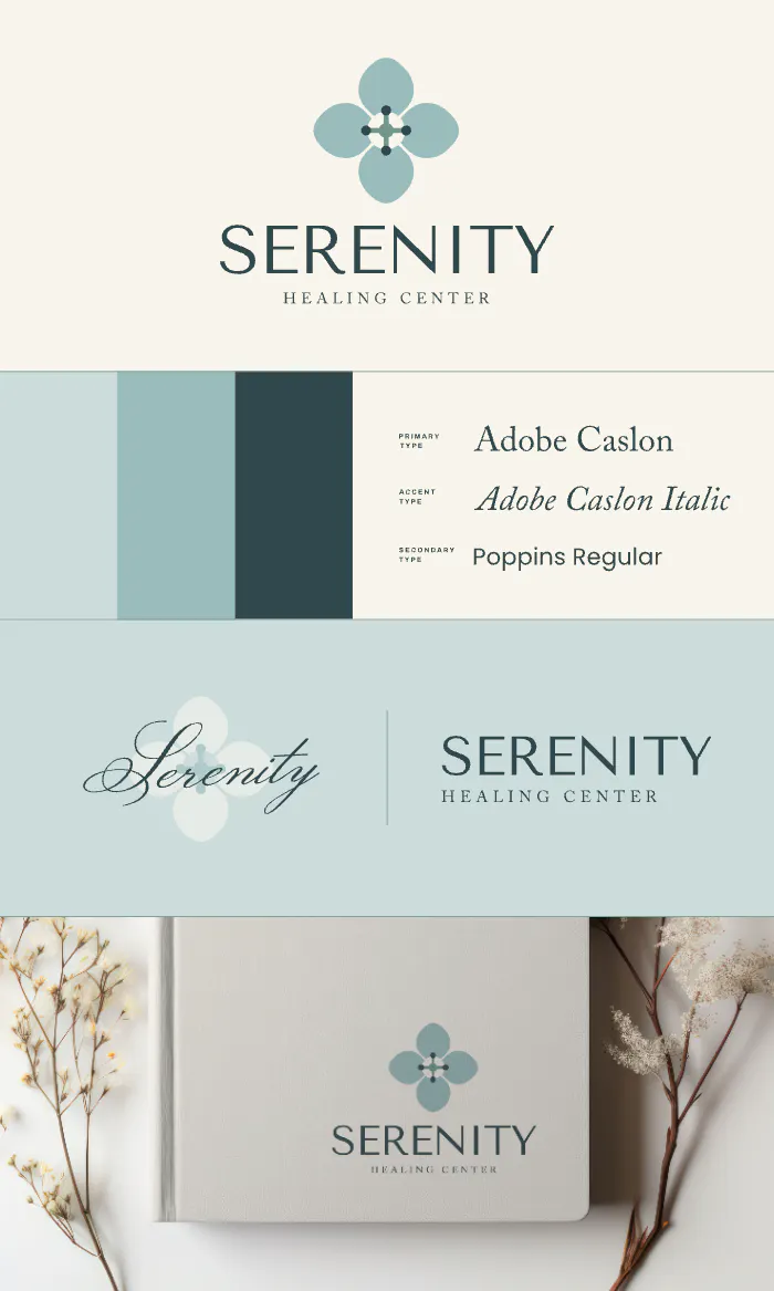
Get inspired with pre-made brand kits in Kittl like those below you can find endless more in the template library.
Wellness Brand Board Design.
Use Template
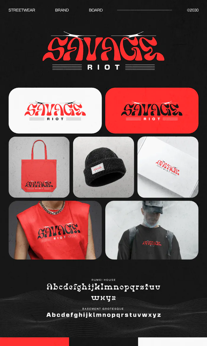
Streetwear Brand Board Design. Use Template
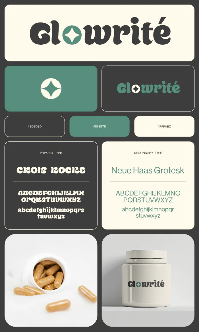
Supplement Brand Board Design. Use Template
Key takeaway: Its not about quantity
Whether you use one color or three, the ultimate goal is clarity, connection, and versatility.
In the video below, Graham takes a logo that doesn’t follow these rules and gives it a complete redesign.
Eliminating excess colors and sticking to a limited color palettes, this logo rescue produces a clean, modern, and visually appealing logo. Check out the logo rescue in the video below!
Be strategic! Take your time to experiment with different color combinations and logo variations in Kittl