


Templates
Tools
Learn
Company
Home
Blog
Design
Elegant Organic Logo Design - Tips and Ideas
Elegant Organic Logo Design - Tips and Ideas

Sometimes we need a break to give our feelings the attention they deserve. Get some quality time, buy ourselves something nice or just watch the grass grow. But you know what, creative work also helps wonderfully when you want to let your mind wander.
There is something meditative about working with form and color. The more time we spend designing, the more we feel the harmony of colors and compositions. Although this feeling is subjective, we often agree on what mood a picture conveys. Why is that? What is our feeling based on, and how can we deal with this as designers?
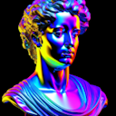
These elegant modern logos keep it really simple. A script font that carries a lighthearted feather stroke can be enough to draw attention to the spirit of a brand and create interest. A Light Sans Serif font fits the minimalist logo design perfectly and gives the viewer some extra information.
When combined, we get a modern minimalist logo design with heart. The clearly structured composition appears harmonious and calm. The fewer elements we use and the more carefully we align them, the tidier our design will be. As they say: “less is more”.
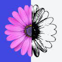
If we take the design a step further, these logos are given a little extra character to their overall looks with elements that evoke the same feeling as the handwritten font, and they also create some depth and dynamics in the composition. We see this fresh and youthful design style, especially popular for Beauty brands and skin care products.
Of course, it works the other way around. By changing the relation between fonts, these logos get a more static appearance. This is emphasized by a lightweight frame that unifies and calms down the whole composition, making it rest in itself.
This way the applicability is increased and even more turbulent backgrounds can be combined without disturbing the calm and basic appearance.
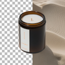
To add more sense of relaxation and mindfulness, we go with a reserved colorway.
As you have seen, most of our natural logos use earthy pastel shades with gold accents. This color choice is perfect to underline the beauty, value, and care that these logos are meant to represent.
One more thing that should be mentioned is the so-called “white space.” The “white space” is the area of a graphic that exists between and next to the elements. The less white space there is, the heavier and more monumental a design appears, and since elegance is light and graceful, we need a lot of space so that our composition seems to float. This makes it all the more important that our hair-thin lettering has a high brightness contrast to the background. Otherwise, it won’t be legible.
In conclusion, these kinds of logos look so subtle that they have to be created with carefulness in mind. Even the slightest change in the typeface, or in the color values can make all the difference.
It really is a balancing act and our templates can help you to walk that rope easily. Stay beautiful and create magic!
Related articles

Design
Swiss Style Poster Design
Is it just simple-looking arrangements of words? Why is there so little detail here? Why is everythi...

Design
Create Tattoo T-Shirt Designs Easily
The custom of marking bodies with permanent designs is probably as old as mankind itself, or at leas...

Tutorials
How to create your own movie title design in Kittl
In the previous article, we showed examples of how Netflix and Warner used to create stunning movie ...